Patten Wilson’s illustrated Coleridge

wilson01.jpg

As is evident by the blurred date on the title page, this illustrated Coleridge by Patten Wilson (1868–1928) was published in 1898. Once again, some of these drawings have appeared here before via copies at Chris Mullen’s Visual Telling of Stories where the scans are a lot better quality than the dreadful job done by Google at the Internet Archive. The drawings look passable when reduced in size but the full-size images are so aggressively compressed that much of Wilson’s fine detail is lost. There’s still very little of Wilson’s beautiful work to be found online—and Coleridge’s poetry is freely available everywhere—so the only reason to look at this particular edition is for the illustrations.

As with Gerald Metcalfe’s volume, The Rime of the Ancient Mariner dominates the collection. I love the way Wilson renders the opening scene by placing the Mariner and the wedding guests in the corner of the picture so he can prefigure the tale with the boats waiting in the harbour. And Kubla Khan’s Pleasure Dome is a lot more impressive than Metcalfe’s city in the clouds. Here’s hoping that a better copy turns up eventually.

wilson02.jpg

wilson03.jpg

Continue reading “Patten Wilson’s illustrated Coleridge”

Gerald Metcalfe’s illustrated Coleridge

metcalfe01.jpg

This angel figure appeared here just over a year ago in a selection from Modern Book Illustrators and Their Work (1914). Subsequent searching at the Internet Archive turned up a well-used copy of The Poems of Coleridge (1907) from which the drawing originates. Gerald Metcalfe (1894–1929), was a British artist whose ink renderings often resemble woodcut engravings. Some of the drawings seem a little perfunctory but he does a decent enough job with The Rime of the Ancient Mariner, a poem whose wealth of incident is more suited to illustration than many of Coleridge’s shorter pieces.

metcalfe02.jpg

metcalfe03.jpg

Continue reading “Gerald Metcalfe’s illustrated Coleridge”

Weekend links 89

gnoli.jpg

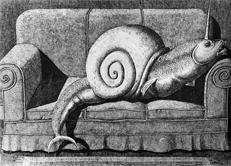
A drawing from Bestiario Moderno by Domenico Gnoli (1933–1970).

RIP Russell Hoban. Nina Allan celebrates a favourite writer while David Mitchell, writing in 2005, pays tribute to Riddley Walker. For me the gulf between Hoban and many of his contemporaries could be measured by his entry in the Writer’s Rooms feature the Guardian Review was running for a couple of years: Hoban’s room was the only one that admitted to being cramped and chaotic.

A wristwatch could be “a tiny flowering hell, a wreath of roses, a dungeon of air” and still tell time. A short story could take the shape of an instruction manual for the most routine of tasks (crying, singing, winding said dungeon, killing ants in Rome), or a compendium of tales about fantastical but oddly familiar species. A novel didn’t have to progress from the first page to the last, hung on a rigid skeleton of plot: it could proceed in oblong leaps and great steps backward, like a game, say, of hopscotch. “Literature is a form of play,” said Cortázar. […] It is perhaps because he so stubbornly resists categorization, as much as for the ludic complexity of his work, that Cortázar is in these parts more admired than he is read. The Anglophone literary imagination (or perhaps just its material substrate: the market) appears to have room for only one Latin American giant per generation—Borges, García Márquez, the freshly beatified San Bolaño. Cortázar was too weird, too difficult, too joyously slippery to make the cut.

Eels Über Alles: Ben Ehrenreich on Julio Cortázar

• Alfred Jarry is another writer the Anglophone world has often found “too weird, too difficult”. Jarry has been dead for over a century but Alastair Brotchie’s recently-published full-length biography is the first such work in English. Mark Polizzotti reviews a life of “the poster boy for literary cult figures” at Bookforum.

• “A Beautiful Trip”: Frances Morgan interviews David Lynch about music and sound. And Robert Wyatt talks for 95 minutes to Tony Herrington about his favourite music.

• Twilight Science: Paul Schütze presents solo musical work and various collaborative projects in new digital editions.

occupy.jpg

Jonathan Barnbrook‘s logo design for Occupy London.

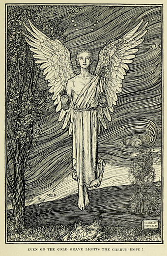
• Winter reads: Myths of the Norsemen by Roger Lancelyn Green. Related: What became of illustrations in fiction?

The White People and Other Weird Stories by Arthur Machen is a new Penguin Classic out in January.

• “This Christmas, why not give Viriconium, city of sex, syphillis & consubstantiation?”

• The Casual Optimist announces its Favourite Book Covers of 2011.

The Collect Call of Cthulhu

Living with Burroughs

Function (2011) by Emptyset | Aftertime (2011) by Roly Porter with Cynthia Miller on the Ondes Martenot.

Athanasius Kircher’s Tower of Babel

babel1.jpg

Here’s a picture whose myriad details I’ve wanted to scrutinise for many years. Lieven Cruyl was the draughtsman and Coenraet Decker the etcher while the picture itself appears as an illustration in Athanasius Kircher’s (deep breath) Turris Babel, Sive Archontologia Qua Primo Priscorum post diluvium hominum vita, mores rerumque gestarum magnitudo, Secundo Turris fabrica civitatumque exstructio, confusio linguarum, & inde gentium transmigrationis, cum principalium inde enatorum idiomatum historia, multiplici eruditione describuntur & explicantur. The book was published in 1679 and, among other speculations, features Kircher’s eye-popping illustration (below) showing how tall the Tower of Babel would have to be in order to reach the Moon. I used part of the big illustration in a cover design for metal band Melechesh in 2006.

babel6.jpg

The copies here are from a scanned volume at the University of Heidelberg where the pages have suffered slightly from bookworm. But the resolution is high enough to explore a picture crawling with tiny details, from the bristling scaffolding at the top of the structure, and the houses (for the workers?) built on the ramps lower down, to a procession of camels and other beasts being led towards the main entrance. In the background there are smaller towers and a few pyramids (Kircher explored the latter elsewhere in the book), and also a harbour with beast-headed sailing ships. The full-size picture may be explored here.

babel2.jpg

Continue reading “Athanasius Kircher’s Tower of Babel”

Tom Phillips album covers

phillips00.jpg

Words and Music (1975) by Tom Phillips.

Two related posts is coincidence, three is a series. Earlier posts from the past couple of weeks looked at album covers created by designers better known for their work in other areas. Tom Phillips is a British artist, writer and composer who I continue to insist is one of our greatest living artists, a figure of singular intelligence, invention and versatility whose lack of grandstanding has never raised his profile to, say, the Hockney level. Phillips’ involvement with the music world, both as composer/librettist, and his oft-cited position as Brian Eno’s art teacher in the 1960s, have led to the creation of a handful of record and CD covers from the mid-70s on. Before we get onto those I’ll note that Phillips has a piece in the latest edition of Eye magazine where he reviews a book of postcards from the Wiener Werkstätte. I happen to have a review in the same issue looking at a republished Kenneth Anger study.

Words and Music above has a January 1975 release date although the cover clearly states “LXXIV” in Phillips’ customary stencil lettering. The pressing was limited to 500 copies and doesn’t seem to have been reissued since which means that copies for sale command excessive prices. Side A comprises recordings of Phillips’ compositions while on the flip the artist/author reads extracts from A Humument, the treated book/experimental novel which is not only his most celebrated work but a project whose influence permeates all of the Phillips oeuvre, including the sleeve art.

phillips01.jpg

Starless and Bible Black (1974) by King Crimson.

phillips02.jpg

A year before Words and Music, Phillips created the cover art for this King Crimson album, and he’s also credited with the design. The fractured stencil lettering on the gatefold interior resembles similar effects in some of Phillips’ paintings while on the back cover there’s a tiny extract from A Humument bearing the enigmatic phrase “this night wounds time”. I’ve wondered for years how this cover came about: Robert Fripp often selects the art for King Crimson’s covers so was Phillips his choice as artist/designer? Or was it a result of the Fripp and Eno connection? If anyone knows the answer, please leave a comment.

Continue reading “Tom Phillips album covers”