Decapitations

heads03.jpg

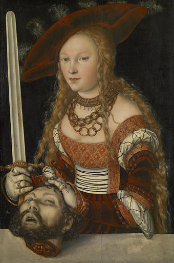
Judith with the Head of Holofernes (1520–1540) by Lucas Cranach the Elder.

It doesn’t take much effort to refute the jeremiads of those who complain that popular culture is exclusively violent, all that’s usually required is to direct attention to Titus Andronicus or The Revenger’s Tragedy. Compared to the stage, the art world seems at first to be more circumspect, especially in the 19th century when the battles scenes of history painters sprawled across acres of canvas, all of them devoid of the physical trauma of warfare.
salome6.jpg

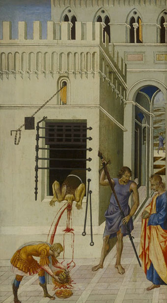
The Beheading of Saint John the Baptist (1455–60) by Giovanni di Paolo.

There are exceptions, however, and the nearer you move to Shakespeare’s time the more examples you’ll find. Paintings produced in an age when violent street executions were still a common sight would have seemed less surprising to their intended audience than they do to our eyes. Several of the paintings here provide a useful contrast with the many sanitised depictions of John the Baptist’s severed head in the Salomé archive.
heads01.jpg

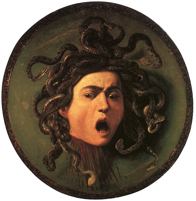
Medusa (c. 1590) by Caravaggio.

Of all the paintings of Medusa’s head the one by Caravaggio is the sole example with a gout of spurting blood. It’s also unusual for being painted on a convex panel intended to resemble the reflecting shield of the Gorgon’s killer, Perseus. Given the violent life of the artist the gore isn’t so surprising although the jet of red in his painting of Judith beheading Holofernes still seems shocking if you’ve never seen it before.

heads04.jpg

Judith Beheading Holofernes (1598–99) by Caravaggio.

The Biblical story of Judith and Holofernes may be the poor cousin to the more popular story of Salomé but depictions of the crucial event make an impression by being consistently gruesome. I suspect the reason is less to do with the story itself than with the success of Caravaggio’s paintings among cultured Europeans. The copying or imitation of celebrated works became a thriving industry in the days of the Grand Tour with the result that 17th- and 18th-century art is overburdened with variations on earlier paintings.
Continue reading “Decapitations”

Satyriconte

satyriconte1.jpg

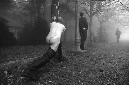
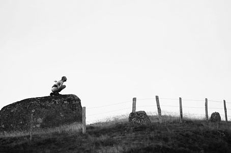
Here in the northern hemisphere it’s the wrong time of year to be cavorting in the open air with your clothes off for any length of time. In warmer months the people behind Satyriconte—who were in touch earlier this week—do just this as an exploration of what they call “the contemporary tale of a satyre”:

Satyriconte is a mix of two french words: satire and tale.
It’s a way to connect with Satyricon, this so old novel written by Petrone.
It’s a road we decided to follow to inquire our world according this point of view.

The Satyriconte project is a photo research around the filthy presence in our occidental civilisation.

So many years of education
……….and still
we can feel the Satire shadow in our daily life.

What about this Satire in our days :
……….Is it washed by our porn torrent ?
……….Is it perfumed and well dressed ?
……….Is it the breath of our parents while they exchange their flesh ?
……….Is it our animal side ? (more)

satyriconte2.jpg

In addition to photos there are drawings and a request for assistance of various kinds, from help staging photo shoots to critical opinion of the project. I’d not-so-helpfully suggest that a contemporary satyr ought to have prosthetic legs (like those used by some paralympic athletes) which give the wearer a suitably goatish appearance.

For more traditional representations of Hermes, Pan, satyrs and fauns this page has plenty of choice examples.

Previously on { feuilleton }
The Piper at the Gates of Dawn
The Great God Pan
Peake’s Pan

The art of Henri Caruchet

caruchet1.jpg

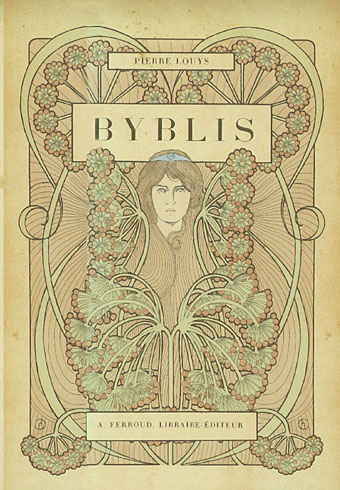
Byblis (1901) by Pierre Louÿs.

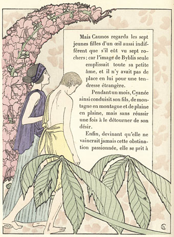
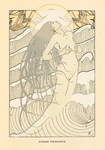
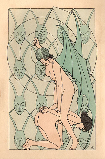
Henri Caruchet isn’t in George Barbier’s league, never mind that of Alphonse Mucha whose graphic style Caruchet appropriated. I’ve not been able to find details about his life either, all that turns up is examples of his book illustration on various websites. Author Pierre Louÿs is notable for his erotic works but it’s Caruchet’s illustrations for Jean de Villiot (via this site) which travel the furthest in that direction (see below), including another example of that deviant sub-genre, the woman being mauled by an octopus. If Caruchet had been a better draughtsman his illustrations might not have languished for so long.

There’s more decorative illustration by Caruchet at Gutenberg.org with an edition of Théophile Gautier’s Émaux et Camées. Two of Gautier’s poems from that volume are quoted by Oscar Wilde in The Picture of Dorian Gray.

caruchet2.jpg

Byblis (1901) by Pierre Louÿs.

caruchet3.jpg

Les Litanies de la Mer (1903) by Jean Richepin.

caruchet4.jpg

Parisienne et Peaux-Rouges (1904) by Jean de Villiot.

Continue reading “The art of Henri Caruchet”

George Barbier’s Falbalas et Fanfreluches

barbier01.jpg

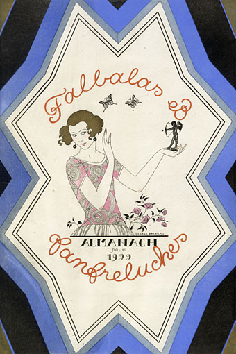
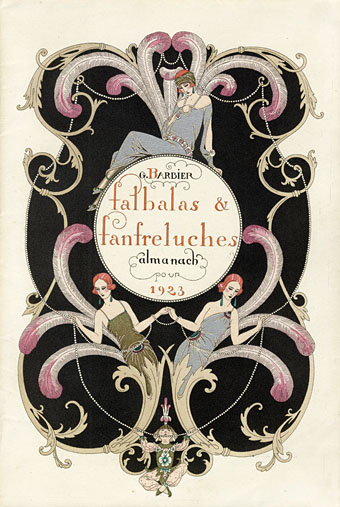
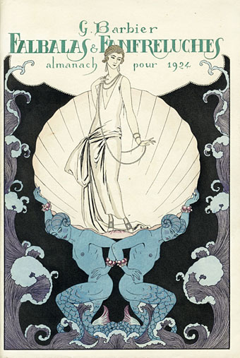
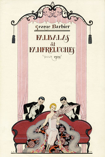
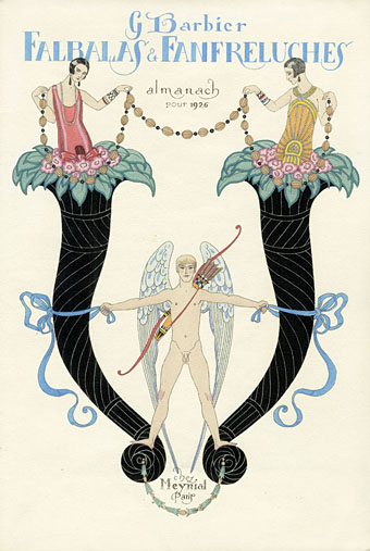
George Barbier’s work has been a regular visitor to these pages. Falbalas et Fanfreluches was a series of pochoir print portfolios published from 1922–1926, a catalogue of various liaisons and amours with a mildly erotic tone. There’s also some sly humour in the examples below, such as the tiny dogs menacing a dandy in L’Agression, and the eyes of the woman in Romance sans paroles wandering to the trim backside of the posing sailor (who doesn’t seem so interested in her).

In addition to being beautiful drawings, Barbier’s title has solved for me a minor conundrum: Falbalas et Fanfreluches means “Ruffles and Frills”, and the Abbé Fanfreluche is a suitably ruffled and frilled character in Aubrey Beardsley’s unfinished erotic novel Under the Hill.

barbier02.jpg

barbier03.jpg

barbier04.jpg

barbier05.jpg

Continue reading “George Barbier’s Falbalas et Fanfreluches”

Weekend links 142

bowie.jpg

Gratifying this week to see album cover art under discussion even if the heat-to-light ratio was as unbalanced as it usually is when pop culture is the subject. Jonathan Barnbrook, who also designed the Heathen (2002) and Reality (2003) packaging for David Bowie, wrote about the thinking behind the new cover on his blog. (And for the time being let’s note that this is still only a cover design, we don’t know what else is on its way.)

For my part I’ll point out that the artist-as-cover-image is the great cliché of album design, and the bigger the name the more the rule applies; Neville Brody complains about this in the first book of his work, as does Storm Thorgerson in the Hipgnosis books. In Bowie’s case the rule has been applied almost universally since his debut album in 1967, the only variations being illustrational ones or slight dodges like having his feet appear on the front of Lodger and his back facing the viewer on Earthling. Consequently the new design is a radical gesture from an artist who could have got away with a photo of himself du jour. By way of contrast, consider that Rod Stewart is a year older than David Bowie and presented the world with this artefact in October 2012.

Related: Hard Format responds to the cover, Chris Roberts on “Picasso resurrected in a Rolf Harris era“, and Alexis Petridis on The inside story of how David Bowie made The Next Day.

The Quicksilver typeface, designed by Dean Morris when he was only 16, bought by Letraset and now an indelible feature of pop design from the 1970s. Morris describes his experience here (“they shunned rapidographs!”) and collects examples of the print history here.

When the days are short, we are closest to the medieval world. To the avoidance of mirrors where death improves our portraits every morning with a few more lines and shadows. What would once have been a sermon, a conjuring of hellfire, a phantom slide show, is now an entertainment. But before we can begin again, we have to kick free of the embrace of our inconvenient predecessors, that compost legion of the anonymous dead. They come uninvited, requiring us to sign up for what the late Derek Raymond called the general contract: a brief turn in the light, then extinction. Eternal darkness. How to live with such knowledge? William Burroughs admired the unswerving bleakness of Beckett’s gaze, the way he reduced compensatory illusions to zero. Nowhere left to crawl. And nothing to crawl on. Last breath is last breath. Stare into the abyss and the abyss will stare right back.

Iain Sinclair reviews The Undiscovered Country: Journeys Among the Dead by Carl Watkins

Broadcast’s James Cargill on Morricone, Minidiscs and Scoring Berberian Sound Studio. Related: Melmoth the Wanderer posts a new mix, The Curious Episode of the Wizard’s Skull, and more spooky sounds are on their way from The Haxan Cloak.

• A Firm Turn Toward the Objective: Joanne Meister on meeting the great Swiss designer Josef Müller-Brockmann.

duchess.jpg

Twitter user @thisnorthernboy reworked Paul Emsley’s portrait of Kate Middleton. @barnbrook approved.

• The Beatles of Comedy: David Free on the Monty Python team.

• The history of the London Underground poster.

Impossible Architecture by Filip Dujardin.

• At Pinterest: Art Dolls & Sculpture

• Grace Jones’ Nightclubbing album has been on repeat play this week: Warm Leatherette/Walking In The Rain | I’ve Seen That Face Before (Libertango) | Demolition Man