Hardy art

hardy1.jpg

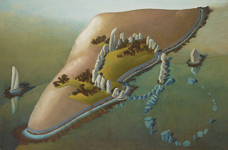
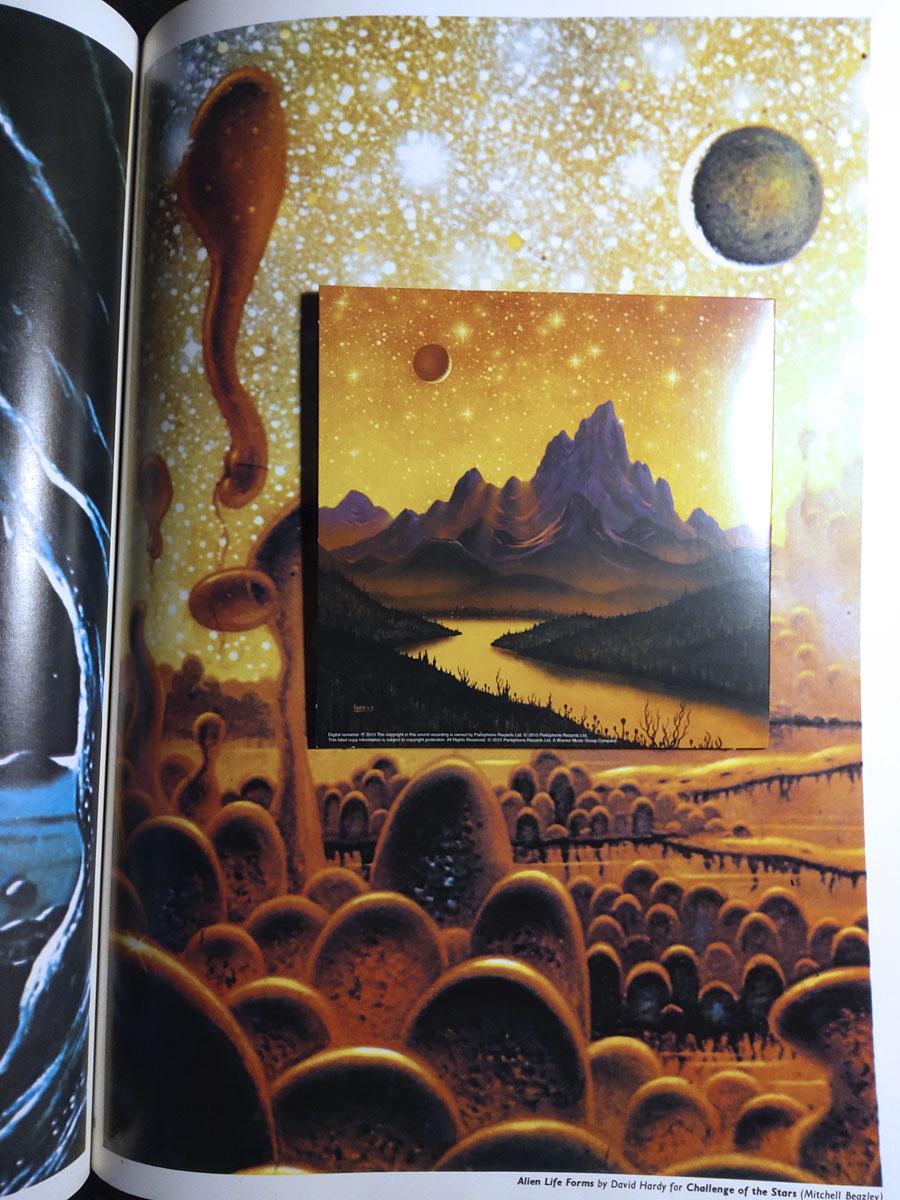
Hawkwind continue to be the overwhelming topic of the moment while I’m reading Joe Banks’ marvellously detailed account of the group’s first decade. One of the many attractions of Hawkwind for this listener was their intersection with other areas of interest: Moorcock and New Worlds, obviously (two of Robert Calvert’s poems appeared in New Worlds Quarterly), but also SF and fantasy in general. The alien planet on the back cover of the Hall of the Mountain Grill album was immediately recognisable as the work of British space artist David A. Hardy thanks to a feature in Visions of the Future (1976) a collection of artwork reprints from the art and fiction magazine Science Fiction Monthly. Hardy had a long association with astronomer Patrick Moore, illustrating the covers of Moore’s novels and later collaborating on a speculative science book, Challenge of the Stars (1972). A few of the latter paintings were reprinted in Visions of the Future, including one with the title Alien Life Forms that depicted amoeboid creatures on a remote planet. The painting would have become the back cover of the Hawkwind album if Hardy hadn’t insisted on creating a new work in a more suitable ratio.

Hardy’s association with Hawkwind extended to their stage shows, with a series of circular paintings used by “Liquid Len” (Jonathan Smeeton) on a rotating projector that covered the band in moving panoramas of ancient monuments, dinosaurs, alien landscapes and exploding worlds. Two of the paintings appear as the endpapers in Joe’s book; the dinosaurs and the monuments may be seen here.

hardy2.jpg

Cover design by Bryan Cholfin.

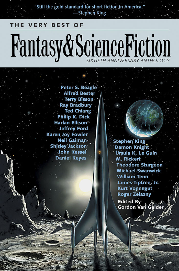
My own Hawkwind covers make very poor comparisons to Hardy’s meticulous renderings but we do have a further connection via The Very Best of Fantasy and Science Fiction, a collection of stories from the long-running magazine edited by Gordon Van Gelder. I designed the book’s interiors and Hardy contributed the cover art. Hardy painted many covers for F&SF throughout the 1970s and 80s, this shining rocket being a reworking of a cover he produced for the magazine’s 60th anniversary issue. The archetypal spacecraft of classic science fiction, and almost a definitive example. You might even call it a silver machine…

Previously on { feuilleton }
Silver machines
Notes from the Underground
Hawkwind: Days of the Underground
The artists of Future Life
Science Fiction Monthly
The Chronicle of the Cursed Sleeve
Rock shirts
The Cosmic Grill
Void City
Hawk things
The Sonic Assassins
New things for July
Barney Bubbles: artist and designer

Jean Alessandrini book covers

alessandrini05.jpg

It’s that Golem again, depicted in 1979 by Jean Alessandrini. The publisher was Bibliothèque Marabout, a French fantasy/horror imprint active from the 1960s to the 1990s that was the genre division of Éditions Marabout, itself a division of publishing behemoth Hachette. Bibliothèque Marabout published a wide range of titles, with many familiar names in addition to writers such as Jean Ray, Thomas Owen and Paul Féval whose work receives little attention in the Anglophone sphere. By 1970, many of these covers had a uniform appearance, predominantly painted illustrations on black backgrounds with the titles set in Roberta, one of the Art Nouveau-styled typefaces of the occult revival. All the Alessandrini covers date from the late 70s and early 80s, and show an evolution of the imprint’s style, with the same black livery but a different typeface that I can’t identify (Coliseum is the closest digital equivalent), together with artwork that’s more of a design rather than an illustration of the book’s contents.

alessandrini02.jpg

Jean Alessandrini is a French artist, designer, typographer and author, also the creator of Typomanie, a book of type designs that I’d like to see. He provided cover drawings in the late 1960s for French SF magazine, Fiction, and later worked for the popular comics magazine Pilote, but his Marabout covers look like collage works, with the grainy appearance of photocopied photos that Neville Brody also favoured for his album cover designs. The combination of a simple symbolic graphic in bright colours on a black background is very reminiscent of David Pelham’s designs for Penguin, some of which also used collage elements. French genre titles seldom seem to follow design trends exterior to France so if there was a Penguin influence at work it’s an unusual case.

Jean Alessandrini has a small but well-designed website here.

alessandrini01.jpg

alessandrini03.jpg

Continue reading “Jean Alessandrini book covers”

Weekend links 526

colquhoun.jpg

La Cathédrale Engloutie (1952) by Ithell Colquhoun.

• Many of the recent lists of “where to start with the music of [x]” aren’t filling an urgent requirement, but in the case of Sun Ra—whose discography runs to 95 albums—any guide is a useful one: Sean Kitching chooses 10 recordings from the Ra galaxy. I’m not unacquainted with Sun Ra’s music but there’s so much of it that almost all these suggestions are news. Related: Namwali Serpell on the life and work of a cosmic visionary.

• Coming soon from Strange Attractor, Ithell Colquhoun: Genius of The Fern Loved Gulley by Amy Hale, the first book-length study of the life and work of the British Surrealist and occult artist.

• I doubt I’ll get to see it but I’m pleased to know that the prematurely shuttered Aubrey Beardsley exhibition is returning to Tate Britain. You’ll need a Decadent face-mask.

• And speaking of music lists, Alexis Petridis compiles a ranking of all the songs by a little-known post-punk band from Manchester.

The Last Arcadian (Process Mix): more psychotropic nougat from Moon Wiring Club.

• Kill Me Again… Ken Hollings on Ennio Morricone and the music of the future.

Mervyn Peake‘s visual archive has been acquired by the British Library.

Anitra Pavlico on the fantastic world (and music) of Maurice Ravel.

Stanley Stellar‘s photos of the New York gay scene in the 1980s.

• At Dennis Cooper’s: Fetish.

• RIP Judy Dyble.

Wikidelia

Chelsea Morning (1968) by Fairport Convention | I Talk To The Wind (1968) by Giles, Giles & Fripp feat. Judy Dyble | Morning Way (1970) by Trader Horne

Notes from the Underground

hawkwind1.jpg

This time last year I was about to start working on the cover of Joe Banks’ Hawkwind book, and here it is at last, after a considerable delay. The special edition has been worth the wait since it comes with an additional 200-page volume, Sideways Through Time, containing the interviews that Joe used for his research. There’s also a set of cards with photos by Laurie Lewis from the session used for the cover of Space Ritual (we used some of the same photos on the book cover), and a print of the Moorcock/Cawthorn Hawklords comic strip from Frendz which further developed the group’s self-mythologising begun by the In Search Of Space “Hawklog”. And for people who pre-ordered the book last year then had to wait for months, there’s a bonus enamel pin based on the hawk design I supplied for the front board. I like badges, and I designed a few for Hawkwind in the past, but this is a better design and a nicer object than any of those I did in the 1980s.

hawkwind2.jpg

It’s a big book.

Now that the book is out I can show off the full cover wrap. As mentioned earlier, I followed Barney Bubbles’ preference for retro futurism by creating a cityscape based on the Deco-styled architecture that Frank R. Paul liked to use in his pulp illustrations. Some of the details refer obliquely to Hawkwind’s cover art or songs of the 1970s, so the speeding car can be taken as a reference to both Kerb Crawler and Death Trap, as well as the speeding Art Deco vehicle on the cover of Roadhawks. The flying saucers are a nod to those by Barney Bubbles on the inner sleeve of the Doremi album (and on one of his black-and-white posters from the same period), while the Philippe Druillet rocket refers to Barney’s own appropriation of a Druillet figure in his Hawk graphics. The combination of vehicles fleeing a burning city gives us the recurring theme in the group’s lyrics about the need to escape from a self-destructing society/planet. Welcome to the future.

Hawkwind: Days of the Underground is available now from Strange Attractor.

Previously on { feuilleton }
Hawkwind: Days of the Underground
The Chronicle of the Cursed Sleeve
Rock shirts
The Cosmic Grill
Void City
Hawk things
The Sonic Assassins
New things for July
Barney Bubbles: artist and designer

Peake’s Insects

peake1.jpg

Having recently watched Jan Švankmajer’s self-reflexive film of the Capek Brothers’ Insect Play I was intrigued by a mention in one of the Mervyn Peake biographies that Peake had created costumes for two stagings of the play in London in 1932 and 1936. “Mr Mervyn Peake’s costumes could not be bettered,” said James Agate in the Sunday Times, but my sole book of Peake artwork doesn’t mention the play at all, and these drawings are the only examples to found after a web search, not the photos I was hoping for. The one below is a more original conception than those used by the amateur actors in the Švankmajer film.

peake2.jpg

My own workload is gaining momentum just now so posting here may be sporadic for a while. I’m also recoding my website from scratch which doesn’t help when you already have more than enough plates spinning. Having refreshed the blog with a flexible template that resizes itself for different devices I decided it to do the same for the rest of the site. I last attempted anything on this scale in 2005 so I’m having to educate myself all over again in the mysteries of cascading style sheets. And I have hundreds of pages that need working on… This will take some time.

Previously on { feuilleton }
Bookmark: Mervyn Peake
The Web by Joan Ashworth
Peake’s glassblowers
Mervyn Peake in Coronation Street
The Worlds of Mervyn Peake
A profusion of Peake
Mervyn Peake at Maison d’Ailleurs
Peake’s Pan
Buccaneers #1
Mervyn Peake in Lilliput
The Illustrators of Alice