Heartbreak Hotel

hh01.jpg

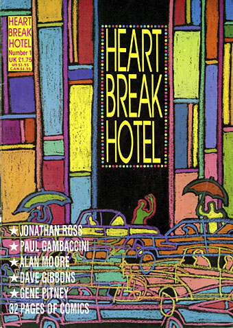
Number One: Teen Angels in Anguish. Cover by Barry Kamen.

Among the recent uploads at the Internet Archive is a complete run of Heartbreak Hotel, a British magazine six issues of which were published in 1988. (More or less…I think the first issue may have appeared at the end of 1987.) Heartbreak Hotel differed from other bi-monthly publications by being predominantly a comics magazine, but it also differed from other comics magazines by a) having the contents of each issue themed to follow a different musical genre, b) running articles by and interviews with people who had little or no connection to the comics world, and c) being a lot more openly sympathetic towards gay men and lesbians than any other magazine aimed at a general readership. The latter stance was a political one in 1988. This was the year when the Thatcher government, growing hubristic after a third election win, passed a Local Government Act whose notorious Section 28 prevented authorities from “promoting homosexuality”. The clause was designed to prevent Labour-run councils from funding gay and lesbian support groups, as well as to stop teachers from mentioning homosexuality in sex education lessons. The editors of Heartbreak Hotel, Don Melia and Lionel Gracey-Whitman, were a gay couple, so the magazine stood against the repressive atmosphere of the time without being too polemical or too serious. The polemic was more overt in affiliated publications Strip AIDS, a benefit comic for the London Lighthouse (a residential and daycare centre for people with AIDS), and AARGH (or Artists Against Rampant Government Homophobia), a collection of comics taking a stand against Section 28 which was the first publication from Alan Moore’s Mad Love imprint.
hh07.jpg

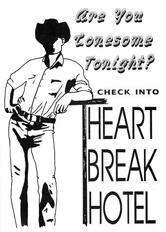
The other notable feature of Heartbreak Hotel was the attention it gave to new artists, to women artists, or to people who weren’t drawing generic action/adventure strips. The first two issues appeared while I was working on the last pages of my adaptation of The Call of Cthulhu so I sent the magazine some sample pages and was subsequently invited to meet the editors at the launch of the next issue in London. I spent a somewhat nervous weekend in the capital; this was my first introduction to the wider comics world, and my introversion in those days was a lot more pronounced among strangers than it is today. I met Alan Moore and Melinda Gebbie for the first time (separately—they weren’t a couple at that time), and was amused when Don made a point of telling me that he and Lionel were gay, something he evidently felt he had to declare even though it had been (for me, at least) quite obvious from the editorial stance of Heartbreak Hotel, as well as the camp graphics scattered throughout the magazine’s pages, and the fact that the publisher was co-named “Willyprods”.
hh08.jpg

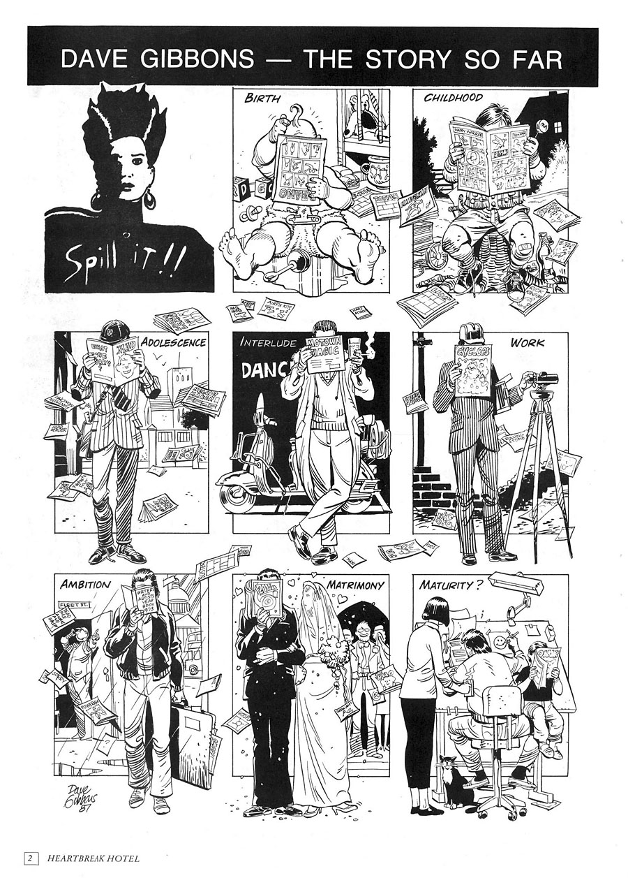
Dave Gibbons spills the beans in issue one.

The format of the magazine was established in the first issue: five or six strips based on songs that suited that issue’s theme, together with interviews or features, some of which also matched the theme. “Spill It!!” was a regular feature in which a different artist had a page to create an autobiographical piece in strip form, and there was also a column about comics and related matters by artist/writer Trina Robbins. I’d initially hoped to draw something for the psychedelic issue but by the time I posted my photocopies that number was already being prepared for print. I did turn up in the fourth issue, however, in a short news piece which announced the publication of the Caemaen Books edition of my Haunter of the Dark strip.
hh09.jpg

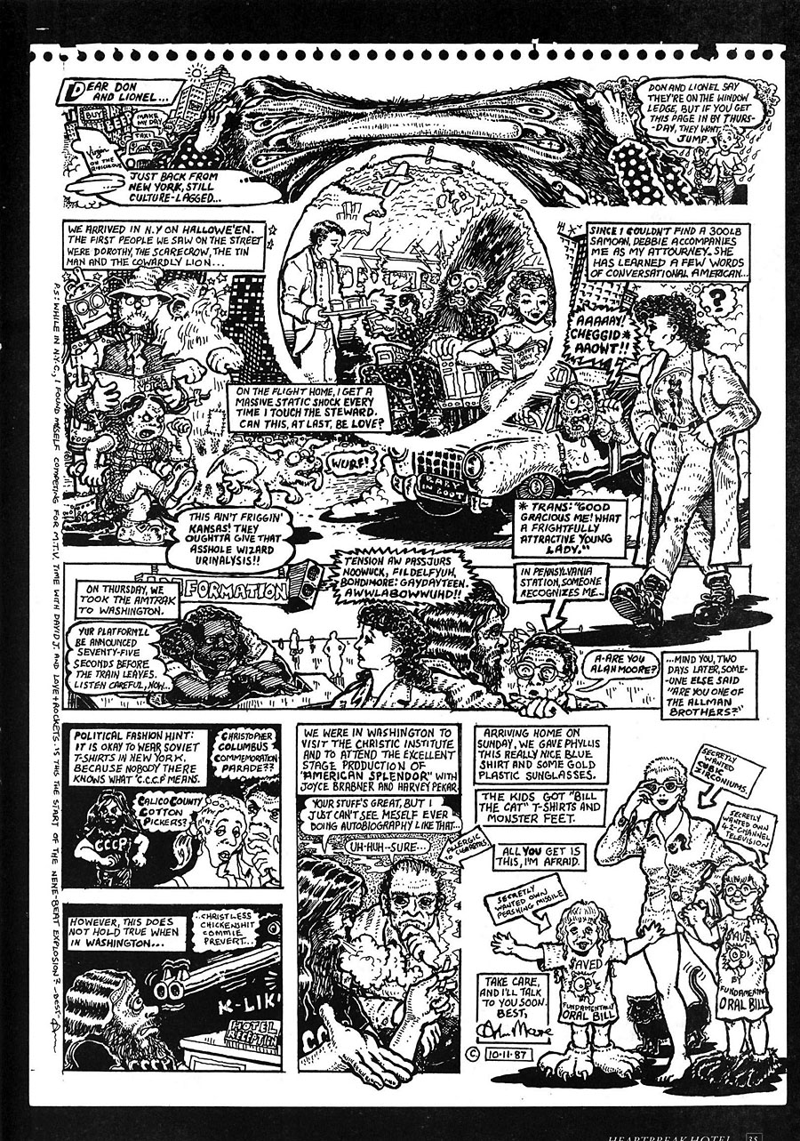
Also from issue one, Alan Moore recounts his trip to the USA.

A more important outcome from my journey to London was Lionel’s offer to run The Call of Cthulhu in BLAAM, a spin-off comic that Willyprods/Small Time Ink was planning. Heartbreak Hotel had been inundated with work by talented newcomers so rather than make them wait for a slot in the parent magazine the editors decided to launch another title to provide an additional outlet for new creators. Lionel had been very impressed with my Lovecraft story, and also assisted with its conclusion when he suggested that I add an extra page to help the pacing near the end, something I did, and which I’ve been grateful for ever since. The first issue of BLAAM, printed on tabloid-size newsprint sheets, came bundled with issue five of Heartbreak Hotel. The idea was that BLAAM would continue separately as a free publication thanks to a combination of low production costs, advertising, and Don Melia’s contacts at Titan Distribution. This was all very exciting, especially when two more issues of BLAAM appeared soon after. My strip was slated to run in number four or five but Willyprods/Small Time Ink didn’t publish anything more after December 1988. I was disappointed by this but not for long. A year later I’d started working on the Savoy comics, and Steve Bissette offered to publish the Cthulhu strip in Lovecraft Lives, a book he was planning for Kevin Eastman’s new enterprise, Tundra Publishing. That one didn’t work out either—the stars weren’t right for a variety of reasons—but all this attention, and the enthusiasm shown by everyone involved with Heartbreak Hotel, made the comics world seem like a good place to be. For a while, anyway.
Continue reading “Heartbreak Hotel”

Weekend links 573

strutt.jpg

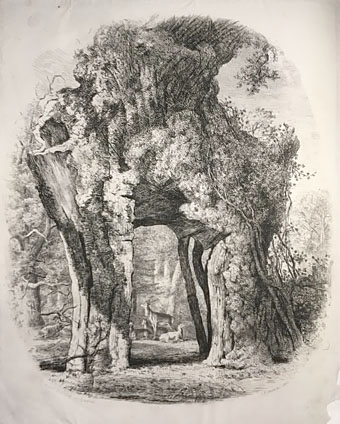
The Greendale Oak, Welbeck, Nottinghamshire, from Joseph George Strutt’s Sylva Britannica (1822/1830).

• “…a single page from Max Ernst’s collage novel Une semaine de bonté (A Week of Kindness, 1934) uncovers the weird brooding threat in Tenniel’s image of Alice in the railway carriage.” Mark Sinker reviewing the Alice: Curiouser and Curiouser exhibition at the Victoria and Albert Museum, London. I don’t know what Ernst page Sinker is referring to but I made the connection between an Ernst collage and Tenniel’s drawing here in 2010.

• At Wormwoodiana: “Calum Storrie’s 36 Elevations is a book of drawings of imaginary architecture, with the emphasis on towers, stairs, ladders, globes, oblique angles, gantries, finials etc.”

• At The Quietus: Jennifer Lucy Allen on The Strange World of…Don Cherry, and Dustin Krcatovich on Don and Moki Cherry’s Organic Music Theatre.

Call it the new orthodoxy of the digital middlebrow, “the rise of safely empowering stories with likeable protagonists who move through short sentence after short sentence towards uplifting conclusions in which virtue is rewarded.” The laudable goal of increasing the diversity of literary voices has somehow morphed into a series of purity tests designed to ensure that any artistic representation ticks the same boxes as its ostensible author. “On this,” Tyree writes, “conservative religious evangelicals secretly agree with their puritanical secularist enemies on a censorious attitude and checklist approach to art as either ‘acceptable’ or ‘offensive’ to whatever program one happens to prefer for cleansing all vileness from the world.” The result?

[A]rt is increasingly viewed by both the right and the left as a sub-branch of medicine, therapy, hygiene, or good manners. Art is no longer that which tells us the truth but rather that which makes us feel better—a deflated ideology that is spawning a sort of unofficial school of palatability.

And this, I fear, is what’s afflicting many of my students…

Justin St. Clair reviewing The Counterforce: Thomas Pynchon’s Inherent Vice by JM Tyree. Since I’m currently in the midst of a Pynchon reading binge this is all very timely

• “Researchers create self-sustaining, intelligent, electronic microsystems from green material“.

• From 2018: Ryuichi Sakamoto and David Toop live at The Silver Building.

• New weirdness: Catwalk Of The Phantom Baroque by Moon Wiring Club.

• Mix of the week:Episode #391 of Curved Radio by radioShirley & mr.K.

• At Dennis Cooper’s: Illegible autographs.

• Elevation (1974) by Pharoah Sanders | Elevation II (1997) by Vainqueur | Elevations And Depths (2010) by Locrian

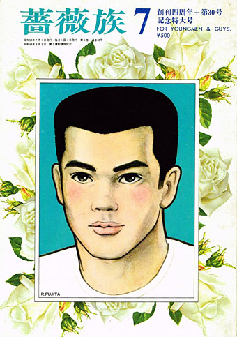
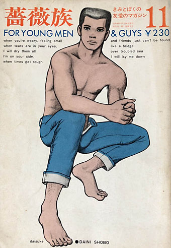
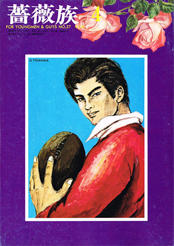
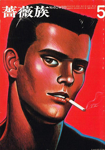
Barazoku covers

barazoku001.jpg

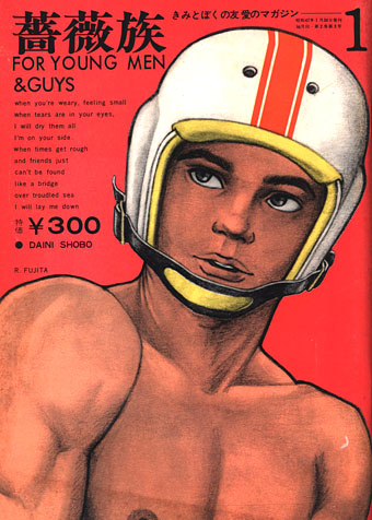
Barazoku (“The rose tribe”) wasn’t the first Japanese magazine for gay men but it was the first such title with a general circulation, as well as the longest running. 400 issues were published from 1971 to 2008. I wasn’t aware until I started reading about the history of this magazine that bara (“rose”) was originally a pejorative term like “pansy”. As with many slang terms, not least “gay”, the meaning and application has evolved over time. Use of “bara” today is confused by its application in the West to almost any form of gay manga that isn’t yaoi, a utilization that some Japanese artists take issue with.

barazoku007.jpg

For Western viewers, the most immediately striking thing about the covers of Barazoku is their reliance on drawings or paintings rather than photographs. This isn’t entirely unprecedented—Physique Pictorial and Fizeek in the US used drawn covers from time to time—but making artwork a consistent cover feature is very unusual. (The first few covers also feature extracts from the lyrics of Bridge Over Troubled Water…) Some of the men who provided covers or interior art have appeared here in the past, among them Ben Kimura, Go Mishima and Sadao Hasegawa. The covers signed “Rune” are the work of Rune Naito (1932–2007), an artist better known in Japan for having popularised the kawaii aesthetic with his drawings of large-eyed girls and panda bears.

barazoku011.jpg

barazoku027.jpg

barazoku040.jpg

Continue reading “Barazoku covers”

Weekend links 572

poumeyrol.jpg

L’Insolite (1980) by Jean-Marie Poumeyrol.

• “As we move down the ladder of prestige into the world of unvetted tweets, we observe an increasing difficulty, among people with very strong opinions, in exercising that basic critical competence of distinguishing between the authorial creation of a character, and the author’s affirmation of that character’s every moral trait and political view.” Justin EH Smith on the HR managers of the human soul.

• “When is a Didone not a Didone? How far must an exemplar Didone, like a Didot or a Bodoni, be altered before it loses its ‘Didoneness’?” John Boardley on the vexed question of font classification, and the need for an alternative to the present system.

• “Birds with Human Faces and Birds with Human Souls share shelf space with The Book of Owls and Expert Obedience Training for Dogs…” Joanna Moorhead visits the Casa Estudio Leonora Carrington in Mexico City.

“Indolent” is a funny way to characterize her natural state, which seems more like “incisive” to me, but I also have the unshakable sense—for myself—that writing can’t or shouldn’t look like staring into space or feel like not wanting to move from the couch. “A fraud is being perpetrated: writing is not work, it’s doing nothing,” she states in that first essay, from 1992. But she immediately counters with, “It’s not a fraud: doing nothing is what I have to do to live.” Listing a few more pertinent existential options, Diski ends with, “Or: writing is what I have to do to be my melancholy self.” The protoplasmic, chattering, melancholic “I” of these essays is, of course, the collection’s constant, its true subject. I can commiserate with her on every page even if emulation is out of reach.

Johanna Fateman on the incisive long-form criticism of Jenny Diski

• At Spine: Vyki Hendy identifies sunburst as a new trend in book cover design. I often think I overuse these things in my own cover designs which means I may be inadvertently (and fleetingly) trendy.

• At the Magnum Gallery, London: Metamorphoses, photographic studies by Herbert List of male bodies and Greek statuary.

• At Spoon & Tamago: A butterfly sipping moisture from puddles, sculpted entirely in wood by Toru Fukuda.

• At Dangerous Minds: Joseph Lanza on the easy listening side of psychedelic pop.

• At CounterPunch: Louis Proyect on thinking like an octopus.

• Mix of the week: Fact Mix 510 by Britton Powell.

• Bye Bye Butterfly (1965) by Pauline Oliveros | Butterfly Mornings (2001) by Hope Sandoval & The Warm Inventions | Butterfly Caught (2003) by Massive Attack

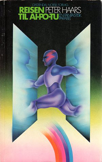
Peter Haars book covers

haars20.jpg

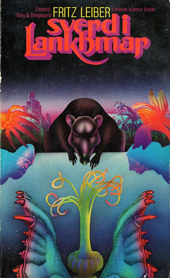
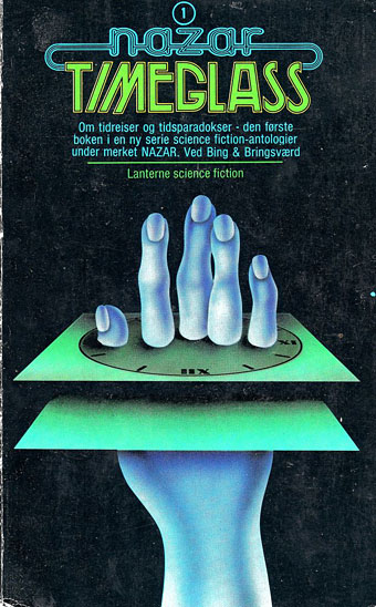
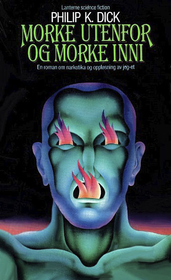
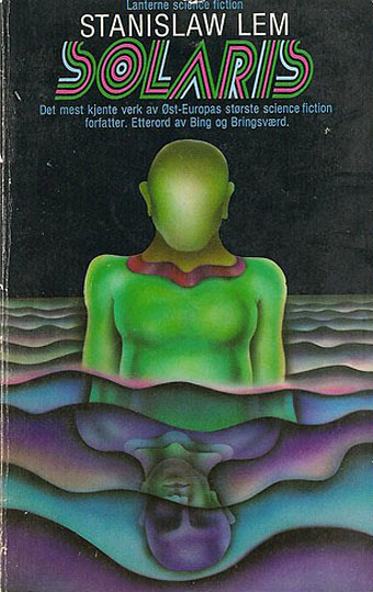
Peter Haars (1940–2005) was born in Germany but moved to Norway in the 1960s where he worked as a graphic designer, art director and illustrator. He also wrote fiction and created Prokon (1971), a one-off publication that looks like a designer’s take on underground comics. Most of the covers that turn up when you search for his work are science fiction, and all painted in that bold airbrush style that was common in the 1970s. Documentation is scarce, unfortunately, ISFDB only lists two titles, so I’ve no idea about the dates, but the Lanterne SF imprint was active throughout the decade.

haars01.jpg

haars21.jpg

haars15.jpg

haars08.jpg

Continue reading “Peter Haars book covers”