Johann Theodor de Bry’s Neiw Kunstliches Alphabet

debry.jpg

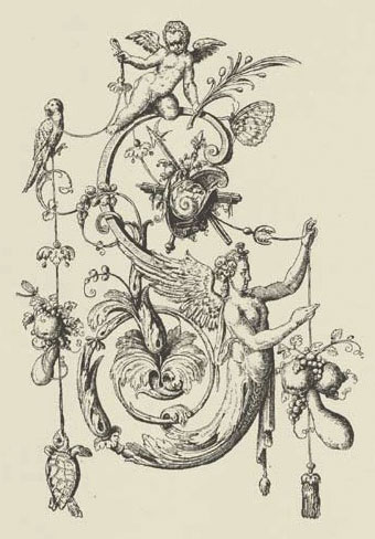
A page from Johann Theodor de Bry’s Neiw Kunstliches Alphabet (1595) which can be found in a free PDF version here, the scans being taken from a Victorian reprint. The late, lamented Giornale Nuovo featured some of these curious letter designs in 2005. Each capital is embellished with various symbolic figures—Moses appears perched on the letter M, for example—whilst also being draped with fruit, lobsters and even insects. I used a smaller redrawing of De Bry’s letter S for one of the page designs in Jeff VanderMeer’s City of Saints and Madmen in 2002. Probably not the use that De Bry intended but then I expect he’d be surprised that his work was still being used at all after four hundred years. Via BibliOdyssey.
strange.jpg

Previously on { feuilleton }
• The Book of Ornamental Alphabets
• Paul Franck’s calligraphy
• Gramato-graphices
• John Bickham’s Fables and other short poems
• Letters and Lettering
• Studies in Pen Art
• Flourishes
Paul Franck’s calligraphy

franck1.jpg

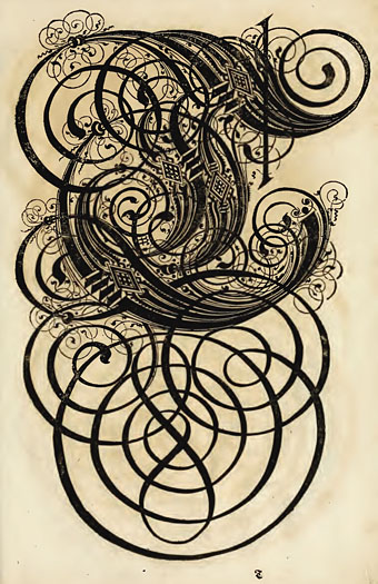
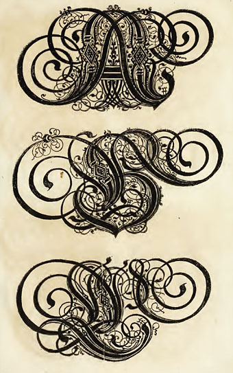
Some of the most extravagantly flourished capitals you’ll see, from another of those books with an unwieldy title, Kunstrichtige Schreibart : allerhand Versalie[n] oder AnfangsBuchstabe[n] der teütschen, lateinischen und italianischen Schrifften aus unterschiedlichen Meistern der edlen Schreibkunst zusammen getragen (1655). The authors are credited as Paul Franck, Paul Fürst and Christoph Gerhard but it’s Franck’s name I know from a book of type designs, and it was a search for better examples of these letters which led me to the Internet Archive who have scans of the entire book. This is the place where European lettering design approaches the bravura elaborations of Arabic calligraphy.

franck2.jpg

Previously on { feuilleton }
• Gramato-graphices
• John Bickham’s Fables and other short poems
• Letters and Lettering
• Studies in Pen Art
• Flourishes
Odes and Sonnets by Clark Ashton Smith

cas.jpg

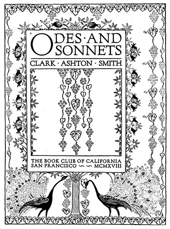
Clark Ashton Smith’s weird fiction is reprinted more often and more widely than his poetry so it’s convenient for those curious about his verse that the Internet Archive has two volumes of early work. Odes and Sonnets is from 1918 and features embellishments by illustrator Florence Lundborg whose grape-devouring peacocks nod towards the fin de siècle spirit Smith was trying to capture in his poems. The Star-Treader, and Other Poems is Smith’s first book from 1912, published when he was just 19, and is heavily indebted to the Decadents. That Decadent influence carried over into the stories he wrote for Weird Tales and augments their unique flavour and over-heated atmosphere, an atmosphere which raised his work above the often mediocre level of his contemporaries. On page 58 of The Star-Treader can be found The Eldritch Dark, the poem from which the leading Smith website takes its name.

Previously on { feuilleton }
• Clark Ashton Smith book covers

The Sapphire Museum of Magic and Occultism

colman.jpg

Cover design by Pamela Colman Smith for The Tarot of the Bohemians by “Papus” aka Gérard Encausse (1910).

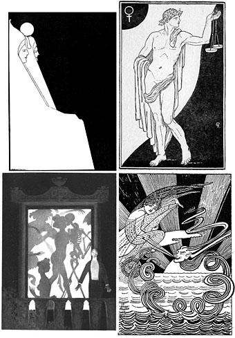
The Sapphire Museum of Magic and Occultism says it’s been around since 1999 but I don’t recall having come across it before. Among a variety of fascinating rarities is this gallery section devoted to some of the less well-known illustrators of occult or occult-related books from the late 19th and early 20th century. Included there are two substantial galleries of work by Pamela Colman Smith, artist of the world’s most popular Tarot deck. Many of the scans are high-quality and, like the pictures at Golden Age Comic Book Stories, seem to be taken from the original printings. A great site.

occult.jpg

top left: WT Horton; top right: Cecil French.
bottom left: Althea Gyles; bottom right: M Bergson MacGregor.

Elsewhere on { feuilleton }
• The illustrators archive

Previously on { feuilleton }
• Pamela Colman Smith’s Russian Ballet
• The art of Julien Champagne, 1877–1932
• The art of Pamela Colman Smith, 1878–1951
• The art of Andrey Avinoff, 1884–1949
• The art of Cameron, 1922–1995
• Austin Osman Spare

The art of Michael Hutter

hutter1.jpg

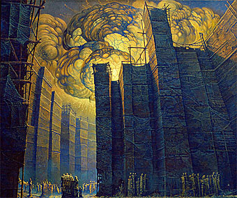
Stadtlandschaft I (City I) (1999).

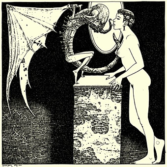
Michael Hutter‘s work is pitched at that enjoyably nebulous zone which lies on the borderlands of fantasy, science fiction and Surrealism, from which hybrid visions emerge that are never too defined in one direction or another. It’s a zone that French and Belgian artists often visit but whose inhabitants from other nations often seem all too few. Hutter’s art encompasses oil paintings and also ink drawings which include some erotic scenes like the example below. His site is well worth a browse, especially the vast and detailed Triptych which recalls similar works by Wayne Barlowe and Hieronymus Bosch. For more inhabitants of the nebulous zone, see the archive link below.

hutter2.jpg

Pterdactyl II.

Elsewhere on { feuilleton }
• The fantastic art archive