Ten views of the Itsukushima Shrine

itsukushima07.jpg

Aki Province: Itsukushima, Depiction of a Festival, from the series Famous Places in the Sixty-odd Provinces (1853) by Utagawa Hiroshige.

The most recognizable and celebrated feature of the Itsukushima shrine, is its fifty-foot tall vermilion otorii gate (“great gate”), built of decay-resistant camphor wood. The placement of an additional leg in front of and behind each main pillar identifies the torii as reflecting the style of Ryobu Shinto (dual Shinto), a medieval school of esoteric Japanese Buddhism associated with the Shingon Sect. The torii appears to be floating only at high tide. When the tide is low, it is approachable by foot from the island. Gathering shellfish near the gate is also popular at low tide. At night, powerful lights on the shore illuminate the torii. Although the gate has been in place since 1168, the current gate dates back only to 1875. [more]

itsukushima06.jpg

Torii at Itsukushima (1896) by Kobayashi Kiyochika.

itsukushima08.jpg

Deer and Torii (1910) by Shoson Ohara.

itsukushima01.jpg

Miyajima in Snow (1934) by Tsuchiya Koitsu.

itsukushima02.jpg

Snowy Miyajima (1936) by Tsuchiya Koitsu.

Continue reading “Ten views of the Itsukushima Shrine”

Weekend links 603

weird.jpg

Weird Tales (Canada), May 1942. Cover art by Edmond Good.

• “…in 1968, seven years after the MOMA retrospective, Orson Welles appreciatively got in touch and suggested that Bogdanovich do a book-length set of interviews with him like the one that Bogdanovich had just done with Ford. The resulting book, This Is Orson Welles (which took a winding path to publication, in 1992, seven years after Welles’s death), is a classic of the literature of movies.” Richard Brody on the late Peter Bogdanovich. The book of Welles interviews is one of my favourite film books, as good in its way as Hitchcock/Truffaut, and like Truffaut’s book you wish it was twice as long.

• At Public Domain Review: Paloma Ruiz and Hunter Dukes on Johann Caspar Lavater’s frog-to-human physiognomies. If you reverse the sequence, as I did for one of the illustrations in Lovecraft’s Monsters, you approach The Shadow Over Innsmouth.

• The week in virtual exploration (via MetaFilter): Mini Tokyo 3D and Explore the Soane Museum, London.

• Submissions are open for the 16th issue of Dada journal Maintenant which will have the theme “Nyet Zero”.

• At Spoon & Tamago: Artists and artisans collaborate on exhibition of 144 maekake aprons.

• DJ Food unearths flyers and posters for the Million Volt Light & Sound Rave, 1967.

• Mix of the week: Isolatedmix 116 by Chris SSG.

• At Dennis Cooper’s: Stephen Dwoskin Day.

The Little Blue Frog (1970) by Miles Davis | Jail-House Frog (1972) by Amon Düül II | Tree Frog (1995) by Facil

Weekend links 600

window.jpg

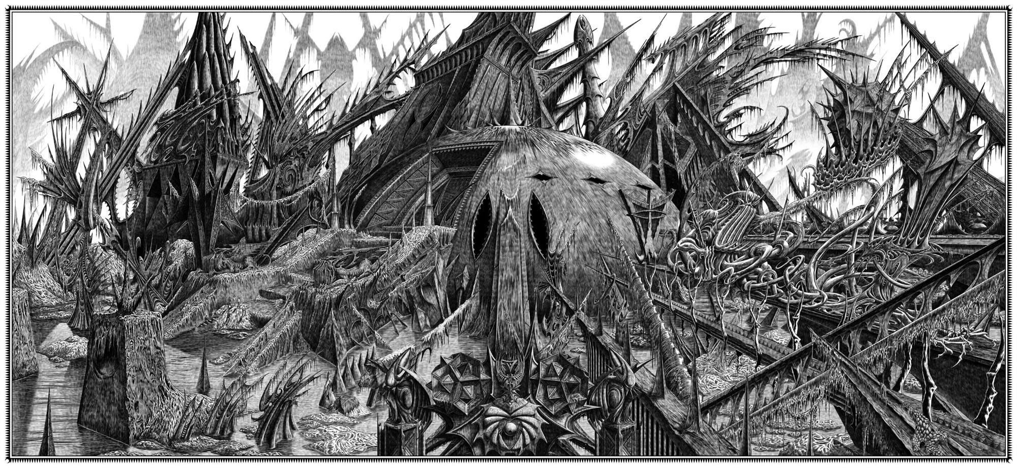
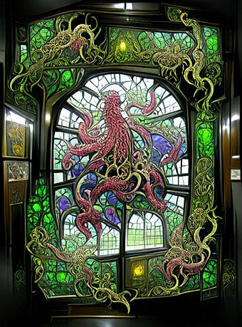
My kind of window. From a collection of machine-learning images by Unlimited Dream Co. Via Bruce Sterling.

• “I will never call myself a queer. That word is one of the things that I detest that has happened, and it’s almost being forced now. For me, you cannot separate that word from the hatred and violence that once accompanied it. When I read it being used in The New York Times, I think, ‘It’s their word and they can fucking have it all they want.’ I will never use ‘queer.’ It’s an ugly word.” John Rechy, still active at the age of 90, talking to Jeff Weiss about hustling, social opprobrium, and his pioneering books.

• “At a time when we are being constantly told that humanity is destroying the planet, it is somehow comforting to see nature not merely outlasting, but triumphing over humanity’s constructions—as nature does in many of Piranesi’s Views of Rome.” Alasdair Palmer on Piranesi’s peerless renderings of Roman ruins.

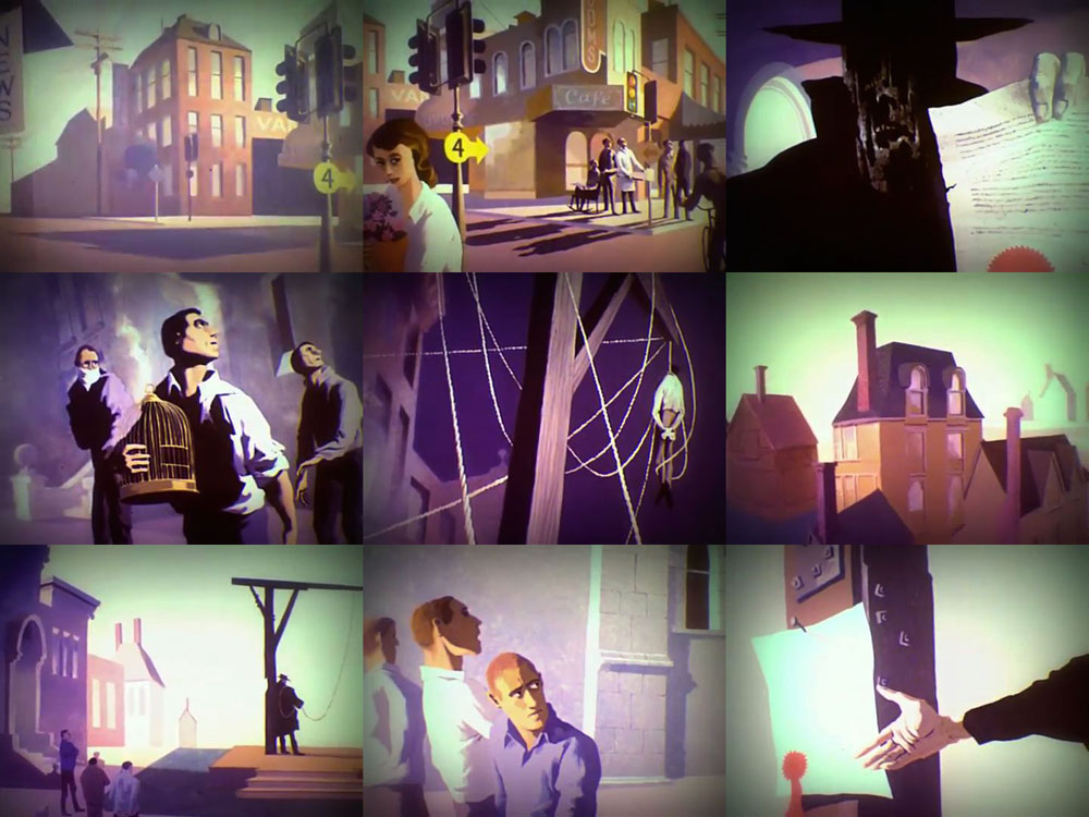
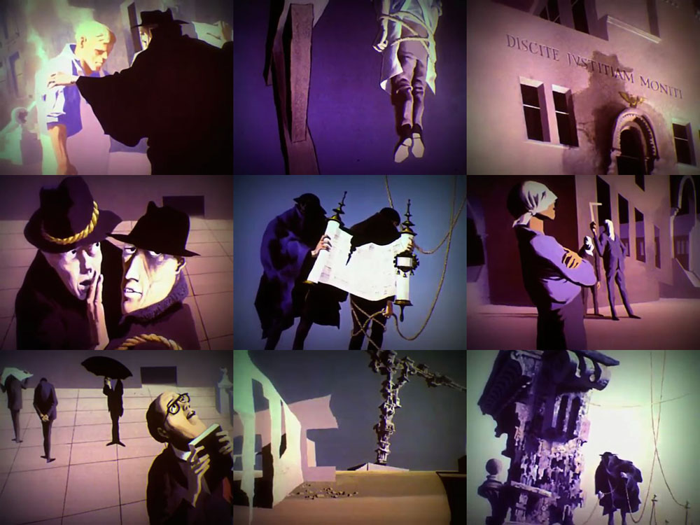
• “The magical aspect of Get Back is its total refusal to adhere to the standard tropes of music documentaries. There are no talking heads commenting on the Beatles’ greatness, no continual barrage of quick edits and highlights.” Geeta Dayal on Peter Jackson’s resurrection of the Fab Four.

But men are not traditionally meant to be objects of art. “Men look at women,” John Berger wrote. “Women watch themselves being looked at.” When men look at men, however, they break rules. “I didn’t set out to be radical,” says Miller. “But I was at a fair and I had a huge nude on a stand by Michael Leonard. I’d only been open ten minutes and a woman started having a go and saying it’s filth. What I found fascinating is she’d walked past a whole span of female nudes. I think society is just immune to female nudity. People don’t see it. If you take this to the straight world of an art fair, it provokes reactions other dealers don’t get. There isn’t anyone else like me.”

Tony Wilkes talks to Henry Miller, owner of an art gallery devoted to the male form

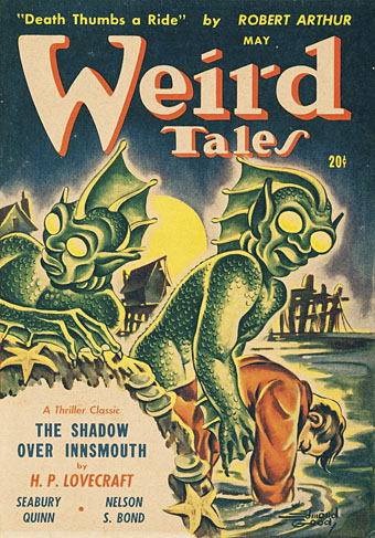
• “I imagine men with starched collars, horrified by an animal with no hard edges to grab onto, no solidity to venerate. Something low, lateral, creeping.” Fiona Glen on “Devil Fish”, Cthulhu and cephalomania.

• I like glowing things so Brian Eno’s glowing record turntable has an immediate appeal. A shame it’s a very limited production which is almost certainly sold out by now.

• The next release on the Ghost Box label will be A Letter from TreeTops by Pneumatic Tubes.

• At Dangerous Minds: A Sight for Sore Eyes Vol. 1, a visual history of The Residents.

• At Wormwoodiana: Mark Valentine on the supernatural thrillers of Archie Roy.

• Mix of the week: A reflection on 2021 at A Strangely Isolated Place.

Swan River Press looks back over a year of book production.

• New music: Spherical Harmonics by Joseph Hyde.

Octopus’s Garden (1969) by The Beatles | The Kraken (2006) by Hans Zimmer | Kraken (2017) by Dave Clarkson

Resurrecting R’lyeh

rlyeh-2021.jpg

Then, driven ahead by curiosity in their captured yacht under Johansen’s command, the men sight a great stone pillar sticking out of the sea, and in S. Latitude 47°9′, W. Longitude 126°43′, come upon a coastline of mingled mud, ooze, and weedy Cyclopean masonry which can be nothing less than the tangible substance of earth’s supreme terror—the nightmare corpse-city of R’lyeh, that was built in measureless aeons behind history by the vast, loathsome shapes that seeped down from the dark stars. There lay great Cthulhu and his hordes, hidden in green slimy vaults and sending out at last, after cycles incalculable, the thoughts that spread fear to the dreams of the sensitive and called imperiously to the faithful to come on a pilgrimage of liberation and restoration.

HP Lovecraft, The Call of Cthulhu (1928)

Behold the fruits of a more benevolent pilgrimage of liberation and restoration. It was just over a year ago that I decided to draw an exact replica of the R’lyeh triple-spread from my comic-strip adaptation of The Call of Cthulhu, the intention being to make the picture available as a poster-sized print once I had a print-ordering system in place. The picture may now be purchased here as a giclée print on Hahnemüle Pearl art paper. This is a big picture (870.46 x 401.15 mm or 34.27 x 15.793 ins), and unlike my other Etsy prints I’m afraid there won’t be a half-size version which means the price will remain relatively high. I’m also keeping it as a black-and-white piece despite the temptation to create a tinted version.

And so to the obvious question: why did I want to redraw a large and very detailed piece of art in the first place? Pull up a weed-festooned Cyclopean bollard and I’ll explain…

starrywisdom.jpg

Creation Books, 1994. Cover art by Peter Smith.

I spent 17 months drawing The Call of Cthulhu, from January 1987 to May 1988, using my preferred media of the time, a 0.2 mm Rotring Variant pen on A3 sheets of Daler cartridge paper. The story took its time getting into print but it was eventually published in 1994 by Creation Books as part of The Starry Wisdom, a collection of Lovecraftian fiction edited by DM Mitchell. I was very pleased to be represented in the book but the pleasure turned to dismay when it transpired that all the artwork had vanished after the printing was done. Or almost all the artwork… To this day I don’t know whether the drawings by other artists suffered the same fate, but my Cthulhu pages disappeared along with the anatomical cross-section and the Yuggoth collage that I created specially for the collection. I still don’t know what really happened either, whether the drawings were stolen (possible), thrown away deliberately (unlikely), or thrown away accidentally (also possible). The lack of resolution to the whole business is partly my fault. Losing all that art was a painful thing to consider, and I couldn’t accuse the printer of anything when nobody could say what had happened (I was in the Creation office during one of the phone conversations between publisher and printer). The printer was also located in the middle of a rural county somewhere so journeying there would have been difficult for this non-driver, as well as being pointless if they could only tell me what I knew already. Time passed and I did my best to put the whole episode behind me.

pens.jpg

Drawing technology then and now: the Variant pen I used throughout the 1980s and the Wacom stylus I use today. That Variant nib is so fine that I have a faint ink dot tattooed on one of my knuckles from where I accidentally stabbed it into my hand. The Wacom pen looks stubby in comparison but is capable of drawing equally fine lines and much more besides.

On the plus side (there was one), the printer had done a good job of half-toning the artwork, so even though the Starry Wisdom pages are rather small the detail in the drawings is still evident. And I also had a complete set of photocopies of the A3-sized originals. I’d been working for Savoy Books since 1989 during which time making photocopies of new drawings had become second nature. Since 1994 this set of copies has become the original art for the Call of Cthulhu strip, rather like the surviving prints of Murnau’s Nosferatu which are all that anyone can see of his film today. The analogy is an apt one since it also extends to picture quality. Just as silent films always look their best when they’ve been restored from the camera negative, my Rotring drawings really need to be reproduced from the originals. The 0.2 mm pen that I insisted on using throughout the 1980s was too fine for the photocopy machines of the time, especially when my shading was so densely rendered that I might as well have been using a pencil. This isn’t so much of a problem if the pages are being reduced in size but it became one last year when I had the idea of making a print of the R’lyeh panorama that would be the same size as the original drawings. Giclée printing is an ink-jet process that reproduces fine detail with great accuracy, so while I could make full-size prints of the Cthulhu pages they’d never look better than what they were, photocopies that hadn’t fully captured the fine lines of the drawings. This wasn’t the only problem.

Continue reading “Resurrecting R’lyeh”

The Hangman by Paul Julian and Les Goldman

hangman1.jpg

After mentioning Paul Julian in the previous post I went looking for examples of his work. The production design and background paintings that Julian created for the animated adaptation of The Tell-Tale Heart (1953) are perennially celebrated, especially around Halloween, but director Ted Parmelee tends to receive all the credit. The Tell-Tale Heart was a production for UPA but Julian had a long career in animation, especially for Warner Bros., and his voice (if not his name) are universally familiar from the sounds the Road Runner makes in the Wile. E Coyote cartoons. Until this week if I’d thought about this at all I would have assumed that the “hmeep-hmeep” sound (as Julian described it) was created by Mel Blanc, not one of the cartoon’s background artists.

hangman2.jpg

The Hangman (1964) is an 11-minute animation that, like The Tell-Tale Heart, is a long way from Looney Tunes and Merrie Melodies. Herschel Bernardi reads a poem by Maurice Ogden that describes a hangman who arrives in a small town and begins executing the citizens one after the other. No-one is spared, even those who support the actions of the hangman when his first victims are Jewish, Black, an unspecified “alien” and a man who openly questions the executions. The poem was written during the McCarthy era but is the kind of moral fable whose sentiments can be applied to any time, even if the design makes the context a specifically American one. Paul Julian painted the backgrounds and co-directed with Les Goldman, while Julian’s wife, Margaret, provided the minimal animation. The jazzy score—which doesn’t really suit the theme—was the work of Serge Hovey. Julian’s townscapes start out as Edward Hopper-like scenes of tall houses, old storefronts and wide roads striped with sunset shadows. In the second half of the film a Surrealist quality takes over. The gallows pole slowly consumes the town as well as its people, dismantling the buildings in order to grow into a towering edifice. The characterisations and the scene transitions make it plain how much of The Tell-Tale Heart was Julian’s work, while the film as a whole reminds me of one of Ray Bradbury’s morality tales. Watch it here.

Previously on { feuilleton }
The Tell-Tale Heart from UPA