A post last year concerned some of the songs that have flaunted their acid credentials by incorporating the letters L-S-D in their titles, the most famous being (of course) Lucy In The Sky With Diamonds. While it might be an idea to follow that post by tracking down songs with the word LSD in their title, a quick glance at Discogs shows an entire blotting pad of potential candidates. So I’ll let someone else do the leg-work on that one.
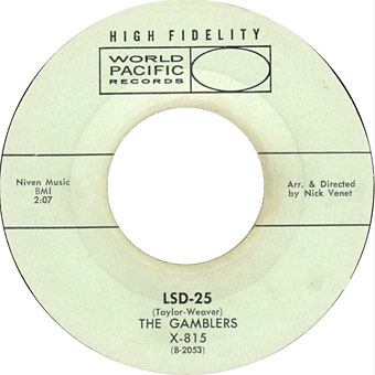
This post is less ambitious, prompted by a brief history of surf music in Rob Chapman’s Psychedelia and Other Colours. The Gamblers receive a mention for being the first group to record a piece of music with LSD in the title: LSD-25 was the B-side of their first single, Moon Dawg!, released in 1960. Moon Dawg! has the distinction of also being one of the first (if not the first) surf singles, and was later covered by The Beach Boys on their debut album, Surfin’ Safari (1962). With its hyperactive drums and twanging guitar Moon Dawg! certainly sounds like a surf number, whereas LSD-25 is more like one of Link Wray’s smouldering instrumentals. I’d heard the A-side on a Cramps-related singles compilation, Loose Lips Might Sink Ships, but hadn’t heard LSD-25 before so this is a welcome discovery. Someone had to be first with the LSD reference (chosen at random by a studio engineer according to Chapman), and we could have done much worse than this.
The Gamblers only recorded one more single before disbanding but guitarist Eliot Ingber had a distinguished career playing with Frank Zappa’s Mothers of Invention, Little Feat, Captain Beefheart (as Winged Eel Fingerling), and (I didn’t know this) as a member of The Peter Peter Ivers Band (sic) on Terminal Love (1974). You may not know Ivers’ name but you’ll probably know his voice when it appears in David Lynch’s Eraserhead in the guise of the Lady in the Radiator singing In Heaven.
Previously on { feuilleton }
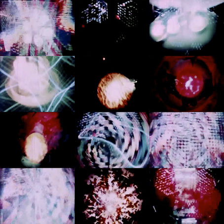
• More trip texts
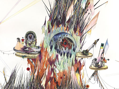
• Trip texts
• Acid albums
• Acid covers
• Lyrical Substance Deliberated
• The Art of Tripping, a documentary by Storm Thorgerson
• Enter the Void
• In the Land of Retinal Delights
• Haschisch Hallucinations by HE Gowers
• The art of LSD
• Hep cats