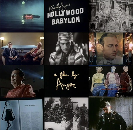
Nigel Finch was a key member of the team of producers and directors working on the BBC’s Arena arts documentaries throughout their golden run during the 1980s and 1990s. The films he directed himself—among them studies of Robert Mapplethorpe’s photography, and a history of the Chelsea Hotel in New York—gave him an opportunity to push some gay content into the TV schedules at a time when Britain’s gay population were seen as enough of a public threat to be legislated against. Some of that proselytising impulse can be found in Kenneth Anger’s Hollywood Babylon (1991), an hour-long documentary which alternates the life and work of the filmmaker with readings and enactments of the lurid episodes recounted in Anger’s scandal anthologies, Hollywood Babylon and Hollywood Babylon II. Finch at one point asks whether Fireworks, the first film in Anger’s Magick Lantern Cycle, should be regarded as a pioneering piece of gay cinema; Anger’s says he’s happy if people take it that way but says little else about its evident homoerotic atmosphere. He remains as resistant to identity politics as he’s always been. (See the unauthorised biography by Bill Landis for details.)
Between the readings and interview sections Finch shows Anger being chauffeured around Beverly Hills in a hearse which stops occasionally at some locus of bygone scandal. Most of the Anger anecdotes are familiar ones from subsequent interviews but there is a bonus for Angerphiles with the appearance at the end of Marianne Faithfull who talks a little about their relationship before singing Boulevard Of Broken Dreams. The picture quality of this YouTube copy could be better but it’s watchable enough.
Update: That YouTube link went private so I’ve updated the links to a better copy at the Internet Archive.
Previously on { feuilleton }
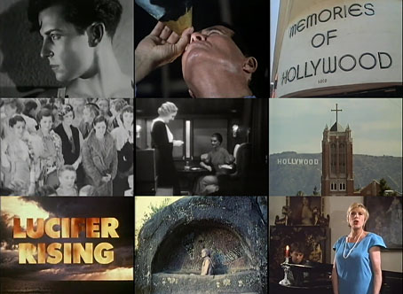
• Lucifer Rising posters
• Externsteine panoramas
• Missoni by Kenneth Anger
• Anger in London
• Arabesque for Kenneth Anger by Marie Menken
• Edmund Teske
• Kenneth Anger on DVD again
• Mouse Heaven by Kenneth Anger
• The Man We Want to Hang by Kenneth Anger
• Relighting the Magick Lantern
• Kenneth Anger on DVD…finally