Weekend links 36

high_society.jpg

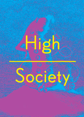
Mervyn Peake’s Caterpillar from Alice’s Adventures in Wonderland finds itself used to promote High Society, an exhibition at the Wellcome Collection devoted to the long history of human drug-taking. There’s more about the exhibition here and also an accompanying book by Mike Jay from Thames & Hudson. Related: The Most Dangerous Drug:

A group of British drug experts gathered by the Independent Scientific Committee on Drugs (ISCD) rated alcohol higher than most or all of the other drugs for health damage, mortality, impairment of mental functioning, accidental injury, economic cost, loss of relationships, and negative impact on community.

• Unless the magazine Man, Myth & Magic was advertised on TV in 1970 (and I suspect it would have been) Austin Osman Spare’s work has never been seen on British television, certainly not in any detail or with a credit to the artist. This week the BBC finally paid him some attention with a brief spot on The Culture Show as a result of the Fallen Visionary exhibition which is still running (until November 14) in London. Alan Moore, Fulgur‘s Robert Ansell and others attempt to summarise Spare’s career in seven minutes.

fujita.jpg

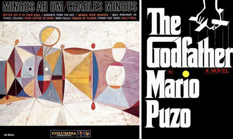
Neil Fujita designs: Mingus Ah Um (1959) and The Godfather (1969).

• RIP graphic designer Neil Fujita. Related:

“By taking the “G” and extending it to the “D,” I created a house for “God.” The way the word was designed was part of the logo and so was the type design. So when Paramount Pictures does a film version or Random House, which bought out the book from Putnam, does another Godfather book, I still get a design credit. In fact, before the first Godfather film opened in New York I saw a huge billboard going up in Times Square with my design on it. I actually got them to stop work on it until we were able to come to an agreement.” Waxing Chromatic: An Interview with S. Neil Fujita

French SF illustration. Related: Where did science fiction come from? A primer on the pulps, a feature by Jess Nevins with some of the craziest covers you’ll see this month.

• Gay-bashers in 1970s San Francisco had to beware the wrath of the Lavender Panthers.

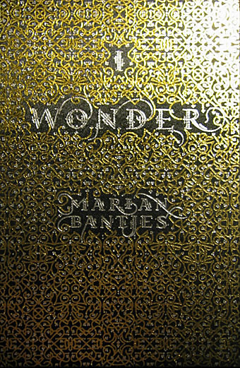
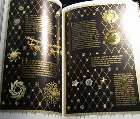
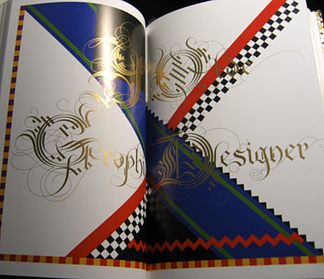
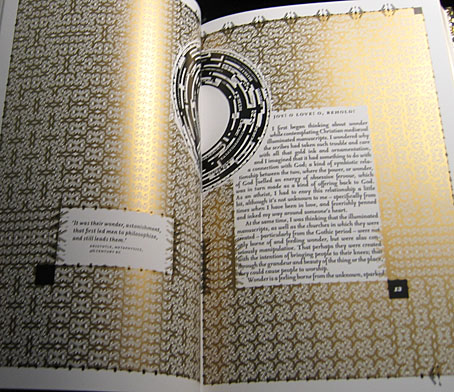
• More Marian Bantjes as she discusses her work in an audio interview.

Music from Saharan cellphones.

Origami Beauty Shots.

Krautrock.com

Better Git It In Your Soul (1959) by Charles Mingus.

I Wonder by Marian Bantjes

bantjes1.jpg

Book of the year, without a doubt. I only bought this yesterday and it’s been another hectic week so I’ve barely had a chance to look at it, never mind read the thing. What we have is 208 pages of unique creations by one of my favourite graphic designers, Marian Bantjes, in a truly beautiful production from one of my favourite publishers, Thames & Hudson. The text comprises Bantjes’ musings on art, design, decoration, pattern, and her personal development, together with some well-chosen quotes from other writers. I could waste a lot of pixels larding the book with superlatives but you really have to see a copy for yourself, words and pictures do it little justice.

bantjes2.jpg

More than anything I’ve seen recently this book is a tactile experience, and yet another volume (that designation which Borges always used to emphasise) which makes a nonsense of the idea of screens as an adequate replacement for all books. The boards are blocked with a gold and silver pattern, the page edges are also blocked in gold and there’s a liberal use of gold ink throughout. There’s so much gold ink on the exterior that leafing through the pages leaves your clothes and fingertips lighted dusted with a glittering residue. As an additional grace note, each volume comes with a length of purple bookmark ribbon.

bantjes3.jpg

Unlike many monographs from graphic designers this isn’t a “greatest hits” collection (although I’d still buy it if it was), all the layouts were created for the book alone. It’s not all gold ink and florid decoration, there are 21st century designs as well as hand-drawn pieces. And pasta. She doesn’t need a computer or even a pencil, she can work wonders with pieces of dried flour and water. Of the quotes, two stood out following a cursory perusal. The first is a humorous occurrence of the famous “Less is more” from Mies van der Rohe, placed in small type on an otherwise blank page. The second is from Oscar Wilde’s The Critic as Artist (1890):

Still, the art that is frankly decorative is the art to live with. It is, of all our visible arts, the one art that creates in us both mood and temperament. Mere colour, unspoiled by meaning, and unallied with definite form, can speak to the soul in a thousand different ways. The harmony that resides in the delicate proportions of lines and masses becomes mirrored in the mind. The repetitions of pattern give us rest. The marvels of design stir the imagination.

You can have your imagination marvellously stirred for nineteen pounds and ninety-five pence.

bantjes4.jpg

Update: The Bantjes Covers, in which the designer explains how her cover design came together.

Elsewhere on { feuilleton }
The book covers archive

Previously on { feuilleton }
T&H: At the Sign of the Dolphin

Weekend links 10

harlequin.jpg

One of a number of vintage ads and ephemeral items at this Flickr set.

• From 1971: The Anthony Balch/William Burroughs/Jan Herman video experiment.

• The NYT reports on World on a Wire, a neglected science fiction drama by Rainer Werner Fassbinder.

• “While some of the technology industry’s brightest minds were inventing the first PCs and developing groundbreaking software, they were also feeding their heads with LSD.”

• The archive of author and illustrator Mervyn Peake has been acquired by the British Library for £410,000.

• Thames & Hudson are publishing I Wonder, a book by the wonderful Marian Bantjes, later in the year. Her site has a preview. I want.

• The gays: It’s election season in the UK so My Gay Vote looks at how the three main parties have supported LGB issues. (No data for the graphs, however.) Is theatre finally glad to be gay? Yet more Tumblrs: I heart skinny boys & Cute boys with cats.

• Trend-spotter, “svengali”, Situationist and the man who named the Sex Pistols: RIP Malcolm McLaren. The Guardian ran a number of memorial pages. Related: Anarchy in Gardenstown.

• Dublin’s One City, One Book choice for April 2010 is The Picture of Dorian Gray.

The Catastrophist: Christopher Hitchens on JG Ballard.

Steampunk Taxidermy by Lisa Black.

• LIFE looks back at Aleister Crowley.

• Groovy songs of the week: Julie Driscoll (with Brian Auger & The Trinity), a pair of songs by Bob Dylan—This Wheel’s On Fire—and Donovan—Season Of The Witch—and sets which look like a collaboration between Verner Panton and Marcel Duchamp. Amazing.

Der Orchideengarten

orchideengarten.jpg

Will at A Journey Round My Skull turned up some gold this week in the form of several covers from a German periodical, Der Orchideengarten, which ran for 51 issues from 1919 to 1921. This is generally credited as being the world’s first fantasy magazine which makes its unaccountable obscurity all the more surprising. Both Will and I first encountered the magazine in Franz Rottensteiner’s essential history of fantasy, The Fantasy Book, published by Thames & Hudson in 1978, with a US edition produced by Collier Books. As well as being a wide-ranging history, Rottensteiner’s book is profusely illustrated throughout and includes two tantalising and distinctly weird covers from Der Orchideengarten, a magazine which Rottensteiner describes as “one of the most beautiful fantasy magazines ever published.” Over the years I’ve found myself becoming thoroughly acquainted with most of the book’s contents as authors were discovered and various gaps filled. One of the few points of obscurity left was that column which describes Der Orchideengarten and those two covers. So you can perhaps appreciate the excitement at seeing more of these rare specimens brought to light.

strobl.jpg

There’s no need to repeat the history when you can read it for yourself on Will’s page and see the covers. One of the magazine editors was author Karl Hans Strobl whose collection of weird tales, Lemuria, had been published two years earlier. This monochrome copy of the cover design is by Richard Teschner, taken from one of my Art Nouveau design books where it stands out like a rather grotesque sore thumb. I don’t know if Teschner was a contributor to Der Orchideengarten but on the strength of this he should have been.

Update: Will posts some interior illustrations.

Elsewhere on { feuilleton }
The illustrators archive

Previously on { feuilleton }
The Great God Pan
Jugend Magazine
Meggendorfer’s Blatter
Simplicissimus