The Disappearance, a film by Stuart Cooper

disappearance1.jpg

If you’re an obsessive cineaste there’s a good chance you maintain a mental list of the films you’d like to see, the films you’d like to see again, and the films you’d like to see reissued on DVD. The vagaries of distribution and ownership often conspire to make older films fall out of sight even when they’ve been produced and promoted by major studios, have had TV screenings and so on. This was famously the case with five of Alfred Hitchcock’s features—Vertigo and Rear Window among them—which managed to remain out of circulation for two decades; more notoriously there was Stanley Kubrick’s neurotic embargo on any screening of A Clockwork Orange in the UK which meant that my generation of Kubrick-watchers had to make do with a variety of pirate VHS recordings.

marlowe.jpg

Penguin edition, 1973. Photo by Van Pariser.

DVD reissues have chipped away at my “must see again” list with the result that Stuart Cooper’s The Disappearance (1977) recently found itself at the top of the catalogue. This film has never been as inaccessible as some: it received at least two TV screenings in the UK, and was available on VHS cassette for a time. There was also a DVD release although by the time I started looking for it the only available copies were secondhand ones commanding high prices. A year or so ago I read Derek Marlowe’s Echoes of Celandine (1970), the novel on which the screenplay is based, and as a result became more eager than ever to see the film again. Having finally watched a very poor-quality transfer of a VHS copy on YouTube I now feel sated, even if the experience was unsatisfying.

The Disappearance is one of those odd productions that ought to have all the ingredients to make a very memorable film but which never works as well as you might hope. The screenplay was by Paul Mayersberg, written between his two films with Nicolas Roeg, The Man Who Fell to Earth (1976) and Eureka (1983); there’s a great cast: Donald Sutherland, David Warner, Peter Bowles, David Hemmings (who also produced), John Hurt, Virginia McKenna, Christopher Plummer; Kubrick’s cameraman of the 1970s, John Alcott, photographed the film shortly after winning an Oscar for his work on Barry Lyndon; the source material is very good: Marlowe’s novel is described as “a romantic thriller” but when the quality of the writing easily matches any literary novels of the period such a description makes it sound more generic and pot-boiling than it is.

Continue reading “The Disappearance, a film by Stuart Cooper”

Ikarie XB 1

ikarie1.jpg

A science fiction novel by Stanislaw Lem (The Magellanic Cloud, 1955).

ikarie2.jpg

Illustration by Teodor Rotrekl.

A film by Jindrich Polák, adapted from Lem’s novel by Polák and Pavel Jurácek. (1963).

ikarie3.jpg

A Second Run DVD (2013).

With the exceptions of Tarkovsky’s Solaris and Stalker (both in a league of their own), I’ve never been very enthused about Eastern Bloc science-fiction cinema. If I hadn’t been watching some Czech films recently, and listening to the soundtrack music of Zdenek Liska, I might not have bothered with this one despite its being promoted as a visual influence on 2001: A Space Odyssey. Ikarie XB 1 won the Grand Prize at the Trieste International Science Fiction Film Festival in 1963, a tie with Chris Marker’s La Jetée. (Umberto Eco was one of the judges.) Fifty years on, Marker’s film has hardly dated at all while Ikarie XB 1 seems very much of its time. But Polák’s film still has some things going for it, surprisingly so considering the director was more used to making comedies.

Ikarie XB 1 is a spaceship travelling to Alpha Centauri in the year 2163. The DVD subtitles don’t translate the name Ikarie so unless you already know it means “Icarus” there’s no foreshadowing of any possible threat, at least until the opening shots of a deranged crewman stumbling through empty corridors. Many of the scenes which follow seem over-familiar but only because the scenario of space-crew as interstellar family has become such a standard feature of filmed space opera from Star Trek on. The production design is dated, of course, but the film makes great use of black and white in the lighting patterns, on-screen visuals, clothing designs, etc. It’s easy to see why Kubrick thought it was a cut above other SF films of the period, especially with its widescreen compositions. The DVD booklet (and Kim Newman’s interview on the disc) mention Kubrick’s stylistic borrowings; judge for yourself with these screen-grabs. I was hoping the Liska soundtrack might be more electronic than it is. It’s very much a Liska score—at times you can’t help but imagine a Svankmajer puppet lurking round a corner—but with added reverb and spectral organ chords. The latter assist a sequence where two of the crew members explore an apparently derelict space station.

This page reviews the film in some detail (complete with plot spoilers). For the curious, the entire film is a free download at the Internet Archive.

Previously on { feuilleton }
Fiser and Liska
Two sides of Liska
Liska’s Golem
The Cremator by Juraj Herz

Design as virus 15: David Pelham’s Clockwork Orange

clockworkbook.jpg

Design by David Pelham (1972).

Continuing an occasional series. Pity the poor designer who has to create a new cover for Anthony Burgess’s novel when David Pelham’s Penguin cover—created in haste forty years ago—is more visible than ever. Pelham’s design is a familiar sight on these pages but it’s also an increasingly familiar sight elsewhere, having become the primary visual signifier not only of the novel itself but also the novel’s entanglement with Stanley Kubrick’s film. Burgess came to resent the cult power of the film and the way it inflated the status of one of his early novels whilst overshadowing the rest of his work. The book still overshadows his other novels but what’s interesting now, fifty years after it was published, and forty years on from Pelham’s cover design, is seeing the novel clawing back some of the territory ceded to the film, in part because of that memorable cog-eyed face. What follows is a look at some of the subsequent reworkings of Pelham’s design.

clockworkposter1.jpg

Artwork by Philip Castle, design by Bill Gold (1971).

It’s necessary to mention the original poster art first since the fat title typography gets reused more than any other part of the film’s publicity. The poster was also indirectly responsible for Pelham’s cover design when Kubrick denied Penguin any use of his promotional material:

Barry Trengove had designed a delightful cover for the Penguin edition of A Clockwork Orange and then the movie came along. While the Penguin marketing department was desperate to tie in with the film graphics, the director of the movie Stanley Kubrick wasn’t at all interested in tying in with the book. Consequently I was given the task of commissioning an illustration that gave the impression of being a movie poster. Sadly I was subsequently let down very badly by an accomplished airbrush artist and designer (whose name I will keep to myself), who kept calling for yet more time and who eventually turned in a very poor job very late. I had to reject it which was a hateful thing to have to do because we were now right out of time.

[…]

Well there I am, late in the day and having to create a cover for A Clockwork Orange under pressure. Already seriously out of time I worked up an idea on tracing paper overnight, ordering front cover repro from the typesetter around 4.00 am. I remember that my type mark-up was collected by a motorcycle messenger around about 5.00 am. Later that morning, in the office, I drew the black line work you see here on a matt plastic acetate sheet, specifying colours to the separator on an overlay while the back cover repro was being pasted up by my loyal assistants who had the scalpel skills of brain surgeons. I had wonderful assistants, absolutely wonderful.

Then more motorcycle messengers roaring around London in large crash helmets; and some days later I would see a proof. In those days, that was quick! Since those times I have often been amused to notice that my hurried nocturnal effort of so long ago appears to have achieved something of iconic status, for I’ve seen this cog-eyed image on fly-posters in Colombia, on t-shirts in Turkey, and put to a variety of uses in Canada, Los Angeles and New York. Because I did it, I spot it. Its like walking into a room where a party’s going on and, although the room is buzzing with conversation, if somebody simply mentions your name in conversation you immediately pick it up because it’s so familiar.

Penguin by Designers: David Pelham

clockworkposter2.jpg

A scarce item, allegedly from 1972 (although it may be from a year later), which surprisingly uses the book design with the film poster titles. According to a film memorabilia site “This rare alternate style R-Rated poster was designed for wild posting exclusively in New York and Los Angeles”. In the US the film was given an X rating on its first release meaning that many theatres wouldn’t have shown it. Following a few edits it was reissued with an R rating. On the back of the 1972 Penguin paperback there’s notice of a copyright restriction against selling that edition in the US so Pelham’s design wouldn’t have been familiar there until much later.

Continue reading “Design as virus 15: David Pelham’s Clockwork Orange”

Helmets

fmj.jpg

Full metal Jacket poster (1987). Illustration by Philip Castle.

Watching Stanley Kubrick’s Full Metal Jacket on Blu-ray recently I was wondering again whether anyone has noted the similarity between the film’s poster design and the cover for the UK edition of one of its source books, Michael Herr’s Dispatches. At the risk of repeating some common piece of Kubrick lore, here goes.

Airbrush artist Philip Castle painted the helmet that’s become the perennial image used to promote the film. Kubrick often reused the services of people he trusted, and had earlier employed Castle as poster artist for A Clockwork Orange. Kubrick also oversaw the design of publicity materials for his later films so we can be reasonably sure this idea was one of his.

herr.jpg

Dispatches (1979). Illustration by Steven Singer.

Michael Herr’s collection of reports about the Vietnam war was first published in the US in 1977 with a UK edition following a year later. The cover of the US first edition is unremarkable compared to this typically excellent Picador design from 1979 (no designer is credited). That year saw the release of Apocalypse Now for which Herr wrote the narration. Kubrick was eager to turn Herr’s book into a film but neither of them could find a suitable story to provide a structure for Herr’s reportage until the director decided to weld Dispatches to the first two thirds of Gustav Hasford’s novel The Short-Timers (1979). Full Metal Jacket mixes episodes and speech/dialogue from both books: Hasford’s sniper attack on a jungle trail gets transplanted to Herr’s description of the fighting in Hue City.

hasford.jpg

The Short-Timers (1987). No illustration credit.

Hasford’s novel was first published in the UK in this shoddy tie-in version with some generic war painting badly cropped into helmet shape in order to match the film poster. Such a good book really deserved better than this hack design. Much as I like Full Metal Jacket, when you read Herr and Hasford you have to admit that the film only captured a fraction of the horror and madness in the books. Herr’s writing is justly celebrated while Hasford’s novel seems to have been forgotten again. Anyone who likes Kubrick’s film ought to search it out, it’s an indelibly memorable and disturbing read. The sniper scene is far more brutal and chilling than its cinematic equivalent, and is delivered by stark prose like this:

The snipers zero in on us. Each shot becomes a word spoken by death. Death is talking to us. Death wants to tell us a funny secret. We may not like death but death likes us. Victor Charlie is hard but he never lies. Guns tell the truth. Guns never say “I’m only kidding.” War is ugly because the truth can be ugly and war is very sincere.

Also worth searching out is Herr’s short memoir, Kubrick, published the year after the director’s death, in which the writer describes his three-year collaboration on Full Metal Jacket‘s screenplay. It’s a generous and insightful piece of writing, worlds away from Frederic Raphael’s condescending and mean-spirited Eyes Wide Open.

Elsewhere on { feuilleton }
The book covers archive

Previously on { feuilleton }
Kubrick shirts

A playlist for Halloween: Orchestral and electro-acoustic

kass.jpg

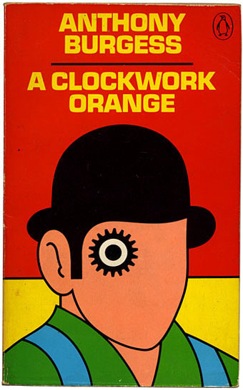
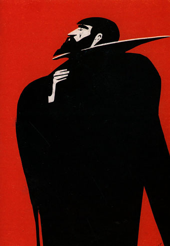
Bluebeard (1982) by János Kass.

I thought I might not be able to do a fresh playlist this year, so much has already been covered by the previous lists (see the links below to earlier posts).

The search for new tonalities and timbres in 20th-century orchestral music led many composers to produce works that sound like—and have been used as—horror film soundtracks although you’ll never find critical discussion acknowledging such a vulgar reaction. This is a very masculine list although some of the performers are women. I might have included Diamanda Galás but she was in the first list, as was Delia Derbyshire with her associates in White Noise, the subject of a longer post here.

The Isle of the Dead (1909) by Sergei Rachmaninov
Mentioned here a few days ago, Rachmaninov’s suitably sombre piece is one of many compositions to borrow the medieval Dies Irae hymn for one of its themes.

Bluebeard’s Castle (1911) by Béla Bartók
Frank Zappa once said that his initial response upon hearing the music of Edgard Varèse was “These chords are mean; I like these chords.” I feel the same about Bartók’s music which can get very mean indeed. The obvious piece to mention would be the Adagio from Music for Strings, Percussion and Celeste which Stanley Kubrick used in The Shining. Instead I’ve selected Bartók’s only opera, a psychodrama for two performers and orchestra in which Bluebeard’s new wife, Judith, explores the castle (which also represents her husband’s character) only to find everything there stained with blood.

Visage (1961) by Luciano Berio
In which Berio records his wife and frequent collaborator, Cathy Berberian, then dissects her vocalisations to disturbing effect. “Visage contains no singing, and virtually no words,” says Martin Butler. “The product of days of gruelling recording for Berberian (leaving her physically damaged), it instead consists of her laughter, moans and groans, snorts and wheezes, and gibberish, all brilliantly edited, filtered, distorted and mixed with electronic backing. It is a remarkable demonstration of the power of the wordless voice. The effect is shocking and extreme, but also hilarious and touching – and often all these things simultaneously.”

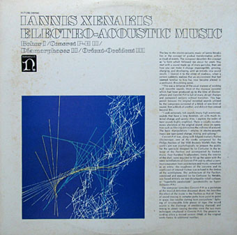
Bohor (1962) by Iannis Xenakis
In addition to making some of the most thrilling and advanced new music of the 20th century, Xenakis chose great titles for his compositions, frequently unusual words. Bohor is a recording of layered sound sources that include a Laotian mouth organ, prepared piano, Iraqi and Hindu jewellery, and should ideally be heard with the sounds surrounding the listener. Intended by its composer to represent “the onset of madness”.

xenakis.jpg

Design by Paula Bisacca.

Uaxuctum: The Legend of the Maya City, Destroyed by Themselves for Religious Reasons (1966) by Giacinto Scelsi
And speaking of great titles… The Italian composer uses orchestra, a choir and an Ondes Martenot to convey an ancient apocalypse. Part III was selected by Robbie Robertson (along with works by other composers listed here) for the Shutter Island soundtrack.

Lontano (1967) by György Ligeti
Stanley Kubrick used Ligeti’s music in three of his films. Lontano‘s piercing harmonics and growling chords prowl through The Shining together with pieces by Bartók and Penderecki.

Black Angels: Thirteen Images from the Dark Land (1970) by George Crumb
Many of the pieces here jangle the nerves but none more than Crumb’s composition for string quartet, glass and metal instruments, a part of which is used in The Exorcist. Composed “in time of war”, it’s a howl of despair whose opening manages to be even more disturbing than Penderecki’s Threnody for the Victims of Hiroshima. The 1990 Kronos Quartet recording is essential.

logos.jpg

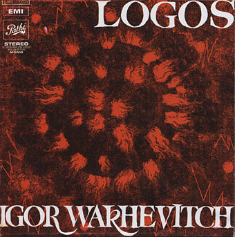
Logos (Rituel Sonore) (1970) by Igor Wakhévitch
“Sound ritual for pop group, mixed choir and magnetic tape.” The first album by the elusive French composer, a composition for a ballet, described by Alan Freeman as “a soprano singer, strange orchestral textures and percussives (drums, cymbals, gongs, etc.) blended with effects and processing. As the ominous percussion sets off with drum-rolls and ritualistic tension, the mood is of a looming anticipation of what is to come. Here we go through phases of weird swirling effects, vivid reverb and atmosphere. The tension becomes overpowering, yet we are led on…”

The Dream of Jacob (1974) by Krzysztof Penderecki
The Polish composer wrote for film soundtracks as well as the concert hall so it’s no surprise that his work can be heard in The Exorcist, The Shining and Shutter Island. The atmosphere of sustained malevolence in this piece is perfect for Kubrick’s haunted house. Whatever Jacob was dreaming about, it wasn’t pleasant.

zorn.jpg

Design by Heung-Heung Chin.

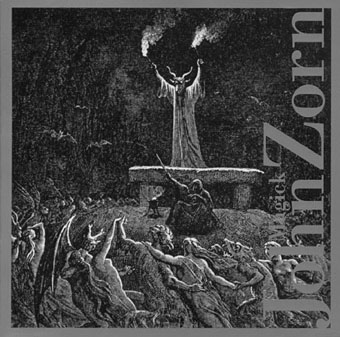
Necronomicon (2004) by John Zorn
A five-part composition for string quartet from Zorn’s Magick album.

Previously on { feuilleton }
Powell’s Bluebeard
A playlist for Halloween: Drones and atmospheres
A playlist for Halloween: Voodoo!
Dead on the Dancefloor
Another playlist for Halloween
A playlist for Halloween
The music of Igor Wakhévitch