Covering Maldoror

roy.jpg

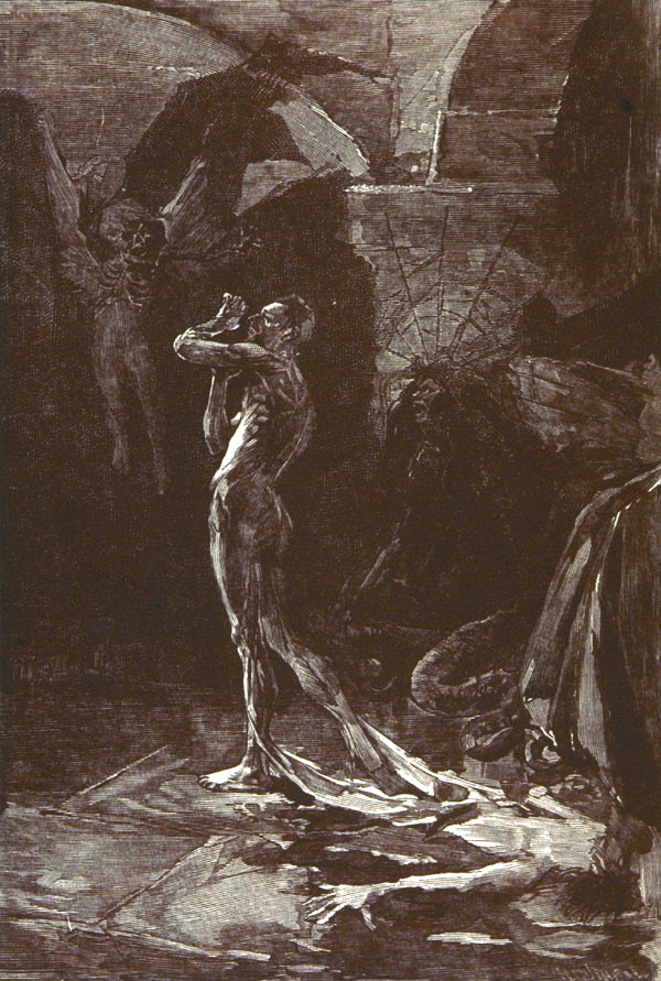
This illustration by José Roy is a frontispiece created for a rare edition of Les Chants de Maldoror published by Genonceaux in 1890. Roy (1860–1924) was a French artist whose work receives little attention today but his Maldoror illustration happens to be the first of its kind, and a picture that serves the text better than some of those being produced a few years later. The detail of a flayed man stepping out of his skin prefigures Clive Barker by almost a century, a further example of the ways in which Lautréamont’s baleful masterpiece was ahead of his time.

maldoror01.jpg

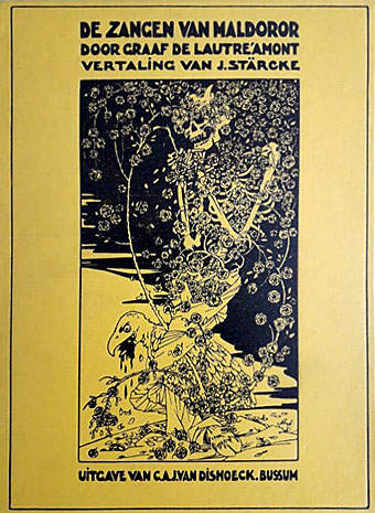
Netherlands, 1917. Cover art by WF Gouwe.

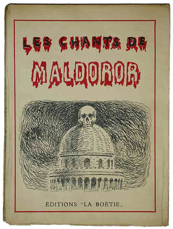
Previous posts here have concerned illustrated editions of Maldoror but this one is all about the covers. Literary classics aren’t always very rewarding in this respect but Maldoror’s textual and imaginative wildness has prompted an assortment of illustrative choices that range from the appropriate to the bewilderingly arbitrary. The following covers are a selection of the more notable examples, avoiding those without pictures or ones that use photographs of the book’s enigmatic author, Isidore Ducasse.

maldoror02.jpg

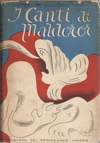
Italy, 1944. Cover art by Mario De Luigi.

maldoror26.jpg

France, 1947. Cover and interior illustrations by Jacques Houplain.

Salvador Dalí was the first well-known artist to illustrate Maldoror but his 1934 edition was published with plain black boards. Houplain’s illustrations follow the text more closely than do those by Dalí, Magritte or Bellmer, all of whom remain preoccupied with their own obsessions.

maldoror03.jpg

Belgium, 1948. Cover and interior illustrations by René Magritte.

maldoror04.jpg

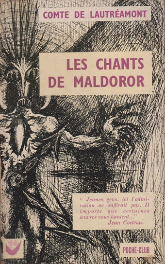
France, 1963. Cover art by Paul Jamotte.

Continue reading “Covering Maldoror”

Ulysses versus Maldoror

covers.jpg

Ulysses (1934), designed by Ernst Reichl; Complete Works of Isidore Ducasse (1967), designed by Pierre Faucheux.

On the design front, that is, not the writing one. Ernst Reichl’s design for the 1934 Random House edition of James Joyce’s Ulysses (the first US edition) has a cover which isn’t so different to the many Art Deco-style bindings from around this time. Inside, however, there’s a significant innovation with his title spread, and the dramatic imposition of a huge capital letter. Random House was presenting Ulysses as a major artistic statement, a quality which Reichl’s design reinforces when the page-filling capitals recur at the openings of each of the novel’s three sections.

ulysses1.jpg

I encountered the huge S on the opening page in a book about Joyce shortly after I’d started reading the novel for the first time, and for years was under the impression that this had been a specific instruction of the author’s, a typographic flourish to add to the rest of the formal manipulations. I’d suggest—insist, even—that all editions of Ulysses should adopt Reichl’s design. Martha Scotford at Design Observer looks at the book in more detail.

ulysses2.jpg

maldoror1.jpg

Les chants de Maldoror-Poésies-Lettres (1950) by Lautréamont. Le club français du livre.

Pierre Faucheux went one further with his grandiose opening for Les chants de Maldoror-Poésies-Lettres by filling the opening of the book with Didot capitals which spell out M-A-L-D-O-R-O-R on each page before the title is reached. This is the design equivalent of shouting in the reader’s face when the book is opened; given the nature of the text I can imagine the author approving. I’ve no idea whether the idea was borrowed from Reichl but Faucheux was a very inventive designer who was quite capable of arriving at such a layout on his own. His cover for a 1967 reprint of the book (above) spells out the title by tearing up the earlier Didot capitals. Rick Poynor at Design Observer (again) looked at more of Faucheux’s covers for the Livre de Poche imprint, while at Eye magazine there’s an essay by Richard Hollis about Faucheux’s innovations.

Continue reading “Ulysses versus Maldoror”

Weekend links 120

sanssoleil.jpg

• More Nabokov: The University Poem by Vladimir Nabokov, translated by Dmitri Nabokov and read by Ralph Fiennes. And Breitensträter – Paolino, a short story from Nabokov’s Russian period that’s only just been translated into English.

• More LSD: “For decades, the U.S. government banned medical studies of the effects of LSD. But for one longtime, elite researcher, the promise of mind-blowing revelations was just too tempting,” says Tim Doody.

• More Marker: The Guarded Intimacy of Sans soleil by Jonathan Rosenbaum, The Revolutionary Cinema of Chris Marker by Patrick Higgins, and Chris Marker’s Faces by Brian Dillon.

• “A private realm, not easily penetrated, from which emerged music that would give rise to so much of the music we know today.” Guy Horton on Kraftwerk’s Kling Klang studio.

• A narrative from the swamps of Borneo: BLDGBLOG on the mephitic enigma of London’s sewers.

• At Coilhouse: The Incredibly True Adventures of Gerda Wegener and Lili Elbe.

• “What some people call idleness is often the best investment,” says Ed Smith.

• Book cover design: Rick Poynor on Pierre Faucheux and Le Livre de Poche.

• Metaphysical psychedelia: Erik Davis on Rick Griffin: Superstar.

Diamanda Galás discusses her 13 favourite albums.

• Rudy Rucker’s Memories of Kurt Gödel.

• The Men of the Folies Bergère

Olympics or gay porn?

Smoketography

The songs of bowhead whales | Another Moon Song (2009) by Espers | One Thousand Birds (2012) by Six Organs of Admittance.