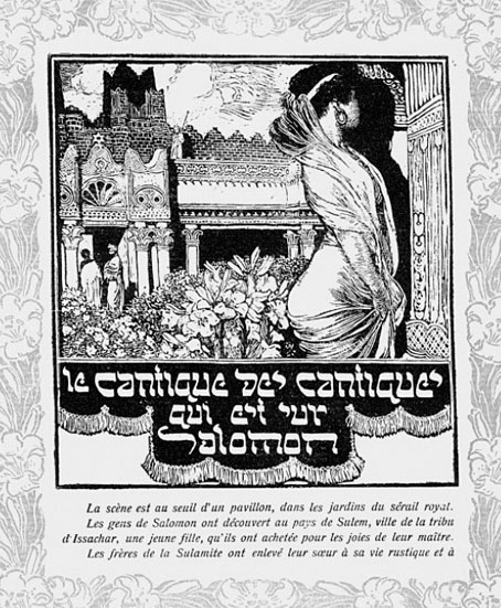
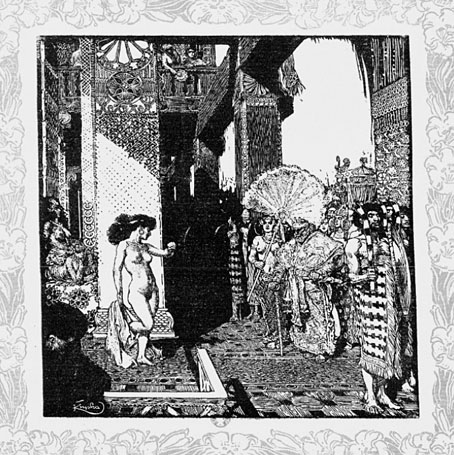
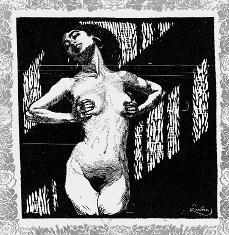
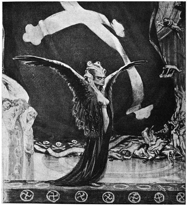
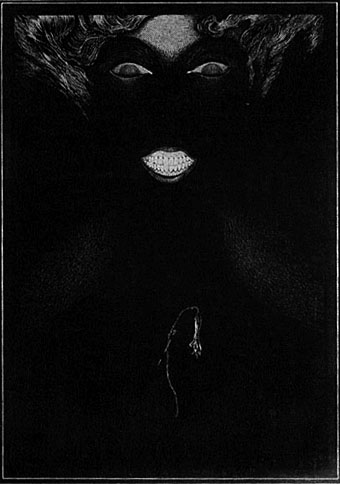
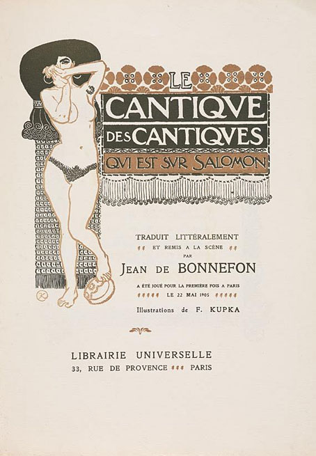
Symbolist cinema

dracula1.jpg

Symbolist? Arguably. Decadent? Certainly. Watching Francis Ford Coppola’s Dracula (1992) again this weekend I thought it worth making note of some of these resonances. The real age of Symbolist cinema was the Silent Era from around 1910 onwards, something I discussed in more detail here. That being so, several films made since can be taken as Symbolist (more usually Decadent) productions even if this was never their original intention. Kenneth Anger‘s Magic Lantern Cycle comes immediately to mind, so too Sergei Parajanov’s The Colour of Pomegranates.

dracula3.jpg

Bram Stoker’s novel was published in 1897 at the ebbing of the fin de siècle but vampires and vampirism were already recurrent Symbolist themes. Aesthetic magus Walter Pater wrote of the Mona Lisa in 1893, “She is older than the rocks among which she sits; like the vampire, she has been dead many times, and learned the secrets of the grave…” Dracula almost demands a Symbolist interpretation, and for now Coppola’s production is the closest we get. I’ve found this makes the film more satisfying in a way: you can ignore the shoddy performances by secondary characters and concentrate on the decor and details (and the tremendous score by Wojciech Kilar). Some of the following screen grabs argue my point.

dracula2.jpg

Oh look, peacock feathers. I loved the artificiality of this film, the excessive palette, the obvious models and miniatures, the layering of images. The dissolve from a peacock feather to Jonathan Harker’s infernal train journey is a great moment.

Continue reading “Symbolist cinema”

Illustrating Poe #5: Among the others

kupka_poe.jpg

The Conqueror Worm (c. 1900) by František Kupka.

Poe’s illustrators are legion, you could easily devote an entire blog to nothing but depictions of his stories and poems. By way of rounding off this week of posts I thought I’d point to some of the works which have caught my attention over the years, several of them being obscure enough to warrant further investigation.

František Kupka’s drawing is, as far as I can gather, one of a series based on Poe’s poem; this seems to be a related piece. As with many Symbolists artists, you can spend a great deal of time scouring the available resources to find more of their work. We’re told that one of Kupka’s more well-known paintings, The Way of Silence (1903), was inspired by the poem Dream-land.

martini_poe.jpg

Berenice (1905) by Alberto Martini.

Alberto Martini (1876–1954) is a fascinating artist whose work bridges the decline of Symbolism and the rise of Surrealism. He’s also another talent whose work is woefully underrepresented on the web so let’s hope that changes soon. Wikipedia describes him as having produced 135 Poe illustrations of which only a small handful are visible online, and most of the ones that are go unlabelled. I know this one is for Berenice since I have it in a book but any Poe reader should guess the title from those blazing teeth. A few more of Martini’s drawings can be seen here.

Continue reading “Illustrating Poe #5: Among the others”

Jugend, 1896

jugend-96-05.jpg

So, then, I’ve now looked through several thousand pages of Jugend magazine and a few things have become apparent. If you’re interested in fin de siècle art and design then all the most interesting material is in the first four years of the magazine’s run, from 1896 on. After 1900 there are still examples of the florid Art Nouveau motifs which filled their earlier pages but the overall style becomes progressively dull, with endless pictures of German towns and hearty country folk. The magazine also begins to reflect an obviously belligerent mood in the country as a whole, pictures of military types and patriotic themes proliferate and the satirical material grows overtly aggressive towards neighbouring nations. Racist cartoons are to be expected—British magazines of the period are much the same—but there’s also a vicious antisemitism boiling away in later issues of Jugend which creates a toxic mix when seen beside the war-mongering on display elsewhere.

jugend-96-01.jpg

Politics aside, these magazines are still a revelation. Pan magazine was being published at the same time (its entire run is also available in the Heidelberg archives) and is the finer journal if it’s art you’re interested in. But Jugend, being a lighter read, contains a wealth of strange and surprising illustrations. Many are naive or just plain bad, of course, but some are quite remarkable. This is the first of a number of posts I’ll make which highlight illustrations that catch my eye. I’ll also be making some follow-up posts about individual artists as the magazine has been a great introduction to minor illustrators I’ve not come across before. This first post is from the two volumes covering 1896 which can be browsed and downloaded here and here.

Continue reading “Jugend, 1896”