Weekend links 450

redon.jpg

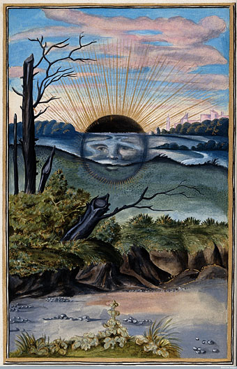
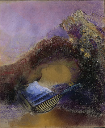
Orpheus (c. 1903–1910) by Odilon Redon. One of 30,000 public-domain images from the Cleveland Museum of Art’s collection.

• Network DVD has announced the premiere home release of Orson Welles’ Great Mysteries, a British TV series that ran from 1973 to 74. Welles’ involvement was limited to introducing each episode but the series itself was one I enjoyed a great deal: 26 short adaptations of period mystery stories that featured a wealth of British and American acting talent. The theme by John Barry was an additional bonus.

• The trailer for Apollo 11, a documentary by Todd Douglas Miller which presents for the first time the 70mm footage recording the Earth-bound parts of the Moon mission. Related: Michelle Santiago Cortés on how NASA used art to shape our vision of the future.

• At Dangerous Minds: a preview of Third Noise Principle, the latest in an excellent series of electronic music compilations from Cherry Red, and Cosey Fanni Tutti talks about her first solo album since 1983.

“The way I understood theory, primarily through popular culture, is generally detested in universities,” Mark [Fisher] told me in 2005, when I interviewed him for the Village Voice. “Most dealings with the academy have been literally clinically depressing.” He darkly surmised that his blog, K-Punk, and the surrounding blogosphere, “seemed like the space—the only space—in which to maintain a kind of discourse that had started in the music press and the art schools, but which had all but died out, with appalling cultural and political consequences.” Mark and the Village Voice are both dead now, leaving unfathomable voids in their wake.

Geeta Dayal on Mark Fisher

• At The Witch Wave: Peter Bebergal and Pam Grossman discuss Bebergal’s latest book (also my current reading), Strange Frequencies: The Extraordinary Story of the Technological Quest for the Supernatural.

• At Bandcamp: another release from the retro-synth cosmos of Jenzeits, and Ufology , an investigation of Britain’s flying-saucer landscape by Grey Frequency.

• Surprising collaboration of the week: Beth Gibbons and Krzysztof Penderecki have made a new recording of Henryk Górecki’s Third Symphony.

Alchemy (1969) the debut album by the Third Ear Band, receives an expanded reissue next month.

The Burn: a science-fiction story by Peter Tieryas with illustrations by Arik Roper.

• Mix of the week: Self-Titled Needle Exchange 275 by Black To Comm.

Amy Turk plays Bach’s Toccata and Fugue in D Minor on her harp.

Chrismarker.org is seeking donations.

Mystery Train (1955) by Elvis Presley | Mystery R.P.S. (No 8) (1981) by Holger Czukay, Jah Wobble, Jaki Liebezeit | Mystery Room (1985) by Helios Creed

Weekend links 292

splendor.jpg

The Black Sun from Splendor Solis (1582) “attributed to the legendary figure Salomon Trismosin”.

Topic B predominates this week. The Black Sun of alchemy was the first thing I thought of when the title of David Bowie’s final album was announced late last year. The Black Sun symbolises the nigredo stage of the alchemical process when putrefaction or decomposition takes place; Carl Jung in Psychology and Alchemy equates the nigredo with the dark night of the soul. At the time I didn’t seriously think that the Bowie of 2015 would have had this in mind as a primary reference even though the Bowie of the early 1970s was immersed in Golden Dawn occultism, the Kabbalah, and a reader of Pauwels & Bergier’s The Morning of the Magicians, a book that informs the lyrics of the Hunky Dory album, and which contains a great deal of discussion about alchemy and other esoteric matters. And yet… Of all the outfits that Bowie might have worn in his final video the one that he chose for Lazarus is a match for the one he wore during the Station To Station Kabbalah-drawing photo session. At Sol Ascendans Alex Sumner and his commenters explored this twilight zone.

Back in the sublunary world, Jonathan Barnbrook’s cut-out sleeve design for the Blackstar album gained additional resonance this week: the black star as the hole that’s left when a more familiar star has been removed from its setting. Hindsight also makes poignant the observation that this was the only album without a picture of the artist on the cover. Elsewhere there were speculations about the title being a reference to Black Star by Elvis Presley (who shared a birthday with Bowie) or a term from oncology, two suggestions that fit so well they’re hard to ignore.

He began to develop a science fiction sensibility, drawing on the New Wave SF movement of Michael Moorcock and JG Ballard, other writers who used the genre such as Anthony Burgess and William S Burroughs, and an older fantasy tradition found in HP Lovecraft and Edward Bulwer-Lytton (whose The Coming Race is name-checked in Oh! You Pretty Things, 1971).

Jake Arnott on David Bowie’s literary influences

• In something-else-also-happened-this-week news, 2016 may see the long-awaited release of Andrei Tarkovsky’s films on Region B Blu-ray. Fingers crossed.

• International posters for The Man Who Fell To Earth. More Nicolas Roeg (and more shiny discs): Eureka (1983) will receive a Blu-ray release in March.

• Cracking the codes of Leena Krohn: Peter Bebergal on the Finnish writer of strange stories.

• Anthems for the Moon: Jason Heller examines David Bowie’s connections to science fiction.

• From 2013: Jon Savage on Bowie’s first meeting with William Burroughs in 1974.

• Mixes of the week: Bowie-esque Vol 1 and Bowie-esque Vol 2 by Abigail Ward.

David Bowie Doing Shit: a Tumblr

“Heroes” (1978) by Blondie & Robert Fripp | “Heroes” (2003) by King Crimson | “Helden” (2007) by Apocalyptica ft. Till Lindemann

Heliotropic

heliotropic9.jpg

Arriving in the post this week was a catalogue for a Maison & Objet exposition of design and decoration which includes one of my paintings among the listed “Inspirations“. The event was held in Paris at the end of January but I’ve been so busy for the past few of months I forgot to see when it was on. Not that I could have said much about it since this is a showcase event you have to attend rather than experience remotely.

Catalogues for big art and design events often tend to the lavish and expensive but the Elsewhere book is the most lavish I’ve ever encountered. The production runs the gamut of the many expensive options which modern printing can provide: metallic inks, varnish effects, iridescent and translucent sheets, embossing, die-cutting, tipped-in inserts, and variable page sizes. The inflexible icing on the cake comes in the shape of a small square of polished marble glued to one of the pages. Excess aside, the print quality is excellent, and I’m very pleased with the way my Elvis painting appears.

sunking.jpg

Sun King (1996).

Sun King was commissioned by Creation Books in 1996 as cover art for a Jeremy Reed novel which ended up being dropped by the company. The concept was the author’s, and while I’m pleased with the way it turned out I always felt it should have had more of a Gustave Moreau quality. This is the first time the picture been used anywhere although I did reuse the Elvis-in-a-Cadillac idea recently for one of the Alas Vegas Tarot cards.

heliotropic1.jpg

My painting is included in the Heliotropic section of the book which shows some of François Bernard’s inspirations. I’m pleased they placed one of the die-cut overlays before my piece. The photos below show some of the pages from the other sections which concern the inspirations of Elizabeth Leriche—her section includes the chunk of marble—and Vincent Grégoire whose section features futurism, space scenes, metallic effects, and Daft Punk.

heliotropic2.jpg

heliotropic3.jpg

Continue reading “Heliotropic”

Alas Vegas Tarot cards

alasvegasdevil.jpg

Back in February I bought a Wacom drawing tablet and said I’d show some proper results from its use later. For the past few months I’ve been working on this project using a combination of Wacom drawing and vector graphics. The initial brief from games designer James Wallis was for six Tarot-style card designs for his Alas Vegas role-playing game which has as its theme a fantasy extrapolation from Las Vegas and its gaudy mythology. The Kickstarter funding for the game turned out to be more successful than was anticipated so James asked me to expand the six cards idea into a full set of black-and-white Major Arcana designs.

This has been a fun series to work on although a number of the cards presented problems at first, the antique nature of the Tarot symbolism being a difficult thing to map across a very commercial American city. The symbolism from the Rider-Waite-Smith (RWS) deck was used as a rough guide although we deviated in a few places from the more traditional attributes. Las Vegas has changed over the years so rather than represent a single period of the city’s history there are references to different eras, from the huge casinos of today back to the buildings of the 50s and 60s with their distinctive “Googie” architecture. Notes for the cards follow below. The artwork can be seen at larger size here.

alasvegas00.jpg

The Fool is usually a young man about to step off a cliff edge with a dog barking a warning at his heels, hence the dog on the sign.

alasvegas01.jpg

Several of the cards convert the Tarot characters into cabaret acts. This one was pretty inevitable, and I’m sure it’s not the first time a stage conjuror has appeared on this card.

alasvegas02.jpg

The chair is based on the 1965 “Ball Chair” design by Eero Aarnio (as seen in The Prisoner TV series), adapted here to resemble the Priestess’s crescent moon.

alasvegas03.jpg

The style on this one is more 70s than 60s: patterned wallpaper (the hearts derive from the symbolism of The Empress, and from playing cards, of course), white rug, Kung Fu pyjamas.

Continue reading “Alas Vegas Tarot cards”

Album cover postage stamps

albums1.jpg

top row: The Division Bell by Pink Floyd; A Rush of Blood to the Head by Coldplay.
bottom row: London Calling by The Clash; Tubular Bells by Mike Oldfield.

The Royal Mail follows its series of British Design Classics postage stamps with a series dedicated to what they call “classic” album covers. The design classics in the earlier series deserved the term—a  Mini motor car, a Penguin book cover, the London Underground map, etc—whereas here we have the word “classic” being used in its lazy journalist sense where it becomes a synonym for “popular” and “familiar”, two attributes which often diminish with time.

albums2.jpg

top row: Parklife by Blur; Power, Corruption and Lies by New Order.
bottom row: IV by Led Zeppelin; Screamadelica by Primal Scream.

It should be noted that the choice of cover art was limited to releases by UK artists, and the designs had to be readable at the very small size of a postage stamp. Even so, I can’t help but regard this as a missed opportunity. There was no need to feature the Beatles since they’d been given their own set of stamps in 2006, but I’ve never thought of the cover of Let It Bleed (below) as a classic, even though musically it’s one of the best Stones albums. I’d rather choose Andy Warhol’s cover for Sticky Fingers but you can imagine the upset at stamp users being forced to lick a picture of a bulging pair of jeans. As for Pink Floyd’s Division Bell, it’s a typically striking design from Storm Thorgerson but does anyone really think it’s more classic than earlier Floyd covers, not least the Dark Side of the Moon prism which even people who hate the band can instantly recognise? Nearly all these choices seem confused or compromised; the Clash cover is the token punk offering—Royal Mail wouldn’t dare choose Never Mind the Bollocks—but Ray Lowry’s design was copied from an Elvis Presley sleeve; Led Zeppelin’s IV is a great album but other releases had far better covers; Primal Scream, another great album but the whole sleeve design is perfunctory; the Blur choice is merely bewildering.

albums3.jpg

left: Let It Bleed by The Rolling Stones; right: The Rise and Fall of Ziggy Stardust and the Spiders from Mars by David Bowie.

As far as designers go, Hipgnosis (via Storm T), Peter Saville (New Order), and Stylorouge (Blur) are included here but there’s nothing from Barney Bubbles, Malcolm Garrett, 23 Envelope, Neville Brody, Designer’s Republic or any of the other pioneering British designers of the past 30 years. The trouble with those names, of course, is that many of the artists they worked for aren’t popular or familiar enough to the average British stamp purchaser so their work can’t be deemed “classic”. A best of British, then, which could have been a lot better.

Classic Album Covers will be issued on January 10th, 2010.

Elsewhere on { feuilleton }
The album covers archive

Previously on { feuilleton }
British Design Classics
Stamps of horror
Endangered insects postage stamps
James Bond postage stamps
Please Mr. Postman