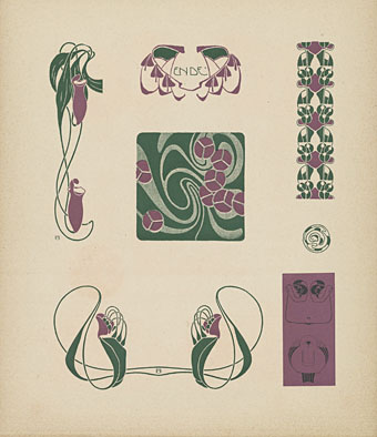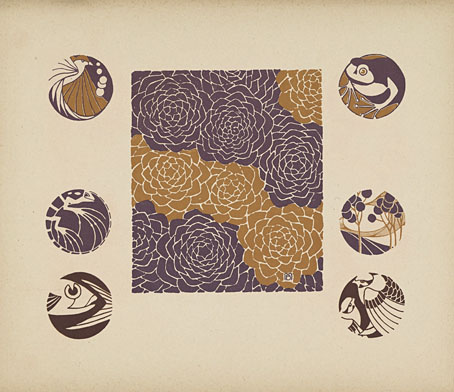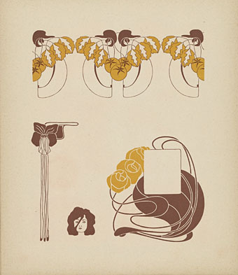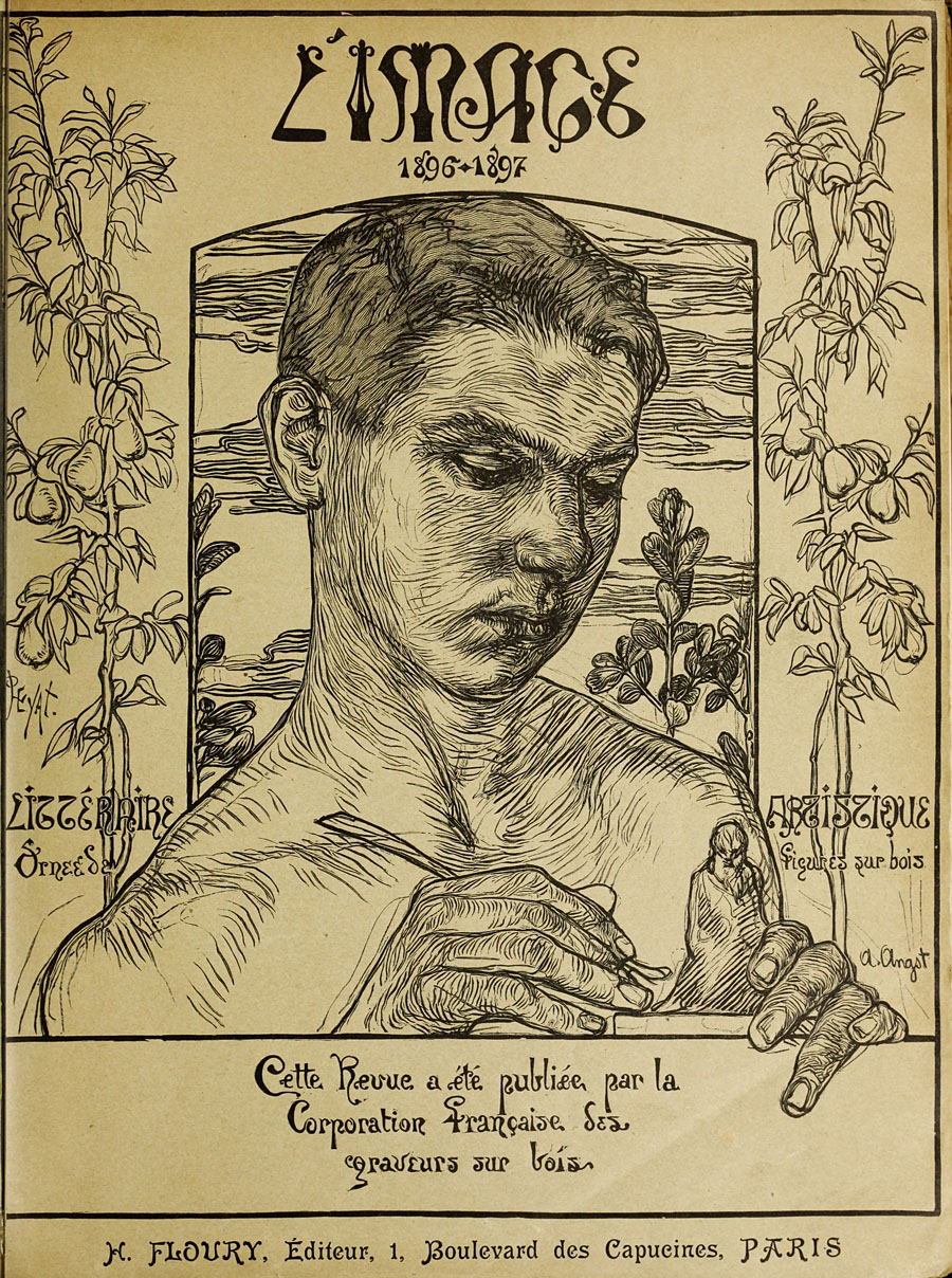
L’Image was a short-lived French publication dedicated to the art of contemporary wood engraving. Short-lived it may have been but its position at the birth of Art Nouveau means that many of its smaller graphics have been recycled ever since in studies of the period. One of these graphics, a fleuron by Jean-Jacques Drogue, was the subject of an earlier post when I was tracing the origin of a motif used for many years by my colleagues at Savoy Books. I eventually found Drogue’s fleuron in a collection of rather poor scans at Gallica, a good resource but one whose web interface (and often the materials themselves) leaves much to be desired.
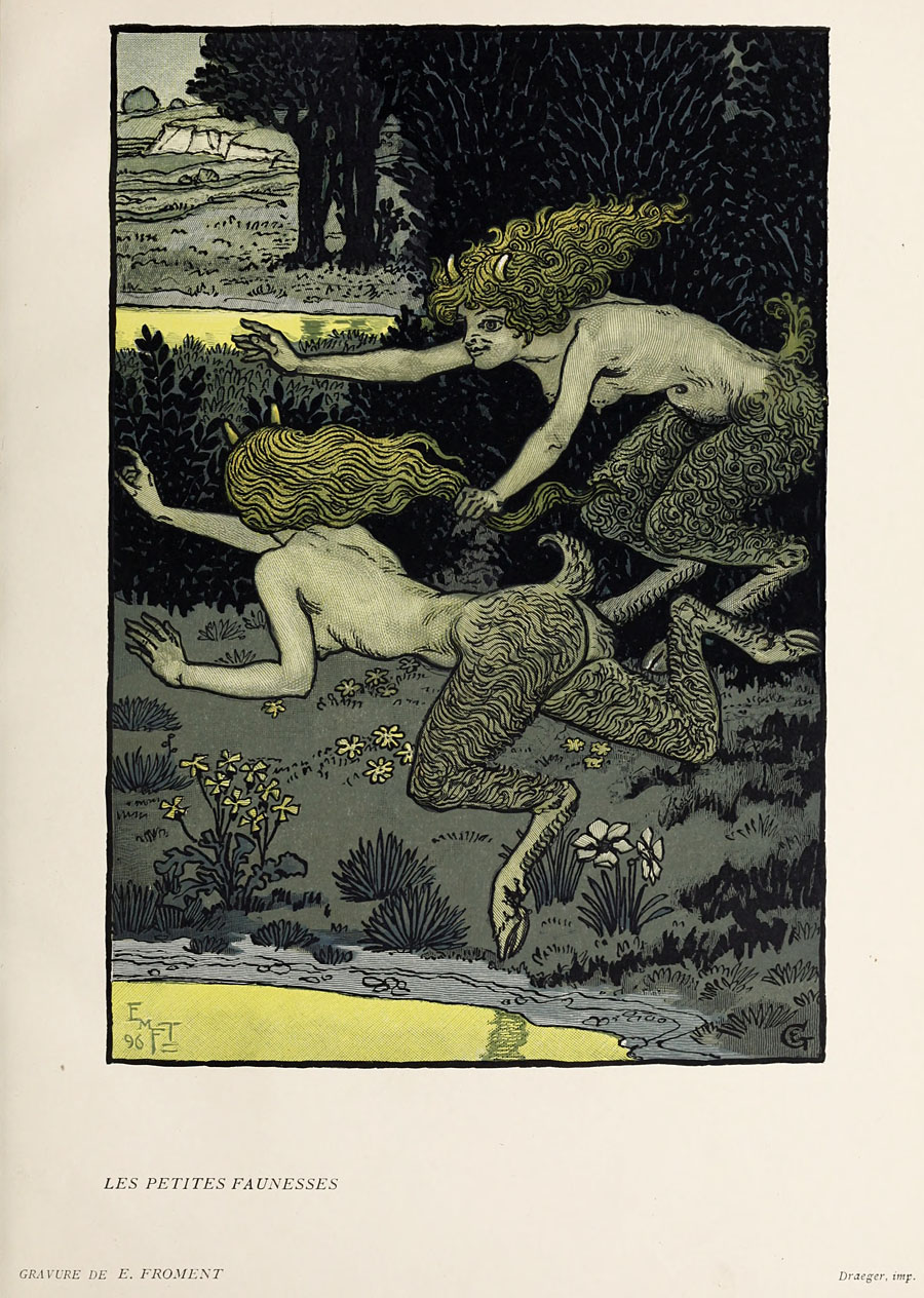
All the images here are from a collection of the entire run of L’Image at the Internet Archive which are much better quality and which include the early issues missing from Gallica. The most notable thing about the earlier issues is the way they combine the Art Nouveau style with Symbolist art; in addition to an engraving by Carlos Schwabe that I hadn’t seen before there’s a very Symbolist piece about nocturnal Bruges featuring art by Georges de Feure.