The art of Alia Penner

penner1.jpg

Kenneth Anger poster (2009).

Alia Penner, like Arik Roper, is another talented member of the omniversal Arthur posse as well as being an illustrator, designer and photographer in her own right. Her title designs opened the Missoni promotional film which Kenneth Anger directed earlier this year, and her work on paper follows a distinctly psychedelic path. The new piece below reminds me a little of Wilfried Sätty’s colour collages with its spots and eggs and butterflies. There’s more gorgeous work to be seen here.

penner2.jpg

Somewhere (2010).

Previously on { feuilleton }
Arik Roper relaunched
Wilfried Sätty: Artist of the occult
Missoni by Kenneth Anger

Wilfried Sätty: Artist of the occult

satty1.jpg

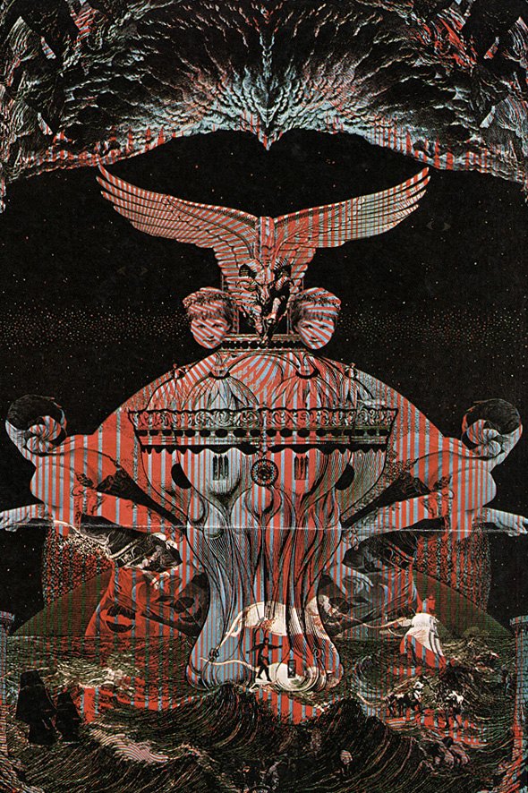
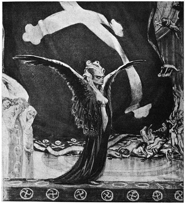
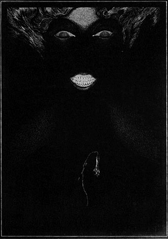
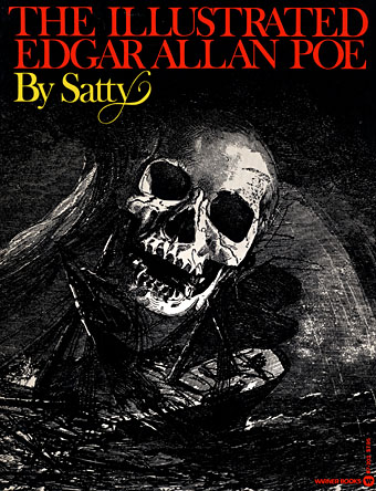
After last week’s post about Wilfried Sätty‘s illustrated Poe, I thought I’d follow it up with this 1970 interview from Man, Myth & Magic, a part-work publication which built weekly into a seven-volume “illustrated encyclopedia of the occult”. In the back of each issue there was a two-page feature, Frontiers of Belief, usually featuring more topical material, and issue 36 had Sätty as its subject. The interview captures him just after he’d been building his reputation as one of San Francisco’s psychedelic poster artists and just before the book collections of his collage work started to appear. The description of his working methods inevitably plays up the occult associations but helps to give a little insight into the artist. The first two pictures here are from the published article to which I added a couple of the album covers he produced in the 1970s. There’s also a poster for an exhibition with friend and fellow artist David Singer whose lettering adorned many of Sätty’s posters.

A note about Sätty’s name: he was known as Wilfried Podriech when he came to America but changed his name to Sätty thereafter. This surname is often reproduced without an umlaut over the “a” which I regard as an error. When Jay Babcock, Richard Pleuger and I visited David Singer to discuss Sätty’s work (and see some of Singer’s own) we were informed that Sätty’s adopted name was intended to be reminiscent of the Egyptian Pharaohonic name Seti. The umlaut over the “a” gives the pronunciation setty; without it would be satty.

*   *   *

ARTIST OF THE OCCULT by Robert W. Neubert

Alchemy can be a state of being according to Sätty, a German-born artist who now lives in San Francisco; and he believes that this concept can be extended to art. In his attempts to plumb the depths of the subconscious he makes use of his collection of occult works, including a 17th century alchemical text and a book of healing and magic published in 1648.

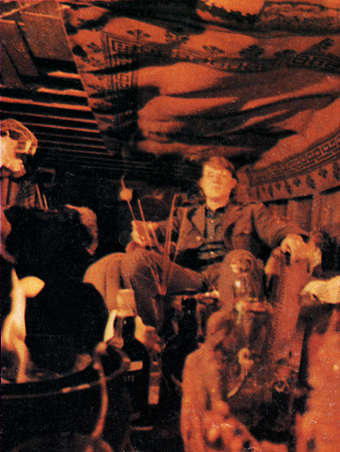
Blue and orange flames flicker from an ancient urn and throw dancing shadows about a dimly-lit subterranean chamber in San Francisco, California. Old, dark-hued tapestries hang from the walls and low ceiling, and occult art objects are crammed into every corner. Baroque harpsichord music filters through the incense-scented air.

Descending a wooden ladder into the nearly black chamber is a tall, lanky man with flowing brown hair, a dark blue Western-styled shirt, and grey flared slacks. He carries under his arm a mystical-looking montage he has recently created and run off on a lithograph press.

The montage is in poster form, and it is a haunting collection of Renaissance and medieval themes, incredible in its intensity, colour and creativity.

satty_photo.jpg

Sätty photographed for Man, Myth & Magic (1970).

The artist is Sätty, a German-born montage-maker with a dream—a dream of plumbing the depths of the subconscious by utilizing alchemy and mysticism in his work.

Alchemy is essential to his creativity, he says. But the 31-year-old artist’s definition of alchemy has a broader meaning than the classic textbook definition of transmuting base metals into gold. He is one of the first non-commercial poster makers, and his work far transcends the psychedelic art used to advertise San Francisco rock and roll dances.

“Alchemy can be a state of being,” he says. “There is such a thing as visual or intellectual or artistic alchemy. The undeveloped mind may be considered akin to lead, the fully-realized mind as gold. And the same is true of art. Much of contemporary art is lead.”

Continue reading “Wilfried Sätty: Artist of the occult”

Illustrating Poe #5: Among the others

kupka_poe.jpg

The Conqueror Worm (c. 1900) by František Kupka.

Poe’s illustrators are legion, you could easily devote an entire blog to nothing but depictions of his stories and poems. By way of rounding off this week of posts I thought I’d point to some of the works which have caught my attention over the years, several of them being obscure enough to warrant further investigation.

František Kupka’s drawing is, as far as I can gather, one of a series based on Poe’s poem; this seems to be a related piece. As with many Symbolists artists, you can spend a great deal of time scouring the available resources to find more of their work. We’re told that one of Kupka’s more well-known paintings, The Way of Silence (1903), was inspired by the poem Dream-land.

martini_poe.jpg

Berenice (1905) by Alberto Martini.

Alberto Martini (1876–1954) is a fascinating artist whose work bridges the decline of Symbolism and the rise of Surrealism. He’s also another talent whose work is woefully underrepresented on the web so let’s hope that changes soon. Wikipedia describes him as having produced 135 Poe illustrations of which only a small handful are visible online, and most of the ones that are go unlabelled. I know this one is for Berenice since I have it in a book but any Poe reader should guess the title from those blazing teeth. A few more of Martini’s drawings can be seen here.

Continue reading “Illustrating Poe #5: Among the others”

Illustrating Poe #4: Wilfried Sätty

satty_poe01

Here it is, the book that began my fascination with the collage art of Wilfried Sätty (1939–1982), a German artist and psychedelic poster designer resident in San Francisco during the 1960s and 1970s. Warner Books published his Poe collection in 1976 and for some reason omit the umlaut from his name even though it’s present in Thomas Albright’s introductory note. I bought my copy in 1979 at a time when I was writing a lot of unsuccessful “experimental” fiction, and the sight of these tremendous collages inspired a surge of writing activity which disregarded Poe’s stories altogether. I’d seen enough of Max Ernst’s engraving collages to know that Sätty was following Ernst’s example but something about Sätty’s work struck me in a manner I couldn’t articulate other than by trying to set down the thoughts they inspired. Personal obsessions aside, I’ve since come to regard this book as the only illustrated Poe which can approach Harry Clarke’s inimitable volume.

satty_poe02

I’m fortunate to own two copies of this edition otherwise I wouldn’t have attempted to scan any pages when doing so involves bending the spine rather badly. The book is profusely illustrated, with many full-page or double-spread illustrations most of which I haven’t tried to reproduce. What you have here are the title pages from nearly all the pieces and a couple of additional illustrations. Sätty’s Poe is still the easiest of his books to find secondhand if you browse the dealer pages at AbeBooks. For more of his incredible work there’s this page at Ephemera Assemblyman, and for details of the artist’s life and career there’s my 2005 essay in Strange Attractor Journal Two.

• Sätty’s illustrations for The Annotated Dracula (1975) at Flickr.

satty_poe03

Continue reading “Illustrating Poe #4: Wilfried Sätty”

Steampunk overloaded!

infernal.jpg

Yes, it’s the “S” word again, and if there was any doubt that this has been the Year of Steampunk here at Coulthart Towers, look at these recent works. And this is by no means everything I’ve been doing in this area, there’ll be further announcements later on.

The covers for KW Jeter’s novels are a pair of reprintings from UK publisher Angry Robot whose books will shortly be available in the US and Canada. Jeter is now famous—infamous, perhaps—for having given the word “steampunk” to the world in the early 1980s. This was intended as a jest after he and a couple of other writers (including a favourite of mine, Tim Powers) had written a number of science fiction novels set in the 19th century; like many light-hearted neologisms, it gained a life of its own. Angry Robot are reissuing two of these early works as a result of the ongoing steampunk explosion.

morlock.jpg

Morlock Night (1979) is a pulpy affair which sees the Morlocks from HG Wells’ The Time Machine using the Time Traveller’s vehicle to return to Victorian London and wreak no end of havoc. Infernal Devices (1987) is a rather more substantial confection involving a great deal of clockwork mechanisms (for once the clock parts are justified!), automata, fish people, and a device capable of destroying the earth. I’ve been producing a lot of engraving collage à la Ernst and Sätty recently but the technique seemed especially appropriate here as a means of illustrating works which themselves are collages of Victorian motifs.

zeppelins.jpg

Meanwhile, over at Tachyon Publications, there’s this cover for another Victorian adventure, two in fact, from master beserker Joe R Lansdale. Flaming Zeppelins combines a pair of comic adventures, Zeppelins West (2001) and Flaming London (2006), which feature a host of notable figures including Mark Twain, Annie Oakley, Buffalo Bill Cody…and a talking seal. Publication date is November 1st.

steampunk.jpg

Then from Tachyon in mid-November there’ll be Steampunk II: Steampunk Reloaded, a 430-page anthology edited by Ann & Jeff VanderMeer which includes fiction and non-fiction from William Gibson, Caitlín R Kiernan, Jeffrey Ford, Cherie Priest, and many others. Also a comic strip, copious illustrations and a very full-on interior design from yours truly of which I’ll only show you the above page for the time being. Yes, that’s a mechanical ostrich but if you want to know what it’s doing there you’ll have to read the book. More about this later. And more later about The Steampunk Bible to which I’m also a contributor, a glossy, full-colour guide to the entire sub-culture which will be published next year by Abrams. By the time that appears I’ll probably be sick of the sight of clockwork parts, dirigibles, florid typefaces and Victorian decoration; I’ll be needing a good dose of Helvetica and Josef Müller-Brockmann minimalism to calm down.

Previously on { feuilleton }
Skeleton clocks
Vickers Airship Catalogue
The Air Ship
Dirigibles
More Steampunk and the Crawling Chaos
La route d’Armilia by Schuiten & Peeters
The art of François Schuiten
Steampunk Redux
Steampunk framed
Steampunk Horror Shortcuts
The Airship Destroyer
Zeppelin vs. Pterodactyls