Cover and interior designs by Galen Smith.
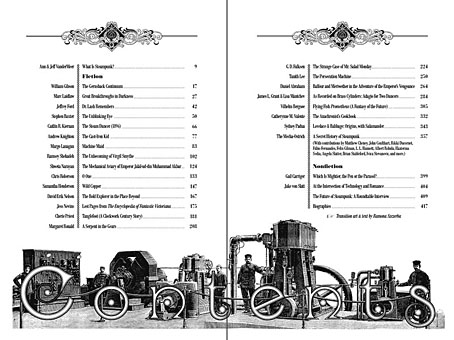
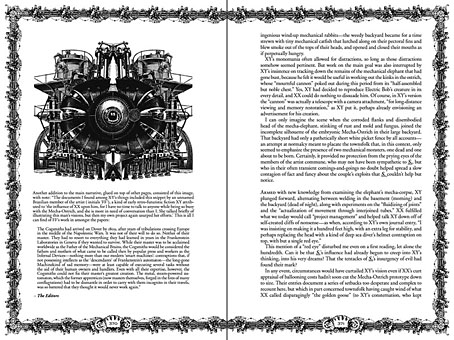
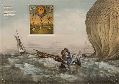
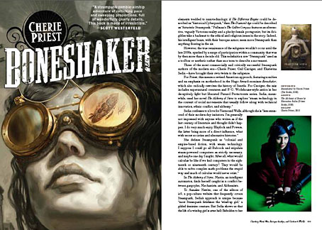
Arriving in your book emporia this week is The Steampunk Bible by Jeff VanderMeer & SJ Chambers, a comprehensive guide to the sub-genre which is now a thriving sub-culture. I contributed some bits of graphic design as well as a bespoke dirigible illustration (see below). The book also features a few other steampunk-related pieces of mine among its wealth of photos and illustrations. This is a typically lavish production from Abrams, beautifully designed by Galen Smith with a cover based on the celebrated Hetzel editions of Jules Verne’s novels. Inside there are essay contributions from Bruce Sterling, Catherynne M Valente, Jess Nevins and others. If you’re a steampunk enthusiast (or know one) this is an essential purchase. Some links and page samples follow below.
• The official Steampunk Bible site
• The Steampunk Bible: Mecha-Elephants, Raygun Rocketships, and Great Stories, a feature by Jeff V.
• Amazon US | Amazon UK | Book Depository | Barnes & Noble | Indiebound
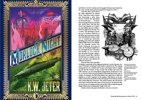
My cover for KW Jeter’s Morlock Night which has just been republished by Angry Robot.
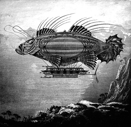
My brief was to create a cannon-bedecked piscine dirigible so this is what I came up with. See it in all its belligerent glory here.
Previously on { feuilleton }
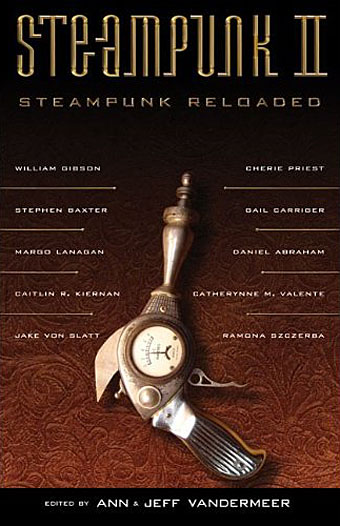
• Steampunk Reloaded
• Steampunk overloaded!
• Vickers Airship Catalogue
• The Air Ship
• Dirigibles
• More Steampunk and the Crawling Chaos
• The art of François Schuiten
• Steampunk Redux
• Steampunk framed
• Steampunk Horror Shortcuts
• The Airship Destroyer
• Zeppelin vs. Pterodactyls
• The Hetzel editions of Jules Verne