Weekend links 221

cornell.jpg

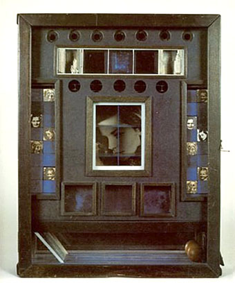
Untitled (Penny Arcade Portrait of Lauren Bacall) (1946) by Joseph Cornell.

• Having been a Bernard Szajner enthusiast for many years it’s good to see his music receiving some belated reappraisal. David McKenna talked to Szajner about his Visions Of Dune album (which is being reissued by InFiné next month), laser harps, The (Hypothetical) Prophets, and working with Howard Devoto.

• Priscilla Frank posts some big views of Marjorie Cameron’s occult paintings as a preview of the forthcoming exhibition at MOCA Pacific Design Center, Los Angeles.

• Fascinating reading in light of the recent kerfuffle over True Detective, Christopher Loring Knowles on the possible sources of HP Lovecraft’s Cthulhu Mythos.

Those who set up oppositions between the electronic technology and that of the printing press perpetuate Frollo’s fallacy. They want us to believe that the book—an instrument as perfect as the wheel or the knife, capable of holding memory and experience, an instrument that is truly interactive, allowing us to begin and end a text wherever we choose, to annotate in the margins, to give its reading a rhythm at will—should be discarded in favor of a newer tool. Such intransigent choices result in technocratic extremism. In an intelligent world, electronic devices and printed books share the space of our work desks and offer each of us different qualities and reading possibilities. Context, whether intellectual or material, matters, as most readers know.

Alberto Manguel, lucid as always, on the act and import of reading.

• “It’s time to give prog rock’s artist-in-residence Roger Dean his due,” says Amber Frost. No argument there, I did my bit in 2010.

• “Why do the covers of so many self-published books look like shit?” asks B. David Zarley.

• Mixes of the week: FACT mix 455 by Airhead, and Secret Thirteen mix 225 by Clock DVA.

• At Core77: Rain Noe chooses favourite skyscraper photos by Russian urban explorers.

• “O, Excellent Air Bag”: Mike Jay on the nitrous oxide fad of the early 19th century.

Nick Carr goes in search of Manhattan’s last remaining skybridges.

Lauren Bacall at Pinterest.

• Shaï Hulud (1979) by Zed (Bernard Szajner) | Welcome (To Death Row) (1980) by Bernard Szajner | Person To Person (1982) by The (Hypothetical) Prophets

Design as virus 17: Boris and Roger Dean

boris2.jpg

The compact disc for Flood (2000) by Boris.

The music of Japanese heavy rock trio Boris has been soundtracking the past few days hence this addition to an occasional series which has already seen the band mentioned once before. It’s common for rock groups at the heavier end of the spectrum to find a visual identity which is maintained across all releases. Boris have never been interested in this kind of consistency; not only do the band vary their appearance for group shots but their music, and the packaging which attends it, explores a variety of different styles. The album cover which featured in an earlier post was a careful copy of the sleeve for Nick Drake’s second album Bryter Layter. All the releases featured here play with Roger Dean’s graphic style of the early 1970s. All art and design credits are given to the band’s own label, Fangs Anal Satan, so we’ll have to assume that it’s a member of the band responsible for the design and illustration.

budgie.jpg

Logo for rock group Budgie by Roger Dean, 1973.

boris3.jpg

Flood CD insert.

boris1.jpg

A label design from 2006 based on Roger Dean’s first Virgin Records logo.

virgin.jpg

Virgin Records label by Roger Dean, 1973.

boris4.jpg

Walrus/Groon (2007).

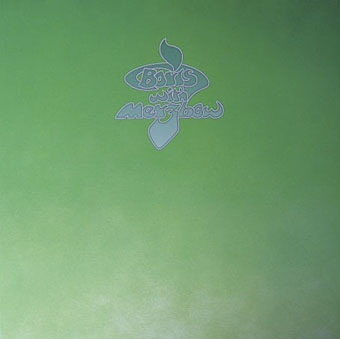
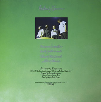
The most elaborate Roger Dean pastiche is this 12-inch single, a collaboration with Japanese noise man Merzbow. On the A-side the band play a version of I Am The Walrus while Merzbow makes noises in the background; the B-side is named after a King Crimson track but the racket everyone makes sounds little like the original. The sleeve is a gatefold affair based on Dean’s design for Close To The Edge (1972) by Yes, complete with handwritten credits and Dean-like painting in the interior. The vinyl disc came in a variety of coloured formats and used the imitation Virgin label. In all, a very collectable item.

boris6.jpg

boris5.jpg

Previously on { feuilleton }
Design as virus 16: Prisms
Design as virus 15: David Pelham’s Clockwork Orange
Design as virus 14: Curse of the Dead
Design as virus 13: Tsunehisa Kimura
Design as virus 12: Barney’s faces
Roger Dean: artist and designer
Design as virus 11: Burne Hogarth
Design as virus 10: Victor Moscoso
Design as virus 9: Mondrian fashions
Design as virus 8: Keep Calm and Carry On
Design as virus 7: eyes and triangles
Design as virus 6: Cassandre
Design as virus 5: Gideon Glaser
Design as virus 4: Metamorphoses
Design as virus 3: the sincerest form of flattery
Design as virus 2: album covers
Design as virus 1: Victorian borders

Weekend links 167

field.jpg

Poster by Luke Insect & Kenn Goodall.

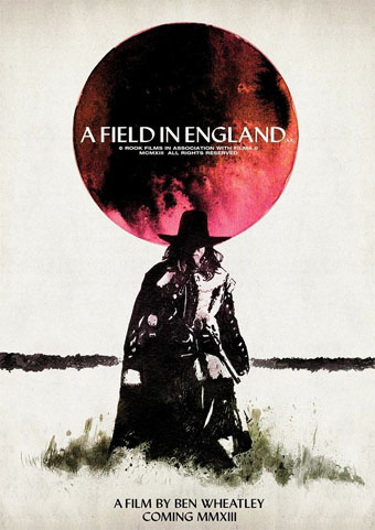
In recent years I’ve had little patience for British cinema: too much dour “realism” with little of Alan Clarke’s vitality, too many comedies that aren’t funny, too many Hollywood calling cards, too much Colin Firth… So it’s been a pleasure to see Peter Strickland’s Berberian Sound Studio followed this month by Ben Wheatley’s A Field In England, a pair of films that stand out by daring to be different in a medium which seems to grow more creatively conservative with each passing year. A Field In England adds to the micro-genre of weird British films set around the time of the English Civil War. In place of witchfinders and devil worshippers we have magic, murder, madness, and a field of hallucinogenic mushrooms. Wheatley, like Strickland, takes risks that wouldn’t be allowed with a bigger budget which makes me excited to see what they’ll be doing next. A Field In England is already out on DVD & Blu-ray. The trailer is here. The director talked to Mat Colegate about the genesis of the film (spoiler alert). There’s more big hats and cloaks in this list of ten 17th century films.

• “I like to look at men…the way they look at women,” photographer Ingrid Berthon-Moine says about her pictures of sculpted testicles.

Roger Dean has finally sued James Cameron over the designs for Avatar. Will be interesting to see how this one turns out.

• Google has taken its Street View cameras to Battleship Island, “the most desolate city on earth“.

• The strange fantasy novels of Edward Whittemore are available again in digital editions.

Julia Holter talks about her forthcoming Gigi-inspired album Loud City Song.

• At Pinterest: Maneki-neko, the beckoning cat of good fortune.

Beautiful Books: Decorative Publishers’ Cloth Bindings.

• The abstract paintings of Hilma af Klint (1862–1944).

Lee Brown Coye illustrates August Derleth in 1945.

Bill Laswell’s discography intimidates the collector.

• Mix of the week: Kit Mix #23 by Joseph Burnett.

• The Soundcarriers: Last Broadcast (2010) | Signals (2010) | This Is Normal (2012)

Storm Thorgerson, 1944–2013

hipgnosis1.jpg

Wish You Were Here (outer and inner sleeve, 1975) by Pink Floyd.

Whenever people ask questions about your work, at some point the subject of influences always turns up. Influences for me are usually few, they’re those things which skew your perception to such a degree—or which enlarge the range of possibilities—that they make you follow a path you might otherwise have never pursued. I’ve said on many occasions that the window of our local record shop in the 1970s was an art gallery whose contents changed every week, with gatefold sleeves offering an endless variety of fantastic visions and smart designs. I was often indifferent to the music the sleeves were intended to advertise, if a favourite band happened to have a great record sleeve then so much the better. It wasn’t that I wanted to be a record sleeve designer as such, more that the views (as Roger Dean called his first book) were incredibly stimulating, and they excited me enough that I wanted to have the creation of images like that in my future.

hipgnosis2.jpg

Wish You Were Here shrinkwrap and George Hardie’s sticker design.

I’ve written at some length about Roger Dean and Barney Bubbles but it was Hipgnosis that dominated those window displays during the golden age of record sleeve design. Obituaries of Storm Thorgerson have rightly been acknowledging the contributions of his Hipgnosis design partners Aubrey Powell and Peter Christopherson, but Thorgerson always came across as the driving force, a position reinforced by his text for the group’s first book collection, An ABC of the Work of Hipgnosis: Walk Away René (1978), and by his post-Hipgnosis career which continued to generate even more startling images. Walk Away René is like the designs of Hipgnosis themselves: witty, clever, and beautifully produced, while Thorgerson’s commentary is refreshingly honest both about the details of album production, and in its lack of the affectation which afflicts many design books. Working in the music business probably helped maintain a no-bullshit attitude; it’s difficult to imagine many other designers cheerfully announcing in their first public showcase that their studio is so primitive that everyone has to piss in the sink. Or, as I noted in December, drawing attention to your least favourite covers in an even more lavish showcase.

hipgnosis3.jpg

The Dark Side Of The Moon (1973) by Pink Floyd.

The cover examples here have been chosen via the essays in For the Love of Vinyl: The Album Art of Hipgnosis (2008) where several people were asked to choose their favourite sleeves. I’d find it impossible to choose a favourite, although at a push I’d probably go for Wish You Were Here. With its absence/four elements concept, in its original package—the postcard insert, the unlabelled sleeve shrink-wrapped in black cellophane then stickered with a George Hardie drawing which I once laboriously copied—it comes close to perfection when you’re discussing album designs as works of art.

hipgnosis4.jpg

Presence (1976) by Led Zeppelin.

The Hipgnosis Covers site is the place to see more work by Storm Thorgerson and company.

Storm Thorgerson, Pink Floyd and the final secret of the world’s greatest record sleeve designer
The Guardian: “The best album designer in the world”
Storm Thorgerson remembered by Aubrey Powell
Adrian Shaughnessy at Creative Review
Mark Blake at MOJO
Telegraph obituary

hipgnosis5.jpg

Go 2 (1978) by XTC.

Elsewhere on { feuilleton }
The record covers archive

Previously on { feuilleton }
Hipgnosis turkeys
Peter Christopherson, 1955–2010
Storm Thorgerson: Right But Wrong
Battersea Power Station

Raising the roof

ramases1.jpg

Roger Dean’s album cover art extends further than his sleeve illustrations for Yes. His earlier designs for the Vertigo label showed his visual invention to good effect, and a couple of those designs have had their imitators. The cover art for Dedicated To You, But You Weren’t Listening by the Keith Tippett Group is one that I’ve seen copied although I forget where for the moment so you’ll have to take this on trust. (Ahem.)

ramases2.jpg

The church steeple blasting off from Space Hymns (1971) by Ramases is borrowed somewhat crudely in a 2011 ad for the Wien Museum which shows Vienna’s St Stephen’s cathedral undergoing a similar transformation. The Ramases idea is so eye-catching I’m surprised I’ve not seen it imitated before, although it wasn’t Dean’s invention; in his Views book he says that it was the group’s idea, and they gave him a thorough brief. I presume by this he means that they also wanted the spire as a cover detail, and looking sufficiently rocket-like to give a surprise when the sleeve is opened.

wien.jpg

“Ramases” was Martin Raphael Barrington Frost, an Egypt-obsessed British musician who recorded two albums and a single with wife, “Selket”. The single B-side, Mind’s Eye (1968), is a decent piece of psychedelia that turns up on compilations. The same can’t be said for Space Hymns, unfortunately; the presence of 10cc as backing band isn’t enough to rescue songs whose cosmic titles offer more than they deliver. But that’s still a great sleeve. Thanks to @weird_prophet for the Wien tip!

Elsewhere on { feuilleton }
The album covers archive

Previously on { feuilleton }
Roger Dean: artist and designer