Philippe Jullian, connoisseur of the exotic

jullian01

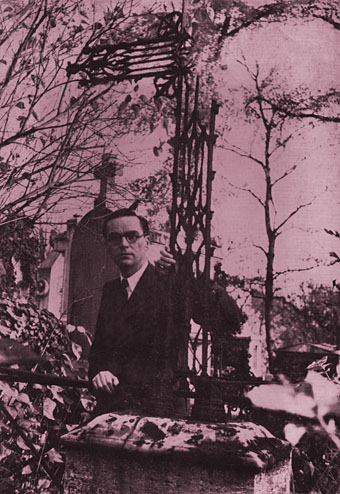
Monsieur Jullian as seen on the back cover of Dreamers of Decadence (1971).

Here at last is the long-promised (and long!) piece about the life and work of Philippe Jullian (1919–1977), a French writer and illustrator who’s become something of a cult figure of mine in recent years. Why the fascination? First and foremost because at the end of the 1960s he wrote Esthètes et Magiciens, or Dreamers of Decadence as it’s known to English readers, a book which effectively launched the Symbolist art revival and which remains the best introduction to Symbolist art and the aesthetic hothouse that was the 1890s. If I had to choose five favourite books Dreamers of Decadence would always be on the list. This point of obsession, and Philip Core’s account of the writer, made me curious about the rest of Jullian’s career.

jullian13

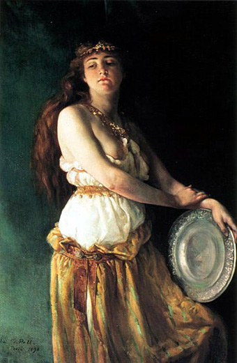
An illustration from Wilson & Jullian’s For Whom the Cloche Tolls (1953). “Tata has called these his Krafft-Ebbing (sic) pictures of his friend Kuno, whatever that means.”

Philip Core was friends with Philippe Jullian, and Core’s essential Camp: The Lie that Tells the Truth (1984) has Jullian as one of its dedicatees. It’s to Core’s appraisal that we have to turn for details of the man’s life. There is an autobiography, La Brocante (1975), but, like a number of other Jullian works, this doesn’t seem to have been translated and my French is dismally pauvre. Core’s piece begins:

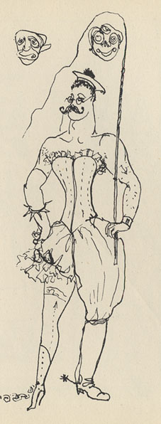
Philippe Jullian, born to the intellectual family of Bordeaux Protestants which produced the well-known French historian, Camille Jullian, was a last and lasting example of pre-war camp. His career began as an artist in Paris with a reputation for drag-acts parodying English spinsters. Snobbery, a talent for sensitive daydreaming, and a consuming passion for antiques, obscure art and social history, made a very different figure out of the thin and dreamy young man. Jullian suffered terribly during the Second World War; he managed to survive by visiting some disapproving cousins dressed as a maiden aunt, whom they were happy to feed. However, he made a mark in the world of Violet Trefusis, Natalie Barney and Vita Sackville-West by illustrating their books with his wiry and delicate doodles; this led to a social connection in England, where he produced many book jackets and covers for Vogue throughout the 1950s.

Having only seen Jullian in his besuited and bespectacled guise it’s difficult to imagine him dragged up, but the cross-dressing interest is apparent in his humorous collaboration with Angus Wilson and in a later novel, Flight into Egypt. As for the wiry and delicate doodles, they’re very much of their time, in style often resembling a less-assured Ronald Searle. One early commission in 1945 was for the first of what would become a celebrated series of artist labels for Château Mouton Rothschild. Later cover illustrations included a run for Penguin Books some of which can be found at Flickr.

Philip Core continues the story:

Elegant in the austerely tweedy way the French imagine to be English, Jullian exploited his very considerable talents as a writer, producing a series of camp novels throughout the 1950s (Scraps, Milord) which deal frankly but amusingly with the vicissitudes of handsome young men and face-lifted ladies, grey-haired antique dealers and criminals. One of the first to reconsider Symbolist painting, Jullian reached an enormous public in the 1960s with his gorgeous book, Dreamers of Decadence – where an encyclopaedic knowledge of the genre and its accompanying literature helped to create the boom in fin de siècle revivalism among dealers and museums.

An acerbic wit accompanied this vast worldly success; always docile to duchesses, Jullian could easily remark to a hostess who offered him a chocolate and cream pudding called Nègre en chemise, “I prefer them without.” Less kindly, to a gay friend who objected to Jullian’s poodles accompanying them into a country food shop by saying “Think where their noses have been”, he could also retort “Yes, that’s what I think whenever I see you kiss your mother.”

Continue reading “Philippe Jullian, connoisseur of the exotic”

Gilded volumes

thomson.jpg

The cover of an 1894 edition of Jane Austen’s novel designed by Hugh Thomson (1860–1920). The so-called “Peacock Edition” is illustrated throughout and a copy can be yours for £845 should you be so inclined. Or you can go to the Internet Archive and download the same edition for free. Thomson’s lavish cover design is absolutely right for the 1890s and as such would have suited Oscar Wilde far more than Jane Austen. AbeBooks drew my attention to this with a feature on rare books with gilded covers where, needless to say, all the titles are very expensive. A lot more reasonable but just as lavish is I Wonder by Marian Bantjes, the perfect gift for anyone who enjoys the art of book design.

Elsewhere on { feuilleton }
The book covers archive

Previously on { feuilleton }
I Wonder by Marian Bantjes

I Wonder by Marian Bantjes

bantjes1.jpg

Book of the year, without a doubt. I only bought this yesterday and it’s been another hectic week so I’ve barely had a chance to look at it, never mind read the thing. What we have is 208 pages of unique creations by one of my favourite graphic designers, Marian Bantjes, in a truly beautiful production from one of my favourite publishers, Thames & Hudson. The text comprises Bantjes’ musings on art, design, decoration, pattern, and her personal development, together with some well-chosen quotes from other writers. I could waste a lot of pixels larding the book with superlatives but you really have to see a copy for yourself, words and pictures do it little justice.

bantjes2.jpg

More than anything I’ve seen recently this book is a tactile experience, and yet another volume (that designation which Borges always used to emphasise) which makes a nonsense of the idea of screens as an adequate replacement for all books. The boards are blocked with a gold and silver pattern, the page edges are also blocked in gold and there’s a liberal use of gold ink throughout. There’s so much gold ink on the exterior that leafing through the pages leaves your clothes and fingertips lighted dusted with a glittering residue. As an additional grace note, each volume comes with a length of purple bookmark ribbon.

bantjes3.jpg

Unlike many monographs from graphic designers this isn’t a “greatest hits” collection (although I’d still buy it if it was), all the layouts were created for the book alone. It’s not all gold ink and florid decoration, there are 21st century designs as well as hand-drawn pieces. And pasta. She doesn’t need a computer or even a pencil, she can work wonders with pieces of dried flour and water. Of the quotes, two stood out following a cursory perusal. The first is a humorous occurrence of the famous “Less is more” from Mies van der Rohe, placed in small type on an otherwise blank page. The second is from Oscar Wilde’s The Critic as Artist (1890):

Still, the art that is frankly decorative is the art to live with. It is, of all our visible arts, the one art that creates in us both mood and temperament. Mere colour, unspoiled by meaning, and unallied with definite form, can speak to the soul in a thousand different ways. The harmony that resides in the delicate proportions of lines and masses becomes mirrored in the mind. The repetitions of pattern give us rest. The marvels of design stir the imagination.

You can have your imagination marvellously stirred for nineteen pounds and ninety-five pence.

bantjes4.jpg

Update: The Bantjes Covers, in which the designer explains how her cover design came together.

Elsewhere on { feuilleton }
The book covers archive

Previously on { feuilleton }
T&H: At the Sign of the Dolphin

Wildeana 3

teleny.jpg

Some recent pieces of Wilde news. The cover above is for a new edition of Teleny and Camille, Jon Macy‘s comic strip adaptation of the erotic novel attributed to Oscar Wilde and members of his Uranian circle:

Teleny is the haunted musical genius that everyone desires but no one has truly touched… until the fateful night that he senses Camille’s presence in the audience. The wealthy young man is instantly seduced by Teleny’s dark beauty and smoldering melancholy. This groundbreaking and powerful early gay novel, written in secret by Oscar Wilde and his anonymous circle of writers, is now re-interpreted as a graphic novel, in all its lush, pansexual excess.

I wrote something about the novel last year. I’m not convinced that Wilde penned the whole thing but I can see places where he may have contributed. There’s a marvellous scene in an all-white room, for example, which seems inspired by the obsessive decor in Des Esseintes’ house from À rebours, the novel which had a great influence on Dorian Gray (both book and character). I’d been intending on writing something substantial about Macy’s adaptation all summer but failed dismally due to a deluge of deadlines. Suffice to say it’s a very accomplished and (most important) erotic work, doing full justice to a story that makes many later erotic novels seem timid and evasive. The drawings are black-and-white throughout which gives a Beardsley-like quality in places, and Macy conveys a period feel without fretting over details as I’m afraid I’d be tempted to do. Northwest Press have published the new edition and have a selection of reviews here.

For the other Wildeana, Lambda Literary had a review of a new book by Matthew Hofer and Gary Scharnhorst, Oscar Wilde in America: The Interviews which sounds like another essential purchase. And the Independent had this story about a sale of Wilde letters which included one to a magazine editor that may be read as a proposition. Readers of Neil McKenna’s The Secret Life of Oscar Wilde will be familiar with the form and know that there’s no “maybe” about it; Priapus was calling.

Elsewhere on { feuilleton }
The gay artists archive
The Oscar Wilde archive

Several Salomés

fowler.jpg

The Dance of Salomé (1885) by Robert Fowler.

There’s always more to find… Unfortunately, Robert Fowler’s academic tableaux is a prime example of bad Victorian art: carefully modelled but overlit, dull and lifeless. And worst of all for the subject at hand: deeply unerotic. We’re supposed to believe that this woman wrapped in a bedsheet would exude enough eros to drive her father to lustful recklessness. This was the bloodless “good taste” against which Oscar Wilde and the Aesthetes set themselves.

moreau.jpg

Salomé Dancing before Herod (1876) by Gustave Moreau.

Wilde’s idea of Salomé can be seen here in one of Gustave Moreau‘s many paintings on the theme. Wilde would have preferred Moreau’s paintings, or something similar, to adorn his published play but he ended up with Aubrey Beardsley instead. You only have to compare Beardsley’s Stomach Dance with Fowler’s painting to see why Aubrey’s art made such a dramatic impression in the 1890s.

pell.jpg

Salomé (1890) by Ella Ferris Pell.

Ella Ferris Pell’s painting isn’t the only portrait of Salomé by a female artist of this period but it’s the one which Bram Dijkstra chose as the cover image for his excellent study Idols of Perversity: Fantasies of Feminine Evil in Fin-de-Siècle Culture (1986). Of this work Dijkstra writes:

In Pell’s painting a number of the most characteristic turn-of-the-century attributes of the biblical temptress are absent. She does not glare at us with a look of crazed sexual hunger; she does not have the wan, vampire features of the serpentine dancer; nor does she show herself to be a tubercular adolescent … Pell’s Salomé, a real life-woman, independent, confident, and assertive, was far more threatening, far more a visual declaration of defiance against the canons of male dominance than any of the celebrated viragoes and vampires created by turn-of-the-century intellectuals could ever have been. Such a woman could not be disposed of in as cavalier a fashion as the evil women in man’s mind. Her indomitable reality was this feminist Salomé’s most formidable weapon, far more dangerous than any imaginary decapitating sword.

henri.jpg

Salomé (1909), two paintings by Robert Henri.

Finally, there’s this pair of paintings by American artist Robert Henri whose work resembles John Singer Sargent’s in its shadowed backgrounds and light brushstrokes. Salomé was no longer a perennial theme by this point but Maud Allan’s improvised dance performance, Vision of Salomé, was proving enormously popular at the time Henri painted these pictures which may explain his choice of subject. There’s little in the rest of his oeuvre along similar lines.

Elsewhere on { feuilleton }
The Salomé archive