Exotica!

hypnotique.jpg

Hypnotique by Martin Denny (1959).

In Waikiki, where I live whenever I get the chance, a bistro known as the Daggar Bar and its accompanying Bora Bora Lounge has for some time been the mecca of people who enjoy a new type of music. I’m one of the gang that gathers there to hear the fresh, clean tropical sounds of Martin Denny and his group.

By the time James Michener wrote the sleeve notes for Hypnotique, Martin Denny‘s fifth album, the composer was attempting to broaden his horizons and outpace his imitators by introducing strings and vocals to augment his “fresh, clean tropical sounds”. This perhaps explains the curious jumble of objects on the album sleeve (a rifle?), my favourite among the wonderful covers Liberty Records’ art department supplied for Denny’s work. The best of these feature model Sandy Warner who appears in a variety of guises, shown here as a cross between a Japanese temptress (if we take the paper mobiles as a cue) and a precursor of Carolyn Jones as Morticia Addams. The art direction was by Bill Pate with photography by Garrett-Howard.

denny.jpg

top left: Exotica (1957); top right: Primitiva (1958).
bottom left: Afro-Desia (1959); bottom right: Exotica vol. III (1959).

Sandy Warner appeared on 16 album sleeves for Denny and was even persuaded to record an album of her own to capitalise on her renown as “Miss Exotica”. In design terms, these sleeves are some of the more successful products of the late Fifties’ fad for tribal kitsch. Other covers were crazier or more garish—and few could resist flaunting a bikini-clad woman—but Bill Pate showed more care with his layouts and Sandy Warner’s alluring presence went a long way towards conjuring the required mystique. Denny’s records aren’t too bad either although when it comes to tiki-fuelled easy listening I tend to prefer his rival Arthur Lyman, especially Taboo from 1958.

Large copies of the covers shown here can been seen at Shellac.org. There are many more sites with galleries devoted to this style of music and sleeve art; Space Age Pop A Go-Go and 317x are two of the better ones. And let’s not forget Dana Countryman’s Virtual Museum of Unusual LP Covers or LP Cover Lover (check the great blogroll) or the Retro Records Flickr Pool

Elsewhere on { feuilleton }
The album covers archive

Street Sounds Electro

electro.jpg

I spent much of the summer of 1983 playing games on a very primitive ZX Spectrum computer while listening to the first couple of Street Sounds Electro compilations. Those mix albums were among the best releases that year and remain highly sought after, seeing as they’ve never been reissued on CD.

face.jpg

The musical reputation of the compilations has overshadowed the sleeve design which was very distinctive for the time and undoubtedly a factor in their success. The vertical ELECTRO type was inspired by Neville Brody’s design for The Face which had turned the magazine’s title through ninety degrees the year before. Also very Brodyish was the use of photocopier-processed graphics and narrow typography although it should be pointed out that Brody hand-drew nearly all his headlines which left his imitators searching through type catalogues for approximations. The sleeve designs are credited to “Red Ranch for Carver’s” about whom I can find no information whatever. Things came full-circle when The Face ran a feature on the electro scene in 1984 giving Brody the opportunity to do a cover with his own variant on the sleeve layouts.

essential.jpg

Essential Electro 9-album box, HBOX 1 (1984).

One of the big attractions of these albums for me was the new directions they were opening up for electronic music. Outside the mainstream pop world electronica in the early Eighties meant either the polite fare of Tangerine Dream or the dreary sludge of minor industrial acts such as Portion Control. Cabaret Voltaire were still vital in the early 1980s: their thundering Crackdown single (with sleeve design by Neville Brody) was remixed for its 12-inch incarnation by dance producer John Luongo while electro producer John Robie (whose production is featured on Electro 1) remixed their Yashar single for Factory Records. But nothing matched the excitement of a bunch of NYC kids lifting Kraftwerk riffs and playing in a very unselfconscious manner with new and relatively cheap equipment, especially the Roland TR-808 drum machine which provides the backbone for many of these recordings.

Continue reading “Street Sounds Electro”

The art of Bob Pepper

pepper1.jpg

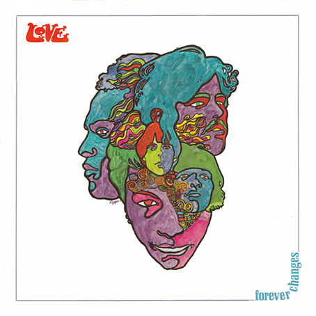
Forever Changes (1967) by Love.
Art by Bob Pepper, design by William S. Harvey.

Following yesterday’s post about Philip K Dick covers (and Erik Davis’s appraisal of the DAW cover), I decided to check out Bob Pepper’s work a bit more and it quickly became obvious I should have joined the dots with this particular artist years ago. Pepper’s work not only decorates one of the recognisable record sleeves of the late Sixties (above), he was working shortly afterwards as an illustrator on the celebrated series of fantasy reprints edited by Lin Carter for Ballantine books. Pepper’s connections with Elektra Records also saw him provide sleeve art for some of the eclectic releases on their Nonesuch label. What’s surprising to me now is the realisation that I’d been seeing his work for years in a variety of places and never noticed it was the same artist. Better late than never, I suppose.

pepper2.jpg

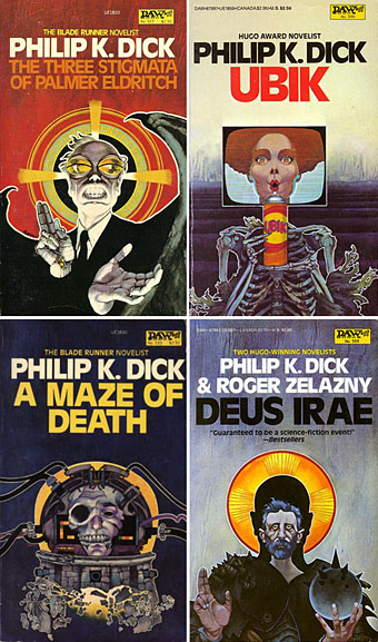
Four more Dick covers for a series of six published in 1982 to coincide with the release of Blade Runner. As with the cover for A Scanner Darkly (in the earlier post) these paintings are all portraits.

pepper3.jpg

A Voyage to Arcturus (1968) by David Lindsay.

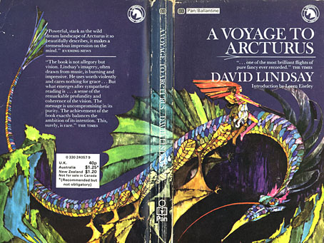
It was the success of the publication of The Lord of the Rings in America which inspired Betty Ballantine to publish a line of fantasy classics in the late Sixties. The series began its run in 1969 and continued until 1974. Lin Carter was commissioned as editor and given free reign to choose any title he thought might be suitable with the result that many of the books in the series—obscurities such as Lud-in-the-mist by Hope Mirrlees—received their first paperback publication. Carter also reprinted personal favourites which frequently shifted from fantasy to outright horror, such as the titles from HP Lovecraft and William Hope Hodgson. The range and scope of this line is what makes the series so notable today and the books have become highly-collectable as a result. Many artists were involved in producing the distinctive cover designs and Pepper’s illustrations were featured on the covers for Mervyn Peake, Lord Dunsany and James Branch Cabell, among others. Unfortunately the various pages devoted to these books aren’t very good at showing the paintings to their best advantage. For a long time Pepper’s cover for A Voyage to Arcturus was one of the few editions available that managed to show a scene from the book, rather than a generic sword-wielding barbarian.

pepper5.jpg

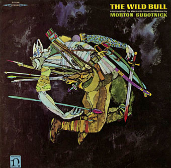
The Wild Bull (1968) by Morton Subotnick.

Nonesuch Records was Elektra’s subsidiary classical music label which not only produced classical recordings but also recordings from around the world in their Explorer series, and a range of original works of contemporary electronic music. I’m not positive that the sleeve above is a Pepper painting but it certainly looks like it. This is another surprise since I’ve had Morton Subnotnick‘s album on a reissue CD for years (with different artwork). The George Crumb recording below is Pepper’s work and I’ve had the original vinyl of that one for several years. The similarity between that sleeve and the one for Love is striking.

farmer.jpg

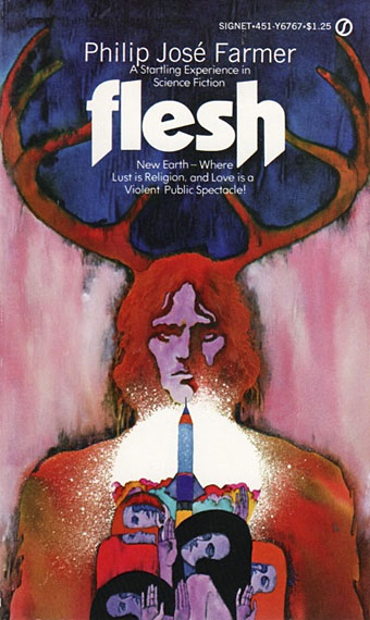
Flesh (1969) by Philip José Farmer.

pepper6.jpg

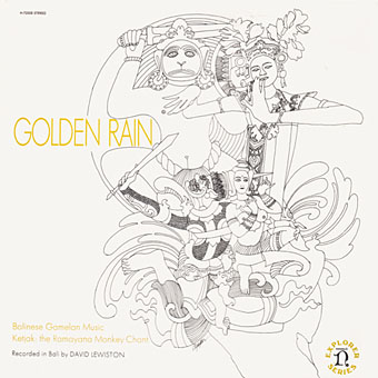
Golden Rain – Balinese Gamelan Music – Ketjak: The Ramayana Monkey Dance (1969) by Various Artists.
Art by Bob Pepper, design by William S. Harvey.

pepper4.jpg

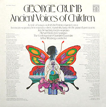
Ancient Voices of Children (1971) by George Crumb.
Art by Bob Pepper, design by Robert W. Zingmark.

delany.jpg

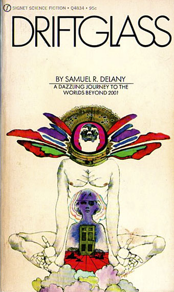
Driftglass (1971) by Samuel R. Delany.

pepper7.jpg

Debussy’s Greatest Hits (1972).

pepper8.jpg

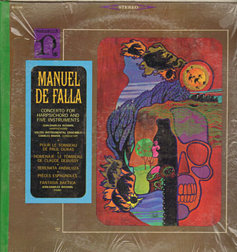
Concerto For Harpsichord And Five Instruments by Manuel De Falla (no date).

ellison.jpg

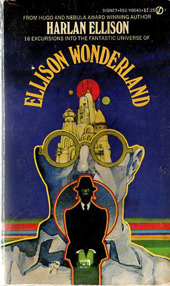
Ellison Wonderland (1974) by Harlan Ellison.

pepper9.jpg

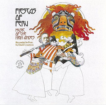
Fiestas of Peru: Music of the High Andes (1975) by Various Artists.
Art by Bob Pepper, design by Jo Ann Gruber.

japan.jpg

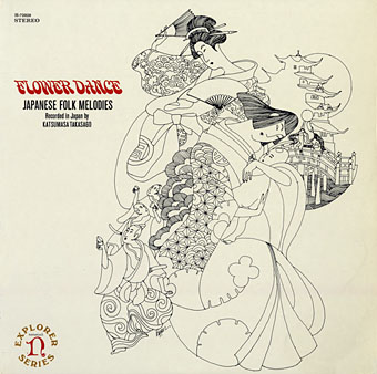
Flower Dance: Japanese Folk Melodies (no date) by Kofu Kikusui, The Noday Family, Nakagawa & Oishi.
Art by Bob Pepper, direction by William S. Harvey, design by Elaine Gongora.

Pepper is retired now but produced artwork for Dark Tower, a fantasy boardgame, in 1981. The game still has its enthusiasts, and this site features a short interview with the artist.

Update: more about the Ballantine covers.

Update 2: a large scan of the George Crumb cover art.

Update 3: More album and book covers added.

Elsewhere on { feuilleton }
The album covers archive
The book covers archive
The illustrators archive

Previously on { feuilleton}
Philip K Dick book covers
Masonic fonts and the designer’s dark materials

Oh Yeah by Charles Mingus

mingus_oh_yeah.jpg

Oh Yeah (1962). Sleeve design by Loring Eutemey.

“People say that I’m hollering. Man, I feel like hollering.” Charles Mingus.

Listening to this great album this week had me searching for the equally great sleeve design from the vinyl edition which vanished from the CD reissue. The cover that replaced it is a dour photo of a gloomy-looking Mingus, completely unsuited to an album full of joyous noise. Happily there’s a Japanese edition that preserves the original design. As far as I can gather Loring Eutemey was a house designer at Atlantic, responsible for many of their jazz sleeves but also providing covers for rock albums including Iron Butterfly’s dumb psychedelic opus, In-A-Gadda-Da-Vida. Lots of playful typography evident in Eutemey’s designs and bold, hand-drawn graphics à la Saul Bass, a style very popular in the Sixties not least because of Bass’s considerable influence.

eutemey.jpg

Designs by Loring Eutemey: Born Under A Bad Sign (1967), In-A-Gadda-Da-Vida (1968).

That playfulness especially suits an album where Mingus set aside his bass to play piano and sing (or, more correctly, holler) his way through seven tracks of energetic craziness. There are some amazing solos here from Rahsaan Roland Kirk, a blind musician famous for playing two saxophones at once, one in each hand. The opening Hog Callin’ Blues is one of my favourite jazz pieces, a number where bop rawness approaches the equivalent rawness of Fifties’ rock’n’roll or Chess blues. Always great to play (loud!) to people who think jazz is all polite cocktail music and studied cool. Mingus recorded lots of great albums, of course, and I imagine this is regarded as a throwaway novelty by many of his more dedicated listeners, but it remains one I keep returning to.

Charles Mingus—piano and vocals
Rahsaan Roland Kirk—flute, siren, tenor sax, manzello, and strich
Booker Ervin—tenor sax
Jimmy Knepper—trombone
Doug Watkins—bass
Dannie Richmond—drums

1 Hog Callin’ Blues (7:26)
2 Devil Woman (9:38)
3 Wham Bam Thank You Ma’am (4:41)
4 Ecclusiastics (6:55)
5 Oh Lord Don’t Let Them Drop That Atomic Bomb On Me (5:38)
6 Eat That Chicken (4:36)
7 Passions Of A Man (4:52)

Elsewhere on { feuilleton }
The album covers archive

Simplicissimus

simplicissimus.jpg

Every issue of the weekly German satire magazine—from 1896 to 1944—is available for download as a free PDF here. Amazing.

Combining brash and politically daring content, a bright, immediate, surprisingly modern graphic style, Simplicissimus featured the work of German cartoonist Thomas Theodor Heine on every cover, and published the work of writers such as Thomas Mann and Rainer Maria Rilke. Its most reliable targets for caricature were stiff Prussian military figures, and rigid German social and class distinctions as seen from the more relaxed, liberal atmosphere of Munich.

Yes, the content is in German but Simplicissimus, like Punch, featured cartoons (some in strip form) and illustrations as well. Each issue also includes a couple of pages of adverts that are fun to look at. Lots of samples from its visual contributors, including the great Heinrich Kley, here. Via Design Observer.

Previously on { feuilleton }
Revenant volumes: Bob Haberfield, New Worlds and others
100 Years of Magazine Covers
It’s a pulp, pulp, pulp world
Vintage magazine art II
The art of Heinrich Kley, 1863–1945
Neville Brody and Fetish Records
View: The Modern Magazine
Vintage magazine art
Oz magazine, 1967–73