Weekend links 668

escher.jpg

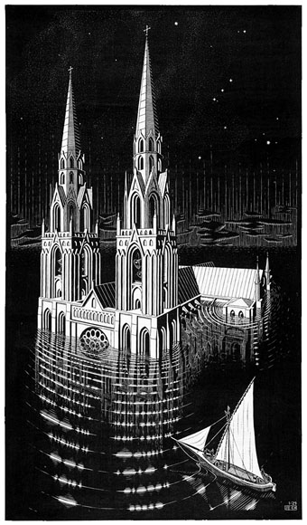
The Drowned Cathedral (1929) by MC Escher.

• “All Saints’ was the last of the seven parish churches to fall headlong into the waves. The drowned church was doomed to lie in a gulley not far out to sea, a habitat for sponges and crabs, and yet it lives on, unvanquishable; for—as the story of Britain’s lost cities, ghost towns, and vanished villages tells us—what has disappeared beneath the sea can rebuild itself in the mind.” Matthew Green explores the history of Dunwich, Suffolk.

• “Why do certain artists endure and become (dread word) ‘iconic’, while some are forgotten or sidelined or only grudgingly acknowledged?” Ian Penman talking to Jeremy Allen about his new book, Fassbinder Thousands of Mirrors.

• Coming soon from Strange Attractor: A new edition of England’s Hidden Reverse, David Keenan’s study of the lives and music of Coil, Nurse With Wound and Current 93.

• “What is electronic music?” Daphne Oram, Desmond Briscoe and David Cain of the BBC Radiophonic Workshop are here to explain.

• “Direct evidence of the use of multiple drugs in Bronze Age Menorca (Western Mediterranean) from human hair analysis.”

• New music: Timespan by Majeure, and Microdosing by African Head Charge.

• “Future of Borges estate in limbo as widow doesn’t leave will.”

Arooj Aftab’s favourite albums.

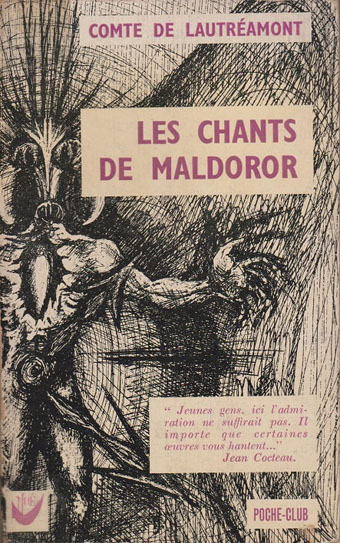
Paperback Covers on Tumblr.

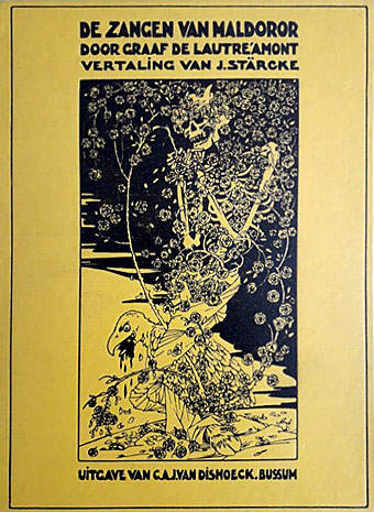
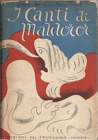
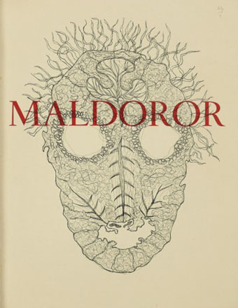
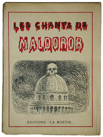
The Engulfed Cathedral (1974) by Tomita | Engulfed Cathedral (1981) by John Carpenter | La Cathédrale Engloutie (2003) by Sora

Weekend links 656

escher.jpg

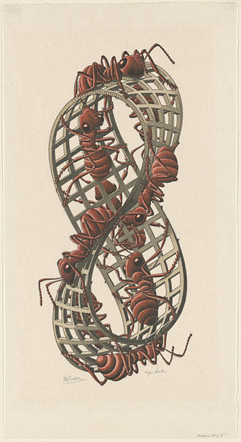
Mobius Strip II (1963) by MC Escher.

• Old music: Warp Records is reissuing two recent Jon Hassell discs later this year: The Living City (Hassell’s ensemble playing live in NYC, 1989) and Psychogeography (Zones Of Feeling) (remixes from City: Works Of Fiction), which will be available as standalone releases or bundled together as Further Fictions together with Hassell’s Atmospherics book.

• “His library is an immense and enviable wellspring, a demimonde of objects by murky creators who for decades have gnawed away at the inner organs of polite society.” Steven Heller talks to Glenn Bray about Library, an 800-page collection of scans from Bray’s trove of books, comics and print ephemera.

• New music: Tsathoggua, the latest in the Lovecraftian series of Cryo Chamber Collaborations which reminds me that I’m still missing the more recent entries. Also the non-Lovecraftian Coil by Ian Boddy.

• “Music is a way to express yourself beyond words,” says Hildur Guðnadóttir.

• See this year’s winners of the annual Close-up Photographer of the Year competition.

• At Dennis Cooper’s: Spotlight on…Ishmael Reed The Last Days of Louisiana Red (1974).

• A few new photos of Michael Heizer’s City in the Nevada desert.

City Of Night (1994) by David Toop & Max Eastley | City As Memory (1995) by John Foxx | City Appearing (2013) by Julia Holter


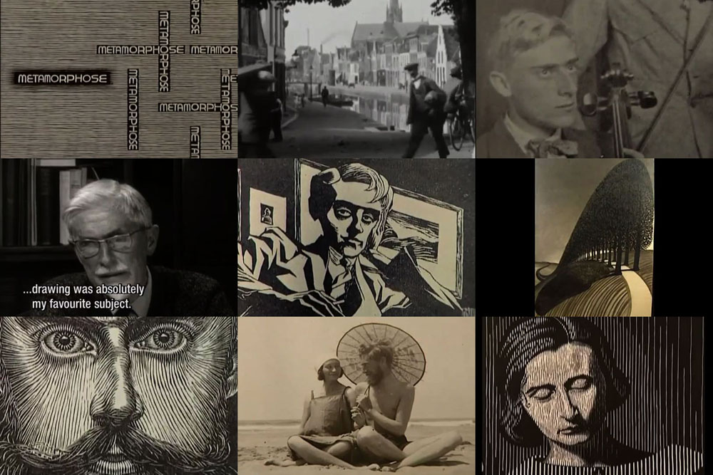
Metamorphose: MC Escher

escher1.jpg

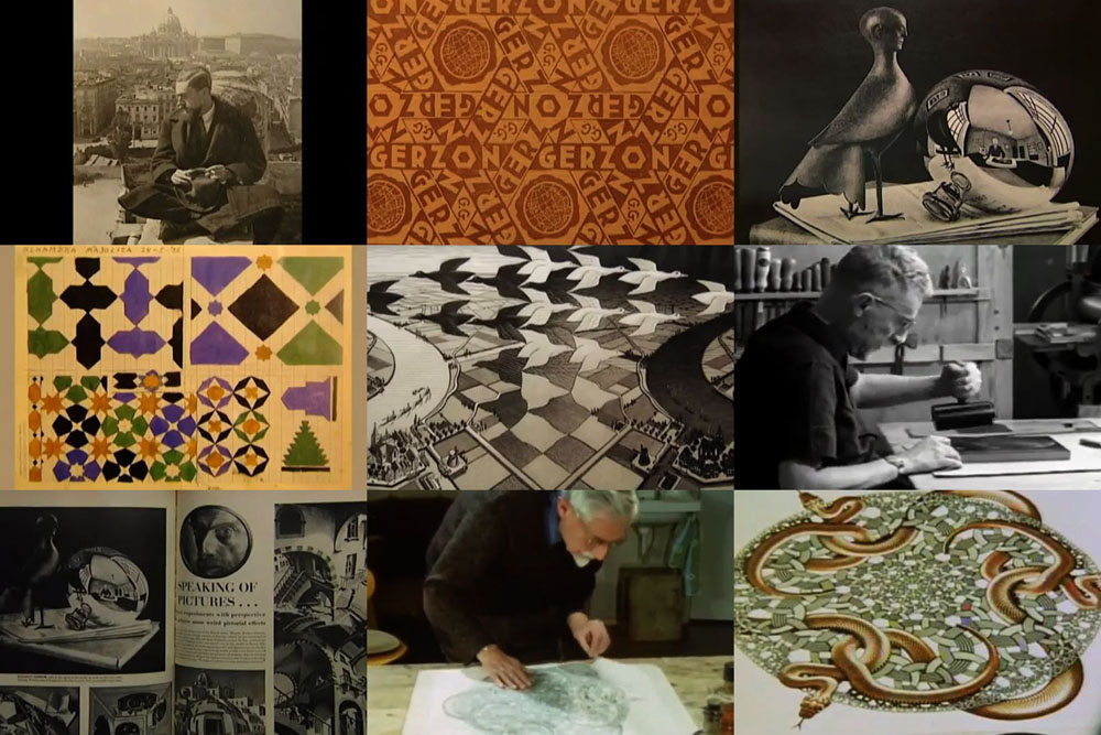
This is a Dutch documentary with narration in English, made in 1998 for the centenary of MC Escher’s birth. Unlike other films about the artist which examine the famous tessellated patterns and visual paradoxes the approach here is a strictly biographical one. Being a Dutch production, the producers had access to a large quantity of material about Escher’s life: photographs, diaries, sketches and so on, which means we learn a lot about his early years and his subsequent travels in Italy. The film seeks out some of the places that Escher drew in the 1920s, the tiny southern towns whose architecture would turn up decades later in many of his well-known prints. There’s also a visit to the Alhambra in Spain where Escher not only sketched the architecture but also made copies of the tile patterns. Best of all is footage of the artist himself in the 1960s talking about his work, together with extracts from other films that show him pulling prints from his engravings.

escher2.jpg

What we don’t have is any indication as to how an artist who was struggling to make a living for at least half his career suddenly came to find his work featured in TIME magazine in the 1950s. Expert commentary in documentaries can sometimes seem superfluous but this is a film that would have benefited from the contribution of someone like Bruno Ernst whose Magic Mirror of MC Escher is an excellent study of the artist’s working methods and the thinking behind them. The film alludes to the growing popularity of Escher’s prints in the 1960s but there’s no mention of this being fuelled in part by illicit reprinting. While scientists and mathematicians were decorating their offices with bona fide Escher prints, their drug-taking students were doing the same in their dorm rooms with bootleg blacklight posters. Escher wasn’t impressed by the hippies, and showed little interest in the art world; there’s a brief mention of Dadaism in a reading from one of his letters but we’re not told what he thought of the Dadaists, or of the Surrealists who would seem like his natural allies, Magritte especially. (Escher’s Castle in the Air woodcut from 1928 was made 31 years before Magritte’s Castle of the Pyrenees.) Art critics reciprocated by ignoring Escher until his popularity made the avoidance unsustainable, after which the default position was to dismiss him as too “tricky” or coldly cerebral. Escher’s outsider status is almost unique in 20th-century art, and warrants a mention at least. Caveats aside, Metamorphose is still worth seeing, especially if you only know the artist from his later works. Watch it here.

Previously on { feuilleton }
More swans and robots
Suspiria details
MC Escher book covers
Relativity
Escher’s snakes
The Fantastic World of MC Escher
MC Escher album covers
Escher and Schrofer

A Penrose pentagram

hofstadter.jpg

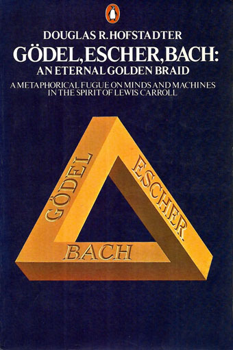
A classic text although that cover art always looks a little off. I’m sure MC Escher would have insisted on the triangle being equilateral.

Most people are familiar with the Penrose triangle by sight even if they don’t know who “Penrose” was. (Psychiatrist Lionel, together with his son, Roger, the celebrated mathematician and physicist.) I’ve been playing with these things for years, most notably on the cover art I created for Zones by Hawkwind, although the triangle also formed the basis for the robot pathways I created a couple of years ago when illustrating Bruce Sterling’s Robot Artists and Black Swans.

pentagram.jpg

Earlier this week it occurred to me that I hadn’t tried applying the Penrose effect to a pentagram. For a fleeting moment I thought the idea might be a novel one but a quick web search disabused me of this; plenty of similar examples exist already. Here it is anyway, after 20 minutes or so in Illustrator. I’m tempted to try a few more things like this when I have the time. Many possibilities present themselves.

Previously on { feuilleton }
More Swans and Robots

More Swans and Robots

robotartists01.jpg

Real Italian fantascienza is an authentic expression of Italian culture, which is brainy, nerdy, gutsy and pulp, it’s far-out but down-home, and raw but civilized. I would not proclaim that it’s the best fantasy writing ever created in the world, but it encourages and motivates me.

Bruce Sterling talking to Paul Semel about his collection of fantascienza stories, Robot Artists and Black Swans. My cover design was posted here last September; the book itself is published this week by Tachyon so I can at finally reveal the interior illustrations. Sterling’s collection presents seven stories written by his Italian alter-ego, Bruno Argento, with several of them appearing in English for the first time. The Italian theme informs the design as well as the content, although the associations aren’t always as obvious as they are in my illustrations for Sterling’s earlier fantascienza book for Tachyon, Pirate Utopia, the art and design for which adapted graphics by the Italian Futurists.

robotartists08.jpg

As I mentioned in the earlier post, while searching for more recent Italian graphics I came across the work of Franco Grignani (1908–1999), a designer whose most famous work was the Woolmark logo, one of those international symbols that most people will have seen even if few know who was responsible for its creation. The Woolmark’s black-and-white stripes are typical of Grignani’s designs, many of which work variations on the eye-jangling Op Art style pioneered by Bridget Riley. Grignani’s work seemed at first as though it might offer a suitable model for the cover design but it quickly became apparent that his style wasn’t suitable for this title so I went in another direction. Grignani’s influence is present inside the book, however, in the more abstracted illustrations, and in the parallel lines that provide a connecting thread between the stories and their illustrations. The Eurostile fonts used throughout the book also have an Italian flavour. They’re a little clichéd for science fiction but I liked the way they combined SF associations with more Italian design, being the work of Alessandro Butti and Aldo Novarese.

robotartists15.jpg

The other design influence, and a more identifiable source, is MC Escher, a choice prompted by the black swans in the title. Escher’s tessellated patterns feature a variety of animals, swans included, so I adapted two of the artist’s swan patterns to prevent the illustration from being robot-heavy. Escher also has an Italian side, as it happens; he enjoyed holidaying in Italy, and the vernacular architecture of the country’s small coastal towns may be found in many of his lithographs. The Escher swans led in turn to a self-indulgent illustration that fills two pages at the front of the book, something that came about after I was playing with Penrose triangles in Illustrator. I’d made a group of these impossible shapes into a construction which a little tweaking turned into a piece of equally impossible architecture, rather like those in the Escher-influenced mobile game, Monument Valley. All that was required to flesh things out was to cover the walls in a brick pattern then add a few swans and robots.

Continue reading “More Swans and Robots”