The story’s first appearance in Strange Tales of Mystery and Terror, September 1931. No illustrator credited.
Rod Serling’s Night Gallery is a series I’d have happily watched if one of the UK channels had rebroadcast it in the 1980s, the way that Channel 4 did with the original Twilight Zone. This weekend I watched for the first time the opening episode of Night Gallery‘s third and final season, an adaptation by Halsted Welles of Clark Ashton Smith’s The Return of the Sorcerer. Smith is a writer whose works are still mostly neglected by film and television but he was in good company in Night Gallery, a series which featured adaptations of stories by a number of fellow Weird Tales writers including HP Lovecraft, Fritz Leiber and Robert Bloch. The story is one of Smith’s modern-day horror tales in which a poverty-stricken translator is offered a lucrative position at an old and sinister house, a place where a fearful occultist requires translations of an ancient volume. The Arabic text turns out to be passages from an early edition of everybody’s favourite forbidden tome, the Necronomicon, and Smith’s story, which was published in Strange Tales of Mystery and Terror in 1931, is the first outside Lovecraft’s own to mention the book, thus beginning the expansion of the Cthulhu Mythos by other hands.
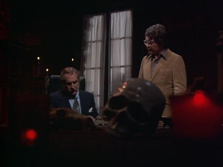
The Night Gallery adaptation was broadcast in 1972. Unlike the first two seasons, where episodes ran for an hour, the third season reduced the running time to under 30 minutes which doesn’t give director Jeannot Szwarc (credited as Jean Szwarc) any time to build up the suspense, if he was capable of such a thing. If you’ve ever seen any of Swarc’s feature films you know not to raise your expectations. As a compensation for the absense of atmosphere we get some striking set designs and a decent cast. The fearful magus, John Carnby, is played by Vincent Price, encountering the Necronomicon for the second time in his career after he’d earlier used the book to summon an eldritch monstrosity in Roger Corman’s The Haunted Palace. Bill Bixby plays the wary translator, while Patricia Sterling is Carnby’s toad-loving partner in Satanism, an addition to the story by Halstead Welles, whose presence adds an extra dimension to the proceedings. The episode could never be considered a lost classic but I enjoy seeing stories by the Weird Tales writers making their first infiltrations into the wider culture. This one is worth watching for Vincent Price and the magical decor alone. I think I ought to go looking for more Night Gallery episodes.
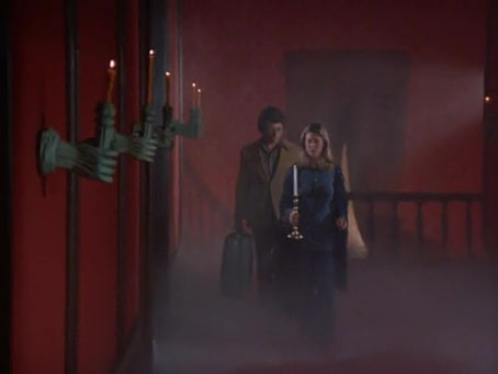
More of those Cocteau hands-through-the-wall. Bixby’s character doesn’t seem very perturbed that the scarlet hall is filled with mysterious vapours.
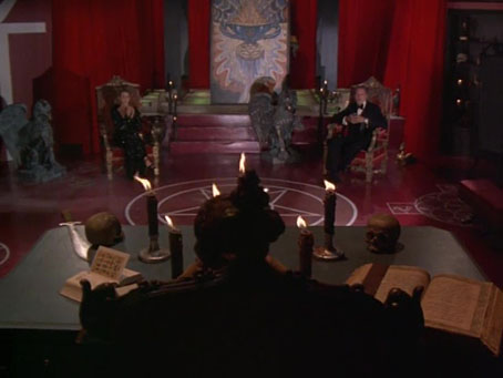
Mystical decor: on the left, Frieda Harris’s Ace of Discs from the Thoth Tarot deck; on the right, The Ancient of Days by William Blake.
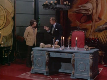
Mystical/Satanic decor: the painting in the background is Frieda Harris’s Ace of Cups from the Thoth Tarot deck.
Previously on { feuilleton }
• The Cthulhu Mythos in the pulps
• Illustrating Zothique
• The Plutonian Drug
• More trip texts
• Yuggoth details
• The Garden of Adompha
• The City of the Singing Flame
• Haschisch Hallucinations by HE Gowers
• Odes and Sonnets by Clark Ashton Smith
• Clark Ashton Smith book covers