Weekend links 275

wessi.jpg

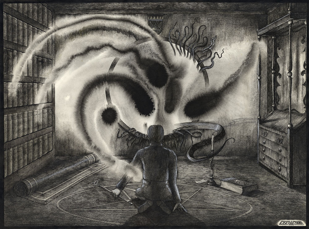
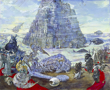
A painting from the Projekt Babelturm series by Wessi.

• “The first thing I would say is that I have no idea what authentic psych music is, and I have no wish to pursue that either. To me the idea of real psych is a paradox. I can’t see how you can have such a thing as real psychedelia when the whole thing is based on a psychedelic drug that gives you hallucinations and illusions and layers and layers of unreality.” Rob Chapman talking to Ben Graham about his new book, Psychedelia And Other Colours.

Elsewhere in a rather psychedelic week: Rob Young reviewed Chapman’s book for the New Statesman; Dangerous Minds posted “Hypnotic video of how a psychedelic masterpiece is made“; and in Germany a homeopathy conference “ended in chaos in Germany after dozens of delegates took a LSD-like drug and started suffering from hallucinations.”

• Coming soon from Dark Entries (so to speak), another collection of Patrick Cowley‘s music for gay porn films.

Jonathan Barnbrook works some quotes from JG Ballard into the British Road Sign Project.

• “Sorcery is more popular than football in Morocco,” says writer and filmmaker Abdellah Taïa.

• “If you’re going to make something, you should try and be wild,” says Mica Levi.

• Coca-Cola Milanese: Patrick Ellis considers the state of the world’s fair in 2015.

• Hear two pieces from Collapse, the forthcoming album by Drew McDowall.

• Mix of the week: Secret Thirteen Mix 162 by Ketev (Yair Elazar Glotman).

Emptyset’s Signal transforms Earth’s ionosphere into sound art.

Paul Laffoley: The Force Structure of the Mystical Experience.

• Fuck off, Star Wars, Ben Wheatley’s High Rise is on its way.
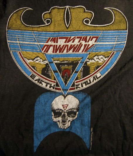
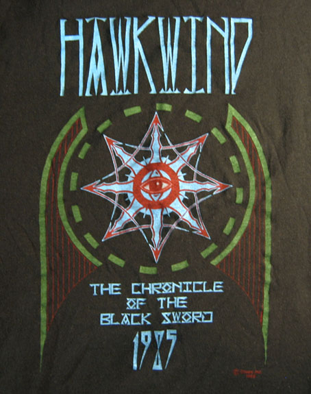
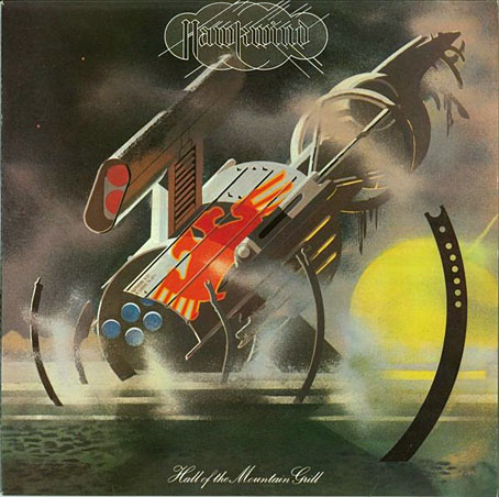
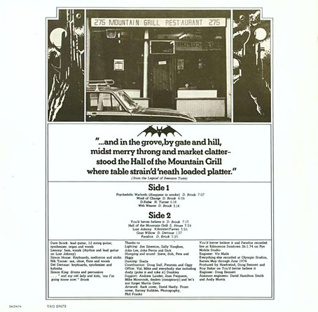
Ideologic Organ

Psychedelic Ride (1967) by The Ides | Psychedelic Warlords (Disappear In Smoke) (1974) by Hawkwind | Psychedelic Sewing Room (1989) by Bongwater

The Gable Window

gable.jpg

The Gable Window (1984) by John Coulthart.

Presenting some of my first Lovecraftian illustrations, neither of which have been made public before. This drawing, and the one below, are as much Derlethian as they are Lovecraftian, depicting scenes from a short story and a short novel written by August Derleth from fragments and notes found in Lovecraft’s papers. The Gable Window was collected in The Survivor and Others (1957) which happens to be the only Lovecraft-related title I own in its original Arkham House printing. Derleth’s posthumous collaborations are often more Derleth than Lovecraft but I liked the central idea of The Gable Window which, like The Music of Erich Zann, concerns a window that also serves as a portal to other dimensions.

lurker.jpg

The Lurker at the Threshold (1982) by John Coulthart.

Before I began adapting The Haunter of the Dark in 1986 I hadn’t made much of an attempt to illustrate Lovecraft seriously. These drawings and a handful of other pieces were more like experimental sketches, although The Gable Window is obviously a very polished piece of work. Rather than depict anything overtly monstrous, each piece began as an arrangement of ink splotches and washes applied to cartridge paper soaked with water. The Lurker at the Threshold is one of several small pictures made with this technique in 1982, none of which are very successful. This one doesn’t look too bad but the best one, depicting the climax of The Dunwich Horror, I sent to the late Roger Dobson for possible use in an issue of Aklo, and haven’t seen it since. The Gable Window refined the technique by using fewer splotches and a more detailed drawing applied afterwards. I’ve never been happy with the figure, and the books on the left are lazily done, but it’s one of the better things I was doing in 1984. The biggest surprise looking at the drawing again was noticing the crest over the window which features a triangle/crescent motif that’s very similar to the one I designed a year later for Hawkwind’s Chronicle of the Black Sword album. This wasnt intentional.

gable-detail.jpg

Today The Gable Window seems like an indicator of where my head was at during this time. I was tired of doing Hawkwind-related things, and eager to immerse myself in something different; a series of Ballard illustrations was one potential way forward, Lovecraft was another. A year later I’d made a decision and, as it were, stepped through the window.

Elsewhere on { feuilleton }
The Lovecraft archive

Rock shirts

shirt1.jpg

Arriving in the post at the end of last week was this T-shirt for British Doom band The Wounded Kings. The Shadow Over Atlantis (2010) was the band’s second album, and they asked permission a while ago to use my Cthulhuesque De Profundis piece on this limited edition shirt. Permission was granted happily enough, my only concern was that the fine detail and dark tones might not reproduce well on black fabric. The printing is remarkably good, however, and the circular design and type layout works very well. The shirts are on sale here.

shirt2.jpg

All of which reminded me that I have a couple of shirts from the Hawkwind era in the 1980s. I’ve not aired these designs before, mainly because the Earth Ritual design is one of my many pieces of Hawk-art that I find amateurish. I used to put considerable effort into the cover designs (some of them, anyway; a few were pieces of art sent to Dave Brock as samples that were later used as official covers); but much of the art I produced for the tour programs and merchandise was done in haste, and should have been a lot better considering it was being used for costly souvenirs.

Earth Ritual was the title of an EP released in 1984 that was notable for having Lemmy as guest bassist, his first appearance on a Hawkwind record after being sacked from the band in 1975. I did the cover for that one but I don’t like it very much. The 1984 tour was named after the EP, hence the shirt, although the show was nothing remotely like the elaborate Space Ritual concept. The triangle with a bar on the skull is the alchemical symbol for Earth, a detail the band used in their stage set. I’ve never liked that skull which is very badly drawn, I’d have been better off using a photocopy of the skull on this drawing from the same year. The design was drawn in black ink on white paper; I had no say in the colouring which was done by the merchandise company. From the same drawing they also made small enamel badges (where the skull looks even worse!), and a sew-on patch which looks much better since they dispensed with the skull.

shirt3.jpg

This was the shirt design for the 1985 tour, one of the final designs for the Chronicle of the Black Sword project, and one of the very last pieces I did for Hawkwind. The design of this one is a little more successful although once again the colours weren’t my choice.

These aren’t the only shirts I’ve done for the music world, in addition to other occasional work for metal bands I produced many exclusive designs for Cradle of Filth from 2001–2005 but they never sent me any of those. To return to De Profundis, I ought to note that the artwork is available as a print from CafePress.

Previously on { feuilleton }
The Cosmic Grill
Void City
Hawk things
The Sonic Assassins
New things for July
Barney Bubbles: artist and designer

The Cosmic Grill

hotmg1.jpg

Design and illustration by Barney Bubbles.

The past week’s music listening has alternated between the back catalogue of Seattle band, Earth (who I recommend highly), and the early recordings of my erstwhile employers, Hawkwind. The latter were reissued recently in a 10-CD box, This Is Your Captain Speaking…Your Captain Is Dead (The Albums And Singles 1970–1974) which I also recommend, it’s very good value, and packages the albums in those facsimile card sleeves that now seem de rigueur for album reissues. A swathe of my rare Hawkwind vinyl got sold off circa 1990, and I’ve never replaced any of the albums or singles so this was a good opportunity to catch up. If you like this period of the band there’s the added bonus of the complete Greasy Truckers concert from the Roundhouse in 1972, a ramshackle performance that nonetheless sounds pristine (my Greasy Truckers vinyl—which I do still own—was ruined by a previous owner with a spillage of tea on the Hawkwind side); there’s also the entirety of the 1999 Party concert from Chicago which I’d not heard before.

hotmg2.jpg

Listening again to Hall Of The Mountain Grill (1974) had me thinking about the origin of the album’s title. Hawkwind never took themselves as seriously as many of their contemporaries, but naming an album of ostensible space rock after a very mundane café in the Portobello Road was one of their more eccentric moments. The humour is compounded by Barney Bubbles’ cover design which for the title uses the kind of typeface (Palace Script) that you see on menus; on the inner sleeve there’s a photo of the fabled restaurant flanked by a pair of Barney’s futuristic towers. The verse beneath the photo (“from the Legend of Beenzon Toste”) refers to nearby Ladbroke Grove, and, of course, to Notting Hill Gate which in 1974 was still a haven for counterculture freaks, the very antithesis of that film. The verse was probably the work of Robert Calvert who explained the attraction of the restaurant in Pete Frame’s Hawkwind family tree:

The Mountain Grill was a working man’s café in Portobello Road—frequented by all the dross and dregs of humanity. Dave Brock always used to go and eat there—which is how I first met him…because I used to eat there too, when I worked on Frendz magazine. It was a kind of Left Bank café/meeting place for Notting Hill longhairs—a true artists’ hangout…but it never became chic, even though Marc Bolan, David Bowie and people like that often went there to eat lunch.

portobello.jpg

Photos on Flickr show how the place looked in 1977 when the sign from the album sleeve was still intact, and also in 2003 shortly before the restaurant closed down. The premises are a very different kind of eaterie today, remodelled and upmarket as befits a gentrified area.

Previously on { feuilleton }
Void City
Hawk things
The Sonic Assassins
New things for July
Barney Bubbles: artist and designer

Weekend links 260

burgher.jpg

Bachelor with “demons” (Sleezy) [sic] (2015) by Elijah Burgher. One of a new series of artworks by Burgher showing at Zieher Smith & Horton, NYC.

• The week in HR Giger: Belinda Sallin on her documentary, Dark Star: HR Giger’s World; Ron Kretsch on the unseen cinema of HR Giger; Matthew Cheney thinks the Gigeresque has become too familiar. I can see his point but originality is always in short supply; asking for something new means setting yourself up for a long wait.

Pwdre ser, or Star jelly, is “a pale, foul-smelling jelly traditionally associated with meteorite falls”. The Rot of the Stars at the ICA, London, is an audio-visual art collaboration between Jo Fisher and Mark Pilkington dealing with the mysterious substance.

• Mixes of the week: A Tri Angle Records birthday DJ set by Björk; OreCast 196 mix by Ilius; Secret Thirteen Mix 153 by M!R!M.

To assume that a given group of people would be similar because of birthdate, Ryder thought, was to risk committing a fallacy. “The burden of proof is on those who insist that the cohort acquires the organised characteristics of some kind of temporal community,” he wrote. “This may be a fruitful hypothesis in the study of small groups of coevals in artistic or political movements but it scarcely applies to more than a small minority of the cohort in a mass society.”

Generational thinking is a bogus way to understand the world says Rebecca Onion

The plan for an airport above the streets of Manhattan. Related: Charles Glover‘s similar plan for London.

Errol Morris on how typography shapes our perception of truth.

Michael Moorcock enjoyed The Vorrh, a novel by Brian Catling.

Clive Barker on almost dying, hustling, and killing Pinhead.

• A new Penguin Books website for Angela Carter.

• Callum James on artist Philip Core.

A Beginner’s Guide to King Tubby

King Tubby Meets Rockers Uptown (1976) by Augustus Pablo | Star Cannibal (1982) by Hawkwind | Sleazy (1983) by Jah Wobble, The Edge, Holger Czukay