
Luke Jerram’s Glass Microbiology
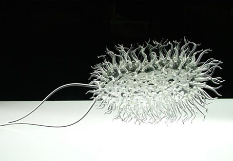
Large E-Coli.
Or art as virus…. Just because micro-organisms can make us seriously ill doesn’t mean they can’t be beautiful. Luke Jerram‘s glass renderings of some of the most deadly examples are on display at the Smithfield Gallery, London, until October 3rd.
The sculptures were designed in consultation with virologists from the University of Bristol using a combination of different scientific photographs and models. They were made in collaboration with glassblowers Kim George, Brian Jones and Norman Veitch. (More.)
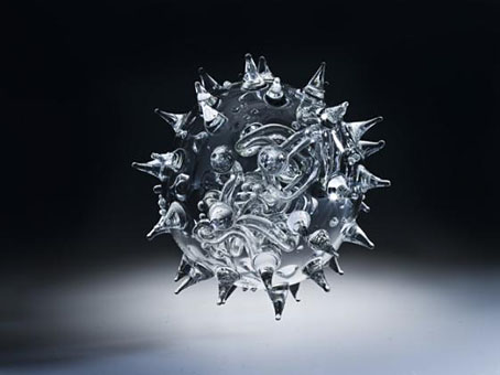
Avian flu.
Previously on { feuilleton }
• Andy Paiko’s glass art
• The art of Josiah McElheny
• The art of Angelo Filomeno
• IKO stained glass
• Cristalophonics: searching for the Cocteau sound
• Glass engines and marble machines
• Wesley Fleming’s glass insects
• The art of Lucio Bubacco
• The glass menagerie
The recurrent pose 29
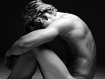
Taner photographed by Hedi Slimane.
No, I don’t go looking for these deliberately, they just keep turning up. This latest manifestation of the Flandrin pose is from a photo shoot by Hedi Slimane. I was going to write a bit more on this subject but haven’t had the opportunity today since the webhost has been having problems and the site was down for a few hours. Something for later. Meanwhile, a commenter recently pointed out this similar example by John Jude Palencar, a Flandrinesque painting for a book cover.
Elsewhere on { feuilleton }
• The recurrent pose archive
Gristleism
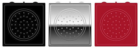
In which the Buddha Machine returns as a bespoke instrument/greatest hits package from Industrial music outfit Throbbing Gristle. Having been a TG aficionado for many years, and being the proud owner of a Buddha Machine, this item looks like an essential purchase.
Thirteen original TG loops: a mix of experimental noise, industrial drone, and classic melodies and rhythms.
Built-in 50mm speaker, volume control, pitch-shift control and loop selector switch.
Features more loops and almost twice the frequency range of the original Buddha Machines.
Powered by two AA batteries.
Palm-Sized: W 67mm x H 69mm x D 35mm
Available in three colours: Black, Chrome and Red
UK Retail Price: 19.99 GPB
Designed by: Throbbing Gristle & Christiaan Virant
Concept by: Christiaan Virant
Manufactured by: Industrial Records Ltd
Music by: Throbbing Gristle
While we’re on the subject of music/noise and musical noise, there’s a couple of other recent discoveries worthy of mention. Inudge is another music-making web toy using loops and a grid system. Very easy to use and fun to play with. Less frivolously, the British Library opened its Archival Sound Recordings to the public earlier this month. I grew up by the sea, and still miss being near it, so the lapping wave soundscapes are a pleasant balm.
Previously on { feuilleton }
• A=P=P=A=R=I=T=I=O=N
• Uncopyable
• Buddha Machine Wall
• God in the machines
• Layering Buddha by Robert Henke
• Generative culture
Angels of Anarchy: Women Artists and Surrealism
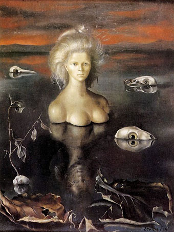
Le Bout du monde by Leonor Fini (1948).
Yes, I’ll definitely be going to see this one.
The first major exhibition of women artists and Surrealism to be held in Europe, Angels of Anarchy, opens this autumn at Manchester Art Gallery.
Featuring over 150 artworks by 32 women artists, the exhibition is a celebration of the crucial, but at the time not fully recognised, role that women artists have played within Surrealism. Paintings, prints, photographs, surreal objects and sculptures by well-known international artists including Frida Kahlo, Meret Oppenheim, Leonora Carrington and Lee Miller will be exhibited alongside works by artists less well-known in the UK, such as Emila Medková, Jane Graverol, Mimi Parent, Kay Sage and Francesca Woodman. Manchester Art Gallery is the only venue for this exhibition, making it a once-in-a-lifetime opportunity to see the works of so many significant women artists displayed together, with many of the works on loan from international public and private collections.
Angels of Anarchy runs from 26 September 2009–10 January 2010 at Manchester Art Gallery, and it’s a paying event with tickets at £6 (concessions £4, free entry for under 18s and Manchester Art Gallery Friends).
Elsewhere on { feuilleton }
• The fantastic art archive
Previously on { feuilleton }
• The art of Leonor Fini, 1907–1996
• Surrealist women