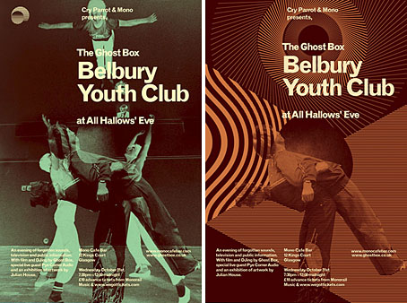
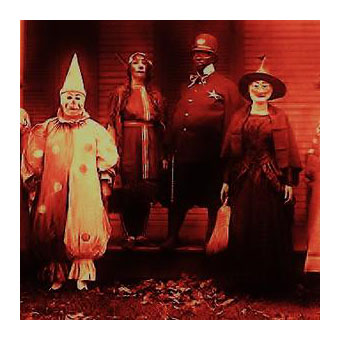
Flyers by Julian House for tonight’s Ghost Box event at Mono Cafe Bar, Glasgow.
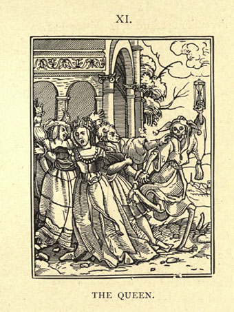
It’s a tradition here to post some recommended listening each Halloween. This year there’s an embarrassment of riches with five listings chosen from the multitudes at Mixcloud. Hauntology is the theme, not Jacques Derrida’s spectral musings but Simon Reynolds‘ deployment of the term to define the music produced by artists on the UK’s Ghost Box label—Belbury Poly, The Focus Group, The Advisory Circle, Pye Corner Audio et al—and their allies delving into similar areas: “folklore, vintage electronics, library music and haunted television soundtracks”. I’ve been plugging the Ghost Box people for years but going by Mark Pilkington’s recent introduction to the sub-genre some still find this information to be news.
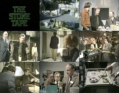
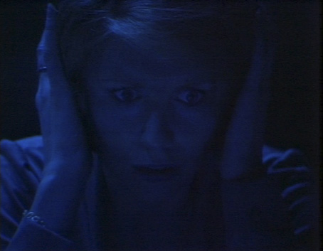
All the following mixes feature Ghost Box tracks, with the Ghost Radio mix being almost solely derived from the label’s releases. All the mixes are a year or so old apart from the Samhain Seance which was posted at the weekend. I’ve been playing these round the clock for the past couple of days, enjoying the way one playlist bleeds into another. Given the choice of only one I’d pick Samhain Seance, a great selection and very adeptly sequenced. Among the highlights there’s a lengthy extract from the occult-themed TV serial I mentioned yesterday, Children of the Stones, which had a superb vocal score by contemporary classical composer Sidney Sager. The Aethereus Mix also features Sager’s score, and opens with a warning from The Stone Tape which has even greater resonance today: “It’s in the computer!”
(Note: I corrected some of the track credits.)
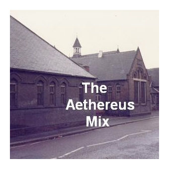
The Aethereus Mix by Soulless Central Radio
The Box Of Delights by Roger Limb
Ecneuqes Rorrim by Pye Corner Audio
The Unseeing Eye by Malcolm Clarke
Cheyne Walk by Jon Brooks
Manège by Jaques Lasry
Children Of The Stones by Sidney Sager
Chocky by John Hyde
A Year And A Day by Belbury Poly
Willow’s Song by Paul Giovanni
Saturn by Neu! [What? This isn’t Neu! It’s a piece by an American artist, Neue.]
Variation 19 by Andrew Lloyd Webber
House Among The Laurels by Jon Brooks
The Ghost Of John by Kristen Lawrence
Double Trouble by John Williams
Windfall by Dead Can Dance
Fantasmagories by Timewriter
Funerailles Des Vampires by Acanthus
Hypnosis by Atrium Carceri
The Moonlawn by Belbury Poly
The Giving Of The Grape by Blood Stereo
Enferissimo by Camille Sauvage
Dream Music by Jonathan Elias
Evaparizione by Ennio Morricone
Spellbound by Creed Taylor
Sequenza Psichedelica by Piero Umiliani
Fantasm by Bernard Fevre
Funeral Organ by Fred Myrow
Uomini Al Bando by Bruno Nicolai
Lucifer Rising by Jimmy Page
Black Mass by Mort Garson
Spookies by James Calabrees
Forest Of Evil by Frank Reidy & Eric Allen
Hell House by Brian Hodgson & Delia Derbyshire
Raven’s Lament by The Haxan Cloak
Voodoo by The Natural Yoghurt Band
Lost World by Moran Russell
Falling by Delia Derbyshire
Sang Pourpre by Igor Wakhévitch
Untitled by Vladimir Ussachevsky
Ghost Radio by elevatoresque
Activate The Poacher by Moon Wiring Club
The Willows by Belbury Poly
Sundial by The Advisory Circle
The Third Eye Centre by Mount Vernon Arts Lab
Hey Let Loose Your Love by The Focus Group
Mind How You Go by The Advisory Circle
Ghost Radio by Moon Wiring Club
Owls And Flowers by Belbury Poly
Civil Defence Is Common Sense by The Advisory Circle
Inside Shoebox Garden by Moon Wiring Club
Albion Festival Report by The Focus Group
Erosion Of Time by The Advisory Circle
Opening Leaves by Moon Wiring Club
Meditation On Nothingness by Roj
Feldspar by Mount Vernon Arts Lab
Nuclear Substation by The Advisory Circle
Far Off Things by Belbury Poly
Plant Room by Mordant Music
Jam Jar Carnival by The Focus Group
Everyday Electronics by The Advisory Circle
They Are In The Room With Us Right Now by Roj
Wool Book by Moon Wiring Club
Post Apocalypse Listings by Mordant Music
From An Ancient Star by Belbury Poly
Fire, Damp And Air by The Advisory Circle
The Insomniacs Almanac by Melmoth The Wanderer
While London Sleeps by Mount Vernon Arts Lab
So Run Down by The Caretaker
Moondial (Theme) by Unknown
The Bane Tree (intro) by (Episodes From) The Field Bazaar
Sorcerer by Ataraxia
The Black Drop by Mount Vernon Arts Lab
In A Beautiful Place Out In The Country by Boards Of Canada
Of Grace And Providence (Remixed) by The Caretaker
The Voice by Brian Hodgson & Delia Derbyshire
The Wicker Man by Paul Giovanni
Children Of The Stones Theme by Sidney Sager
Legend Of Hell House by Brian Hodgson & Delia Derbyshire
Samhain Seance by The Ephemeral Man
Twins Of Evil (extract)
Forest Of Evil (Dawn) by Demdike Stare
Blackthorn Winter by Sproatly Smith
The Harmony Programme by The Focus Group
Sulphur by Cyclobe
The Power Of The Witch (extract) Rare BBC Documentary
Another Witch Is Dead by The Eccentronic Research Council
Blood On Satan’s Claw (intro)
Disorder by The Haxan Cloak
Black Blind Light by Moonstone
Denned Earth (Decay And Rebirth) by Ruhr Hunter
Children Of The Stones — Episode 3 (extract), soundtrack by Sidney Sager
Strung Like Lights At Thee Printemps by Godspeed You Black Emperor
Grim Reaper by Teen Suicide
The Globe Inn by The Future Kings Of England
Halloween 3 (ending)
Previously on { feuilleton }
• A playlist for Halloween: Orchestral and electro-acoustic
• A playlist for Halloween: Drones and atmospheres
• A playlist for Halloween: Voodoo!
• Dead on the Dancefloor
• Another playlist for Halloween
• The Séance at Hobs Lane
• A playlist for Halloween
• Ghost Box