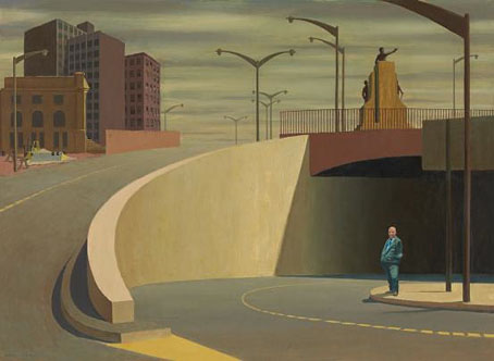
The Incredible Shrinking Man.
Of Richard Matheson’s many books I’ve only read I Am Legend so can’t say much about his fiction other than to confirm (as everyone else does) that none of the three adaptations so far have managed to do it justice. Of his work for film and television there’s too much to say, it’s so copious and indelibly memorable. Here’s a list of five favourite Matheson creations.
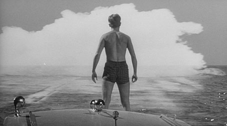
The Incredible Shrinking Man (1957)
JG Ballard frequently referred to this as one of his favourite science fiction films, not because of the SF element, which is never properly explained, but because of its inadvertent Surrealist qualities. For my part, every time I watched this I was always impatient to get to the later scenes where the unfortunate Scott becomes trapped in the cellar, and his own house becomes an increasingly alien and hostile environment. The ending where he accepts his condition is very Ballardian.
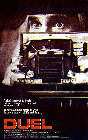
Duel (1971)
A sweating and manic Dennis Weaver is pitted against an anonymous truck driver who remains unseen but for a few shots of an arm and some boots. The lethal game of cat-and-mouse was famously directed by Steven Spielberg, his second feature, and one that’s a lot more impressive than some of his subsequent films. Watch it on YouTube.
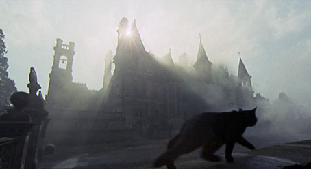
The Legend of Hell House (1973)
Matheson’s take on Shirley Jackson’s The Haunting of Hill House—four investigators in a haunted mansion—with the gain ramped up 100%. The film starts off quietly but is very soon into full-on hysteria; director John Hough finds so many eccentric camera angles you could actually calm down after this by watching a Terry Gilliam film. Meanwhile Roddy McDowell chews the scenery as though over-acting is going out of fashion. Bonuses are a grown-up Pamela Franklin (Flora in Jack Clayton’s superb The Innocents), and a great score from Radiophonic synthesists Brian Hodgson and Delia Derbyshire. Watch the trailer.
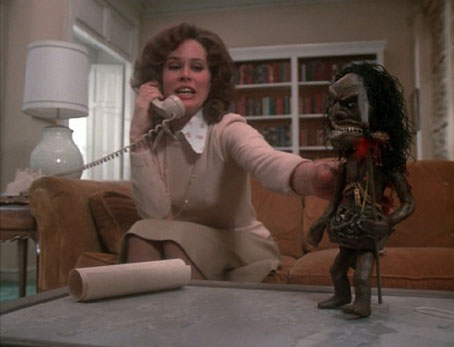
Trilogy of Terror (1975)
A three-story TV movie in which Karen Black took all the leading roles. No one remembers the first two stories but everyone who’s seen this remembers the third, Amelia (based on a Matheson short story, Prey), in which Ms Black is hunted in her apartment by a Zuni fetish doll. It’s on YouTube!
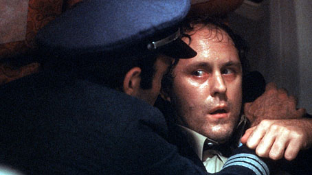
Nightmare at 20,000 Feet (1983)
Sorry, Shatnerphiles, but the superior version of this story is the one from Twilight Zone: The Movie. John Lithgow is a much better actor than William Shatner, the gremlin on the wing of the plane is a fearsome creature that’s seriously destructive (not, as Matheson lamented of the original, “a surly teddy bear”), and the whole sequence is directed by George Miller fresh from Mad Max 2. The original Twilight Zone episode wasn’t bad but it can’t compete with Miller pulling out all the stops. Watch it here.
Previously on { feuilleton }
• New York City abandoned