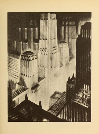
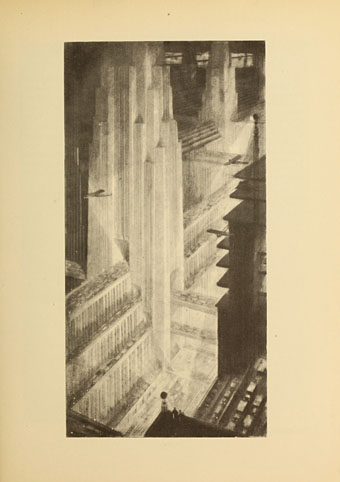
The Metropolis of Tomorrow by Hugh Ferriss

ferriss01.jpg

Crowding Towers.

The work of architectural renderer Hugh Ferriss (1889–1962) has appeared here before. The Metropolis of Tomorrow (1929) was a major influence on the architectural style I deployed in the Reverbstorm series, together with Berenice Abbott’s photographs of New York City in the 1930s. Ferriss’s hazy proposals for cities of the future are more visible today than they used to be thanks to the popularity of those sites that enjoy outmoded visions of the future.

Flickr has been a good source of Ferriss’s drawings in the past but the Internet Archive recently posted the entirety of The Metropolis of Tomorrow, pages as well as pictures. The book appeared a couple of years after Fritz Lang’s Metropolis, and shares that film’s idea of the future city as a kind of superannuated New York. Skyscrapers were still a relatively new idea so this seemed a natural development at the time, as did the concept of super-highways and rooftop aerodromes. Human beings in Ferriss’s future are either ant-like specks or they’ve vanished altogether among the massed ranks of towers which often look more like less like buildings and more like Art Deco spacecraft. Lang’s vision was dystopian only in the way it relegated its workers to the underworld, while Ferriss’s proposals were wholly optimistic. Looking back we’re more aware of the shortcomings of such ideas, and from my perspective it wasn’t so difficult to bring out the latent menace inherent in these megastructures. Ferriss’s metropolis, like that of Fritz Lang, is a fun place to visit but you wouldn’t necessarily want to live there.

Browse the rest of the book here or download it here.

ferriss02.jpg

Overhead traffic-ways.

ferriss03.jpg

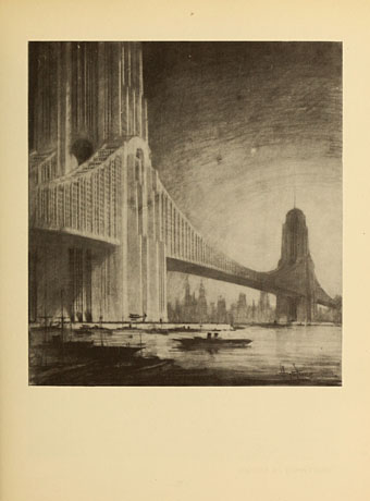
Apartments on bridges.

ferriss04.jpg

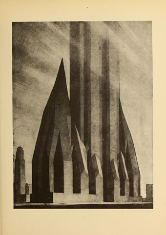
Evolution of the set-back building: second stage.

ferriss05.jpg

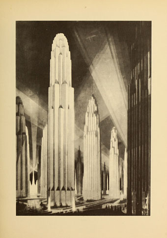
Verticals on wide avenues.

Continue reading “The Metropolis of Tomorrow by Hugh Ferriss”

Design as virus 18: Sound Effects

sound1.jpg

BBC Sound Effects No 1 (1969). Design by Roy Curtis-Bramwell.

I used to own this album, the first in a series of sound effects collections from the BBC tape library intended for use by musicians, theatre technicians and anyone else who might need a recording of a thunderstorm, fire alarm or creaking door. Going through my diminished stock of vinyl recently reminded me that I got rid of my rather battered copy some time ago. Now that we can sample any sound we come across these library albums are a lot less useful than they were in the analogue era. One result of their ubiquity was that some of the sounds became distractingly familiar; I still can’t listen to Hawkwind’s Warrior on the Edge of Time album without recognising all the cues (wind, seagulls, etc) borrowed from this collection.

sound2.jpg

Sound Affects (1980) by The Jam. Design by Bill Smith with The Jam. Photography by Martyn Goddard & Andrew Rosen.

And speaking of borrowings, the cover design has proved as durable as the sounds. The Jam purloined the grid design and the title for their fourth album in 1980, although the florid typeface of the original was evidently too circusy for the group’s Mod sensibilities. The music inside also tips into pastiche, this being the album featuring Start!, Paul Weller’s plundering of The Beatles’ Taxman.

sound3.jpg

Good Vibrations (2013). Design by Julian House.

Roy Curtis-Bramwell’s grid of photos and drawings was reworked recently by retro-master Julian House in one of a number of poster designs for Good Vibrations, a BBC feature film. House’s designs for the Ghost Box CDs also feature a similar grid arrangement of enigmatic details in their booklet artwork. I hadn’t considered until now that the Ghost Box details may have their origin in the Sound Effects covers.

sound4.jpg

Detail from the sleeve of Seven Songs (1982) by 23 Skidoo. Design by Neville Brody.

All of which had me trying to think of other examples of this idea. The only one that came to mind was the row of seven symbols on Neville Brody’s sleeve for the first 23 Skidoo album. Brody said these don’t necessarily relate to the seven tracks on the album although it’s possible to view them that way. (The running dog appeared later on Brody’s design for the Throbbing Gristle album box.) As usual, if you know of any further examples then please leave a comment.

There’s more about the BBC albums (and pictures of the rest of the series) here.

Elsewhere on { feuilleton }
The album covers archive

Previously on { feuilleton }
Design as virus 17: Boris and Roger Dean
Design as virus 16: Prisms
Design as virus 15: David Pelham’s Clockwork Orange
Design as virus 14: Curse of the Dead
Design as virus 13: Tsunehisa Kimura
Design as virus 12: Barney’s faces
Design as virus 11: Burne Hogarth
Design as virus 10: Victor Moscoso
Design as virus 9: Mondrian fashions
Design as virus 8: Keep Calm and Carry On
Design as virus 7: eyes and triangles
Design as virus 6: Cassandre
Design as virus 5: Gideon Glaser
Design as virus 4: Metamorphoses
Design as virus 3: the sincerest form of flattery
Design as virus 2: album covers
Design as virus 1: Victorian borders

Aubrey Beardsley in The Studio

ab1.jpg

Aubrey Beardsley in the year 1893 was 21, and on the threshold of being catapulted to fame (and notoriety) via his illustrations for Oscar Wilde’s Salomé. Some of Beardsley’s drawings in the distinctive style he called “Japanesque” had already appeared in The Pall Mall Magazine, and he was hard at work on some 600 illustrations and embellishments for Dent’s Le Morte D’Arthur which began publication in 1894. Some of those illustrations are featured in the glowing introduction by Joseph Pennell which appeared in the first issue of The Studio magazine in April 1893 (when Beardsley was still only 20), a title that became the leading showcase for the British end of the Art Nouveau movement in the 1890s. Pennell’s appreciation also included Beardsley’s Joan of Arc’s Entry into Orleans, a piece which showed how much the artist’s early work owed to Mantegna, and the first drawing of Salomé which later helped secure the Wilde commission. The Joan of Arc picture was reproduced as a fold-out supplement in the magazine’s second issue.

ab2.jpg

All the major Beardsley books refer to Pennell’s article but I’ve never had the opportunity to see it in full until now, thanks to the excellent online archives at the University of Heidelberg. There are many volumes of the international editions of The Studio at the Internet Archive but for some reason these don’t include the early numbers; at Heidelberg we can now browse the missing issues. In the first volume in addition to Beardsley there’s a piece about Frederic Leighton’s clay studies for paintings and sculptures, illustrations by Walter Crane and Robert Anning Bell, and an article on whether nude photography can be considered art. In this last piece several of the examples happen to be provided by Frederick Rolfe aka Baron Corvo, and Wilhelm von Gloeden, two men who we now know had other things on their mind when they were photographing Italian youths.

The collected volumes of The Studio from 1893 to 1898 may be browsed or downloaded here. I’ve not had time to go through the rest of these so I’m looking forward to discovering what else they may contain.

ab3.jpg

ab4.jpg

ab5.jpg

Detail from Joan of Arc’s Entry into Orleans.

ab6.jpg

Elsewhere on { feuilleton }
The Aubrey Beardsley archive

Adelaide Hanscom’s Rubáiyát

hanscom01.jpg

(Apologies again for the downtime, the fourth outage this month.)

Thanks are due to Beautiful Century for drawing my attention to this 1905 edition of the Rubáiyát illustrated by Adelaide Hanscom (later Adelaide Hanscom Leeson). Hanscom (1875–1931) was an American artist and photographer whose work here is notable for the early use of photographs to illustrate a popular book, and for many of those photographs being nude portraits of her literary friends. No doubt the “exotic” theme enabled these to escape opprobrium at a time when male nudity (in photographs at least) was a very scarce commodity. The book was understandably popular, and a later edition featured tinted plates, an example of which can be seen below. A few of the plates look too much like what they were—friends of the artist posing in costumes—but the majority achieve that nebulous atmosphere, common to much photography of the time, that sought to imitate the effects of painting. Browse the rest of the book here or download it here.

hanscom02.jpg

hanscom03.jpg

hanscom04.jpg

hanscom05.jpg

Continue reading “Adelaide Hanscom’s Rubáiyát”

Weekend links 179

tomaselli.jpg

Summer Swell (2007) by Fred Tomaselli. The artist is interviewed at AnOther.

• Mixes of the week for the season of mists and mellow fruitfulness: Forever Autumn Mixtape by The Outer Church, and celebrating what would have been Trish Keenan’s 45th birthday: Trish’s Toys & Techniques Birthday Tape (with cover art by Julian House).

Jirí Kolár: His Life, Work and Cultural Significance to the Czech Republic. Leah Cowan looks into the life and work of this influential Czech artist. Related: Jirí Kolár: poet and collage artist, and collages, rollages and prollages by Jirí Kolár.

• “Name any well-known poet from any age, any country. He or she wrote at least one poem about death, most likely several poems.” Russ Kick introduces his new book, Death Poems.

[M]any pictures in the splendid exhibition at the British Museum show men having sex with men. One of the earliest erotic handscrolls, from the 15th century, shows a Buddhist priest casting longing glances at his young acolyte. Indeed, among some samurai, male love was considered superior to the heterosexual kind. Women were necessary to produce children, but male love was purer, more refined.

The question is why were Japanese – compared not just with Europeans, but other Asians, too – so much more open to depicting sex? One reason might be found in the nature of Japanese religion. The oldest native ritual tradition, Shinto, was, like most ancient cults, a form of nature worship, to do with fertility, mother goddesses, and so forth. This sometimes took the form of worshipping genitals, male as well as female.

Ian Buruma on The joy of art: why Japan embraced sex with a passion. Shunga: Sex and Pleasure in Japanese Art is a forthcoming exhibition at the British Museum.

Harold Offeh on how the cosmic life and music of Sun Ra inspired the artwork decorating the Bethnal Green, Notting Hill Gate and Ladbroke Grove Tube stations in London.

• Fearful symmetry: Roger Penrose’s tiling by Philip Ball. Related: Penrose Tiles Visualizer, and lots more Penrose tiling links at The Geometry Junkyard.

Masculine / Masculine. The Nude Man in Art from 1800 to the Present Day, a new exhibition at the Musée d’Orsay.

• Into the Croation Zone: more derives from Christina Scholz here, here, and here.

Stephen Eskilson on Heteronormative Design Discourse.

Applied Ballardianism

The Zero of the Signified (1980) by Robert Fripp | The League of Gentlemen (Fripp/Lee/Andrews/Toobad, 1981): Minor Man (with Danielle Dax) | Heptaparaparshinokh