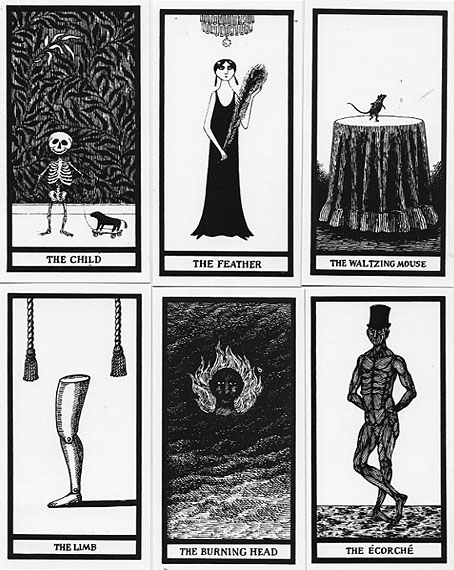
The Fantod Pack (1995): a Gorey take on the Tarot deck.
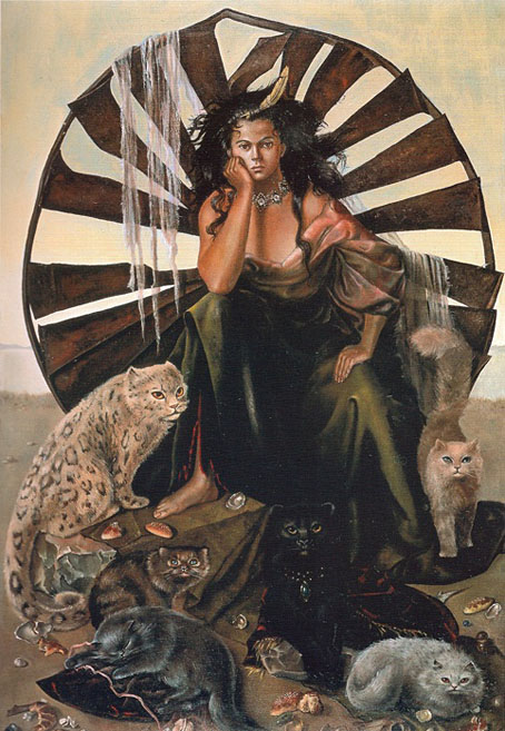
• A happy 100th birthday to Edward Gorey. I was hoping to link once again to Gorey’s appearance on the Dick Cavett Show from 1977 (a rare TV interview) but it’s one of those things that’s no longer available at YouTube. You can always browse Goreyana instead. Meanwhile, there’s this in Scotland: In Gorey Detail: Celebrating An American Friend At Custom House, Leith. A tribute exhibition which is running in Edinburgh for this week only.
• “A blisteringly frank and triple X-rated chat with Peter Berlin”. A blisteringly hyperbolic headline for a discussion between Ted Stansfield and Peter Berlin, the self-invented sex object of the 1970s.
• This week in the Bumper Book of Magic: Smoky Man posts my replies to his questions about the creation of the book’s Rainy Day and Kabbalah sections.
• Tricky’s Maxinquaye was released 30 years ago this month. David Bennun revisited the album five years ago.
• At Colossal: Felines evoke ‘A Floating World’ in Tùng Nâm’s whimsical illustrations.
• New music: Gloam by Emptyset, and The Mount Hibiki Tapes by Mount Shrine.
• Mix of the week: A mix for The Wire by Polonius.
• Steven Heller’s font of the month is Steam.
• Last Of The Steam Powered Trains (1968) by The Kinks | Steam Megawatt (1979) by Tod Dockstader | Building Steam With A Grain Of Salt (1996) by DJ Shadow