The art of Antoon van Welie, 1866–1956

vanwelie1.jpg

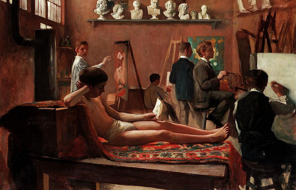
The Artists’ Studio (1906).

This week’s post is another by Sander Bink about a neglected artist of the Dutch fin de siècle. There’s no need for me to add a great deal to Sander’s appraisal below other than to point out the evident debt that Antoon Van Welie seems to owe to the Pre-Raphaelites for whom Ophelia was a popular subject. British artists of the 19th century have often been criticised for adding little to the evolution of Continental art but the influence of the Pre-Raphaelites and the Arts and Crafts movement pervades European Symbolism. My thanks again to Sander for the post.

* * *

Antoon van Welie (Dutch Wikipedia only) was a Dutch painter known mainly for his portraits of the rich and famous. Around 1900 his work was praised by writers and critics such as Camille Mauclair, Jean Lorrain and Anatole France. He had studios in The Hague, London, Paris and The Vatican. There’s not much information about him in English, and for a long time there wasn’t a great deal in Dutch either, since during his lifetime he was already more or less forgotten. His being openly gay could have been one of the reasons. Male beauty is one of his subjects, as illustrated by The Artists’ Studio. His preference for depicting Catholic priests and flamboyant society ladies might also have been a little too extravagant for Dutch artistic standards of the period. The influence of Symbolism and mysticism on his work sets him a little apart from the crowd as well. All this does make him somewhat of a “decadent” or fin de siècle artist. What surely did not help his posthumous fame was a portrait of Mussolini he painted in 1921, and apparently he later also made one of Hitler. But in 2003 he was rescued from art-historical oblivion by the good people of the Louis Couperus Museum in The Hague. An exhibition there was followed in 2007 by a larger one at Museum Het Valkhoff in Nijmegen: The Last Decadent Painter. The book published for the occasion gives an extensive overview of Van Welie’s life and oeuvre but is unfortunately only available in Dutch.

The portraits which made him famous in his day are, in my opinion, technically not that great and sometimes tend toward kitsch. More subtle and beautiful are his early Symbolist works which, like those by Simon Moulijn, are strongly influenced by Maeterlinck’s neo-mystical writings.

vanwelie2.jpg

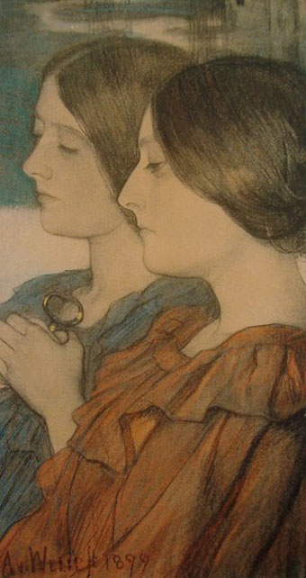
Aglavaine en Sélysette (1899).

Some quite refined examples are the lithograph Aglavaine en Sélysette and the pastel Les Princesses de Légende, both directly inspired by Maeterlinck’s plays.

vanwelie3.jpg

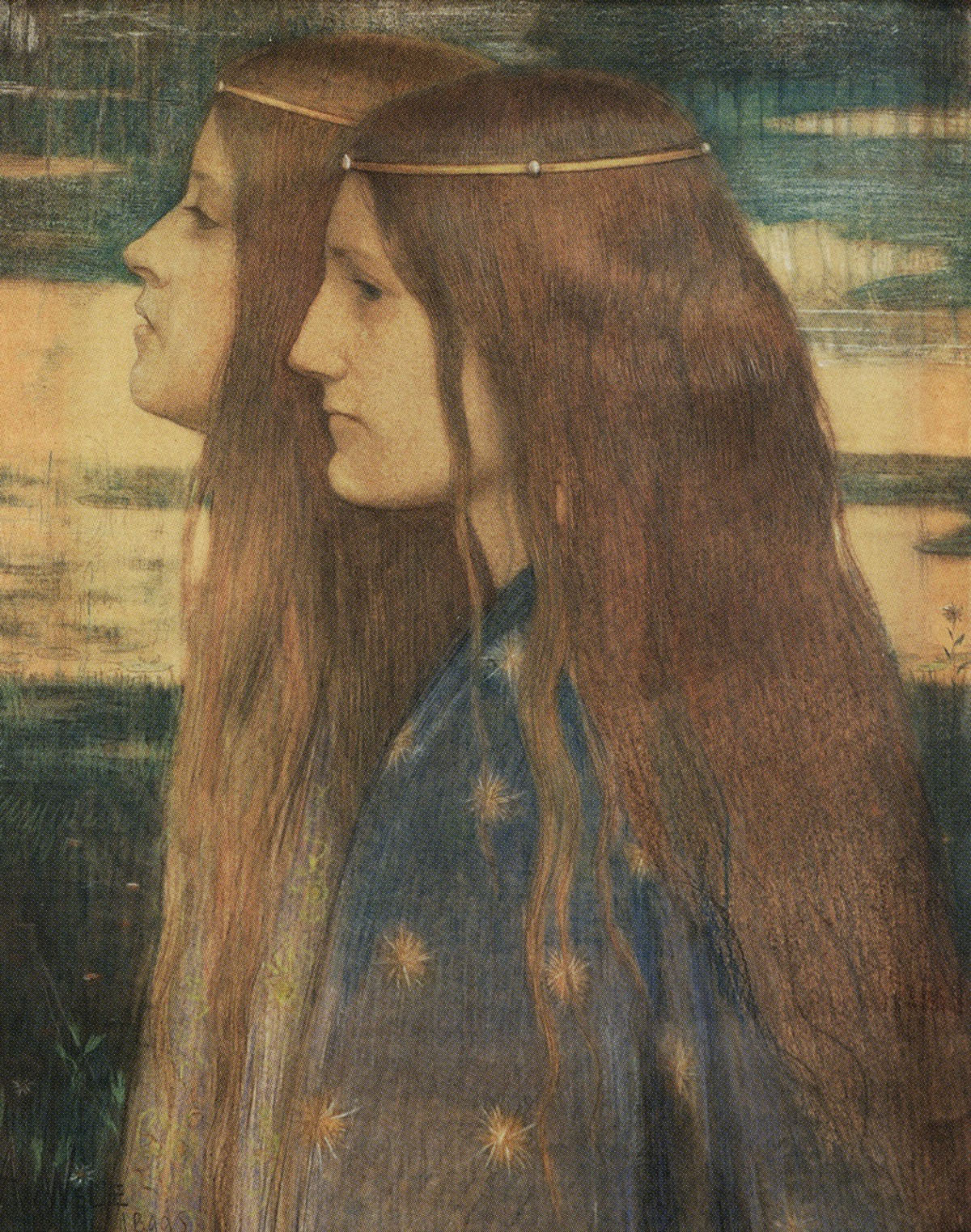
Les Princesses de Légende (1899).
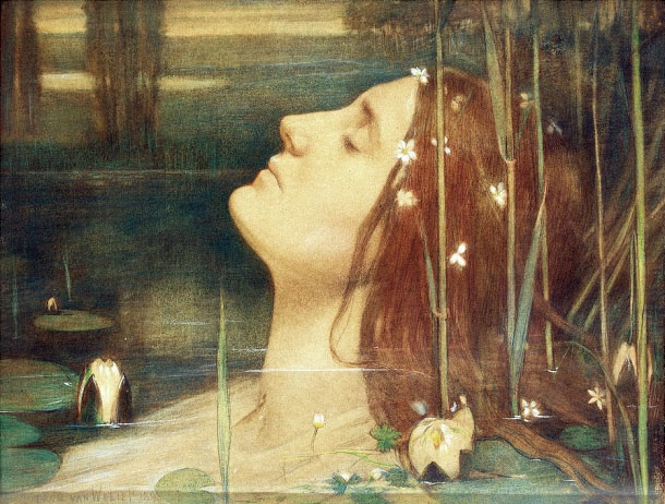
vanwelie4.jpg

Ophelia.

Literature was an important influence, as it was for many other Symbolist painters, and Van Welie duly produced the pastel Ophelia in 1898–’99. The same goes for musical themes, an example of which is the serene pastel Holy Cecilia with Lyre.

vanwelie5.jpg

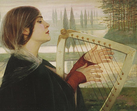
Holy Cecilia with Lyre (1899).

vanwelie6.jpg

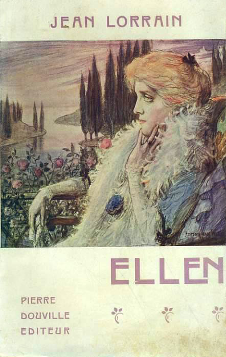
He also designed book covers like the one for Jean Lorrain’s novel Ellen from 1906.
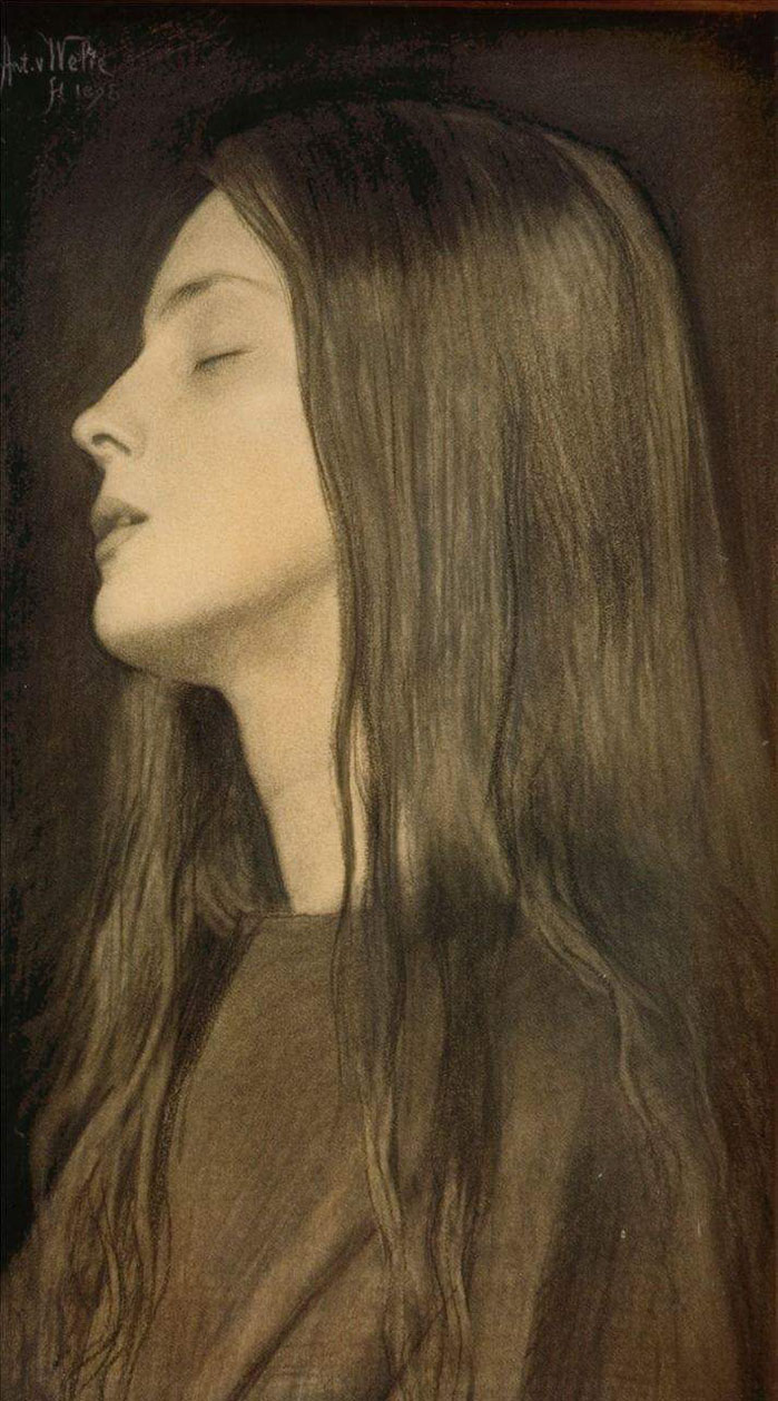
vanwelie7.jpg

La Douleur (1895).

But his most attractive work and as far as I am concerned one of the finest works of 1890s Dutch art is the chalk drawing La Douleur. Although the title emphasizes the young lady’s suffering, she also seems to be in a (sexual) ecstasy. A paradoxical beauty like Baudelaire’s femmes damnées: “de terribles plaisirs et d’affreuses douceurs”.

Sander Bink

Elsewhere on { feuilleton }
The gay artists archive

Previously on { feuilleton }
The art of Simon Moulijn, 1866–1948
René Gockinga revisited
Gockinga’s Bacchanal and an unknown portrait of Fritz Klein
More from the Decadent Dutch

Weekend links 422

kolosimo.jpg

Wu Ming, a communist writing collective known for its historical fiction, sees Kolosimo as using pseudohistory as a tool to shake people from their belief that capitalist society is natural and transhistorical, opening minds to other possibilities for how humans can live. They regret that popular proponents of his theories today, like Graham Hancock and Erich von Däniken, are unable to recognize the political motivations behind his project: “Nothing of his radicality survives in today’s copycats… Every corner has been blunted, the heresy has become telegenic, but we know that the revolution will not be televised.”

The secret history of Marxist alien hunters by AM Gittlitz

I received the Sphere edition of Peter Kolosimo’s book as a Christmas present in 1974, and being 12 years old at the time took its theories fairly seriously. As a work of pseudohistory it’s as poor as the books of Erich von Däniken but I always liked the title, and it happens to be the place I first encountered the mysterious words “Popol Vuh”, a name that would acquire a very different significance a few years later. Kolosimo also joins Kenneth Grant in taking HP Lovecraft’s work as a thin fictionalisation of supposed fact. For a serious dismantling of Not of This World see this review (the first of three parts) by “skeptical xenoarchaelogist” Jason Colavito.

• The Archons are back: Erik Davis talks with Gnostic scholar Matthew Dillon about religious mourning, the Nag Hammadi library, sex-magick Jesus, the Gnostic Eden, David Icke’s lizards, and the power of the Archons as an allegory of contemporary technological and political power.

Crystal Voyager (1973) is a surfing film by David Elfick that ends with a 23-minute sequence of slow-motion waves set to Echoes by Pink Floyd. Some of the same footage later appeared in the final scenes of Peter Weir’s The Last Wave (1977).

• Sweet artifice: “Dandies in the age of decadence favoured synthetics over nature, nowhere more so than in perfumery’s fabulous counterfeits,” says Catherine Maxwell.

• Now for a lampshade solo: Pascal Wyse on how the Radiophonic Workshop built the future of sound.

• Wilde about Paris: Alex Dean on the sex, drink and liberation of Oscar Wilde’s “lost” years.

Bee in the City: the vanguard of an invading army from Planet Bee.

• Five books that most inspired Alexander McQueen.

Colin Newman‘s favourite albums.

Echoes (1969) by Leon Thomas | Echo Waves (1974) by Ash Ra Tempel | Not Of This World (1988) by Danzig

Bibliothek des Hauses Usher

rottensteiner.jpg

As promised a couple of weeks ago, this book-cover post is one of several that originates with Franz Rottensteiner’s horizon-expanding The Fantasy Book: The Ghostly, the Gothic, the Magical, the Unreal (1978). Rottensteiner’s study was important for me not only for its introduction to many hitherto unknown writers but also for its wide-ranging collection of illustrations and cover designs. Most of the artwork has since become very familiar but a few examples were by artists or designers I hadn’t encountered elsewhere. Hans Ulrich Osterwalder was one of these, his art for a series of German horror titles appearing inside the book and, in the case of the US edition of The Fantasy Book, on the cover. Searching for Osterwalder’s work a few weeks ago I was delighted to discover that the German covers were part of a series of horror/dark fantasy reprints for the Bibliothek des Hauses Usher imprint from Insel Verlag, for which Osterwalder created many more striking and unusual covers.

Bibliothek des Hauses Usher published 26 novels or story collections from 1969 to 1975. I thought at first that this was a paperback series but all the books were hardbacks with uniform black covers and white spines. The imprint logo is a rather ordinary looking House of Usher cracking down the middle (a nod to Arkham House, perhaps) with a slogan on the back cover borrowed from Ambrose Bierce: “Can such things be?” Each volume was printed on light green paper, at least until the paper stock ran out. The last three volumes were printed on white paper then on green again when further stocks were found.

page.jpg

Osterwalder’s work on this series stands out for being innovative, surreal and free of the cliches that persist on horror titles. Most of the artwork is illustrative of the contents but it manages this without being too overt or obvious which isn’t an easy thing to do. The list of authors is an interesting mix as well (if you overlook the typically lamentable absence of women writers): many of the names are those you’d expect in a series such as this but there are also some such as Jean Ray and Stefan Grabiński who you wouldn’t find in an Anglophone series. Grabiński was a Polish writer of weird fiction who receives a mention in Rottensteiner’s book (and is a favourite of China Miéville) but whose work is still largely unknown to Anglophone readers. Just as obscure to English readers is Thomas Owen who was a Belgian writer (real name Gérald Bertot) and a friend of Jean Ray’s. Tartarus Press published a collection of Owen’s stories in 2012 but I’ve not read it so can’t vouch for their quality.

All 26 covers are shown below in their order of publication. Hans Ulrich Osterwalder still works as an artist and designer, and has a website here. Franz Rottensteiner was interviewed at 50 Watts a few years ago.

usher01.jpg

usher02.jpg

usher03.jpg

Continue reading “Bibliothek des Hauses Usher”

Weekend links 421

wojnarowicz.jpg

The Death of American Spirituality (1987) by David Wojnarowicz.

Dau: “Art imitating life on an unprecedented scale”. Siddhant Adlakha on a colossal Russian feature-film project that sounds like a real-life equivalent of Synecdoche, New York. Adlakha’s piece, which claims that Dau is finished, was written a year ago but there’s still no sign of the film itself. Wikipedia has more details and links.

Metropolis Magazine from Phantasm Press is a facsimile republication of the 32-page theatre programme produced for the UK premier of Fritz Lang’s feature film.

Children Of The New Dawn is a preview of the score for Mandy by the late Jóhann Jóhannsson. From last year: The Drowned World (live) by Jóhann Jóhannsson.

Grand Panorama of a Whaling Voyage ’Round the World (1848) by Benjamin Russell & Caleb Purrington is the longest painting in North America.

• “This summer, there is only one book to take to the Terminal Beach”: Applied Ballardianism: Memoir from a Parallel Universe by Simon Sellars.

• “La série des Fredi en trois volumes est une étude sincère et consciencieuse de l’inversion sexuelle.”

• “The Book was Mallarmé’s total artwork, a book to encompass all books,” says Sylvia Gorelick.

• At BLDGBLOG: Graphic Inferno, art by Rico Lebrun based on Dante’s Divine Comedy.

• Mixes of the week: XLR8R Podcast 549 by Hólmar, and FACT Mix 661 by Kelly Lee Owens.

• “Dealing with creative block? A deck of cards might help,” says Abigail Cain.

The Instagram account archiving exquisite interiors from vintage porn.

Polish composers report from Outer Space

Wind From Nowhere (1994) by Uzect Plaush | Slolooblade : The Drowned World (1994) by Mo Boma | Inner Space Memorial for JG Ballard (2014) by Janek Schaefer

James Cawthorn: The Man and His Art

cawthorn-cover.jpg

The past year would have been busier than usual with the amount of illustration work I had to deal with, but it was made even busier with my having to design this book at the same time. James Cawthorn: The Man and His Art was originally intended to be a modest memorial by Maureen Cawthorn Bell for her artist brother following his death in 2008, but the book grew into a heavyweight volume of 448 pages containing over 800 individual pieces of art: book covers, illustrations for magazines and fanzines, private pieces for friends and relatives, and many sketches or preliminary works, most of which have never seen print before.

cawthorn-coverspread.jpg

Given Jim Cawthorn’s long association with Michael Moorcock, as both friend and collaborator, the task of collating the artwork and editing the book went to Moorcock bibliographer John Davey, who also serves as the book’s publisher. John spent three years locating over 3000 pieces of artwork, large and small. Some of these pieces are now lodged with the Moorcock archives in the Bodleian Library, Oxford, while others may only be found in the pages of the many science fiction and fantasy fanzines that Jim illustrated, copies of which are stored at the British Library. From this body of material Maureen and John selected a core of representative work from Jim’s private as well as public life, although no-one at the outset of the project was expecting the final picture tally to be so high.

cawthorn-spread-01.jpg

My task as the book’s designer involved making the text presentable (easy) and corralling the artwork (not so easy, and I also had to either clean or colour-adjust every single piece). Maureen had divided the book into several sections, beginning with a lengthy biographical reminiscence. Following this was “Jim by Jim”, a selection of interviews, magazine pieces, some fiction, essays and book reviews. There was also a lengthy extract from Fantasy: 100 Best Novels (1988), a book credited to Jim and Michael Moorcock but, by Moorcock’s admission, mostly Jim’s work. Jim Cawthorn was very well-read, especially in the genres—he was old enough and interested enough to have read The Lord of the Rings when it was first published—and could also present his erudition engagingly for a reader, so the text section of Maureen’s book is far from indulgent.

cawthorn-spread-02.jpg

The book design isn’t as elaborate as some I’ve worked on but it didn’t need to be when the pictorial material is rich with what Moorcock calls “wizardry and wild romance”. Maureen wanted a particular picture of Moorcock’s Elric character on the cover so I took details and motifs from some of Jim’s many Elric illustrations to give the book a thematic thread and internal consistency. Cawthorn was present at the creation of Elric in the early 1960s; he not only provided Moorcock’s characters with their first illustrations but even helped plot one of the earliest stories, Kings in Darkness.

cawthorn-number.jpg

Page numbers are framed by the swords from the Elric stories.

Using motifs such as the sword silhouette and Elric head is something I frequently do with book designs but for this book I also went to the trouble of creating a one-off font for the drop capitals based on Jim’s hand-drawn lettering. Jim drew titles and other lettering throughout his career, so again this was a decision warranted by the book’s contents. The few times we met I never asked him about this but I’ve always thought his lettering designs were derived from the stylised titles that J. Allen St. John created for many of the early Edgar Rice Burroughs books. Jim spent most of his life drawing Burroughs’ characters, and was very familiar with the work of Burroughs’ original illustrators. I was hoping to find a title design of Jim’s that I could rework for the book’s title but none of the examples worked as well as I hoped. For this reason the title lettering is based on different styles from the John Carter novels that were Jim’s favourites among Burroughs’ works.

cawthorn-spread-03.jpg

Other features include a foreword by Alan Moore, an afterword by Michael Moorcock, a gallery of Jim’s Lord of the Rings drawings and character sketches from the early 1960s (which predate all others bar those by Tolkien himself), artwork for Hawkwind (including Dave Brock’s “Meliadus” T-shirt), and even a handful of photos from the set of The Land that Time Forgot (1975), the ER Burroughs-derived feature film scripted by Jim with Michael Moorcock. The page samples here are necessarily few given the size of the book.

cawthorn-spread-04.jpg

For the moment James Cawthorn: The Man and His Art is available exclusively from publishers Jayde Design at a special pre-publication price of £20. After publication on 6th August the price will rise to £35. Further page samples follow.

Continue reading “James Cawthorn: The Man and His Art”