Wendel Dietterlin’s Architectura

dietterlin01.jpg

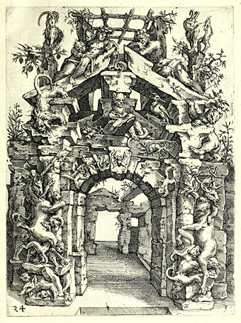
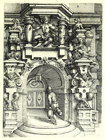
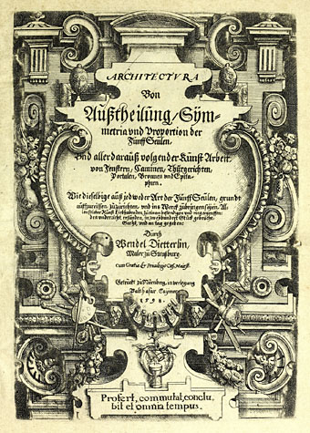
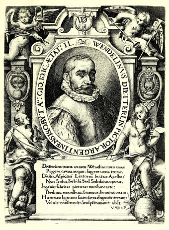
While looking through my bookshelves recently for examples of Baroque architecture I was reminded of the eccentric designs of Wendel Dietterlin (c. 1550–1599), a German painter and engraver whose Architectura (1598) is less a guide to architectural form than an excuse to indulge the artist’s fervid imagination. This wasn’t really the reference material I was after—Dietterlin is pre-Baroque—but I’d not seen so much of his work in one place before. Dover Publications have reprinted all of these plates for many years as The Fantastic Engravings Of Wendel Dietterlin but it’s one Dover book I’ve never owned.

dietterlin02.jpg

“Fantastic” is an apt description. Where a similar study might present the reader with careful elaborations of Vitruvian principles, Dietterlin offers plate after plate of suggestions for portals, fountains, fireplaces and facades, many of which are festooned with bizarre and grotesque details. Wild animals are a persistent theme. Other artists of the period tended to favour mythological scenes for fountain sculpture; Dietterlin shows a series of large animals being attacked by smaller ones: bear versus dogs, dragon versus men, and so on. Similar groupings may be found on his designs for rustic arches. Ostensibly these are traditional hunting scenes but there’s a fury in Dietterlin’s renderings that pushes the representations away from the decorative towards the pathological.

dietterlin03.jpg

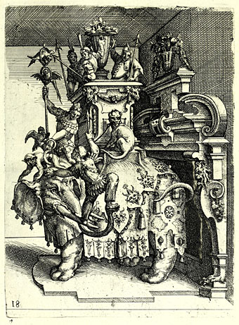
In other designs the wildness is transferred to the decoration itself. Examples of the traditionally sober orders of Classical architecture are shown encrusted with decorations added at the whim of the artist; Dietterlin wasn’t the only artist to do this but other artists are seldom this excessive. Strangest of all is the plate that shows a huge elephant standing before (or emerging from) a fireplace. René Passeron included a handful of engraving artists in the precursors section of his Concise Encyclopedia of Surrealism in 1975, but Dietterlin isn’t among them. I’d say that elephant alone is suitable qualification, a forerunner of Magritte’s Time Transfixed, as well as a literal (if inadvertent) representation of “the elephant in the room”.

dietterlin04.jpg

dietterlin05.jpg

Continue reading “Wendel Dietterlin’s Architectura”

Goodfellow and Borges

goodfellow1.jpg

Last week’s story search had me looking through this handful of Penguin volumes again, all of which have cover illustrations by Peter Goodfellow. These were the first Borges books I bought, beginning with the Labyrinths collection in 1985. The Book of Sand is two volumes in one—The Book of Sand and a late poetry collection, The Gold of the Tigers—with cover art suitable for both. I used to think that the covers of the other books were pastiching or quoting well-known artists but now I’m not so sure. Two of them definitely are quotes or pastiches: The Book of Imaginary Beings is a play on the weird growths you find in Hieronymus Bosch, while Doctor Brodie‘s contemplative skeleton is from the famous anatomical engravings in De Humani Corporis Fabrica by Andreas Vesalius, with some Chinese or Japanese landscape details added to the background.

goodfellow2.jpg

Two positive artistic references suggested that the other covers might follow suit, so I used to take the Labyrinths cover as a vague reference to the anomalies that Salvador Dalí would situate in his desert vistas, while A Universal History of Infamy was de Chirico, perhaps, although this no longer seems certain at all. Those columns look like Bernini’s double colonnade from Saint Peter’s Square in Rome, not a Turin arcade, and the picture lacks the disjunctive perspectives you find in de Chirico’s “Metaphysical” paintings. The pastiche thesis is further diluted when you discover that Goodfellow had been quoting from Bosch as far back as his cover for Ursula Le Guin’s Rocannon’s World in 1972, while he borrowed another skeleton from Vesalius for Structures by JE Gordon. Sometimes you can reach too far for meaningful connections.

goodfellow3.jpg

The Bosch-like cover does seem to have had an enduring influence, however. When Penguin published the Collected Fictions in the UK in 1999 they used a detail from Bosch’s Garden of Earthly Delights for the artwork. Bosch details turned up on a later edition of A Universal History of Infamy, and have subsequently appeared on a series of Turkish Borges editions. Not a bad choice for a writer whose fictions offer universes of possibility.

goodfellow4.jpg

goodfellow5.jpg

Elsewhere on { feuilleton }
The book covers archive
The illustrators archive

Previously on { feuilleton }
The Rejected Sorcerer
The Immortal by Jorge Luis Borges
Borges on Ulysses
Borges in the firing line
La Bibliothèque de Babel
Borges and the cats
Invasion, a film by Hugo Santiago
Spiderweb, a film by Paul Miller
The Library of Babel by Érik Desmazières
Books Borges never wrote
Borges and I
Borges documentary
Borges in Performance

Metamorphose: MC Escher

escher1.jpg

This is a Dutch documentary with narration in English, made in 1998 for the centenary of MC Escher’s birth. Unlike other films about the artist which examine the famous tessellated patterns and visual paradoxes the approach here is a strictly biographical one. Being a Dutch production, the producers had access to a large quantity of material about Escher’s life: photographs, diaries, sketches and so on, which means we learn a lot about his early years and his subsequent travels in Italy. The film seeks out some of the places that Escher drew in the 1920s, the tiny southern towns whose architecture would turn up decades later in many of his well-known prints. There’s also a visit to the Alhambra in Spain where Escher not only sketched the architecture but also made copies of the tile patterns. Best of all is footage of the artist himself in the 1960s talking about his work, together with extracts from other films that show him pulling prints from his engravings.

escher2.jpg

What we don’t have is any indication as to how an artist who was struggling to make a living for at least half his career suddenly came to find his work featured in TIME magazine in the 1950s. Expert commentary in documentaries can sometimes seem superfluous but this is a film that would have benefited from the contribution of someone like Bruno Ernst whose Magic Mirror of MC Escher is an excellent study of the artist’s working methods and the thinking behind them. The film alludes to the growing popularity of Escher’s prints in the 1960s but there’s no mention of this being fuelled in part by illicit reprinting. While scientists and mathematicians were decorating their offices with bona fide Escher prints, their drug-taking students were doing the same in their dorm rooms with bootleg blacklight posters. Escher wasn’t impressed by the hippies, and showed little interest in the art world; there’s a brief mention of Dadaism in a reading from one of his letters but we’re not told what he thought of the Dadaists, or of the Surrealists who would seem like his natural allies, Magritte especially. (Escher’s Castle in the Air woodcut from 1928 was made 31 years before Magritte’s Castle of the Pyrenees.) Art critics reciprocated by ignoring Escher until his popularity made the avoidance unsustainable, after which the default position was to dismiss him as too “tricky” or coldly cerebral. Escher’s outsider status is almost unique in 20th-century art, and warrants a mention at least. Caveats aside, Metamorphose is still worth seeing, especially if you only know the artist from his later works. Watch it here.

Previously on { feuilleton }
More swans and robots
Suspiria details
MC Escher book covers
Relativity
Escher’s snakes
The Fantastic World of MC Escher
MC Escher album covers
Escher and Schrofer

Weekend links 625

styrsky.jpg

Hand (1940) by Jindrich Styrsky.

• “I love very much Symbolist painters like Odilon Redon, Ferdinand Knopf or Léon Spilliaert. Or Nordic European painters such as Munch or Gallen-Kallela. I like the way they often mix nature and mythology. Some Surrealist painters are very inspiring too: De Chirico, Tanguy, Toyen, Styrsky, or Dorothea Tanning, for instance.” Lucile Hadzihalilovic talking to Mark Cousins about her new film, Earwig, and her approach to cinema.

• “It was no accident that Mishima chose to experiment with science fiction. It was a genre he had long admired. He adored Arthur C. Clarke, and lavished praise on Godzilla…” Alexander Lee on Yukio Mishima’s sole venture into science fiction, Beautiful Star.

• Old music: Roforofo Fight by Fela Kuti, a great favourite round here, is receiving a 50th anniversary reissue.

Readers of Berlin’s Third Sex were confronted with a whole fête galante of misfits, deviants, and sexual mutineers cavorting on the legal edgelands of society. There’s the “gathering of obviously homosexual princes, counts and barons” discussing Wagner, the women-only ball where a “dark-eyed Carmen sets a jockey aflame”, the drag act burlesquing Isadora Duncan, a café in the city’s north where Jewish lesbians play chess, gaggles of gay labourers meeting up to gossip before tending to their needlework, the Russian baron distributing alms to hustlers in the Tiergarten, a canal-side tavern where soldiers from the nearby barracks find gay men only too willing to pick up their tab, and the encrypted classified ads with which the lonesome and horny sought to make the vast metropolis just a little smaller.

James Conway on the pioneering sexology of Magnus Hirschfeld

• At Aquarium Drunkard: The Miles Davis Septet playing live at Chateau Neuf, Oslo, in 1971.

Industrial Symphony No. 1 by David Lynch & Angelo Badalamenti featuring Julee Cruise.

• Mix of the week: Ghosts & Goblins 1 by The Ephemeral Man.

• New music: The Homeland Of Electricity by Scanner.

• Steven Heller’s font of the month is Pufff.

• Galerie Dennis Cooper presents Ilse Bing.

• RIP Paula Rego and Julee Cruise.

Teacher Of Electricity (1970) by Old Gold | Electricity (1980) by Orchestral Manoeuvres In The Dark | Night Electricity Theme (2017) by Dean Hurley

Jan Parker’s witches

parker01.jpg

Also witch-finders, demons, magi, and a skeletal Adolf Hitler clutching a glowing crystal ball… Jan Parker is a British artist who was working as an illustrator in the early 1970s, during which time he produced a small number of covers for SF and fantasy titles. One of these, The Worlds of Frank Herbert, is a book I used to see a lot on the secondhand shelves although I never owned a copy. As with Victor Valla’s cover art, the 70s was a decade when idiosyncratic imagery of the type created by Parker and co. was a more common sight on genre covers than it is today. Witchcraft and Black Magic, published by Hamlyn in 1971, brought Parker’s brand of naïve weirdness to a Peter Haining history of the more lurid forms of occultism. This is a book that I did own for a while until someone borrowed it and never returned it, a persistent hazard for the books in my not-very-extensive occult library. Haining’s study is the kind of thing that publishers often call a pocket guide, although this suggests something you’d carry around to be used as an identification tool during chance encounters; you wouldn’t want to encounter most of the people (never mind the creatures) in these paintings.

parker02.jpg

A handful of Parker’s illustrations turned up some years ago at the now-defunct Front Free Endpaper, then were reblogged at Monster Brains and elsewhere. The copies here are from another recent upload at the Internet Archive where the book is part of a sub-archive of titles scanned from Indian libraries. The very tight binding evidently presented difficulties for the scanner, hence the appearance of fingers holding open most of the pages. It’s good to see this one again; I always valued the book more for the artwork than the text which isn’t bad but was simply another commission for the very prolific Haining, a writer who was a better anthologist than a historian. If you want a general history of the occult there are more authoritative options elsewhere.

parker03.jpg

As for the artwork, I wonder now how long it took Parker to paint all these pictures. There are about 80 original illustrations plus a number of others taken from antique books or from artists such as Frans Hals and Goya; that’s a lot of original art for a book of only 160 pages. Many of Parker’s pieces are copies of pre-existing portraits or of familiar illustrations like the perennially popular demons from de Plancy’s Dictionnaire Infernal. This makes me wonder why Hamlyn commissioned copies from Parker rather than simply paying a picture library for the original images as Marshall Cavendish were doing in 1971 with their multi-part encyclopedia, Man, Myth and Magic. Whatever the reason I’m pleased they gave Parker so much free reign. His depictions of historical figures wouldn’t be out of place in the portrait gallery in Dance of the Vampires, while some of his other pieces stray into outright Surrealism; the picture of people being menaced by flying eyeballs was used for the cover art of the US reprint from Bantam.

parker04.jpg

Haining’s book had at least one reprint in the UK before going out of print. The early 1970s saw the peak of the occult revival which had begun in the previous decade, and which made room in publishers’ lists for odd little books like this one. Secondhand copies are still floating around although they’re seldom cheap. If you do find one just be careful who you lend it to.

parker05.jpg

Continue reading “Jan Parker’s witches”