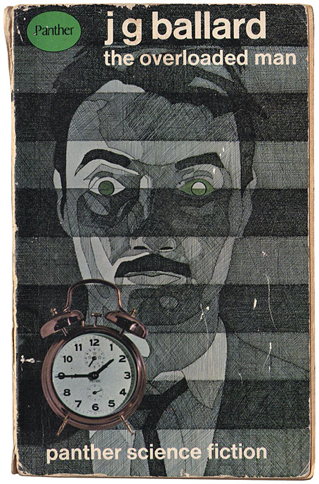
A paperback ravaged by the passage of time. Art by Ray Ginghofer.
Time of Passage, a piece of short fiction by JG Ballard, received its first publication in Science Fantasy magazine in February, 1964. The piece was subsequently collected in two paperbacks, The Impossible Man and Other Stories (Berkley Medallion, 1966), and The Overloaded Man (Panther, 1967). Time of Passage is more of a biographical sketch than a story, describing in reverse the life of a stockbroker, James Falkman, a man “born” in 1963 by being dug out of a grave while surrounded by tearful relatives. Ballard goes on to describe the major events of Falkman’s life, from retirement to career to marriage, charting the man’s gradual descent into youth and eventual infant helplessness. The story ends with Falkman bheing taken to a hospital in 1900 for a final encounter with his mother, his “death” in Ballard’s words.
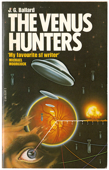
A revised reprint of The Overloaded Man, 1980. The artwork by Peter Gudynas may be the only Ballard cover to feature flying saucers.
There may be earlier literary examples of the life described in reverse but Ballard’s is the earliest one I know of. I’m thinking here of explicit reversals of human circumstance, as opposed to the more common reverse chronology whereby an otherwise forward-flowing story is chopped into episodes which are then presented in a reversed order. Philip K. Dick’s Counter-Clock World (1967) is a novel-length extrapolation of Ballard’s concept, set in a future where time has started to run backwards, and the dead are being born again in cemeteries. The 1960s saw a peculiar spate of fiction along these lines; to paraphrase Charles Fort, it must have been time-reversal time. In an earlier Ballard story, Mr. F is Mr. F, the titular character finds himself aging in reverse while time continues to run forward for his wife and the world outside their home; in An Age (1967) by Brian Aldiss scientific experiments reveal that time is actually moving in reverse despite our perceptions to the contrary.
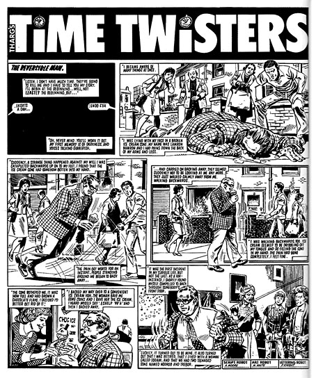
Art by Mike White.
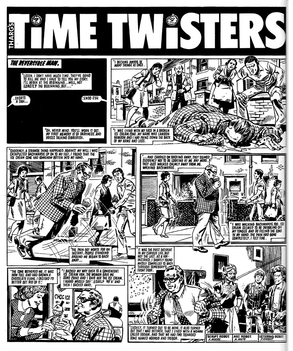
Alan Moore would no doubt have been familiar with one or more of these stories when he wrote The Reversible Man for 2000 AD in 1983, a four-page strip which shows the life of an ordinary man from death to birth. Moore freshens the concept a little by the use of first-person narration. The most well-known treatment of the idea is Time’s Arrow by Martin Amis, a novel whose structure was taken by some reviewers as wholly original even though Amis said he was inspired by a passage in Kurt Vonnegut’s Slaughterhouse-Five. I’ve always felt Amis was being evasive on this point; he was very familiar with Ballard’s fiction, he interviewed Ballard and reviewed his novels on several occasions. Anyone with this much interest in Ballard’s work would have read Time of Passage in one of its many reprintings.
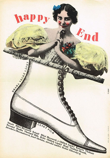
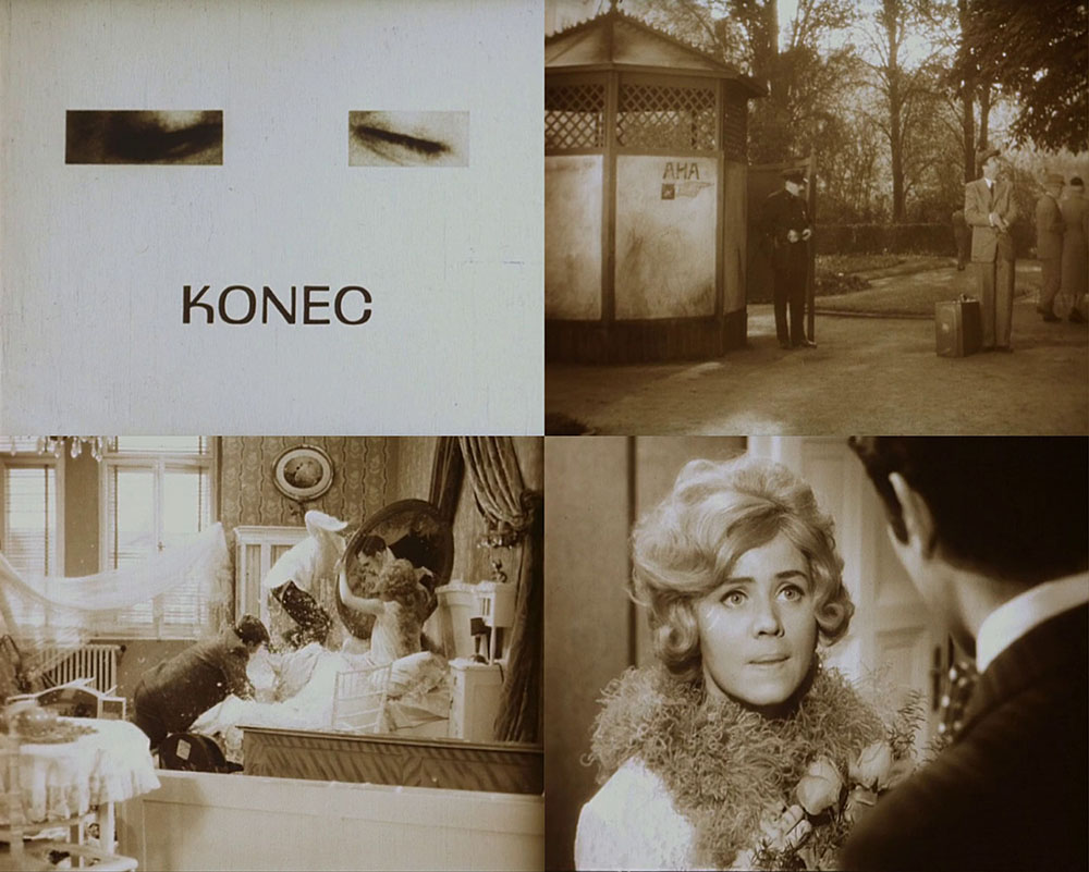
Design by Milan Grygar.
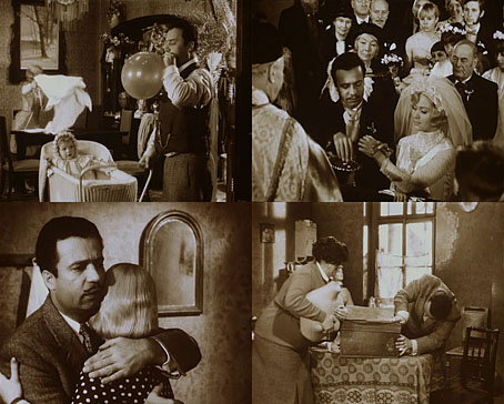
When it comes to authorial influence it seems unlikely that Czech film-maker Oldřich Lipský could have been influenced by Ballard or Dick’s time-reversals, which makes the appearance of Happy End in 1967 all the more remarkable. Lipský’s feature film, which I watched last week, is essentially Ballard’s death-to-life narrative played for its comic potential, with the film itself running in reverse for much of the time. Happy End opens with a title card in Czech—”Konec” (“The End”)—before presenting the “birth” of its protagonist by means of a guillotine. The decapitated head of Bedřich Frydrych (Vladimír Menšík) is attached to his body, after which the guards lead him (backwards) to the place described by his cheerful voiceover as a school (aka prison) where he says he’s being prepared for life in the outside world. Before he sets off to his waiting apartment the police give him a suitcase containing the body of his wife, Julie (Jaroslava Obermaierová), the pieces of which he assembles in the bath in his apartment. Julie is “revived” when Frydrych pulls an axe from her forehead, after which Julie’s lover, Ptáček (Josef Abrhám), makes his first arrival, jumping backwards into the bedroom through the window.

The love-triangle between Frydrych, Julie and Ptáček forms the bulk of the story, and also the basis for much of the film’s black humour. One of the hallmarks of the reversed biography is ironic reinterpretation, something that Amis makes a substantial meal of in his novel. In many cases it’s easier to do this with film than it is with words: a fight between Frydrych and Ptáček becomes an energetic “tidying up” of the apartment, with the cuckolded husband and the wife’s lover reassembling broken furniture and clearing away all the signs of destruction. Happy End is a long procession of these reversals, accompanied by Frydrych’s voiceover narration which persists in giving any tragic and difficult moments a positive gloss. Most of them, anyway. A substantial win at the racetrack becomes a negative incident when the events are played in reverse. But the loss of money is offset by Frydrych and Julie’s young daughter who pulls fresh banknotes out of an impromptu fire on the kitchen floor.
For non-Czech speakers the humour and invention of Happy End is undermined by the effort required to keep up with the film’s frenetic pace (many of the scenes are speeded-up as well as running in reverse) while reading subtitles which reinterpret everything you’re seeing on the screen. My own viewing was further compromised by amateurish subtitles, but this is all the more reason to watch it again. Second Run have recently released Happy End as a region-free blu-ray with “new and improved English subtitle translation”. This is the second Lipský film I’ve watched to date (thanks, Jay!). I’ll be looking for more.
Previously on { feuilleton }
• Art on film: Je t’aime, Je t’aime