Firebird, a film by Rein Raamat

varvilind1.jpg

There’s a Firebird of a different kind in this short film by an Estonian animator whose equally short Hell was featured here some time ago. Hell and Firebird are so stylistically opposed they look like the work of two different film-makers, although in the case of Hell this is a result of the film being based on the etchings of an Estonian artist, Eduard Wiiralt,  Firebird (1974) is simpler fare, another example of the cultural fallout from The Beatles’ Yellow Submarine, and a rather late one at that, not only in style but in the progress of its scenario.

varvilind2.jpg

Where The Beatles had Pepperland as a frozen monochrome world which has to be restored to life and colour by the Fab Four, Rein Raamat presents a monochrome city whose listless inhabitants are enlivened by the arrival in the sky of a giant coloured bird. The bird’s changing colours bring further life to the city itself; flowers and fountains burst forth, to the annoyance of a ferocious black cat who evidently preferred the earlier dispensation. As with any symbolic story made in the Soviet bloc, you can’t help but see this as a mirror for life in the world outside the cinema. Watch it here.

Previously on { feuilleton }
The groovy video look
Hell, a film by Rein Raamat
Tadanori Yokoo animations

Firebirds

bilibin.jpg

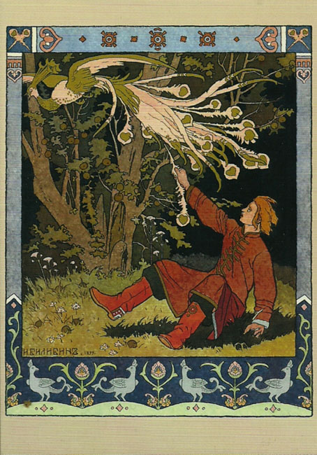
Ivan Tsarevich Catching the Firebird’s Feather (1899) by Ivan Bilibin.

The firebirds are those that you find on the covers of recordings of Stravinsky’s Firebird ballet score, or on its popular distillation, The Firebird Suite. The latter has long been one of my favourite pieces of classical music, in fact it was one of the first I owned, via a cheap vinyl pairing with The Rite Of Spring that was mainly of interest for being conducted by Stravinsky himself. The cover photo showed a ballerina as the Firebird in a ballet performance, a common choice for the covers of Firebird recordings.
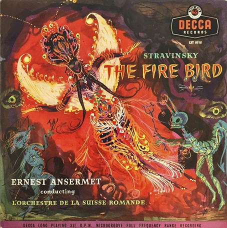
firebird-1955.jpg

No artist/designer credited, 1955.

Much better was the cover of Tomita’s Firebird album (see below) which I bought around the same time, an uncredited tapestry design which is also a better album cover than the painting used on the earlier Japanese release. Depicting the Firebird itself is the other obvious choice when designing Stravinsky albums, and the dazzling, magical bird has helped this particular opus fare better in the world of classical album design than many other recordings.
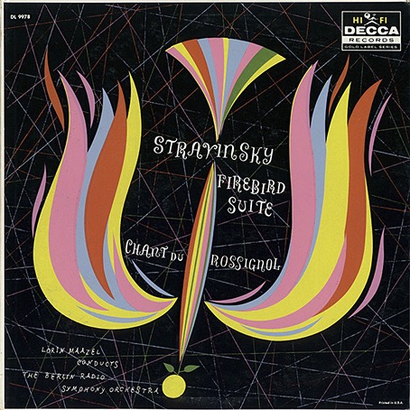
firebird-1958.jpg

No artist/designer credited, 1958.

It’s easy to cast aspersions at the designers or art directors of classical records when you see an uninspired cover design, but the format presents a number of difficulties. There’s no such thing as a fixed design for a classical album because classical albums have no fixed form. With the exception of albums devoted to a single long composition most classical albums are compilations, pairing longer works with shorter ones, often by two or more composers. This confusion of identity creates problems for the designer, as does the huge quantity of classical releases. Then there’s the problems posed by the music itself which is so often abstract; you can’t “illustrate” The Goldberg Variations. The default choice is to use a painting or a drawing or a photograph of the composer as a cover image, or a photo of the conductor or performer. The easiest assigments, as these Firebird covers demonstrate, are albums based around a composition with a well-defined theme that can be depicted visually. Nobody has ever had a problem designing a cover for recordings of Debussy’s La Mer, for example, the only difficulty is deciding what picture of the sea you want to use.
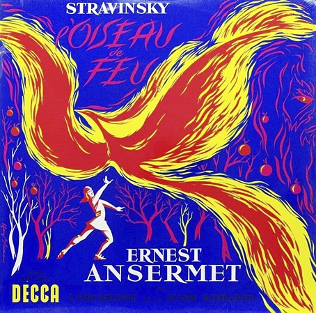
firebird-1960-1.jpg

No artist/designer credited, 1960.

I’ve never had the impression that classical devotees care very much about these issues, it’s the music and the performance they’re interested in. Record labels (or their marketing departments) do seem to pay attention to visual matters now and then, and you’ll find occasional attempts to create a new line of themed covers. (The Orphic Egg series was one of the more bizarre examples from the 1970s.) Deutsche Grammophon have a history of decent cover design but even they resort to using photos of the artist or conductor far too often. I’ve never been asked to design a classical release, and I’m not sure I’d relish the task, but the problems raised by the form fascinate me. This is a subject I’ll no doubt keep returning to.
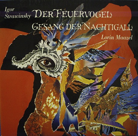
firebird-nd2.jpg

Irma Seidat, no date.

Continue reading “Firebirds”

Weekend links 797

robertson.jpg

Bloomsbury Roofs (no date) by J. Elspeth Robertson.

• “Lud Heat and Suicide Bridge…are only offshoots of a huge central corpus of mad experimental writing, prose and poetry and just research notes. Pages and pages and pages of this lunacy.” Iain Sinclair describing to Robert Davidson the genesis of his influential poem/book Lud Heat. Related: Serious houses: The Lud Heat Tapes.

• At Criterion Current: Deeper into Robert Altman, a look at five lesser-known films from the director’s expansive filmography. Good to see Quintet receiving some attention, a science-fiction film that’s not without flaws but is still closer to the written SF of the 1970s than the decade’s box-office hits.

• Among the new titles at Standard Ebooks, the home of free, high-quality, public-domain texts: Short Fiction, by Charles Beaumont.

• Mix of the week: Ambient Focus 26.06.21 by Kevin Richard Martin aka The Bug.

• At the BFI: Rory Doherty chooses 10 great films set in 1970s America.

• At Colossal: Frédéric Demeuse’s photos of ancient forests.

• RIP Claudia Cardinale and Danny Thompson.

• New music: If the Sun Dies by Greg Weeks.

• The Strange World of…Rafael Toral.

Silver Forest (1969) by Organisation | A Forest (1980) by The Cure | A Forest In The Sky (2024) by Hawksmoor

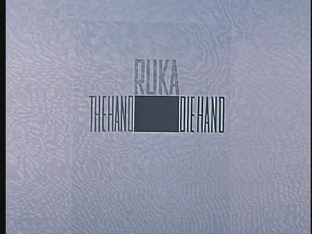
The Hand, a film by Jiří Trnka

hand1.jpg

Regular readers may have noticed that Jiří Trnka’s name has been written here with all the Czech accents intact, something that hadn’t been possible until a few days ago thanks to a database coding fault. This had long been the case with accents like those used in Czech, Polish, Turkish, Japanese, and other languages, to my endless frustration. I’ll spare you the technical details but the solution, which I resolved at the weekend, turned out to be easier than I expected, as a result of which I’ve been going back through posts adding accents to names which until now had been incomplete.

hand2.jpg

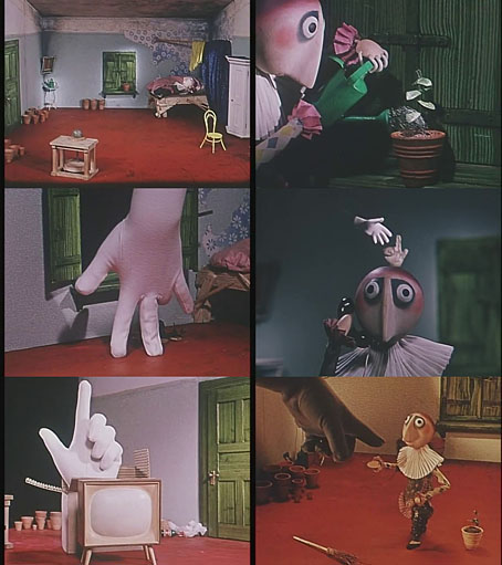
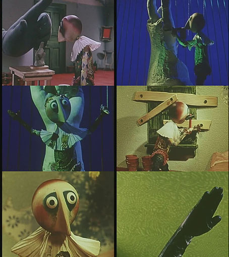
Jiří Trnka (1912–1969) came to mind while I was restoring the accents for Jiří Barta; both men are Czech animators, with Barta having been mentioned here on many occasions. Trnka was one of the founders of the Czech animation industry whose puppet films aren’t always to my taste but I thought I might have mentioned The Hand (1965) before now. This was Trnka’s final film, and one of his most celebrated for its wordless presentation of a universal theme: the freedom of the artist in the face of authoritarian demands. Many of Trnka’s previous films had been stop-motion puppet adaptations of fairy tales which lends The Hand a subversive quality when the scenario seems at first to be pitched in a similar direction. The artist character is a typical Trnka puppet with a persistently smiling face who spends his time in a single room making flowerpots with a potter’s wheel. “The hand” in this context refers both to the manual nature of the potter’s craft as well as to the huge gloved appendage that forces its way into the room demanding that the pots be abandoned in favour of hand-shaped sculptures. The resulting battle of wills shows the strengths of animation in delivering a potent visual metaphor.

hand3.jpg

Trnka’s message at the time of the film’s release was especially pertinent for the Soviet satellite nations where the promise of post-war Communism had been corrupted by decades of repressive governments, a situation that Jan Švankmajer bitterly addressed in The Death of Stalinism in Bohemia. Trnka isn’t as savage as Švankmajer but his message is still an ironic one, and may have been fuelled by an equivalent bitterness. Trnka’s career was bookended by films showing the struggle of assertive individuals against authoritarian oppression, but in the first of these, The Springman and the SS (1946), the contest is between a Czech chimney-sweep and the Nazi occupiers. The Hand could only be taken by Czech viewers as being aimed at their own oppressive government, and as such may be seen as Trnka’s contribution to the Czech New Wave, especially those films (Daisies, The Cremator) that the same government regarded as politically subversive or otherwise harmful. The Hand, like The Cremator, was withdrawn from distribution a few years after its release. Jiří Barta is a very different director to Trnka but Barta’s The Vanished World of Gloves (1982) features a dystopian sequence showing a fascist world of marching hands which looks like a homage to Trnka’s film. Watch The Hand here.

Previously on { feuilleton }
Jiří Barta: Labyrinth of Darkness
Jiří Barta’s Pied Piper

The art of Jean-Michel Nicollet

nicollet12.jpg

French artist Jean-Michel Nicollet isn’t really known as a comic artist but one of his strips appeared in the Métal Hurlant Lovecraft special in September, 1978, and was reprinted in the Heavy Metal Lovecraft special a year later. Nicollet’s three-page story, H.P.L., is a slight thing which you can read below but his paintings present more of the atmosphere of Lovecraft’s fictional worlds than many of the other strips in those issues, including the equally slight contribution from Moebius. Prior to this, Métal Hurlant had been using some of Nicollet’s paintings for cover art, as a result of which one of the same illustrations appeared on the cover of the very first issue of Heavy Metal magazine in 1977. The winged Lovecraft from his comic strip turned up again on the cover of a Robert Bloch story collection for French publisher Nouvelles Éditions Oswald (NéO) in 1980.

nicollet09.jpg

Nicollet seems to have retired now from cover work but during the 1970s and 80s he was a very prolific illustrator, especially for NéO. NooSFere has a gallery of his covers which are mostly for reprints of early 20th-century horror, fantasy and adventure tales, also a few detective stories. He seems to have enjoyed illustrating classic detective fiction (photos show him posing with a large Holmesian pipe) so there may well be more covers which aren’t included in the NooSFere list.

nicollet11.jpg

The selections I’ve chosen here match my own preferences for cosmic horror and weird fiction, and represent another attempt to look further afield for this type of illustration. French cover design can be unsympathetic to cover illustration, crowding the paintings with poor type choices and purposeless graphics. The uniform layouts of NéO treat the artwork with more respect.

nicollet13.jpg

nicollet14.jpg

Continue reading “The art of Jean-Michel Nicollet”