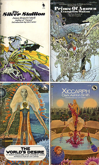
top left: Bob Pepper (1969); right: David Johnston (1974).
bottom left: Mati Klarwein (1972); right: Gervasio Gallardo (1972).
I wrote about the classic line of fantasy paperbacks in the Ballantine Adult Fantasy series last year as part of the post about Bob Pepper’s illustration:
It was the success of the publication of The Lord of the Rings in America which inspired Betty Ballantine to publish a line of fantasy classics in the late Sixties. The series began its run in 1969 and continued until 1974. Lin Carter was commissioned as editor and given free reign to choose any title he thought might be suitable with the result that many of the books in the series—obscurities such as Lud-in-the-mist by Hope Mirrlees—received their first paperback publication. Carter also reprinted personal favourites which frequently shifted from fantasy to outright horror, such as the titles from HP Lovecraft and William Hope Hodgson. The range and scope of this line is what makes the series so notable today and the books have become highly-collectable as a result.
I’m fairly sure this page of cover scans of the BAF series wasn’t there when I was searching for Pepper covers. Whether it was or not, it contains a lot of Bob Pepper artwork I hadn’t seen before at large size, plus a substantial number of the other covers. I was never all that taken with Gervasio Gallardo’s work which took the lion’s share of the illustration duties but the passage of time has lent his paintings and their florid title designs the distinction of being emblematic of the era. And some of the rest are still pretty decent covers.
Elsewhere on { feuilleton }
• The illustrators archive
• The book covers archive
Previously on { feuilleton }
• The art of Bob Pepper
• Fantastic art from Pan Books