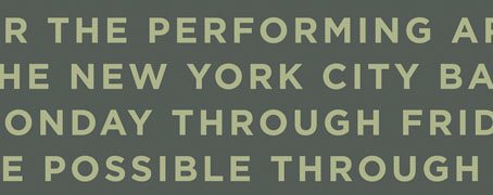
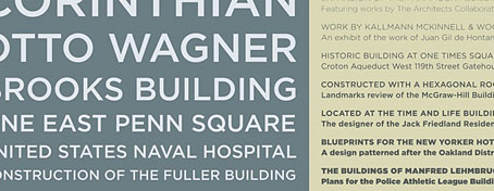
Helvetica at 50
The BBC talks typefaces.
Category: {typography}
Typography
Calligraphy by Mouneer Al-Shaárani
Beautiful work. Via growabrain.
Update: “A study of medieval Islamic art has shown some of its geometric patterns use principles established centuries later by modern mathematicians.” Full story here.
Previously on { feuilleton }
• The Journal of Ottoman Calligraphy
• Word into Art: Artists of the Modern Middle East
The Door in the Wall
Photographer Alvin Langdon Coburn (1882–1966) illustrates HG Wells’ wonderful short stories in a rare edition of The Door in the Wall and Other Stories, from 1911. More pictures here.
The Door in the Wall was a true three-way collaboration between the author, the photographer and the typographer, Frederic W. Goudy, who specifically produced his Kennerley Old Style typeface for this book. Designed in the elegant Arts-and-Crafts style, it was printed on French hand-made paper at Goudy’s Village Press in an edition of 600 copies. In fact, only 300 copies contain the full compliment of Coburn’s rich photogravures, due to some being damaged in shipment and being replaced by aquatones. The photographer personally prepared the gravure plates, pulled proofs and oversaw the printing of the edition.
The Door in the Wall.
The Lord of the Dynamos.
Previously on { feuilleton }
• War of the Worlds book covers
The Times makeover
The new masthead designed by Luke Prowse, with a coat of arms
by wood engraver Edwina Ellis.
So, in today’s Neville Brody news (no, I’m not intending on posting about him every day…) it seems the designer has been busy with colleague Luke Prowse making The (London) Times look better. Not before time (so to speak), it was starting to look very out-of-date beside the recent makeovers at The Guardian and Independent. Brody is evidently first choice for these kind of projects at the moment, confirming that he’s still one of our most important print designers.
Among the changes are a new typeface, Times Modern, which has been applied to a new design for the masthead. Considering that this is one of the most famous newspaper mastheads in the world, I hadn’t realised it had changed so much over the years. The Times website has a nice online gallery showing the development from its earliest days as “The Daily Universal Register” through to the present.
An early edition from 1788.
Brody has said of the new typeface, “Times Modern is a contemporary answer to the needs of compact newspapers. With pinched proportions, it allows more copy in the headline without compromising legibility. It is both authoritative and elegant, while robust at smaller sizes.” Since he’s on record expressing his dislike for Times New Roman, he must have enjoyed being given the opportunity to supplant an ugly and over-familiar font with something more suitable.
Previously on { feuilleton }
• 100 Years of Magazine Covers
The Journal of Ottoman Calligraphy
Seeing as we’re living through a period of recurrent paranoia and hysteria, with a whole state of matter being declared dangerous, with people falling under suspicion for not being white, and with events like this a daily occurrence, one can only wonder how we endured thirty years of deadly IRA terrorism in this country without panic in the streets or the nation turning into a police state.
Useful then to be reminded of some of the many positive aspects of Arab culture which is exactly what the Journal of Ottoman Calligraphy is devoted to. This is a new blog so there isn’t much there just yet (although what’s there is gorgeous) but I look forward to seeing what they post in the future.
Via the excellent BibliOdyssey.
Previously on { feuilleton }
• Word into Art: Artists of the Modern Middle East