The exposition moiré

expo2000-1.jpg

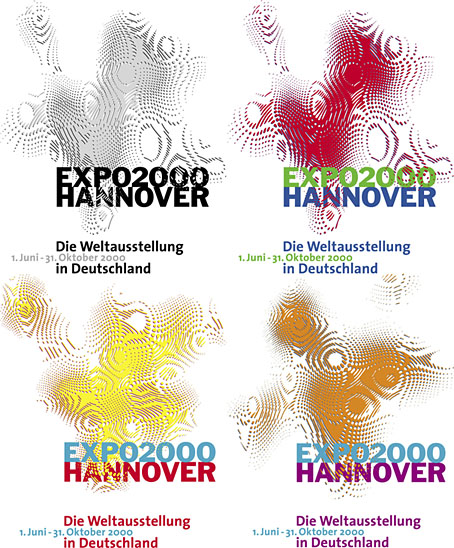
Logos designed by QWER, Iris Utikal and Michael Gais.

Hannover’s Expo 2000 wasn’t very successful as expositions go but it had an attractive logo, a combination of bold sans-serif type with a moiré background pattern which ideally had to be seen in its animated form. World expositions tend to be concerned with technical innovations and novelties, and this animated design was certainly novel, if impossible to replicate in print. All the static versions of the logo are essentially screenshots of the moving version, with the moiré image frozen at a various places to generate many shape and colour variations. Not all of these are satisfactory. I think it was Matisse who said that anyone can put two colours together; the real challenge is putting three together in a harmonious manner.

expo_logo.gifThe pattern was a little more animated on the original exposition website, albeit reduced to this tiny gif. The site is mostly intact and browsable at the Internet Archive, a primitive thing by today’s standards but Expo 2000 was the first world exposition with a dedicated website, something which really did set it apart from its predecessors. Many of the exposition’s buildings and exhibits would have seemed bizarre or alarmingly ugly to the people who attended the Paris Exposition Universelle in 1900 but much that was on display in Hannover would at least have been comprehensible to a visitor from the past. Trying to explain what “a website” was to someone in 1900, even a futurologist like HG Wells, would have required considerable effort.
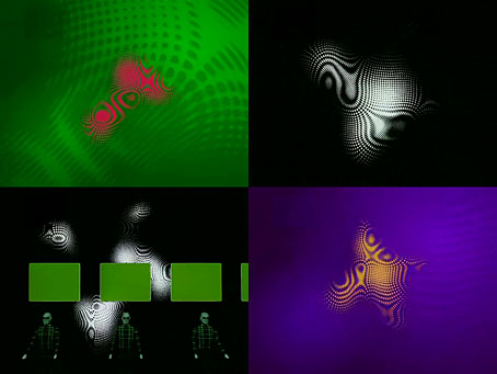
expo2000-2.jpg

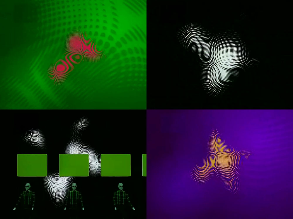
Video for Expo 2000 by Kraftwerk.

Ephemerality is a distinguishing characteristic of world expositions, all those splendid pavilions and eye-catching constructions don’t last very long even though the events themselves involve years of planning. A list of exposition features that have managed to survive would be a disparate collection, taking in well-known landmarks like the Eiffel Tower, Seattle’s Space Needle and the Atomium in Brussels, architectural projects such as the Grand Palais in Paris and the Biosphere in Montreal, and one-off oddities like the Unisphere in Queens and the cement dinosaurs in Crystal Palace Park. If Expo 2000 is remembered for anything today it’s the one-off song that Kraftwerk wrote for the occasion, Expo 2000, which arrived with graphics and visuals based on the expo logo. Kraftwerk had been hired at great cost to create the jingles in different languages that accompany the animated logo. This is turn led to the song, the group’s first new studio composition in 14 years.
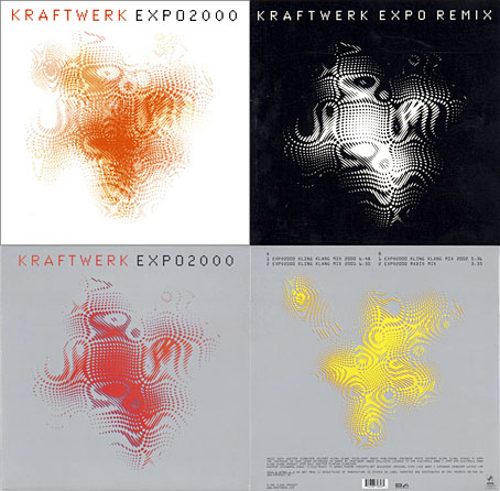
expo2000-4.jpg

I thought these abstract images were a good match for Kraftwerk, I prefer them to the other designs for the single which show the four computer-generated figures that later appeared on the cover of Minimum-Maximum. The CD case at the top left was made with lenticular plastic which imitated the moiré effect of the animated logo. I didn’t buy this one when I had the chance, choosing instead the “enhanced” version which came with a minuscule copy of the video in a CD-ROM section. Like most CD-ROM singles, the audio tracks still play but the enhanced section no longer works. Welcome to the future.

Continue reading “The exposition moiré”

Weekend links 681

hunter.jpg

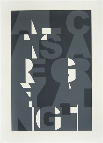
All Cats are Grey At Night (2009) by Kenny Hunter.

“They found ways to do the impossible”: Hipgnosis, the designers who changed the record sleeve for ever. Lee Campbell talks to Anton Corbijn about Squaring the Circle, Corbijn’s documentary about the Hipgnosis design team. Peter Christopherson is shown in the accompanying photo but Campbell doesn’t mention him at all, despite his having been an equal partner with Storm Thorgerson and Aubrey Powell from the mid-70s on. Many of those famous covers were photographed by Christopherson’s camera.

• A new book by Stephen Prince at A Year In The Country: “Lost Transmissions weaves amongst brambled pathways to take in the haunted soundscapes of electronica, the rise of the occult in the 1970s, cinema and television’s dystopian dreamscapes and hauntological work which creates and gives a glimpse into parallel worlds…”

• New music: Ambient Bass Guitar by John von Seggern, and Sturgeon Moon/Beaver Moon by Missing Scenes.

• How Samuel R. Delany Reimagined Sci-Fi, Sex, and the City.

• Mix of the week: Tranquility by A Strangely Isolated Place.

Galerie Dennis Cooper presents…Snow Globalists.

• The Strange World of…African Head Charge.

• Steven Heller’s font of the month is Baudot.

Nights on Earth.

Transmission (1979) by Joy Division | Clandestine Transmission (1994) by Richard H. Kirk | Transmission (1996) by Low

Fender guitar catalogue, 1976

fender01.jpg

Another post prompted by 70s Sci-Fi Art, and a publication that’s very typical of its decade. The Fender guitar catalogue for 1976 showcases its product range with a series of illustrations that carefully pastiche the kind of art you’d find in books of fairy tales. Selling rock’n’roll equipment in this manner wasn’t a trend-setting step by 1976, not with the punk hordes on the march, but corporations are seldom ahead of the general culture. The cover art by Ruby K. Lee is a copy of one of Kay Nielsen’s drawings for East of the Sun and West of the Moon. Lee also provides one of the interior drawings, with the rest of the art being the work of Bruce Wolfe. (There may be another artist involved since one of the illustrations lacks a credit.) This looks like a huge amount of effort for a small product catalogue but the illustrations were also part of an ad campaign with accompanying storybook copy. It’s good to see Busorama being used for all the headings. I’ve been using this font myself for its associations with the 1970s.

fender02.jpg

Since I keep borrowing tips from 70s Sci-Fi Art I’ll note again that Adam Rowe’s Worlds Beyond Time: Sci-Fi Art of the 1970s will be published by Abrams next month.

fender03.jpg

fender04.jpg

fender05.jpg

Continue reading “Fender guitar catalogue, 1976”

Weekend links 677

cv-brody.jpg

Design by Neville Brody, 1980.

• My work soundtrack for the past couple of weeks has been non-stop Cabaret Voltaire so this is pertinent. Neville Brody designed many of the group’s record sleeves in the 1980s as well as this poster and another one that I’ve only seen as a small picture in the first Brody book. He was also responsible for the CV logo which I never managed to find in badge form.

• “Anger’s preferred mode of artistry in his last decades was self-mythologising, and while he would return to filmmaking late in life, it was less as hierophant than totem—the worn keepsake of a once powerful magick.” Ryan Meehan remembers Kenneth Anger.

• New music: Waves by Ben Chasny and Rick Tomlinson, Topos by UCC Harlo, and Zango by WITCH.

Kafka’s perpetual redescription of his plight suggests that throughout his writing life he was less interested in finding a solution or even arriving at a single, definitive formulation of the problem than he was in exploring the implications and complications of his situation from new, unexpected angles and crafting an ever-expanding lexicon of figures for its inescapability.

Ross Benjamin, the translator of Franz Kafka’s diaries, on the neurotic concerns that Kafka turned into art

• “Why are men seemingly always naked in ancient Greek art?” Sarah Murray investigates.

Artists for Bibi: an auction in aid of Arthur Machen’s great-great-granddaughter.

• At Public Domain Review: Unidentified Floating Object: Edo Images of Utsuro-bune.

• Steven Heller’s font of the month is Acorn.

• Old music: Moon Journey by Mort Garson.

• RIP Tony McPhee.

Kafka (1964) by The Rowdies | Kafka (1982) by Masami Tsuchiya | Kafka (Main Title) (1992) by Cliff Martinez

Glaser goes POP

glaser1.jpg

The purchase of big art and design books requires careful consideration round here, what with shelf space being stressed in multiple ways. (One of the shelves bearing the heavier volumes sags alarmingly.) But this one was recommended to me by a couple of people, and I’d also had a book token hanging around unused for over a year so here we are.

glaser2.jpg

Skin types for Seventeen magazine, 1967.

Milton Glaser: POP is a copiously-illustrated 288-page study of the work produced by Milton Glaser and his colleagues at Push Pin Studio, with an emphasis, as the title and cover art suggests, on the company’s prime decade of the 1960s. The book was compiled and edited by the redoubtable Steven Heller, together with Mirko Ilic and Beth Kleber, and presents an overview of Glaser’s remarkable career as designer and illustrator. Glaser was an exceptionally versatile artist, something which has often made appraisal of his career a difficult business. You could easily choose ten of his book or album covers from the many examples assembled by Heller and co., and all would look like the work of different people.

glaser3.jpg

The Alexandria Quartet by Lawrence Durrell; Pocket Books, 1969. I’d much rather have this set than my Faber collection which packages the four books into an unwieldy brick.

Matters are further complicated by the often collaborative nature of the work at Push Pin, and the fact that designers and illustrators aren’t always given credit for their commissions. In the past I’ve gone looking for Glaser’s work then given up when I seemed to be encountering designs that weren’t by him at all. In addition to demonstrating Glaser’s range, Heller, Ilic and Kleber have done everyone a service by showing unused illustrations and crediting work that was previously debatable. Some years ago I wrote a post about the uncredited cover art for the first budget sampler album, The Rock Machine Turns You On (1968), an entry which didn’t manage to resolve the issue of whether or not the cover art was Glaser’s work. It turns out it was by him after all, collage being one of the techniques he employed from time to time.

glaser5.jpg

TIME magazine gets groovy. A fold-out cover from 1969.

On a more personal level, Glaser’s versatility and multi-disciplinary approach is encouraging if you find yourself being led in a similar direction. Designer-illustrators are no longer as rare as they used to be, but illustrators, like many fine artists, still tend to develop a favourable style which they then stay with year after year. Illustrators who change their style according to their mood, or the nature of the brief, or a desire to experiment, remain in the minority. Glaser’s illustration ranges more widely than any other artist I’ve seen, from realistic pen-work and watercolour sketches, through bold, stylised designs, to complete abstraction. He could also be playful and frivolous in a manner you can’t imagine from some of his more serious contemporaries, while also being adept enough at illustrating children’s stories that he might easily have spent his career doing this alone.

glaser4.jpg

Avon Books, 1970.

But the main attraction of Milton Glaser: POP for this reader is the focus on all those bold graphics, especially the commissions that reworked the emerging psychedelic styles for the commercial sphere. The cover illustration is emblematic of many other examples. This drawing first appeared in a New York magazine supplement in 1967 to accompany an article about LSD, before being reused on the dustjacket of Tom Wolfe’s book about Ken Kesey and friends, The Electric Kool-Aid Acid Test. Glaser and his colleagues at Push Pin were prime exponents of something I’ve taken to calling “the groovy look“, a term I reserve for commercially oriented quasi-psychedelic art. This isn’t meant to be a serious label, it’s a private term that I used to attach to anything resembling the art styles seen in the Yellow Submarine feature film. Serious or not, the label persists when I continue to feel the need for a suitable descriptor for this type of art. “Psychedelic” is the most common label (and one which obviously suits Yellow Submarine) but it seems inappropriate when discussing magazine adverts for household products or illustrations in children’s books. Steven Heller prefers the term “Pop”, but this strikes me as too loose, risking confusion with the many varieties of Pop Art which seldom resemble the vivid, stylised creations of Glaser et al. Pop would also seem misapplied as a description for commercial art when Pop Art was all about the appropriation (ironic or otherwise) of commercial iconography. If you start to label a swathe of commercial art as Pop along with the gallery art that was borrowing from it then the term becomes so diffuse it loses its meaning. The “groovy style” had a long reach, and evolved beyond the decade it was born in. Plenty of examples may be found in the early 1970s by which time Pop Art (in the gallery sense) had lost its momentum.

glaser6.jpg

Above: Glaser ad art, 1966. Below: Dave Dragon’s cover art for XTC, 1989.

I’ll no doubt return to this question, especially when I’ve just done something in the groovy style myself. (You’ll have to wait a few months before you see the results.) In the meantime there’s a lot to enjoy in this book. I haven’t yet mentioned Glaser’s unused promotional art for the Saul Bass feature film, Phase IV, or the many typeface designs that Glaser created with his associates, and the way one of them—Baby Fat—is used on the cover of the first UK paperback of The Soft Machine. I think this was the first William Burroughs book I ever bought, and it’s been sitting on my shelves all this time without my realising it was a Glaser production. That’s how it often is with graphic designers; they shape our world almost as much as architects do yet their specific influence isn’t always recognised.

glaser7.jpg

Corgi Books, 1970.

And by coincidence, the latest post at The Daily Heller is about a Glaser exhibition tied to the publication of the book. If you’re in New York it’ll be running for the next two weeks.

Previously on { feuilleton }
The groovy look
Milton Glaser album covers