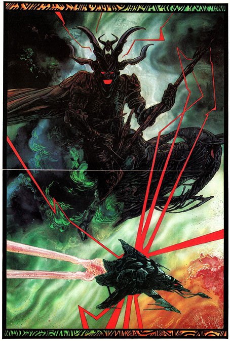
Weekend links 676

binnie.jpg

Sleeve Study, from Kakitsubata (1998) by Paul Binnie.

• “London was not a project for me. It was the curse that never stops giving.” Iain Sinclair talking to Matthew Stocker about his new book for Swan River Press, Agents of Oblivion.

The Ultimate DMT Breakthrough Replication Compilation, a video guide to the DMT experience by Josie Sims. Related: Kristen French on what hallucinogens will make you see.

• At Spoon & Tamago: A return to Tokyo Genso’s depictions of an urban Japan transformed by vegetation and neglect.

• New music: The Shell That Speaks The Sea by David Toop & Lawrence English.

• At Bajo el Signo de Libra: San Sebastián de Mártir a Icono Homosexual.

• Cosmic views from the Milky Way Photographer of the Year, 2023.

Nakamura Mitsue makes a Noh mask from a single block of wood.

• Mix of the week: A mix for The Wire by Eleni Poulou.

• At Dennis Cooper’s: Delphine Seyrig Day.

Of Ancient Memory (The Oblivion Seekers) (1994) by Jarboe | Oblivion (2001) by Lustmord | Oblivion (2004) by Redshift

Toytown psychedelia

alala2.jpg

The Teletrips of Alala (1970).

The imaginative landscapes of childhood were always close at hand in the psychedelic culture of the 1960s, more so in Britain than the USA, and especially where music was concerned. Grace Slick may have given the world White Rabbit but there’s a whole sub-genre of British psychedelic song-writing devoted to children’s games, children’s dreams, sweetshops, fairy tales and the like. Rob Chapman in his essential study of the form, Psychedelia and Other Colours, refers to this tendency as “infantasia”. With psychedelic art being so vivid and playful it’s a small step from lysergic wonderlands to children’s books styled in a quasi-psychedelic manner, which is what we have here. There was a lot of this around in the early 1970s, not all of it very memorable. Some of the best examples were published by Harlin Quist, a US/French imprint who specialised in beautiful books illustrated by exceptional talents. A few of these may be seen at The Peculiar Manicule.


Gertrude and the Mermaid (1968)
by Richard Hughes, illustrated by Nicole Claveloux.

gertrude1.jpg

“This is the story a little girl, her doll named Gertrude, and a mysterious mermaid-child.” The first of several books by Nicole Claveloux for Harlin Quist.

gertrude2.jpg

gertrude3.jpg


Help, Help, the Globolinks! (1970)
by Gian Carlo Menotti, translated and adapted by Leigh Dean, illustrated by Milton Glaser.

globolinks1.jpg

“Recounts the events following the landing of the outer-space Globolinks on Earth.” A German comic opera from 1968 in which a group of children encounter an alien invasion.

globolinks2.jpg

globolinks3.jpg

globolinks4.jpg


The Teletrips of Alala (1970)
by Guy Monreal, illustrated by Nicole Claveloux.

alala1.jpg

“With her unique power to enter the television set and change the course of the programs, Alala creates havoc in the world.” Nicole Claveloux puts her own twist on the Yellow Submarine art style. A few years after this she was creating comic strips for Métal Hurlant. Her more recent work includes erotic retellings of fairy tales. (more pages)

alala3.jpg

alala4.jpg


Andromedar SR1 (1971)
by Martin Ripkens & Hans Stempel, illustrated by Heinz Edelmann.

andromedar1.jpg

“Two astronauts under the spell of an evil octopus are ordered to steal the cobalt-blue flowers from the Martian Mice.” Ripkens and Stempel were better known for their work as cinema critics and film-makers. (more pages)

andromedar2.jpg

andromedar3.jpg


Cartulino: El asombroso doctor Zas (1971)
by Miguel Agustí, illustrated by Alberto Solsona.

solsona02.jpg

A comic strip from a Spanish title, Strong. Alberto Solsona also drew Agar-Agar, the grooviest strip in the short-lived Dracula comic. Cartulino had a number of different adventures but online examples are scarce.

solsona03.jpg


Los Doce Trabajos de Hércules (1973)
by Miguel Calatayud.

hercules1.jpg

“Serie de episodios sobre la penitencia llevada a cabo por Hércules el mayor de los héroes griegos.” A comic adaptation rather than a story book but the art style is a good example of the general trend.

hercules2.jpg

hercules3.jpg


Update: Added Alberto Solsona.

Previously on { feuilleton }
Glaser goes POP
Return to Pepperland
The groovy look
The psychedelic art of Nicole Claveloux
Psychedelia and Other Colours by Rob Chapman
David Chestnutt’s psychedelic fairy tales

Weekend links 675

stuck.jpg

Lucifer (1890) by Franz Stuck.

• “I wanted to reclaim the word ‘psychonauts’ and take it back into the 19th century, where it describes not only renegades and rebels, but also establishment scientists, doctors, and pillars of the literary establishment. The word that was used at the time was “self-experimenter.” Mike Jay (again) talking to Steve Paulson about psychoactive research and the scientists who taste their own medicine.

• “How did countercultures commune before the internet?” asks J. Hoberman, reviewing Heads Together: Weed and the Underground Press Syndicate, 1965–1973 by David Jacob Kramer.

• At Public Domain Review: Medieval advice concerning the mythical Bonnacon: “the protection which its forehead denies this monster is furnished by its bowels”.

• DJ Food unearths posters and badges for The Kaleidoscope, a short-lived Los Angeles music venue of the late 60s.

• At Spoon & Tamago: Gaku Yamazaki has documented thousands of unusual road signs across Japan.

• New music: Psalm013: Unland by Pram of Dogs, and Intimaa by Bana Haffar.

• At Unquiet Things: A sneak peek from the forthcoming The Art of Fantasy.

• The Strange World of…Shirley Collins.

• At Dennis Cooper’s: Bruce Posner Day.

Kenneth Anger: a life in pictures.

• RIP Tina Turner.

Kaleidoscope (1967) by Kaleidoscope (UK) | Kaleidoscope (1984) by Rain Parade | Collideascope (1987) by The Dukes Of Stratosphear

Phantastische Edelmann

edelmann1.jpg

There’s more to Heinz Edelmann than the designs he created for Yellow Submarine, as Edelmann himself often used to remind people. And there’s more to his work for animated film than the Beatles’ exploits. Der Phantastische Film is a short introductory sequence for a long-running German TV series which has been doing the rounds for a number of years. Brief it may be but a couple of the monstrous details resemble those that Edelmann put into his covers for Tolkien’s books.

edelmann2.jpg

Edelmann had plans to capitalise on the success of Yellow Submarine with more films like this when he set up his own animation company, Trickfilm, but the only other example is The Transformer, a short about steam trains which he designed. (The direction was by Charlie Jenkins, with animation by Alison De Vere and Denis Rich.) Given the persistent popularity of Yellow Submarine I keep hoping someone might revive its style for something new. The first animated feature directed by Marcell Jankovics, Johnny Corncob, comes close but lacks the trippy Surrealism of the Beatles film. The Japanese can certainly do trippy Surrealism (see Mind Game or Paprika) but I’ve yet to see anything that approaches the Edelmann style. Johnny Corncob, incidentally, is now available on Region B blu-ray from Eureka. It’s worth seeing but the main film in the set, Son of the White Mare, is Jankovics’s masterpiece.

edelmann3.jpg

On a slightly related note, until today I hadn’t looked at ISFDB.org for Heinz Edelmann’s genre credits so I hadn’t seen this Lovecraft cover before. Hard to tell if this creature is supposed to be Cthulhu or Wilbur Whateley’s brother when The Dunwich Horror is one of the stories in the collection. Either way, it belongs in the Sea of Monsters. Insel Verlag published this one in 1968, a year before launching their special imprint devoted to fantastic literature, Bibliothek des Hauses Usher.

Previously on { feuilleton }
Return to Pepperland
The groovy look
The Sea of Monsters
Yellow Submarine comic books
Heinz Edelmann

Glaser goes POP

glaser1.jpg

The purchase of big art and design books requires careful consideration round here, what with shelf space being stressed in multiple ways. (One of the shelves bearing the heavier volumes sags alarmingly.) But this one was recommended to me by a couple of people, and I’d also had a book token hanging around unused for over a year so here we are.

glaser2.jpg

Skin types for Seventeen magazine, 1967.

Milton Glaser: POP is a copiously-illustrated 288-page study of the work produced by Milton Glaser and his colleagues at Push Pin Studio, with an emphasis, as the title and cover art suggests, on the company’s prime decade of the 1960s. The book was compiled and edited by the redoubtable Steven Heller, together with Mirko Ilic and Beth Kleber, and presents an overview of Glaser’s remarkable career as designer and illustrator. Glaser was an exceptionally versatile artist, something which has often made appraisal of his career a difficult business. You could easily choose ten of his book or album covers from the many examples assembled by Heller and co., and all would look like the work of different people.

glaser3.jpg

The Alexandria Quartet by Lawrence Durrell; Pocket Books, 1969. I’d much rather have this set than my Faber collection which packages the four books into an unwieldy brick.

Matters are further complicated by the often collaborative nature of the work at Push Pin, and the fact that designers and illustrators aren’t always given credit for their commissions. In the past I’ve gone looking for Glaser’s work then given up when I seemed to be encountering designs that weren’t by him at all. In addition to demonstrating Glaser’s range, Heller, Ilic and Kleber have done everyone a service by showing unused illustrations and crediting work that was previously debatable. Some years ago I wrote a post about the uncredited cover art for the first budget sampler album, The Rock Machine Turns You On (1968), an entry which didn’t manage to resolve the issue of whether or not the cover art was Glaser’s work. It turns out it was by him after all, collage being one of the techniques he employed from time to time.

glaser5.jpg

TIME magazine gets groovy. A fold-out cover from 1969.

On a more personal level, Glaser’s versatility and multi-disciplinary approach is encouraging if you find yourself being led in a similar direction. Designer-illustrators are no longer as rare as they used to be, but illustrators, like many fine artists, still tend to develop a favourable style which they then stay with year after year. Illustrators who change their style according to their mood, or the nature of the brief, or a desire to experiment, remain in the minority. Glaser’s illustration ranges more widely than any other artist I’ve seen, from realistic pen-work and watercolour sketches, through bold, stylised designs, to complete abstraction. He could also be playful and frivolous in a manner you can’t imagine from some of his more serious contemporaries, while also being adept enough at illustrating children’s stories that he might easily have spent his career doing this alone.

glaser4.jpg

Avon Books, 1970.

But the main attraction of Milton Glaser: POP for this reader is the focus on all those bold graphics, especially the commissions that reworked the emerging psychedelic styles for the commercial sphere. The cover illustration is emblematic of many other examples. This drawing first appeared in a New York magazine supplement in 1967 to accompany an article about LSD, before being reused on the dustjacket of Tom Wolfe’s book about Ken Kesey and friends, The Electric Kool-Aid Acid Test. Glaser and his colleagues at Push Pin were prime exponents of something I’ve taken to calling “the groovy look“, a term I reserve for commercially oriented quasi-psychedelic art. This isn’t meant to be a serious label, it’s a private term that I used to attach to anything resembling the art styles seen in the Yellow Submarine feature film. Serious or not, the label persists when I continue to feel the need for a suitable descriptor for this type of art. “Psychedelic” is the most common label (and one which obviously suits Yellow Submarine) but it seems inappropriate when discussing magazine adverts for household products or illustrations in children’s books. Steven Heller prefers the term “Pop”, but this strikes me as too loose, risking confusion with the many varieties of Pop Art which seldom resemble the vivid, stylised creations of Glaser et al. Pop would also seem misapplied as a description for commercial art when Pop Art was all about the appropriation (ironic or otherwise) of commercial iconography. If you start to label a swathe of commercial art as Pop along with the gallery art that was borrowing from it then the term becomes so diffuse it loses its meaning. The “groovy style” had a long reach, and evolved beyond the decade it was born in. Plenty of examples may be found in the early 1970s by which time Pop Art (in the gallery sense) had lost its momentum.

glaser6.jpg

Above: Glaser ad art, 1966. Below: Dave Dragon’s cover art for XTC, 1989.

I’ll no doubt return to this question, especially when I’ve just done something in the groovy style myself. (You’ll have to wait a few months before you see the results.) In the meantime there’s a lot to enjoy in this book. I haven’t yet mentioned Glaser’s unused promotional art for the Saul Bass feature film, Phase IV, or the many typeface designs that Glaser created with his associates, and the way one of them—Baby Fat—is used on the cover of the first UK paperback of The Soft Machine. I think this was the first William Burroughs book I ever bought, and it’s been sitting on my shelves all this time without my realising it was a Glaser production. That’s how it often is with graphic designers; they shape our world almost as much as architects do yet their specific influence isn’t always recognised.

glaser7.jpg

Corgi Books, 1970.

And by coincidence, the latest post at The Daily Heller is about a Glaser exhibition tied to the publication of the book. If you’re in New York it’ll be running for the next two weeks.

Previously on { feuilleton }
The groovy look
Milton Glaser album covers