
Brian Eno: The well of freedom is running dry | Your shiny New Labour police state awaits.
Category: {politics}
Politics
Readouts

The HAL Project.
January flew by in a blizzard of work so posting here tended to rely more on pictures than words. As usual the things I’ve been designing will be unveiled when they’re closer to being published or released but for now here’s some new or not-so-new items worthy of note.
• The HAL Project screensaver. I’ve never had much time for gaudy screensavers, I prefer something which doesn’t get annoying when I’m otherwise engaged. For a while now I’ve been using the Mac-only Lotsawater which turns your monitor into a vertical water tank with slow motion ripples. I replaced that this week with Joe Mackenzie’s HAL Project screensaver (for Mac and Windows) which throws up random samplings of the HAL 9000 monitor animations from 2001: A Space Odyssey. Sounds a bit dull until you see it in action, very crisp and detailed graphics, many of which mimic the animations of those in the film. I’ve belatedly realised how similar these fields of colour and their lines of white type are to the opening titles of A Clockwork Orange, yet another connection between the two films. Now I can sit trying to figure out some of the less obvious 3-letter codes for the spacecraft’s systems; Stanley Kubrick was so thorough you just know they all mean something.
Via the Kubrick obsessives at Coudal.
• A pair of new blogs. Designer Barney Bubbles should need little introduction here but if you require one then read this. Paul Gorman has been in touch to inform me of a new online companion to his BB book, Reasons To Be Cheerful, which already looks like a treat with displays of Bubbles creations that didn’t make the book.
Writer Russ Kick was also in touch this week with news of his books and book culture blog, Books Are People, Too. Russ is the author of several books for Disinformation and his Memory Hole website notoriously caused a headache for the Bush regime when he forced photos of flag-draped coffins returning from Iraq onto the front pages of American newspapers.
• Songs of the Black Würm Gism. And speaking of books, the much delayed sequel to DM Mitchell’s landmark Lovecraft anthology, The Starry Wisdom comes shambling into the light of day at last. The Creation Oneiros website describes it thus:
The Black Würm Gism Cult – oceanic insect porn – a vortex of cosmic mayhem stalked by ravening lysergic entities – a post-human psychedelic seizure of Lovecraftian text, art and fragments. SONGS OF THE BLACK WÜRM GISM picks up where the acclaimed anthology THE STARRY WISDOM left off and goes beyond – way beyond! – what H.P. Lovecraft dared to show. Editor D.M. Mitchell presents an illustrated brainstorm of visceral deep-sea dream currents, aberrant trans-species sex visions, and frenzied ophidian entropy.
Contributors include: alan moore (cover illustration), john coulthart (introduction), grant morrison, david britton, ian miller, john beal, david conway, kenji siratori, herzan chimera, james havoc, reza negarestani, & many others
Yes, the rather pompous introduction for this volume is mine and the cover is Alan Moore’s psychedelic arachnoid rendering of the demon Asmodeus, the same picture I used to create my little hidden film on the Mindscape of Alan Moore DVD. The Starry Wisdom roused a vaporous fury among the more staid Lovecraft readers so I look forward to seeing what squeaks of outrage this new book inspires. Publication is set for September 2009 but you can order it now from Amazon and other outlets.

• Ghost Box haunts again. And if anything was going to provide a suitable soundtrack to “aberrant trans-species sex visions, and frenzied ophidian entropy” you could do worse than some of the works of the Ghost Box collective, especially the spooky and abrasive Ouroborindra by Eric Zann. Ritual and Education is a new download-only sampler of Ghost Box tracks and probably an ideal place to start if your curiosity is piqued by my recurrent raves about these releases. From An Ancient Star is the latest CD from Belbury Poly which swaps the Pelican Books graphics of earlier works for a convincing piece of crank lit. cover art which wouldn’t look out of place in the RT Gault archives.
Previously on { feuilleton }
• The Demon Regent Asmodeus
• The Séance at Hobs Lane
• Ghost Box
• 2001: A Space Odyssey program
Obamicon

Given this week’s conjunction of a Poe anniversary and the Presidential Inauguration, creating this was irresistible. Obamicon.me allows you to turn any photo into something resembling Shepard Fairey’s ubiquitous Obama poster. The only drawbacks are the way the processing stretches the type and the use of Arial for the title, a font which few self-respecting designers can bear to use. If you’re as picky as I am, some Photoshop post-production is required.
Previously on { feuilleton }
• The best font won
• Another lazy meme post
Patrick McGoohan and The Prisoner
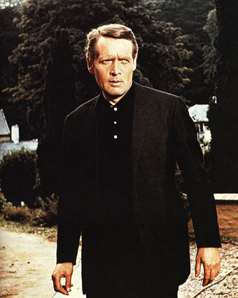
Patrick McGoohan as The Prisoner.
“I will not be pushed, filed, stamped, indexed, briefed, debriefed or numbered. My life is my own.”
The Prisoner, which ran for seventeen episodes from 1967 to 1968, was the best original drama series there’s ever been on television. Period, as Harlan Ellison would say. Best because it grabbed the format of the TV adventure series with both hands to subvert the expectations of the audience and the people who were paying for it. Best because it dared to do this at a time when there was little precedent for experiment in a medium that was barely a decade old. Best because it had something important to say while still being entertaining. And best because it had Patrick McGoohan in the central role at the peak of his acting career.
Fiction can be anything, but to look at what we’re offered by TV channels you wouldn’t know it. Cop shows, hospital shows, detective shows and soap operas proliferate, ad infinitum. The Prisoner came out of Danger Man, an immensely successful post-James Bond spy series which may have been popular but, McGoohan’s presence aside, has little to recommend it today. It lacked the camp bravura of The Avengers and couldn’t compete with the budgets of the Bond films. But it’s fair to say that without it McGoohan wouldn’t have had the chance to do something radical. ITC’s Lew Grade thought he was getting Danger Man 2 with better production values; what he received—to his eventual dismay—was the kind of television one would expect if the staff of Michael Moorcock’s speculative-fiction magazine New Worlds had been given a fat budget and free reign. Like New Worlds, The Prisoner seized familiar genre themes but took them as a means to an end, not an end in themselves. The series borrowed from science fiction and spy thrillers—brainwashing and mind control, Cold War paranoia, the limitless surveillance and duplicity of Orwell’s Nineteen Eighty-Four—and used a drama format to say something direct and personal to its audience about individual freedom, the limits and excesses of the state, and the importance of being able to say “No” when the world insists that you capitulate.
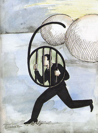
Number Six by Roland Topor.
McGoohan was the driving force as well as the star. His own company, Everyman Films, produced the series for ITC; he planned everything with the writers, wrote three episodes and directed five of them himself. The Prisoner only lasted for a season and a half—cut short after Grade lost his patience—but the form was potentially endless, flexible enough to present a familiar Cold War spy story on the one hand, while having an entire episode play as a Western, on the other. In one of the later episodes McGoohan is largely absent when his mind is transferred to another man’s body and he finds himself living a new life, ostensibly a free man. (But freedom in The Prisoner is always circumscribed.) The last three episodes collapse everything that’s preceded them into intense and increasingly surreal psychodrama. Like Moorcock’s fluid character Jerry Cornelius, whose exploits were running in New Worlds while The Prisoner was being broadcast, McGoohan had found a vehicle to say what he wanted about the world using popular culture. It’s a coincidence but I’ve always found it apt that the cover illustration for Moorcock’s novella The Deep Fix (1966) included a figure obviously modelled on McGoohan’s Danger Man. The book’s tagline “Drugs took him into a nightmare world where logic ceased to exist” could be a description of a later Prisoner episode. Apt too that the first novel based on the series in 1969 was by New Worlds regular Thomas M Disch.
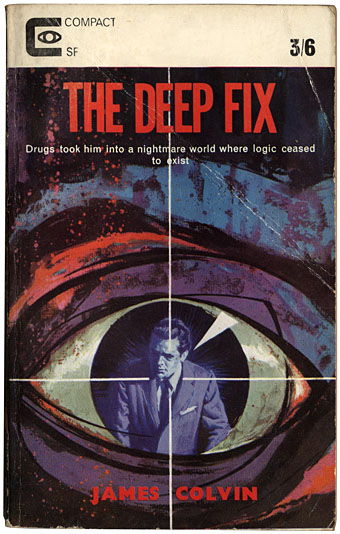
(James Colvin was a Moorcock nom-de-plume.)
The Prisoner was produced in the era of the social dramas of The Wednesday Play and Play for Today yet it remains relevant in a way its worthier contemporaries could scarcely manage. Social realism dates as quickly as yesterday’s news but allegory stays fresh. And it’s a dismal truth that the world of infinite surveillance has crept closer in a way that few would have imagined possible in 1968. The cameras that follow McGoohan’s Number Six everywhere are a familiar sight on Britain’s streets; a headline in yesterday’s Independent newspaper read: “Big Brother database a ‘terrifying’ assault on traditional freedoms“. McGoohan, who was raised in Ireland, would have appreciated the adherence of another Irishman, James Joyce, to the Luciferian cry of disobedience in Ulysses, “Non serviam!”—”I will not serve”. Joyce’s Stephen Dedalus defies God and his family; McGoohan’s Number Six defies everything else. That example, of the man who can “make putting on his dressing gown appear as an act of defiance”, is something we need as much now as we did in 1968. Hollywood is currently threatening a big-screen version but why wait for more compromised studio product when you can go to the source. Get yourself a deep fix—it’s a masterpiece.
Previously on { feuilleton }
• Thomas M Disch, 1940–2008
• Revenant volumes: Bob Haberfield, New Worlds and others
Further farewells
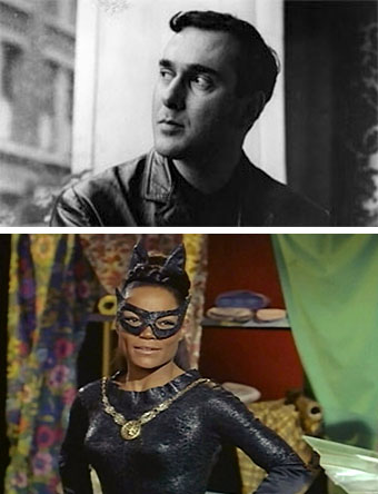
Harold Pinter and Eartha Kitt.
2008: the year that keeps on taking.
The Guardian has a copious collection of Pinter pieces including Michael Billington’s lengthy obituary. Eartha Kitt was just as unique in her own way, prompting Orson Welles in the 1950s to call her “the most exciting woman in the world”. For my sister and I a decade later she was the most exciting Catwoman in the world and that’s how I’ll remember her. But let’s not forget those Cha-Cha Heels…
Eartha’s frivolity might seem to jar beside Pinter’s moral and political seriousness but the World Socialist Web Site managed to link the pair with a priceless headline, Harold Pinter and Eartha Kitt, artists and opponents of imperialist war. Their article tells you a few things about Eartha that many of the obituaries would have ignored. I’m sure Pinter would have been proud to hear of her speaking her mind at the White House. The world is a smaller place when talents and voices like these are gone.