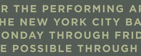
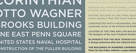
The beautifully elegant Gotham typeface by Hoefler & Frere-Jones was already becoming pretty ubiquitous even before the Obama brand designers chose it for all their campaign graphics. I’ve used it myself a couple of times recently, notably on the jacket for Keith Seward’s Horror Panegyric. Some typefaces have a flush of popularity then fade as they start to look dated but I can’t see this happening with Gotham. Hoefler & Frere-Jones have pulled off the very difficult task of creating a new sans serif that not only works as well as classics such as Futura and Gill Sans but is on the way to being a classic in its own right.
Previously on { feuilleton }
• New things for December


