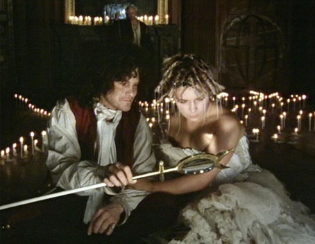
Prospero (Heathcote Williams) and Miranda (Toyah Willcox), The Tempest (1979).
The Shakespeare who spun The Tempest must have known John Dee; and perhaps through Philip Sidney he met Giordano Bruno in the year when he was writing the Cena di Ceneri—the Ash Wednesday supper in the French Ambassador’s house in the Strand. Prospero’s character and predicament certainly reflect these figures, each of whom in his own way fell victim to reaction. John Dee, with the greatest library in England, skrying for the angels Madimi and Uriel (so nearly Ariel)—all of which is recorded in the Angelic Conversations—ended up, in his old age, penniless in Manchester. Bruno was burnt for heresy.
Ten years of reading in these forgotten writers, together with a study of Jung and his disciples proved vital in my approach to both Jubilee and The Tempest. As for the black magic which David Bowie thought I dabbled in like Kenneth Anger, I’ve never been interested in it. I find Crowley’s work dull and rather tedious. Alchemy, the approach of Marcel Duchamp, interests me much more.
Derek Jarman, Dancing Ledge (1991).
Damon Albarn’s opera Doctor Dee has been all over the news this week following its premier as part of the Manchester International Festival. Last weekend one of the press ads was announcing this as an “untold story”, as though no one had given much thought to the Elizabethan magus prior to Mr Albarn’s arrival. Neither the ads nor anyone associated with the production will be in a hurry to tell you that the idea for the opera came from Alan Moore who’s had a fascination with John Dee’s life and work for many years. Albarn and fellow Gorillaz cohort Jamie Hewlett approached Alan about a collaboration a couple of years ago; Alan agreed to write something on the condition that Gorillaz provide a contribution to Alan’s magazine, Dodgem Logic. They agreed, Alan set to work, having suggested John Dee as a good subject then the whole thing fell apart: Gorillaz said they were too busy to accommodate themselves to the magazine’s generous deadlines so Alan told the pair that he was now too busy to have anything further to do with their opera. This is all old news (and being a Dodgem Logic contributor I have a partisan interest in the story) but it’s worth noting since the opera will be playing elsewhere once it’s finished its Manchester run so we’ll continue to hear about it. The point is that the subject matter was Alan Moore’s choice, not Damon Albarn’s; if Alan had decided to write something about Madame Blavatsky (say) we’d now be reading reviews of Blavatsky: The Opera. Albarn can at least be commended for staying with the subject. Despite John Dee’s exile in Manchester being part of the city’s history (among other things he helped organise the first survey of the streets) you can bet the apes from Oasis have never heard of him.
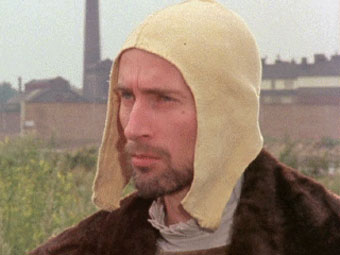
Richard O’Brien as John Dee in Jubilee (1978).
All of which had me thinking how John Dee, a maverick intelligence of the Elizabethan era, has a tendency to attract equally maverick intelligences in later eras. Derek Jarman’s work returns to John Dee often enough to make the magus a recurrent theme in his films, from the scenes in Jubilee (1978) (part of an earlier script) where he’s portrayed by Richard O’Brien showing Elizabeth I the future of her kingdom, to The Tempest (1979) where Prospero’s wand is modelled on Dee’s Monas Hieroglyphica, to The Angelic Conversation (1987) which borrows its title from Dee’s scrying experiments and finds via the sonnets another connection between John Dee and Shakespeare (Ariel being the contrary spirit whose magic allows a vision of the future in Jubilee). By one of those coincidences which make you think there must have been something in the air during the mid-70s, Michael Moorcock’s novel Gloriana, or The Unfulfill’d Queen was published the year Jubilee premiered, a fantasy in which the Elizabethan court is blended with its fictional counterpart from Spenser’s The Faerie Queen, and which features a Doctor John Dee as the queen’s Councillor of Philosophy. (If you want to stretch the connections further, Jenny Runacre who plays Elizabeth in Jubilee had earlier portrayed Miss Brunner in the film of Moorcock’s The Final Programme.)
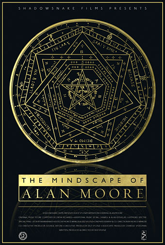
My 2009 poster design for The Mindscape of Alan Moore, a documentary by Dez Vylenz. John Dee’s Sigillum Dei Aemeth appears in the film so I used this as the principal motif for the packaging design and DVD interface.
Reading the reviews it’s impossible to tell how Alan’s libretto might have fared on stage compared to the work which is now showing, the content of which draws on Benjamin Woolley’s excellent biography, The Queen’s Conjuror. Alan and Benjamin Woolley can both be found among the interviewees in a Channel 4 documentary about John Dee broadcast in the Masters of Darkness (sic) series in 2001. For those keen to delve beyond the stage show, Derek Jarman’s films are all on DVD, of course, while fragments of Alan’s libretto can be found in the fourth edition of Strange Attractor along with his notes for the rest of the opera. Charlotte Fell Smith’s life of Dee from 1909, for many years the standard study of the man, can be found online here.
Previously on { feuilleton }
• The Tempest illustrated
• Robert Anning Bell’s Tempest
• In the Shadow of the Sun by Derek Jarman
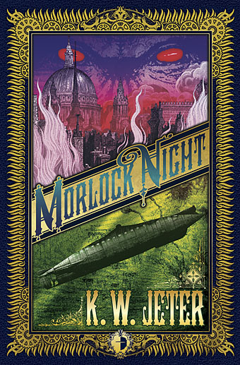
• Designs on Doctor Dee
• Derek Jarman at the Serpentine
• The Angelic Conversation
• The life and work of Derek Jarman