Weekend links 535

beardsley.jpg

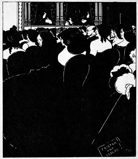
The Wagnerites (1894) by Aubrey Beardsley.

• “Part of my problem with influence is that the concept is too univocal; most of us are impacted by many others during our lifetimes, but often in oblique ways. So many of the most interesting bits of cultural transmission happen nonlinearly, via large groups of people, and in zigzag mutations. Assigning influence can also have the unintentional effect of stripping artists of their own originality and vision.” Geeta Dayal reviewing Wagnerism by Alex Ross.

• “Buñuel stubbornly refused to have any group affiliation whatsoever. Even though critics always tried to categorize him, he never wanted to explain the hidden meanings of any of his films and often denied that there were any.” Matt Hanson on the surreal banality of Luis Buñuel’s The Exterminating Angel.

• Next month Soul Jazz release the fourth multi-disc compilation in their Deutsche Elektronische Musik series devoted to German music from the 1970s and 80s. The third collection was the weakest of the lot so I wasn’t expecting another but this one looks like it may be better.

• James Balmont chooses the five best films by Kiyoshi Kurosawa, who he calls “cinema’s master of horror”. I’ve yet to see any of these so I can’t say whether the label is warranted or not.

• At Wormwoodiana: Mark Valentine in a two-part post here and here charts the emergence of an under-examined sub-genre, the metaphysical thriller.

• Power Spots: 13 artists choose favourite pieces of music by Jon Hassell. A surprising amount of interest in his first album, Vernal Equinox.

• At Spine: George Orwell’s Animal Farm receives new cover designs for its 75th anniversary.

• “Pierre Guyotat’s work is more relevant now than ever,” says Donatien Grau.

• Mix of the week: FACT mix 775 by Sarah Davachi.

• May 24th by Matthew Cardinal.

• Ry Cooder with Jon Hassell & Jim Keltner: Video Drive-By (1993) | Goose And Lucky (1993) | Totally Boxed In (1993)

The hundred-year Voyage

arcturus1.jpg

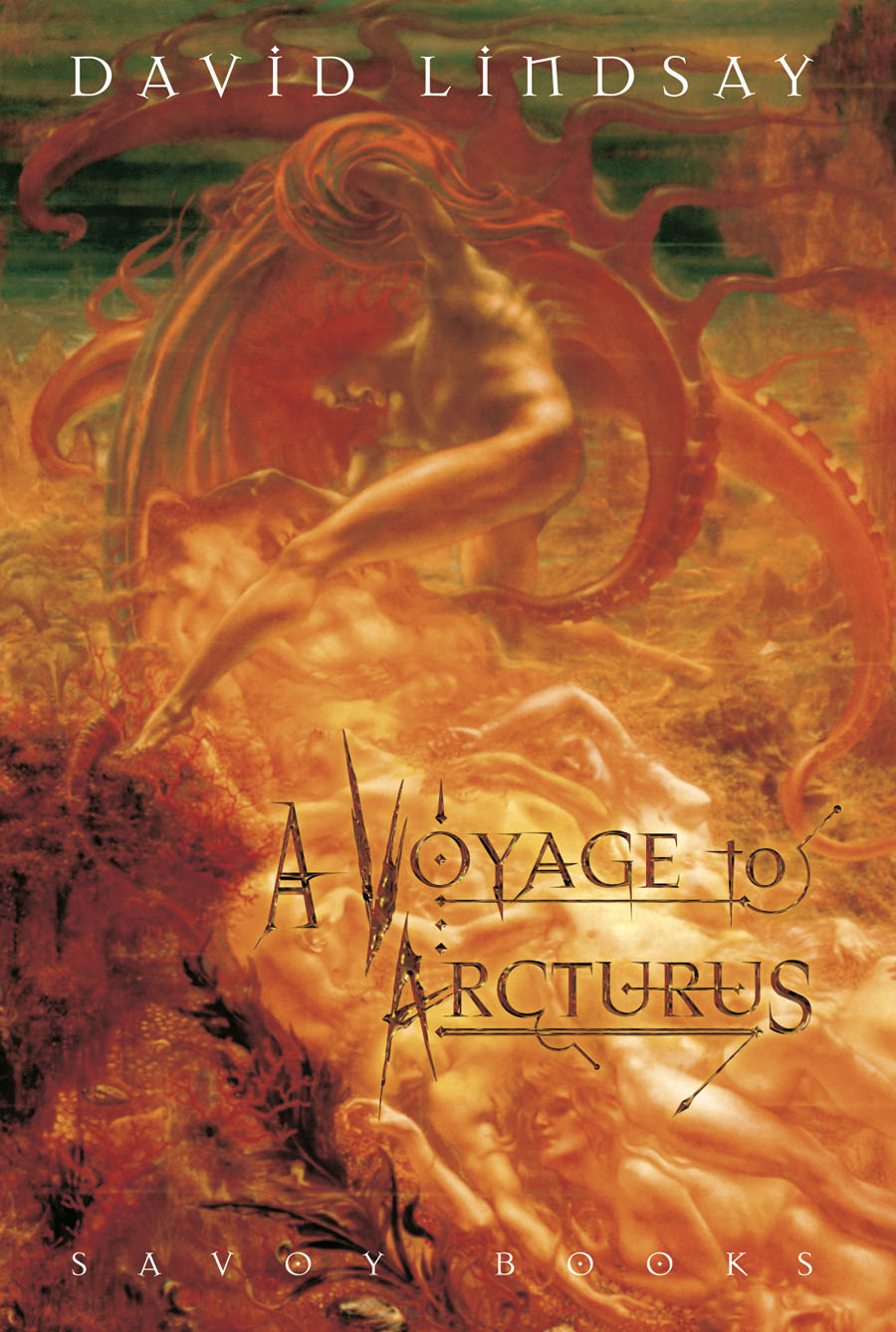
Today’s post at Wormwoodiana reminds me that David Lindsay’s unique novel of philosophical fantasy, A Voyage to Arcturus, was published a hundred years ago today. I designed a lavish reprint for Savoy Books in 2002, an edition which unfortunately used the re-edited text from earlier reprints instead of going to the original publication. This wasn’t done for lack of a first edition, it was more out of ignorance—nobody bothered to look into the history of the text—as well as convenience; Savoy’s earlier reprinting of Anthony Skene’s Monsieur Zenith the Albino had involved many weeks of text preparation, scanning pages from a photocopy of Skene’s very scarce novel, then running the copy through rudimentary OCR software and proofing the result. In Savoy’s slight defence, the reprint of Arcturus did correct a couple of typos that everyone else had missed.

arcturus2.jpg

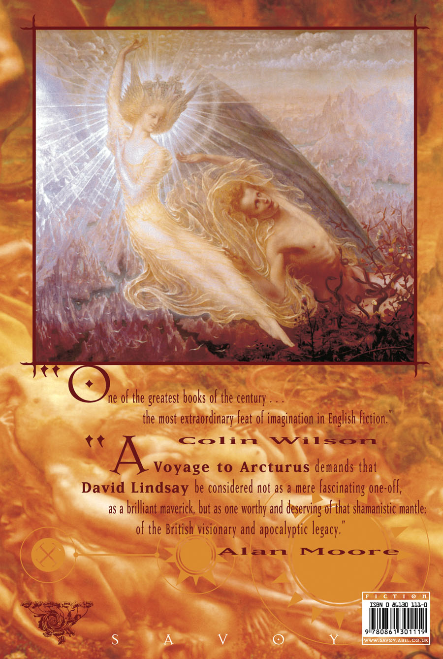
I still think the best feature of my design was the selection of Jean Delville’s remarkable Symbolist painting, The Treasures of Satan (1895), a picture used with the permission of the Brussels Museum of Fine Art. (They supplied us with a print of the painting together with a photo of Delville’s Angel of Splendour (1894) for the back cover.) With the exception of Bob Pepper’s artwork for the 1968 Ballantine paperback, previous reprints of the novel seldom reflected the contents on their covers. I’m no longer happy with the type layout on the rest of the dust-jacket, however, although the front cover looks okay. The Savoy edition included an introduction by Alan Moore, an afterword by Colin Wilson, a collection of philosophical aphorisms by David Lindsay, plus a couple of photos of the author which I don’t think had been published before. Despite its flaws, the book was well-received. The paper was heavier stock than is generally used for hardback fiction which made for a heavy and expensive volume but the edition still sold out.

Penguin are reprinting the novel next year in an edition which continues the tradition of unsuitable cover art. According to Lindsay site The Violet Apple the figure on the cover is from an illustration for a Dostoevsky novella, so what is it doing on Lindsay’s book? Cover art aside, the novel is in a class of its own, and very highly recommended.

Previously on { feuilleton}
• The art of Bob Pepper
• Masonic fonts and the designer’s dark materials

Bergling’s Art Alphabets

bergling02.jpg

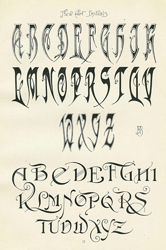
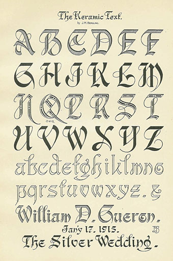
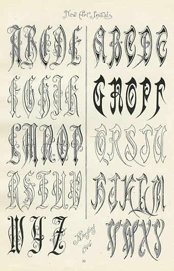
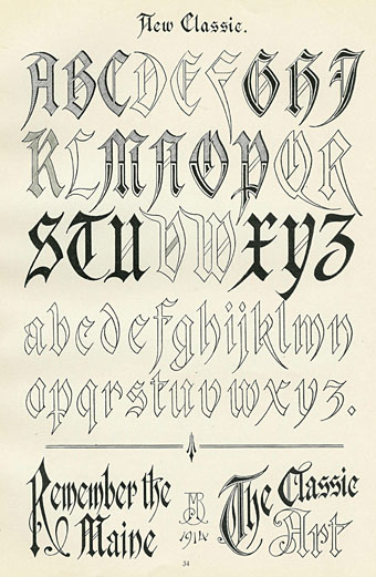
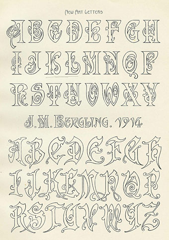
Old type catalogues seldom contain any unusual typefaces so you have to look to craft books for original letterforms. Art Alphabets and Lettering (1914) is an American book for artists and sign painters written and designed by JM Bergling which contains several pages of novel designs among its more familiar typefaces. Bergling evidently had a flair for alphabet design, there are more unique examples here than you’d usually find in a book of this kind, and Bergling’s letterforms are consistently stylish and inventive. In addition to providing a number of spiky variants on the Art Nouveau style (which by 1914 was going out of fashion), he also found time to draw his own version of a 19th-century staple, the Rustic Alphabet. There are two copies of the book at the Internet Archive: a complete one and an incomplete one, the latter volume possibly being a later printing since it contains a number of pages not included in the former.

bergling01.jpg

bergling03.jpg

bergling04.jpg

bergling05.jpg

Continue reading “Bergling’s Art Alphabets”

Robot Artists and Black Swans

robotartists.jpg

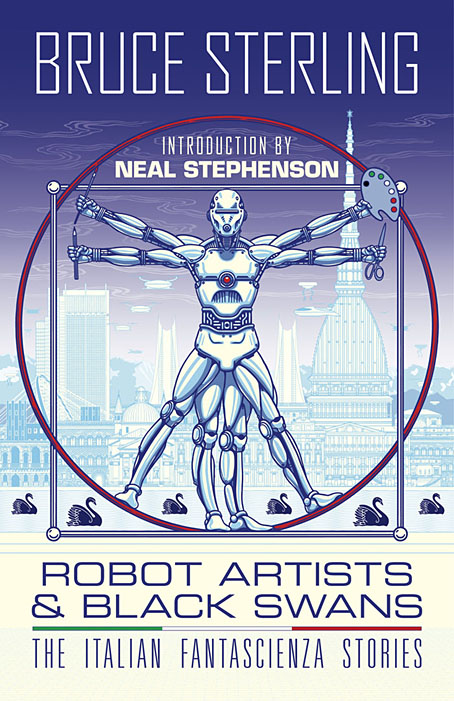
Four years ago I designed and illustrated a book for Tachyon written by Bruce Sterling, Pirate Utopia. Robot Artists and Black Swans is a kind of sequel, being the work of the same author for the same publisher, and with a similar geographical focus on southern Europe. The new book differs from the earlier one by being a collection of stories rather than a single piece, many of which are set in or near the city of Turin where Sterling and his wife, Jasmina Tesanovic, spend much of their time. Sterling has been living in Europe for many years, long enough to have cultivated an alter-ego, Bruno Argento, an Italian science-fiction writer who is offered as the real author of the stories in Robot Artists and Black Swans.

Pirate Utopia was an easy book to design because of the Futurist theme which I illustrated by adapting graphics by artist and designer Fortunato Depero. For the cover of the new volume I considered trying something similar with another Italian artist/designer, Franco Grignani (1980–1999). In addition to having studied in Turin, Grignani was commissioned by David Pelham to create cover art for a handful of Penguin science fiction titles in the late 1960s. Much of Grignani’s artwork is heavily indebted to the Op Art style popularised by Bridget Riley and Victor Vasarely, especially the early Riley formula of dazzling arrangements of parallel lines, a formula he made his own after Riley’s work evolved in other directions. Despite these favourable qualities, Grignani’s art proved too abstract for my purposes, and for Tachyon’s who wanted something more illustrative, so I ended up co-opting a very different Italian artist/designer, Leonardo da Vinci. The figure of Da Vinci’s Vitruvian Man has been parodied and pastiched many times so this isn’t remotely original (I’ve also used the original drawing on a pastiche book cover I designed for the Lambshead Disease Guide), but making the figure a robot was a convenient way of combining the title with Italian history. One of the stories in the collection, Pilgrims of the Round World, concerns the inhabitants of Turin during the Renaissance years, and mentions Leonardo (or “the Vinci boy”) several times, so the figure does have some actual relevance beyond being recognisably Italian. The background is, of course, the city of Turin given a slightly futuristic tweak, although it’s more Turinesque than a match for the place itself.

As usual, I’ll save discussion of the book’s interior until after publication which will be in March, 2021. Watch this spacetime.

Previously on { feuilleton }
• Pirate Utopia by Bruce Sterling
• Futurismo!

Jodorowsky times three, or The box that never was

jodorowsky1.jpg

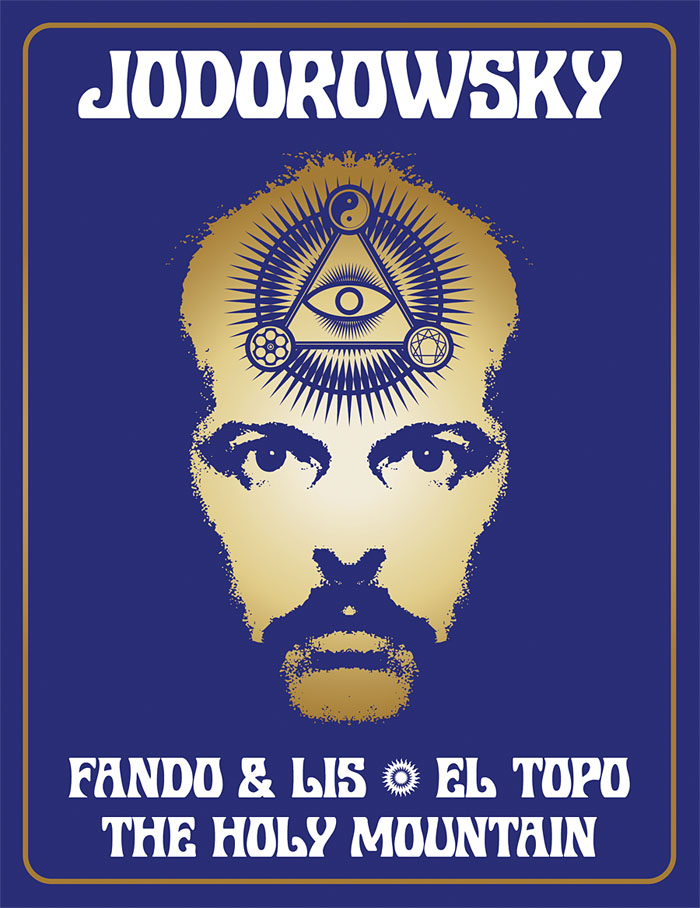
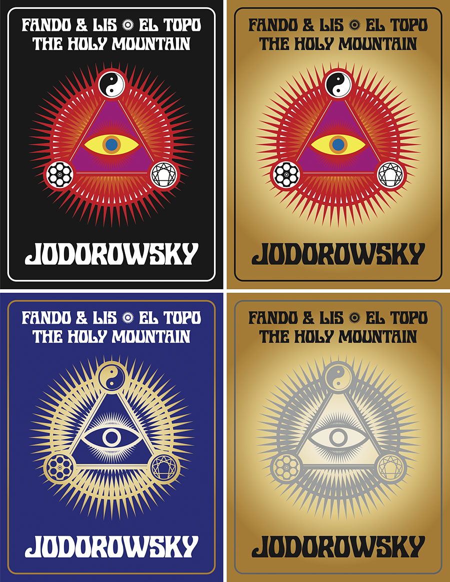
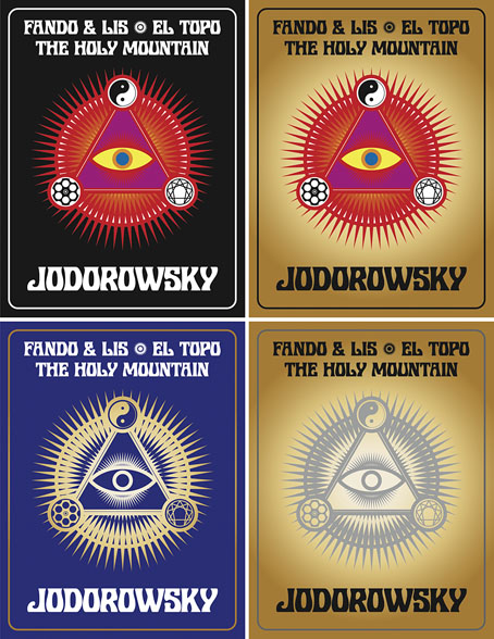
The first three feature films by Alejandro Jodorowsky—Fando y Lis, El Topo and The Holy Mountain—are released this week on Region B blu-ray by Arrow Video, but the box they’re packaged in won’t look like any of the designs shown here. It was almost three years ago that Arrow asked me to create something for this box set, but backstage wrangles meant the project moved out of my hands in the early stages. This was a great disappointment since Jodorowsky’s interests and aesthetics align with my own much more than many other directors whose work has been released by Arrow. And having written the notes for the Arrow release of Henri-Georges Clouzot’s The Mystery of Picasso, I was looking forward to working with the company again.

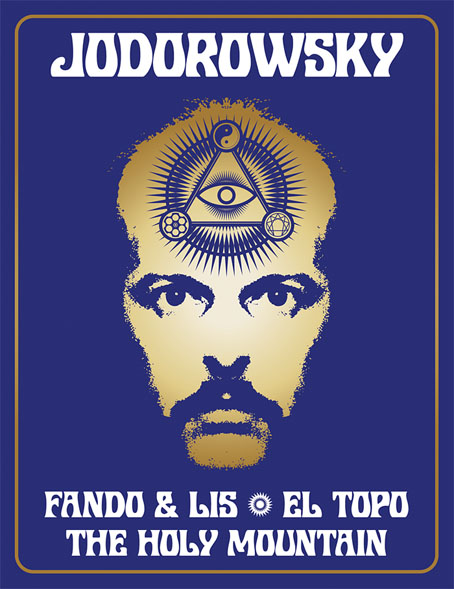
In preparation for the work I rewatched almost all of Jodorowsky’s films (I still haven’t seen Tusk or The Rainbow Thief), then drew up a detailed proposal with sketches, something I seldom do for commissions. Arrow releases all have double-sided inserts in the boxes that hold the discs, one side of which shows a poster design from the film’s original release, the other a new design. My idea for the new art was to connect the three films using Tarot-like iconography (the director is a Tarot scholar, among other things), with each film also being assigned a symbol of some kind. The Surrealist fable of Fando y Lis lacks any suitable graphics so for this I chose a yin and yang symbol to represent the film’s opposed-yet-connected brother and sister characters; El Topo was to be represented by a cross-section through a revolver chamber, while the seven characters from The Holy Mountain are represented by the enneagram that Jodorowsky himself wears in the film. All three symbols are connected by the eye-in-a-triangle from El Topo, a symbol that worked while a three-film box was being planned but which wouldn’t have worked for the final release which adds Jodorowsky’s most recent film, Psychomagic, A Healing Art. For the box design I suggested metallic inks (or foils) either as highlights or in other combinations. The font was a further suggestion, Roberta being one of the typefaces of the occult revival of the 1970s. The art for each film didn’t go further than the sketch stage although I was asked to work up the El Topo design into a final piece; I wasn’t very satisfied with the end result so it isn’t posted here. One problem with the extended negotiations was they were taking place at a time when I was extremely busy with other projects, including contracted illustration work for Editorial Alma. There was no contract for the Arrow commission so it had to take second place even though it was the work I most wanted to be concentrating on at the time. Collisions such as these are an occupational hazard when you’re working freelance.
jodorowsky2.jpg

As things turned out the stumbling block wasn’t my art and design suggestions (which Arrow liked) but the parties described in communications as “the rights-holders”. These individuals apparently disliked the Arrow Video aesthetic and wanted something more directly connected with the films, preferably photographic material which is what you now see on the discs and the box art. It should be emphasised that the rights-holders are not the director, whose wishes for the presentation of his work were never part of the discussion. Given the previous activities of the rights-holders we should probably be grateful that the first three films have been reissued at all. For details of Jodorowsky’s difficulties with one rights-holder in particular, see this interview by Jay Babcock.

On the upside (there is one!), the box set is a typically high-quality Arrow release, with new transfers of the films approved by the director. The bonuses include Jodorowsky’s short films (including his explanation of Tarot symbolism), Louis Mouchet’s feature-length documentary, La Constellation Jodorowsky (1994), soundtrack CDs of El Topo and The Holy Mountain, a small poster and set of postcards, and a substantial booklet. In the end the most important thing is that the films are available for home viewing once again, not their exterior decoration.

Previously on { feuilleton }
• Fabulas Panicas by Jodorowsky
• Alejandro Jodorowsky’s Dune
• Jodorowsky on DVD