Design as virus 1: Victorian borders

bookplate.jpg

There’s nothing new about drawing attention to the viral nature of design, whether in the repeated use of motifs and styles or the way in which typefaces breed and proliferate; Jonathan Barnbrook alludes to this process directly by calling his font house Virus.

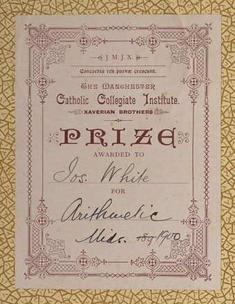
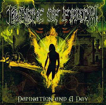
The plate above comes from a Victorian book I bought several years ago, The Pictorial Cabinet of Marvels, a reasonably lavish volume for children concerning places and things of interest around the world. Since I like playing with excessive Victorian flourishes now and then I’m always on the look out for new examples and the border here immediately caught my eye. I have a decent selection of clip art books from Dover and Pepin containing this kind of thing but nothing quite like this particular design. When I was putting the Damnation and A Day album together for Cradle of Filth I took one of the corner pieces as a starting point for a border design I used on the front and back of the booklet and the tray.
damncov.jpg

The poor old Xaverian Brothers of Manchester’s Catholic Collegiate Institute would no doubt be mortified to see part of their prize bookplate being used to decorate such a blasphemous artefact. The album was released by Sony Music in 2003 so this little border motif has travelled the world by now. I seem to recall sending the record company the border design separated from the artwork so they could make up some posters.

And so we come to what I’m assuming is its latest manifestation, a poster design for Manifest Destiny, a Los Angeles music event organised by Tee Pee Records.

tee-pee.jpg

I say “assuming” since I’ve no idea whether this example is from my design or not. But it seems a safe bet seeing as the original is from such an obscure source. Not that I mind if it is, of course. I can’t very well complain when I swiped the thing in the first place, now can I?

Update: Tee Pee designer Sarah MacKinnon writes to say her Victorian motif is from one of Dover’s clip art books. Now I know that I wouldn’t mind finding the book for my own collection. This makes the occurrence of the original more unusual, at least from my point of view, since it’s the only time I’ve spotted one of these reprinted elements in its period setting.

Previously on { feuilleton }
• Masonic fonts and the designer’s dark materials
New things for July

motorway_city_sm.jpg

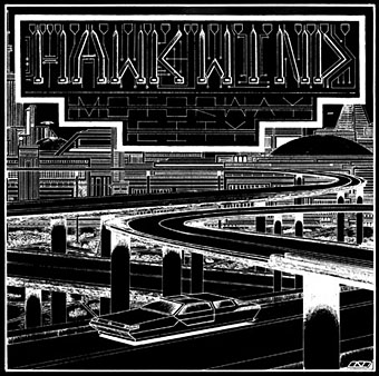
Motorway City by Hawkwind, Flicknife Records single (1983).

This month’s issue of Record Collector magazine has a feature about Hawkwind which featured my Motorway City sleeve among its illustrations. It was odd seeing this again, being a single it doesn’t turn up so often and it has the distinction of being one of the oldest of my works in print. Although the single was released in 1983, the drawing was done in 1980 (I was 18 at the time) and it ended up with Dave Brock somehow.

The A-side is taken from the Zones album, which sports one of my more successful cover illustrations for the band, and the song is a Ballardian eulogy to driving on motorways at night. Despite their reputation for being a bunch of spaced-out hippies, Hawkwind were frequently drawn to the harder side of things (Lemmy used to shout “Die! Die!” at their tripping audience and was proud of freaking people out), and this song isn’t even science fiction, despite my flat futuristic cityscape in the background. Before he finished with the band for good, singer Robert Calvert wrote two songs based on JG Ballard books, High Rise and the punk- and Crash-derived thrash piece Death Trap, both on the PXR5 album from 1979. Motorway City was written around the same time and it’s a shame it didn’t have Death Trap on the B-side instead of yet another version of Master of the Universe. My drawing was done as black on white but the record company smartly (for once) reversed out the design which I always felt made it look a lot better, as well as fitting more with the night-driving theme.

Also this month, I’m in the process of reworking the website a bit which means making more prints of artwork available. I’ve started with some of the Lovecraft pictures, which is always the most popular stuff but I’ll gradually be working through everything and setting up PayPal facilities for other items. Many pictures and designs can already be had as prints at CafePress but that system is best for t-shirts and other goods, it lacks the personal touch which people often want from a signed print.

Previously on { feuilleton }
• Hawkwind: They’re still feeling mean
• Barney Bubbles: artist and designer

Wanna see something really scary?

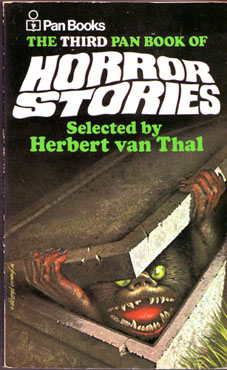
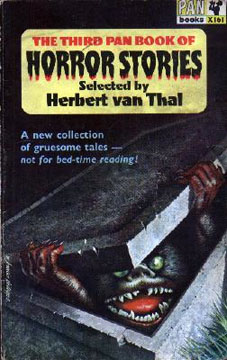
pan_horror.jpgXeni Jardin and Boing Boing readers reminisce today about the childhood traumas inspired by Sesame Street characters. Wimps, say I, although in fairness I was too old to be frightened of Muppetry by the time that stuff appeared on British TV screens.

Scariest thing in the Coulthart household, easily out-classing anything on children’s television (Doctor Who monsters included), was the cover of the third Pan Book of Horror Stories. My parents had a small collection of paperbacks from the early Sixties which included some horror and occult fiction. My sister and I found this book one day while rooting in an old suitcase and were both mortified by it. I seem to remember there being dares to go and look at it again and also have vague recollections of at least one nightmare occurring as a result. A shame there isn’t a larger scan available since I’m curious to know who the artist was.

pan_horror2.jpgA few years later I was reading the Pan series myself although I never went back to this particular one. Herbert van Thal’s selections got off to a good start, reprinting old horror classics with newer fiction, but soon degenerated into detailed and repetitive tales of dismemberment and blood-letting, the kind of stuff that makes you think “cool” when you’re a teenage boy but which is otherwise worthless. Most of the writers in the later books are unheard of elsewhere which makes me suspect they were probably hacks earning a quick couple of quid writing under pseudonyms. The strangest thing about volume three now is looking at the contents list and seeing that we had stories by William Hope Hodgson and Algernon Blackwood in the house all that time and I never knew it.

Update: The cover artist was W. Francis Phillipps.

Elsewhere on { feuilleton }
• The book covers archive

Previously on { feuilleton }
• Druillet meets Hodgson
• A playlist for Halloween
• Ghost Box
• Le horreur cosmique

Philip K Dick book covers

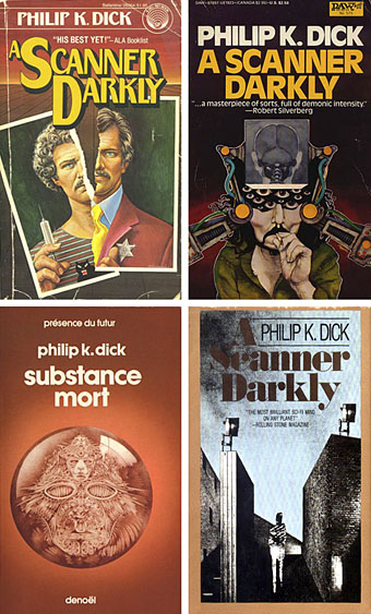
scanner_covers.jpg

650 Philip K Dick covers here although no thumbnails for ease of browsing. Interesting seeing how many publishers have tried to bracket Dick as a typical science fiction writer when many of his books are marginal sf at best. Then there’s the curiosity of the translated title, Substance Mort for A Scanner Darkly being one example.

Update: Odd coincidence dept. (well, it’s PKD, right?), having posted the above last night I find today that Dick enthusiast Erik Davis is discussing the DAW cover (above, right) over at Total Dick Head. Thanks to this we discover that the artist is Bob Pepper who produced the classic cover art for Love’s Forever Changes album.

Update 2: Henri alerts us to his own PKD site which also includes even more cover scans (and thumbnails this time), including those from French editions.

Elsewhere on { feuilleton }
• The book covers archive

Masonic fonts and the designer’s dark materials
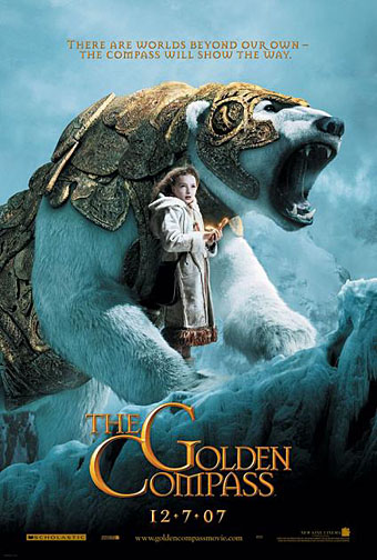
golden_compass.jpg

The trailer for The Golden Compass turned up this week, the first part of Philip Pullman‘s His Dark Materials trilogy, and I can’t help but note that the film’s designers have chosen Jonathan Barnbrook’s Mason font for the titles and the rest of the typography. This isn’t so surprising given that Mason has been used on the covers of several editions of the books already but I wonder if this flush of even greater popularity will spell (as it were) the end of a stylish typeface.

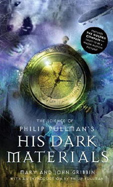
hdm.jpgMason (originally named Manson) was one of Barnbrook’s earliest published type designs, appearing in 1992 via the Emigré foundry, and over the past fifteen years has been widely imitated and become the default font for fantasy works, especially book jackets. The attraction for the genre is obvious in the way the design uses elegant and traditional serif letterforms that have been amended slightly to give them a distinctive quasi-ecclesiastical flavour, with flourishes derived from Greek, Renaissance and Biblical letters. The Gothic arch of the letter A has also helped make the font a popular choice for New Age or occult books. Mason was designed as a set of serif and sans serif variations but it’s Mason Serif Regular which is used the most. (The cover for The Science of His Dark Materials shown here is using both the sans serif variation and Mason Regular Alternate.)

Distinctive fonts take a while to get around and I don’t recall seeing Mason until at least 1994. From 1995 to 2000 it began to appear everywhere, even in newspaper ads for a while, before finding a permanent place in the book world. The trouble with this kind of ubiquity is that the novelty the design once possessed quickly vanishes and it begins to runs the risk of becoming a design cliché. Many typefaces go this way, especially in the publishing world where the choice of typeface is often dictated by genre expectations. So Orbit-B and its variants used to signify “science fiction” or “the future” in the 1970s, Caslon Antique and Rubens have become associated with horror while FF Confidential has been over-used for crime novels.

Continue reading “Masonic fonts and the designer’s dark materials”