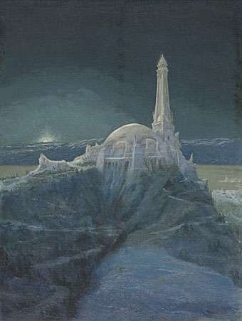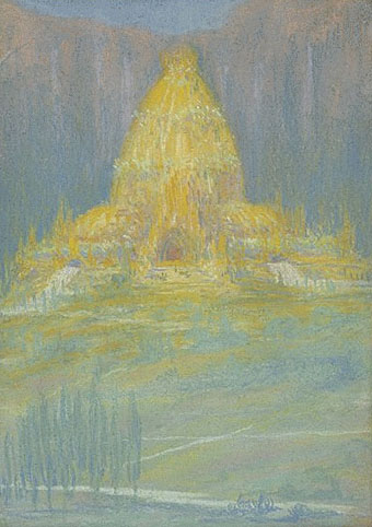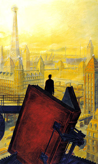
Paris au XXieme Siecle by Jules Verne (1994).
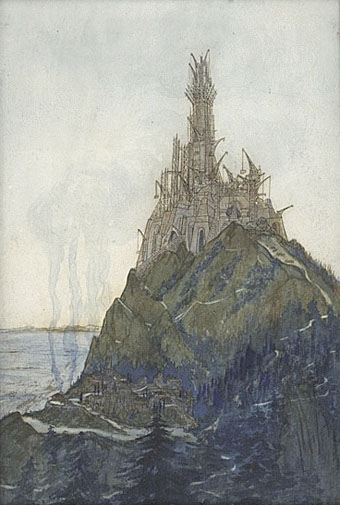
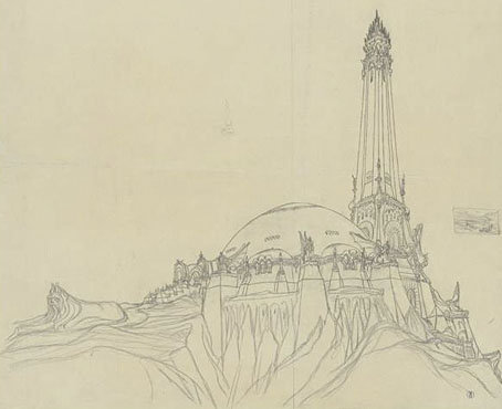
Following a comment I made last week in the post about the Temples of Future Religions by François Garas I’ve decided it’s time to give some proper attention to one of my favourite comic artists, François Schuiten, a Belgian whose obsession with imaginary architecture resembles the earlier endeavours of Garas and others. Schuiten’s parents were both architects which perhaps explains his predilection. In addition to a large body of comics work, he’s produced designs for film—notably Taxandria by Raoul Servais—Belgian stamps, and a steampunk makeover for the Arts et Métiers station of the Paris Métro. In 1994 he created cover designs and a series of illustrations for the publication of Jules Verne’s rediscovered manuscript, Paris au XXieme Siecle.
Cover for Spirou (2000).
I first encountered Schuiten’s work in a 1980 issue of Heavy Metal magazine which was reprinting translated stories from the French Métal Hurlant along with original work. Schuiten’s story, The Cutter of the Fog, was an erotic and futuristic tale of a small community and the obsession of the local “fog-cutter”. François’s brother Luc wrote the piece and it bears some similarity with JG Ballard’s Vermilion Sands story, The Cloud Sculptors of Coral D. Unusually for Schuiten, the architecture was downplayed in this one although the small homes with their geodesic roofs are like extrapolations of architectural plans from one of the Whole Earth Catalogues.
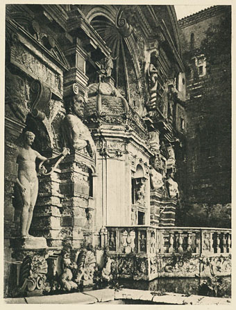
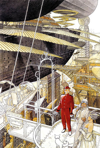
The next time I saw his work was several years later when artist Bryan Talbot showed me some of the comic albums he’d brought back from a European convention. Among these there were several of the Cités Obscures books that Schuiten had been creating during the Eighties and Nineties with writer Benoît Peeters. These knocked me out with their apparently effortless creation of an imaginary world comprised of several city states, each with their own unique architectural style, and a wealth of retro-future technology, from dirigibles of all shapes and sizes to ornithopters and huge motorised unicycles. One of the many things I liked about European comic artists, and something which made me favour their work over their American counterparts, was the creation of richly detailed imaginary universes with inhabitants one could expect to meet in our world, not facile superheroes or vigilantes. Schuiten went further than his contemporaries by making the architecture meticulously believable and foregrounding its design to an extent that in some of the Cités Obscures stories architecture itself is the subject.