The art of George Barbier, 1882–1932

barbier1.jpg

Les Chansons de Bilitis (1922).

I’ve posted examples of George Barbier’s Art Deco drawings before but online examples of his work outside the world of fashion illustration have been difficult to find. The Bunka Women’s University Library corrects that with a collection of high-quality scans which include a book about the artist, George Barbier, Étude Critique (1929) by Jean?Louis Vaudoyer. There’s also his adaptation of the Sapphic classic by Pierre Loüys, Les Chansons de Bilitis, from 1922. The drawings there lack the customary ardour of other adaptations but they’re marvellously elegant nonetheless, with some beautiful page designs.

Note: these books can’t be linked to individually, you need to follow the links from “Art Deco illustrated books” in their site menu.

barbier2.jpg

Nijinsky (1913).

barbier3.jpg

Poèmes en Prose (1928).

Elsewhere on { feuilleton }
The illustrators archive

Previously on { feuilleton }
The Decorative Age
Images of Nijinsky

Design as virus 10: Victor Moscoso

india.jpg

Continuing an occasional series.

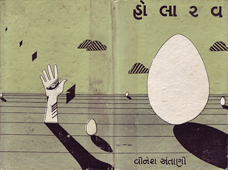
A recent post at A Journey Round My Skull is a stylish series of Indian book jackets from 1964 to 1984. These impress partly for the way they rework western design approaches, and they consequently look very different from the florid visuals one might (lazily) expect of Indian cover design. Western culture borrowed more than enough from India in the 1960s, from clothes to music, so it only seems right that the sub-continent should be free to take something back.

luna.jpg

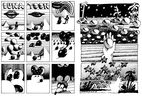
Luna Toon by Victor Moscoso (1968).

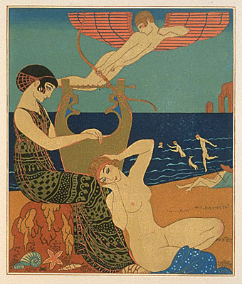
Will at A Journey Round My Skull mentions the above cover design as reminding him of this Krautrock bible, The Crack in the Cosmic Egg, a book which happens to be a favourite repository of musical obsession. The cover reminded me more of the weirdly abstract comic strips created by artist and graphic designer Victor Moscoso for the early run of Zap Comix in the late Sixties. Moscoso was one of the most graphically revolutionary of the West Coast poster artists, and his approach to comics looks surprisingly fresh today next to the work of fellow artists like Robert Crumb. Those limitless vistas go back to Giorgio de Chirico but it was Salvador Dalí who made deserts raked by evening shadows reflect interior landscapes of his own, and it was Dalí’s immense popularity that in turn popularised that endless plane as a stage for surreal events. Moscoso borrows from the Surrealists and comic artists like George Herriman as much as he borrows from Disney; in his posters he was one of many artists taking motifs or whole designs from Art Nouveau. Our Indian egg may well be an original work but the first example in Will’s post is a very Saul Bass-like hand, so I’m guessing that the designers of these books were looking around for inspiration. And that eye-in-a-hand? Moscoso had done that as well.

neon.jpg

Blues Project Poster by Victor Moscoso (1967).

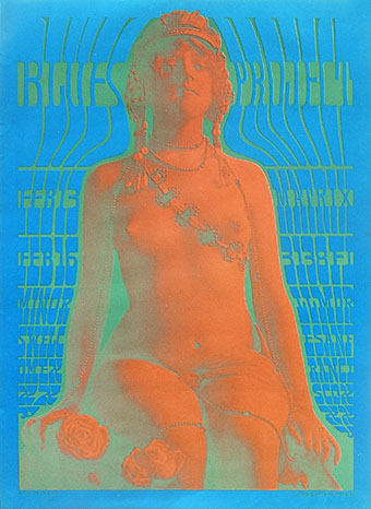
While we’re discussing Victor Moscoso, it’s convenient to draw attention to a slight mystery connecting his poster art and the great album cover designer, Barney Bubbles. The poster above was one of a number that Moscoso made incorporating Victorian or Edwardian photographs, and two at least of these use antique erotica as their central image.

ritual.jpg

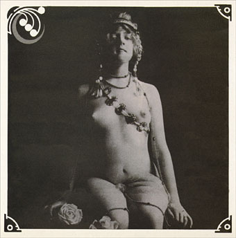
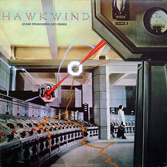
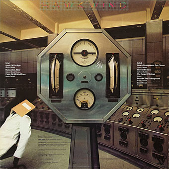
Space Ritual interior, design by Barney Bubbles (1973).

This particular photo always stands out for me. The woman is familiar to anyone who’s seen the interior of the fold-out sleeve Barney Bubbles created for Hawkwind’s Space Ritual album in 1973. Barney spent some time in San Francisco in the late Sixties and was undoubtedly familiar with Moscoso’s work, as he was with all the great designs coming from the West Coast at that time. What surprises me is that he should have somehow found the same image to use as Moscoso did. Was there a popular book of Edwardian erotica which everyone was familiar with? Did he ask Moscoso where he’d found the photo? Did he find it by chance? Barney Bubbles experts don’t know the answer (I’ve asked) and the question is in any case a rather trivial one. But I’m still curious… As early porn photos go it’s a particularly fine one and I’d like to know whether there are more like it and where it came from. Needless to say, if anyone knows more about this, please leave a comment.

Previously on { feuilleton }
Design as virus 9: Mondrian fashions
Design as virus 8: Keep Calm and Carry On
Design as virus 7: eyes and triangles
Design as virus 6: Cassandre
Design as virus 5: Gideon Glaser
Design as virus 4: Metamorphoses
Design as virus 3: the sincerest form of flattery
Design as virus 2: album covers
Design as virus 1: Victorian borders

Battersea Power Station

battersea.jpg

A photograph of the control room of Battersea Power Station, London, by Michael Collins, one of a series which will shortly be on display at the Royal Institute of British Architects.

The images show Battersea Power Station as what Collins describes as a “twentieth century ruined castle” – a building that was built to last, with a high quality structure and interior, including Art Deco walls and ceilings.

Giles Gilbert Scott’s enormous temple of heavy industry continues to sit decaying on the banks of the Thames while property developers come and go. The latest of these, Real Estate Opportunities, has fallen into debt which means proposals to develop the site are once again on hold. A part of me likes the idea of the building sitting there unused and purposeless year after year, like some vast Steampunk Stonehenge; Giles Gilbert Scott’s other Thames-side power station, Bankside, was successfully transformed as Tate Modern, but we know from various proposals that the fate of Battersea, whether as theme park or shopping centre, is likely to be a lot less edifying.

quark1.jpg

It took redevelopment to transform Bankside from temple of industry to temple of culture but Battersea’s unmistakable presence has a powerful cultural history of its own. Everyone knows the Hipgnosis sleeve design for Pink Floyd’s Animals (1977); less familiar is the photos of the control room which Hipgnosis used for Hawkwind’s Quark, Strangeness and Charm the same year. I tend to prefer the back cover of this sleeve to the front; that octagonal readout device is more interesting than the rather unconvincing sparks and exchanges of energy. And speaking of energy, my former employers are still active, unlike the rancorous Floyd.

quark2.jpg

There’s a page here listing other uses of the power station, including its many film appearances which date back to the 1930s. That list mentions the control room’s use as a background for the “Find the Fish” sequence in Monty Python’s The Meaning of Life (1983) but they omit an earlier Monty Python appearance when you briefly see the building in operation during And Now for Something Completely Different (1971). It was closed down a few years later. So here it is, then, belching fumes over west London on a profoundly gloomy winter afternoon.

battersea2.jpg

Elsewhere on { feuilleton }
The album covers archive

Previously on { feuilleton }
The Sonic Assassins
The Bradbury Building: Looking Backward from the Future

The Studio & Studio International

studio1.jpg

Back in February I posted some pictures from a 1971 collection of Art Nouveau illustration and design, some of which were competition entries from The Studio magazine. The Studio, which later became the long-running Studio International, can be seen from issue 11 onwards at the Internet Archive now that they’ve started uploading Google’s book scans. I’ve only looked at one of these so far, Volume 11–13 which runs over 850 pages and so takes some time to go through, as do all these rather unwieldy PDF books. The issues are missing their covers and so aren’t dated but would appear to be from around 1896 to 1898, one of the final entries being a memorial piece for Aubrey Beardsley who died that year; The Studio was the magazine which had introduced Beardsley to the public only five years earlier.

studio2.jpg

The Studio ran regular competitions among its readers and the examples shown here are from some of those. I especially like these type designs; dare we assume that the “Dorian” design below is named after Dorian Gray? As a whole the magazine is an odd mix of very dull Victorian art of the landscapes and artisans type, with occasional flares of interest when they devote a feature to the emerging Art Nouveau style or profile a Symbolist artist such as Giovanni Segantini.

studio3.jpg

A note for anyone wishing to download Google scans from the Internet Archive: some of the PDF links lead you to a Google page where they’re trying to sell you an e-text or get you to buy a book. To see the available files you need to click “All Files: HTTP”.

Previously on { feuilleton }
The Great God Pan
Art Nouveau illustration
Jugend Magazine

Fillmore sealife

fillmore1.jpg

Country Joe & the Fish by Wilfred Weisser (1968).

A pair of sea-themed psychedelic posters from a small collection here. Most of the examples are familiar faces but these two stood out for me, especially the octopus one by Wilfred Weisser which I hadn’t seen before. The figures in Bob Fried‘s poster below look like they may have been borrowed from Walter Crane or a later Victorian illustrator.

Update: For the record, Bob Fried’s figures are indeed by Crane, an illustration for Spenser’s Faerie Queene from The Studio magazine, 1896.

fillmore2.jpg

Canned Heat by Bob Fried (1967).

Previously on { feuilleton }
Max (The Birdman) Ernst
Taking Woodstock
Dutch psychedelia
Family Dog postcards
Octopulps