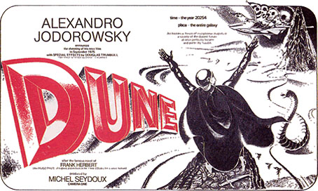
Fortunate Londoners can get to see a new exhibition, Alejandro Jodorowsky’s ‘Dune’: An exhibition of a film of a book that never was, which runs at The Drawing Room until October 25, 2009. As well as production designs from concept artists Moebius, HR Giger and Chris Foss, there’s newly commissioned work by artists Steven Claydon, Matthew Day Jackson and Vidya Gastaldon.
Jodorowsky’s proposed 1976 adaptation of the Frank Herbert novel is now the stuff of legend, and it’s possible that his outrageously ambitious plans are more fun to dream about than they would have been on the screen. But it remains a tantalising prospect that Jodorowsky might well have pulled off a science fiction equivalent of Fellini’s Satyricon. Either way, along with Stanley Kubrick’s unmade Napoleon, it’s one of the great lost films of the 1970s.
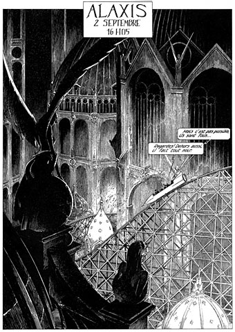
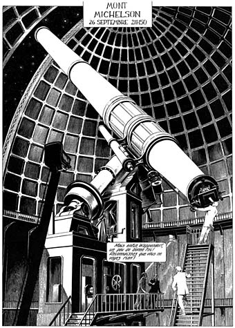
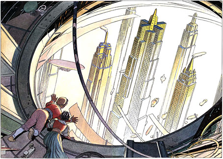
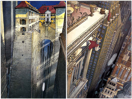
Among Jodorowsky’s proposed cast were Orson Welles, Mick Jagger and Salvador Dali, the last of whom was to play the Emperor of the Universe, who ruled from a golden toilet-cum-throne in the shape of two intertwined dolphins. Unable to secure the money from Hollywood to create the ‘Dune’ of his imagination, Jodorowsky abandoned the film before a single frame was shot. All that survives of this project is Jodorowsky’s extensive notes, and the production drawings of Moebius, Giger and Foss. These reveal a potential future for sci-fi movie making that eschewed the conservative, technology-based approach of American filmmakers in favour of something closer to a metaphysical fever-dream.
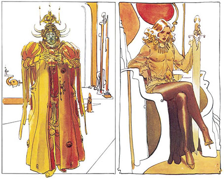
left: Emperor Shaddam IV; right: Feyd Rautha.
Moebius’s designs are wildly different from those used in David Lynch’s 1984 adaptation (which I like nonetheless). His sketch of the Emperor on the left gives some idea of how Salvador Dalí might have appeared in the film, while the figure on the right is Baron Harkonnen’s effete nephew, Feyd, a far more radical conception than the grinning fool played by Sting in the Lynch version. There’s a lot more of Moebius’s sketches at the excellent Dune.info site.
Previously on { feuilleton }
• Dalí and Film
• Jodorowsky on DVD