Nature Boy: Jesper Ryom and Wilfried Sätty

ryom1.jpg

Interest in the work of collage artist Wilfried Sätty (1939–1982) increases by slow degrees, and did so again last year although I completely missed the occasion. Better late than never. Nature Boy is a 12-inch single by Jesper Ryom on the Berlin-based Power Plant label which comes adorned with this Sätty collage of a tattooed boy. The picture appears as a vignette in the posthumous Visions of Frisco (2008) but this is the first time I’ve seen the larger work. Power Plant promoted the single by staging an exhibition of Sätty prints, photos of which can still be viewed hereNature Boy can be heard in full at YouTube.

ryom2.jpg

Elsewhere on { feuilleton }
The album covers archive

Previously on { feuilleton }
Wilfried Sätty: Artist of the occult
Illustrating Poe #4: Wilfried Sätty

Weekend links 115

vandamme.jpg

Untitled painting by Suzanne Van Damme (1901–1986).

Eric Berkowitz, author of Sex and Punishment: 4000 Years of Judging Desire, chooses five books for The Browser.

Venus febriculosa is running another competition: Design a new cover for Brian Eno’s Music For Films.

• Paul Mayersberg and Tony Richmond on making The Man Who Fell to Earth.

When a good idea occurs, it has been prepared by a long time of reflection. But you have to be patient. We all have what I call the invisible worker inside ourselves; we don’t have to feed him or pay him, and he works even when we are sleeping. We must be aware of his presence, and from time to time stop thinking about what we are trying to do, stop being obsessed about answers, and just give him the room, the possibility, to do his work. He is tenacious, you see. He never loses hope.

Screenwriter Jean-Claude Carrière discusses his remarkable career. Related: The Discreet Charm of the Bourgeoisie revisited.

Tragic Time Capsules: Capturing the Decay of Forgotten Olympic Venues.

Louis Menand on “The Puns and Detritus in James Joyce’s Ulysses“.

• Saul Bass’s original ending for Phase IV unearthed in Los Angeles.

Katherine Lanpher uses witchcraft to find a New York apartment.

Italo Calvino’s adolescence – that in-between time.

• The early film posters of Waldemar Swierzy.

Psychedelic nano-art in oils and ferrofluids.

David Toop has a blog.

Callum James Paper.

Bodies of Water (1995) by David Toop

Design as virus 14: Curse of the Dead

curse.jpg

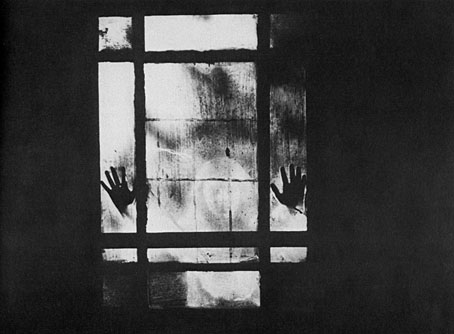
Curse of the Dead (1966).

Continuing an occasional series. This photograph, reproduced in Denis Gifford’s A Pictorial History of Horror Movies (1973), intrigued me for years. Gifford’s book is a very good collection of stills from horror films of all kinds, ranging from the earliest days of cinema to the 1970s. The pictures are mostly black-and-white, and are often far more stimulating than the films they would have been promoting. The text generally refers to the films depicted but in the case of this picture there’s only a single credit, Curse of the Dead (1966), a film I’d never heard of. These kinds of mysteries have been banished for good now we have resources like IMDB where you can learn immediately that Curse of the Dead is a Mario Bava film whose original Italian title was Operazione Paura. (It’s also known, with the usual hyperbole, as Kill, Baby…Kill!) “An 18th century European village is haunted by the ghost of a murderous little girl” says the summary. Bava’s films were always visually impressive so it’s really no surprise to find it was one of his.

carnacki.jpg

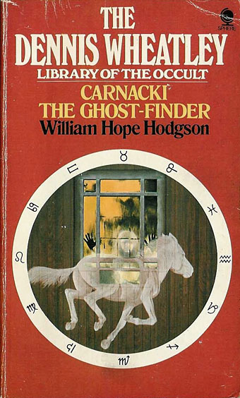
The first repeat usage I know of is this cover from the Dennis Wheatley Library of the Occult series published by Sphere books from 1974–77. Sphere used Wheatley’s name to sell a lot of reprints but the series was substantial and featured a number of titles that would have been appearing in paperback for the first time. Unfortunately the best thing about the covers was the uniform design of the horoscope circle against a coloured background. The quality of the illustrations was very uneven so it’s probably for the best that the artists and photographers went uncredited.

arkham.jpg

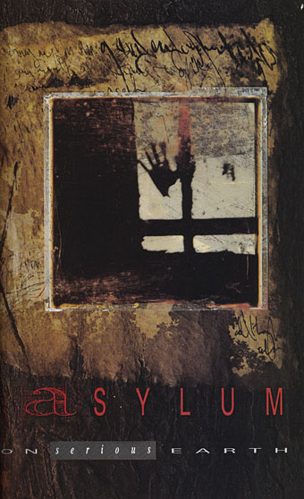
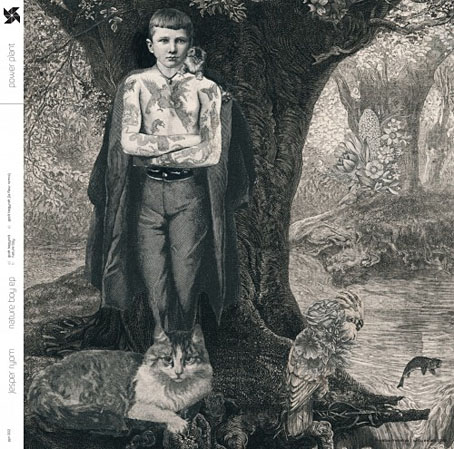
Then there’s one of Dave McKean’s title pages for Arkham Asylum (1989), the heavily symbolic Batman book he created with Grant Morrison. There’s only a portion of the picture but I’d say it’s a good guess he used the Gifford book since at least one of the panels in his earlier Violent Cases was based on another of the Gifford photos.

This isn’t all, I’m sure I’ve seen the Gifford picture used on a record sleeve but there’s little way of discovering which one unless somebody recognises the photo. If anyone knows, please leave a comment. And despite all of this I still haven’t seen Bava’s film even though I’m told it had a strong influence on Twin Peaks. This account at The Horror Digest is slightly disappointing when a colour equivalent of the Gifford still lacks the particulated creepiness of the black-and-white version. More surprising is finding yet another film featuring the arms-out-of-the-walls motif. This obviously requires further investigation.

Update: Thanks to Irv in the comments for finding the following singles so quickly. The Decorators sleeve was the one I remembered. (See it larger here.) Kicks were an Australian band. Odd that these were both released in the same year.

decorators.jpg

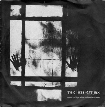
Twilight View (1980) by The Decorators. Design by Malcolm Garrett.

kicks.jpg

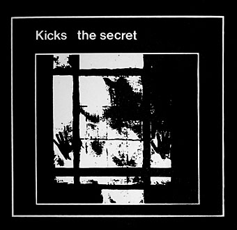
The Secret (1980) by Kicks.

Previously on { feuilleton }
Design as virus 13: Tsunehisa Kimura
Design as virus 12: Barney’s faces
Design as virus 11: Burne Hogarth
Design as virus 10: Victor Moscoso
Design as virus 9: Mondrian fashions
Design as virus 8: Keep Calm and Carry On
Design as virus 7: eyes and triangles
Design as virus 6: Cassandre
Design as virus 5: Gideon Glaser
Design as virus 4: Metamorphoses
Design as virus 3: the sincerest form of flattery
Design as virus 2: album covers
Design as virus 1: Victorian borders

Green Pipes: Poems and Pictures

jpf01.jpg

This is a strange book. Green Pipes: Poems and Pictures (1929) was written and illustrated by Joseph Rous Paget-Fredericks (1903–1963), a man better known these days for a substantial collection of memorabilia and archive material related to 20th-century dance. Paget-Fredericks studied with Léon Bakst then went on to create his own costume designs as well as producing some books for children of which this is an example. In style the poems aim at AA Milne’s When We Were Very Young but succumb to tweeness with a superfluity of fairies and pixies. At first glance the illustrations seem just as twee until you notice remarkable details such as costumes and foliage created from a wealth of disconnected lines and squiggles. The drawing of a Smoke Sprite is closer to something by Alastair than EH Shepard, while the Snow Fairy is the vaguest outline in a dress composed of circles, lines and dots. The Green Pipes of the title are the pipes of Pan, and so we get a late eruption of that peculiar flourishing of Pan Mania that extends from the 1890s to the 1930s. A book of children’s poetry isn’t the place you’d expect to encounter flower children kneeling before a piping faun but after the openly Pantheist chapter of The Wind in the Willows anything is possible. Far more out of place among all the fairies is a painting of a pirate brandishing a bloody cutlass. And what are we to make of the lines at the end of Elfin Children?

Then from the windowed heights we stream
By silent starlit mire…

The Starlit Mire (1911) was a book of epigrams by James Bertram & F. Russell illustrated by Austin Osman Spare (with a head of Pan blocked onto the cover). It’s not at all a book for children so the occurrence of that phrase in Paget-Fredericks’ poem is very surprising. Is “starlit mire” a quote that precedes the Bertram & Russell book? Please leave a comment if you know.

Read Green Pipes online here or download it here.

jpf02.jpg

jpf03.jpg

Continue reading “Green Pipes: Poems and Pictures”

Can’s Lost Tapes

can1.jpg

Design by Julian House.

“Tapes”, that’s the crucial word. For the past twenty-four hours I’ve been immersed in The Lost Tapes, the triple-disc collection of previously unreleased recordings by the mighty Can, and contemplating the importance of tape to the German music scene (Krautrock, if you must) of the 1970s. Can performed live throughout their career but their reputation is based on their recorded output. One reason why not only Can but also Faust and Kraftwerk were able to spend so much time creating unprecedented music was because they all had their own studios. These were doubtless primitive—Can’s was famously housed in a disused cinema—but the ability to experiment with recording free from the escalating costs of a professional studio gave them an advantage that few of their British or American contemporaries possessed. Can’s process wasn’t so very different from that employed by The Beatles and Miles Davis: play or improvise for hours then rely on talented editors (George Martin and Teo Macero respectively) to structure the music. Can’s Teo Macero figure was Holger Czukay whose advanced skills as a tape collagist were evident pre-Can on his Canaxis album.

can2.jpg

Can-heads have known all this for years, of course, you get to see some of the rudiments of the process in the archive footage on the 2003 DVD documentary. And knowing this always begged the obvious question: where’s all the unreleased tape? The Lost Tapes finally answers that question, it was in a vault in disarray. The booklet notes detail the sifting process that eventually culled three CDs from 50 hours of material. What’s great about this is that it’s all so much better than I expected (this was already evident from the preview tracks that Mute have been releasing). Many hardcore Can collectors will have heard the Canobits bootlegs that contain a mix of rudimentary tracks, long jams and live recordings, all of which are worthwhile but which mostly fail to match the quality of the Lost Tapes material. In addition to hearing preliminary pieces from Vitamin C and Sing Swan Song there are more of the band’s recordings for obscure film and TV, and some stunning live moments from the period around 1972 when they were really at their peak. I never expected there to be as much from the Malcolm Mooney period as there is here. Nice packaging too by Julian House in his day job as a designer at Intro: three discs in a ten-inch box with a booklet filled with the customary House collage business. This is an essential purchase for any Can enthusiast, but it’s also essential listening for anyone fascinated by the extraordinary music that erupted in Germany in the early 1970s.

Previously on { feuilleton }
A cluster of Cluster