Derek Jarman album covers

sexgang.jpg

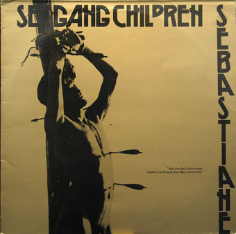
Sebastiane (1983) by Sex Gang Children. A 12″ single using a still from Jarman’s film.

A final post for this Jarman week. Derek Jarman sustained his film career with regular music promo commissions (see this earlier post) but he never produced any album covers as such. What you have here are music releases which happen to feature his artwork or stills from his films. One thing I like about these cover art posts is the disparate music lists they create; the process of investigation also turns up surprises such as a Jayne County album for which he supplied the lettering.

coil.jpg

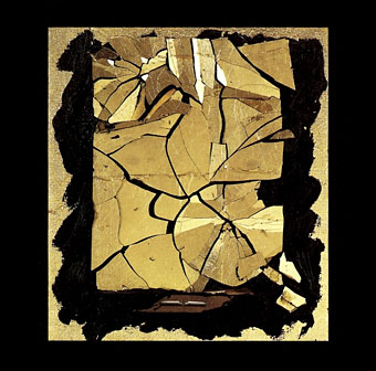
How To Destroy Angels (1992) by Coil. Painting: Fine Balance (1986).

Coil’s album of remixes and digital mangling of one of their earliest recordings. A great collection of rumbling ambience, some of which I used in my Night Music mixes.

county.jpg

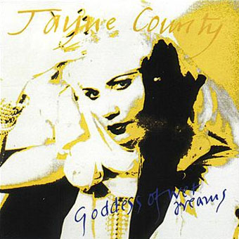
Goddess Of Wet Dreams (1993) by Jayne County. Graphics by Derek Jarman, painting by Michael Spencer Jones, design by Warren Heighway.

towering.jpg

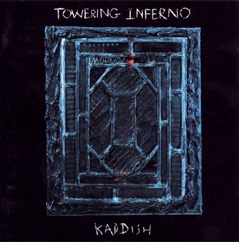
Kaddish (1993) by Towering Inferno. Painting: Modern Times.

An odd album. Towering Inferno were Richard Wolfson and Andy Saunders, who on this album are joined by a large cast of musicians including well-known names such as Márta Sebestyén, Jocelyn Pook, Elton Dean, Chris Cutler, and others. The album is described as “a dream history of Europe in the wake of the Holocaust”, and received great praise on its release although I wonder how often anyone listens to it today. Beautiful pieces of music spoiled throughout by surprisingly hamfisted use of vocal samples.

Continue reading “Derek Jarman album covers”

Weekend links 198

boty.jpg

Bum (1966) by Pauline Boty.

Eleanor Birne on Pauline Boty, “the only prominent female Pop artist among a generation of famous men”. Ken Russell’s Pop Art documentary, Pop Goes the Easel (1962), which features Boty, may be seen here. Two years later Boty was back with Ken Russell playing the part of the prostitute from The Miraculous Mandarin in a film about Béla Bartók. That’s something I’d love to see. There’s more about her painting, and the work of other female Pop artists, here.

• Why Are We Sleeping? Mark Pilkington on the music world’s recurrent interest in the philosophy of GI Gurdjieff. Pilkington’s most recent Raagnagrok release with Zali Krishna, Man Woman Birth Death Infinity, was reviewed by Peter Bebergal.

• Cinematic details: Frames-within-frames in The Ipcress File (1966), and the typography of 2001: A Space Odyssey (1968).

highrise.jpg

A Jay Shaw poster for Ben Wheatley’s forthcoming film of High-Rise.

• “…a large cavity must be dug in the bird’s shoulder and filled with ball bearings.” Christine Baumgarthuber on the dubious delights of The Futurist Cookbook.

• Why Tatlin Can Never Go Home Again: Rick Poynor on the difficulties of finding a definitive representation of an artwork online.

Jay Parini reviews Inside a Pearl: My Years in Paris by Edmund White. At AnOther Donatien Grau talks to White about fashion.

• At Bajo el Signo de Libra (in Spanish): the homoerotic and occasionally Surrealist art of Pavel Tchelitchew.

• At 50 Watts: Kling Klang Gloria: Vintage Children’s Books from Austria.

• The motorbike girl gangs of Morocco photographed by Hassan Hajjaj.

Geoff Manaugh on how LED streetlights will change cinema.

Stylus “is an experiment in sound, music and listening”.

• Mix of the week: Secret Thirteen mix 106 by Senking.

• At Pinterest: JG Ballard

This Is Pop? (1978) by XTC | Pop Muzik (1979) by M | Pop Quiz (1995) by Stereolab

Weekend links 197

field.jpg

Posters by Jay Shaw for Ben Wheatley’s A Field in England which receives a US release this month.

Alvin Baltrop’s Gay New York: “the clandestine activities taking place under New York piers between 1975 and 1986”. AnOther samples some of the work on display at the Open Eye Gallery, Liverpool. Meanwhile, BUTT has some shots from Texas Porno Road Trip, a photo series by Mike McLeod. Related: HBO will show you anything but a male erection, says Justin Moyer.

• “[Robert] Desnos quickly proved himself to be one of the most gifted in these experiments – eventually known as ‘the period of sleeping fits’. He was capable of writing, speaking, drawing and composing entire fantastical narratives.” Eugene Thacker on the Surrealist séances of the 1920s.

• “It’s history, not a viral feed,” says Sarah Werner. A complaint about the way the ongoing decontextualisation of images is both pernicious and potentially lucrative.

His prose is a palimpsest of echoes, ranging from Eliot’s Preludes and Rhapsody on a Windy Night (lines like “Midnight shakes the memory / As a madman shakes a dead geranium” are Burroughsian before the fact) to Raymond Chandler’s marmoreal wisecracks and Herbert Huncke’s jive. I suspect that few readers have made it all the way through the cut-up novels, but anyone dipping into them may come away humming phrases. His palpable influence on JG Ballard, William Gibson, and Kathy Acker is only the most obvious effect of the kind of inspiration that makes a young writer drop a book and grab a pen, wishing to emulate so sensational a sound. It’s a cold thrill.

Peter Schjeldahl reviews Call Me Burroughs by Barry Miles.

• “Dance music was born in LGBT communities, but has this been forgotten?” Luis-Manuel Garcia on an alternate history of sexuality in club culture.

• Avant-Grade Hallucinogens: the Poetics of Psychedelic Perception in Moving Image Art by Stuart Heaney.

No Condition Is Permanent: weekly radio shows from Count Reeshard at LuxuriaMusic and iTunes.

The Golem: where fact and fiction collide. David Barnett on 100 years of Gustav Meyrink’s novel.

• Don’t Let Harlan Ellison Hear This: Nick Mamatas on a great writer.

• Mix of the week: the Ela Orleans Mix at A Sound Awareness.

Amon Düül II playing live on French TV, 1971 & 1973.

• A soundmap of London canals and minor rivers.

The Peculiar Underworld of Rare-Book Thieves.

• At Pinterest: William Burroughs and Phalluses.

Architecture of Doom

Hallucinations (1967) by Tim Buckley | Phallus Dei (1969) by Amon Düül II | Hallucinations (In Memory of Reinaldo Arenas) (1994) by Paul Schütze

The Grammar of Ornament revisited

jones01.jpg

I’ve owned a facsimile of Owen Jones’ study of ornamental design for many years. Jones was an architect who helped in the planning of London’s Great Exhibition in 1851, and in the subsequent development of the Victoria & Albert Museum. The Grammar of Ornament (1856) originated from this work, a lavish guide to the history of ornament through the ages, and from all parts of the world. My facsimile is a large, heavy and unwieldy volume: nice to look at but difficult to use. One of the earliest posts here linked to an online copy but a recent addition to the archives at the University of Heidelberg is better quality, and also much more accessible.

What I’m hoping for now is that someone will do the same for Auguste Racinet’s Polychrome Ornament (1877), a book inspired by The Grammar of Ornament‘s example which is even more lavish. This Flickr set has copies of the plates but when anything at Flickr can be deleted on a whim it’s always better to have an alternative available.

jones02.jpg

jones03.jpg

jones04.jpg

Continue reading “The Grammar of Ornament revisited”

The Royal Picture Alphabet

royal1.jpg

Another pictorial alphabet but no architecture this time. “Royal” is used here in the more general sense of “grand” or “first-rate”, and this isn’t the only example of an instruction book for children that calls its alphabet a royal one. John Leighton’s Royal Picture Alphabet is a finer example than others to be found at the Internet Archive, however, where the results are either very simple or, in the case of Walter Crane’s Absurd ABC, might have benefitted from additional pages. It’s surprising that Leighton’s book is a more substantial piece of work than Crane’s when Crane wrote a history of book design. Leighton’s alphabet is also surprisingly polysyllabic; you can’t imagine anyone today choosing “Eccentricity” to represent the letter E.

Books such as this always have trouble with the letters at the end of the alphabet, especially that tricky X. The Royal Picture Alphabet chooses “Xantippe”, the wife of Socrates, while its earlier counterpart has “Xanthus”, a horse from Greek mythology. (That old stand-by, the xylophone, didn’t become established until later in the 19th century.) Both books, and Crane’s volume, offer “Zany” for the letter Z.

royal2.jpg

royal3.jpg

royal4.jpg

Continue reading “The Royal Picture Alphabet”