Great Work of Time

greatwork.jpg

More science fiction. I said a couple of weeks ago that I was up to date with all my cover art from last year but I’d forgotten about this return to Victoriana. In mitigation, I started work on the design in January last year. I’ve done a lot of other work in the meantime while waiting for the book to be announced on the publisher’s website, which it was last month.

Great Work of Time is an award-winning novella by John Crowley that Subterranean Press are reprinting in a numbered edition signed by the author. Crowley is an exceptional writer so I was very pleased to be asked to work on this one. I’ve also designed the interior—which will be printed with black and magenta inks—and created a small number of spot illos. The story concerns a group of select individuals, The Otherhood, who attempt to perpetuate the British Empire by manipulating history, a scheme that might be considered the colonialism of time as well as space. The unintended consequences that result from this are more complicated and weirder than you usually find in time-travel stories, while Crowley’s conception of time is a lot more sophisticated than the stereotype of a linear route which temporal voyagers enter or leave at different places. I could say more but doing so would expose the workings of a very elaborate piece of clockwork. This is one of those stories that you finish reading and immediately want to read again.

I’m still not sure when Great Work of Time will be published but the pre-order page is here.

Previously on { feuilleton }
The Time Machine

Zen-Gun and The Zen Gun

zen1.jpg

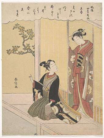
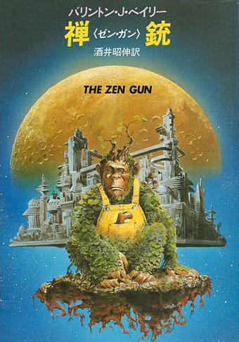
Japanese edition, 1984. Cover artist unknown.

At last, kosho Hako Ikematsu permitted himself to exult, at last he held the zen gun in his hands.

Zen in the art of electronics…

He knew its age: more than three Earth centuries. He knew its provenance: the zen master who made it had been a member of the order from which his own had originally sprung. The external appearance of the gun was a testament to certain cultural concepts: it seemed improvised, unfinished, crude, yet in its lack of polish was a feeling of supreme skill…in the Nipponese language of the time it had wabi, the quality of artless simplicity, the rustic quality of leaves strewn on a path, of a gate mended roughly with a nailed-on piece of wood and yet whose repair was a quiet triumph of adequacy and conscious balance. It had shibusa, the merit of imperfection. Only incompleteness could express the infinite, could convey the essence of reality. Hence, the unvarnished wood bore the marks of the carver’s chisel…

These qualities were themselves but superficial excrescences of the principles on which the gun acted, principles so abstruse in character that one dictum alone succeeded in hinting at them: Nothing moves. Where would it go? Pout the chimera had succeeded in using the gun as an electric beam to hurt or kill, without regard to location. But that was the most trivial of its capabilities. Only a kosho could unlock its real, dreadful purpose…

I read a novel recently that was unapologetic space opera. This isn’t something I do very often. Ryuichi Sakamoto is to blame, strange as this may seem, as a result of my spending a day or two listening to my old Sakamoto CDs. One of these, Illustrated Musical Encyclopedia, contains a short instrumental titled Zen-Gun, a piece which almost shares a title with the space opera in question, The Zen Gun by Barrington J. Bayley. I bought the Sakamoto disc in 1990, and I’ve known about the novel, which was published in 1983, for almost as long as I’ve been listening to the album. Every now and then I’ve wondered whether the two works might be connected, or at least whether Sakamoto borrowed Bayley’s title, but I’d never considered reading the novel until now.

zen2.jpg

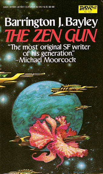
US edition, 1983. Cover art by Kelly Freas.

Barrington Bayley (1937–2008) is a writer whose works I’d mostly avoided while he was alive. This despite the continual praise he received from Michael Moorcock, and the acknowledgement by William Burroughs in Nova Express for an idea borrowed from a Bayley story with a Burroughs-like title, The Star Virus. (Samples of Burroughs’ voice happen to turn up on an album that Ryuichi Sakamoto recorded after Illustrated Musical Encyclopedia, the Bill Laswell-produced Neo Geo. Make of this what you will.) Bayley was the odd man out among the British writers of science fiction’s New Wave for persevering with hard SF, a sub-genre I don’t enjoy reading very much unless it’s by a trustworthy writer. All genres have their share of bad writers but science fiction, especially the variety concerned with space-faring and futuristic technology, has historically been home to more than most. I already knew that Bayley could write a decent story—he appeared regularly in the pages of New Worlds magazine—but I feel I’ve been doing him a disservice by ignoring his novels for so long.

The thing that really pushed me towards The Zen Gun was reading the Wikipedia entry for the novel which includes the following praise from Bruce Sterling:

Yet Bayley’s elemental energy, his mastery of the sense of wonder, cannot be denied. His work is the very antithesis of tired hackdom. To invent an entire self-consistent cosmology and physics for a $2.50 DAW paperback…is one of those noble acts of selfless altruism that keep SF alive.

Then there’s this comment about the mysterious Zen Gun itself, a piece of wood carved into the shape of a pistol which is capable of destroying entire suns: “Powerful as the weapon is, its existence is a paradox, as only those who have attained inner peace can use it.” After reading this I knew I had to read the novel.

Continue reading “Zen-Gun and The Zen Gun”

Foreign affairs

something.jpg

A Czech edition of Something from Below by ST Joshi, 2022.

A few of my illustrations and cover designs have been reprinted on foreign editions over the past couple of years so I thought I’d note them here. All the books are cosmic horror of one kind or another which isn’t too surprising when I’m known more for this than for my work in other genres. Seeing your cover art reused in other countries (or in your own country, for that matter) happens less often than you might think. The music business goes in the opposite direction in this regard. Books, for a variety of reasons, tend to be reprinted with new covers whereas album releases will sail through the years packaged in whatever cover they were fortunate (sometimes unfortunate) to have received when first released. Consequently, you can’t predict which design or illustration might end up being used for a reprint or a new edition.

cthulhu.jpg

A Swedish edition of The Call of Cthulhu and other stories, 2022. The cover art is from the series of illustrations I produced for Lovecraft’s Monsters, a story collection edited by Ellen Datlow.

This list isn’t necessarily all that may be out there. Another peculiarity of the publishing world is that you can be told a foreign edition is being planned then, after various agreements have been made, never hear about it again. This is partly a result of the Babel-like nature of the internet, in which we navigate our own language zones while remaining ignorant of the other zones which exist close by. If nobody tells you the book was published then you’re unlikely to encounter it by accident. Publishing is also a slow business, so that you might agree to a reprint, send off the artwork then forget all about it until somebody contacts you a year later asking where they should send a complimentary copy. (And publishers don’t always send complimentary copies…) Missing from this list are a Russian edition of Under the Pendulum Sun by Jeannette Ng, and a Chinese edition of The King in Yellow by Robert W. Chambers. In both cases I sent the publishers the artwork and was paid a small fee as a result but I’ve yet to discover whether the books were published using my cover art, or even published at all.

hodgson.jpg

The above is a Turkish edition of The House on the Borderland published by the Karanlik Kitaplik imprint of Ithaki. The imprint title translates as “Dark Bookshelf” although “Dark Library” seems more likely, with the other books in the series being horror novels that feature similar cover designs using tinted monochrome artwork. My illustration is from the interior of the Swan River Press edition which I would, of course, recommend to all Anglophone readers. The Turkish publisher said they planned to reprint some of my other Hodgson illustrations inside their edition but I don’t know whether they’ve done this. Ithaki also have another edition of the novel which reuses the Ian Miller cover art from the old Panther paperback.

last3.jpg

French edition of The Last Ritual by SA Sidor, 2021.

Asmodee has tentacles in many countries so the spin-off books published by the company’s Aconyte imprint have generated a number of foreign editions, one of which has already been mentioned here. I’m pleased to see the reworked covers using fonts sympathetic to the Deco-style design. There are more books in this series (the most recent being The Ravening Deep) so there may be more foreign editions in the future.

last2.jpg

Italy, 2021.

last1.jpg

South Korea, 2022.

last4.jpg

Spain, 2022. This one comes with a postcard of the cover design.

litany2.jpg

Spanish edition of Litany of Dreams by Ari Marmell, 2022.

litany1.jpg

South Korea, 2022.

Previously on { feuilleton }
Das Letzte Ritual
Litany of Dreams
The Last Ritual
Something from Below
Lovecraft’s Monsters

Weekend links 659

harunobu.jpg

The First Day of Spring (Risshun), from the series Fashionable Poetic Immortals of the Four Seasons (c.1768) by Suzuki Harunobu. Risshun in Japan begins on the 4th of February.

• “…after centuries of imbibing alcoholic beverages as their main source of potable water, European’s new fondness for boiled drinks—coupled with the psychoactive properties of caffeine—swapped societal tipsiness with a mindstate primed for the Enlightenment’s intoxication with reason.” Hunter Dukes on A Treatise Concerning the Properties and Effects of Coffee (1792) by Benjamin Moseley.

• Steven Heller on John Wilcock, Master of the Underground: “[He] was one of the great ‘happening’ characters of midcentury America, beat myth to Hippie legend. He was founder of half a dozen underground papers, and started one of the first citizen-access cable television shows. His achievements are a dense package.”

• At Fonts In Use: Florian Hardwig explores the origin of “the Dune font” as used on the covers of Frank Herbert’s novels during the 1970s and 80s.

• At Smithsonian Magazine: “Hundreds of Frank Lloyd Wright’s designs were never built. Here’s what they might have looked like.”

• Mix of the week: Fact Mix 893 by KMRU & Aho Ssan & Sevi Iko Dømochevsky.

• New music: Hypnagogia by Martina Bertoni, and Cosmos Vol. II by Ran Kirlian & Jaja.

• “Forgotten ‘Stonehenge of the north’ given to nation by construction firm.”

• At Aquarium Drunkard: Soft Machine live at Jazz Bilzen, 1969.

• RIP Tom Verlaine.

Goofin’ At The Coffee House (1959) by Henri Mancini | Bring Me Coffee Or Tea (1971) by Can | Starfish And Coffee (1986) by Prince

Now It’s Dark

dark1.jpg

Now It’s Dark by Lynda E. Rucker; cover art by John Coulthart; jacket design by Meggan Kehrli; introduction by Rob Shearman; edited by Brian J. Showers and Timothy J. Jarvis; copyedited by Jim Rockhill; typeset by Steve J. Shaw; published by Swan River Press.

Hardback: Published on 27 January 2023; limited to 400 copies of which 100 were embossed and hand numbered; signed by Lynda E. Rucker, Rob Shearman, and John Coulthart; xii + 225 pages; lithographically printed on 90 gsm paper; dust jacketed; illustrated Wibalin boards; sewn binding; head- and tail-bands; ISBN: 978-1-78380-043-8.

dark2.jpg

Dust jacket.

dark3.jpg

Printed boards.

This is the last of the books I was working on last year, and being another design for Swan River Press means that once again the artwork is a wraparound cover with printed boards under the wrap. Now It’s Dark is a collection of horror stories (or possibly “strange stories” à la Robert Aickman), and a very fine collection it is. I was given carte blanche with this one so the cover is a mood piece rather than anything directly illustrational. One of the stories concerns the god Pan, which tempted me at first to do something with a satyr-like face, possibly as an architectural feature like a mascaron. But focusing on a single story in this way usually makes me worry about giving that story too much attention if it hasn’t also provided the title of the collection. Thinking about mascarons and their positioning above arched doorways led to the design you see here, a gesture towards a minor trend in horror illustration that makes use of the Arcimboldo effect, as with my battered Shirley Jackson paperback.

haunting.jpg

Corgi Books, 1977. No artist credited.

zuccari1.jpg

A Boy and His Dog on a Staircase in Rome (1886) by Niels Frederik Schiøttz-Jensen.

My cover is a variation on a real place, the “House of Monsters” entrance of the Palazzo Zuccari in Rome which today houses the Bibliotheca Hertziana. I placed the portal into an extended Baroque facade while moving the monstrous windows to the boards of the book. Given the way the grotteschi concept was a common feature of the Baroque you’d expect there to be more doorways like this but the palazzo street entrance seems to be unique. Equivalents such as the Ogre’s Head at Bomarzo are more like theme-park attractions than architectural features. I’ve never seen Umberto Eco mention the Palazzo Zuccari but I imagine he would have enjoyed seeing an infernal mouth as an entrance to a library.

zuccari2.jpg

Previously on { feuilleton }
Infernal entrances