Storm Thorgerson, 1944–2013

hipgnosis1.jpg

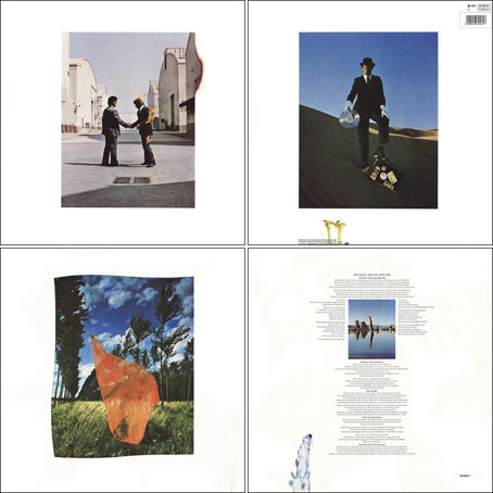
Wish You Were Here (outer and inner sleeve, 1975) by Pink Floyd.

Whenever people ask questions about your work, at some point the subject of influences always turns up. Influences for me are usually few, they’re those things which skew your perception to such a degree—or which enlarge the range of possibilities—that they make you follow a path you might otherwise have never pursued. I’ve said on many occasions that the window of our local record shop in the 1970s was an art gallery whose contents changed every week, with gatefold sleeves offering an endless variety of fantastic visions and smart designs. I was often indifferent to the music the sleeves were intended to advertise, if a favourite band happened to have a great record sleeve then so much the better. It wasn’t that I wanted to be a record sleeve designer as such, more that the views (as Roger Dean called his first book) were incredibly stimulating, and they excited me enough that I wanted to have the creation of images like that in my future.

hipgnosis2.jpg

Wish You Were Here shrinkwrap and George Hardie’s sticker design.

I’ve written at some length about Roger Dean and Barney Bubbles but it was Hipgnosis that dominated those window displays during the golden age of record sleeve design. Obituaries of Storm Thorgerson have rightly been acknowledging the contributions of his Hipgnosis design partners Aubrey Powell and Peter Christopherson, but Thorgerson always came across as the driving force, a position reinforced by his text for the group’s first book collection, An ABC of the Work of Hipgnosis: Walk Away René (1978), and by his post-Hipgnosis career which continued to generate even more startling images. Walk Away René is like the designs of Hipgnosis themselves: witty, clever, and beautifully produced, while Thorgerson’s commentary is refreshingly honest both about the details of album production, and in its lack of the affectation which afflicts many design books. Working in the music business probably helped maintain a no-bullshit attitude; it’s difficult to imagine many other designers cheerfully announcing in their first public showcase that their studio is so primitive that everyone has to piss in the sink. Or, as I noted in December, drawing attention to your least favourite covers in an even more lavish showcase.
hipgnosis3.jpg

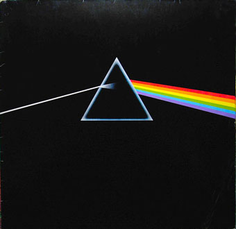
The Dark Side Of The Moon (1973) by Pink Floyd.

The cover examples here have been chosen via the essays in For the Love of Vinyl: The Album Art of Hipgnosis (2008) where several people were asked to choose their favourite sleeves. I’d find it impossible to choose a favourite, although at a push I’d probably go for Wish You Were Here. With its absence/four elements concept, in its original package—the postcard insert, the unlabelled sleeve shrink-wrapped in black cellophane then stickered with a George Hardie drawing which I once laboriously copied—it comes close to perfection when you’re discussing album designs as works of art.
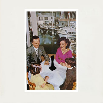
hipgnosis4.jpg

Presence (1976) by Led Zeppelin.

The Hipgnosis Covers site is the place to see more work by Storm Thorgerson and company.

Storm Thorgerson, Pink Floyd and the final secret of the world’s greatest record sleeve designer
The Guardian: “The best album designer in the world”
Storm Thorgerson remembered by Aubrey Powell
Adrian Shaughnessy at Creative Review
Mark Blake at MOJO
Telegraph obituary

hipgnosis5.jpg

Go 2 (1978) by XTC.

Elsewhere on { feuilleton }
The record covers archive

Previously on { feuilleton }
Hipgnosis turkeys
Peter Christopherson, 1955–2010
Storm Thorgerson: Right But Wrong
Battersea Power Station

Doorways

doorway1.jpg

Another fine book for us collagists, Libro estraordinario di Sebastiano Serlio bolognese : nel quale si dimostrano trenta porte di opera rustica, mista con diuersi ordini, & uenti di opera dilicata di diuerse specie : con la scrittura dauanti, che narra il tutto (1566) is a guide to “porte rustiche”, or old doorways. There are fifty in all, of which I’ve chosen seven random examples. Browse the rest here or download the book here.

doorway2.jpg

doorway3.jpg

doorway4.jpg

Continue reading “Doorways”

Julius Klinger’s Sodom

klinger1.jpg

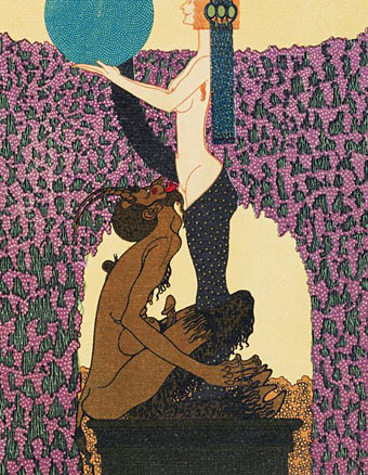
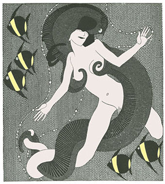
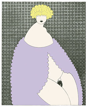
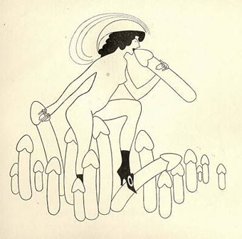
The more I look at the work of Austrian artist Julius Klinger (1876–1942), the more I like what I see. This Pinterest sample shows his versatility, equally at home with detailed illustration, often with a Beardsley-like quality, as he was with more Modernist design. Sodom (1689) (aka The Farce of Sodom, or The Quintessence of Debauchery) is the notorious Restoration drama attributed to John Wilmot, the second Earl of Rochester, which is here illustrated by Klinger for an edition privately published in Leipzig in 1909. The play is one of the most flagrantly outrageous works in the English language, with a cast of characters that includes Bolloxinion, the King of Sodom, Cuntigratia, his Queen, and so on; you can see parts of it performed in The Libertine (2004) with Johnny Depp playing Rochester, and taking the role of Bolloxinion.

Klinger produced 16 illustrations in all. His picture of Salomé gets linked to this series on a number of websites but I’ve seen other sites that list it as a separate piece. Since Salomé isn’t mentioned anywhere in Sodom I’d also be inclined to keep them separate.

klinger2.jpg

klinger3.jpg

klinger4.jpg

Elsewhere on { feuilleton }
The illustrators archive

Previously on { feuilleton }
Deutsche Kunst und Dekoration #21
Julius Klinger’s Salomé

Weekend links 155

austin.jpg

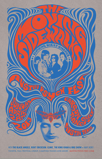
Poster design by Mishka Westell for this month’s Austin Psych Fest. Billy Gibbons’ pre-ZZ Top psychedelic outfit, The Moving Sidewalks, surprised everyone by reforming for a New York gig last month, their first performance together in 44 years.

• Pye Corner Audio played the Boiler Room, London, last week, and remixed a track from FC Judd’s Electronics Without Tears. Also on the latter is Chris Carter who talks about his own remix (and the “Radiophonic” Mr Judd) here.

Tom Bianchi’s Fire Island Pines, Polaroids of New York’s gay enclave from 1975–1983. Related: In Conversation with the Violet Quill: Andrew Holleran, Felice Picano, and Edmund White.

• From 2011: Sex, prison and lost ligatures: The story of Herb Lubalin’s Avant Garde typeface. Related: The ITC Avant Garde Gothic group at Flickr.

• Music reissues: Tape Works 1981–1982 by Laughing Hands is out now, and Scott Walker’s early solo albums will be reissued in the summer.

fraser.jpg

Drugs and the Mind (ii), a cover design from 1957 by Eric Fraser (1902–1983) whose illustrations and designs are in exhibition at the Chris Beetles gallery, London.

• At Ubuweb: William S. Burroughs + Brion Gysin + Genesis P-Orridge – Cold Spring Tape (1989).

The World According to John Coltrane, an hour-long documentary.

Neko Font: for when you need a word made of cats.

Fuck yeah, Sarah Bernhardt

Sordid Spheres!

99th Floor (1967) by The Moving Sidewalks | Over Fire Island (1975) by Brian Eno | Ledge (1980) by Laughing Hands

Le Cantique des Cantiques

kupka1.jpg

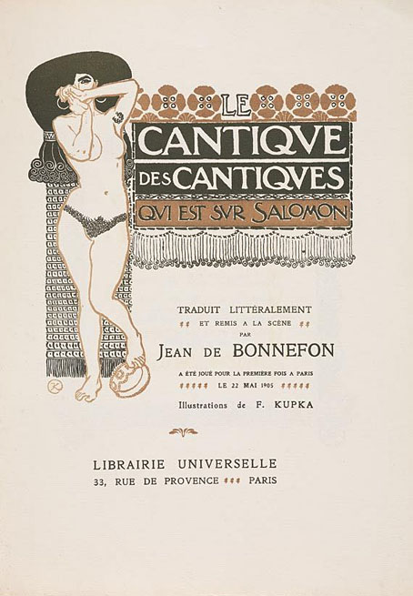
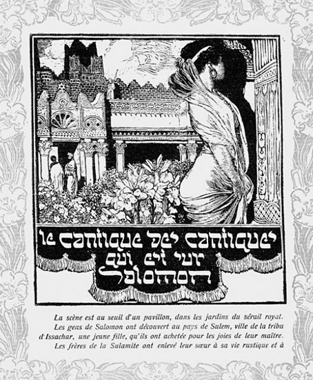
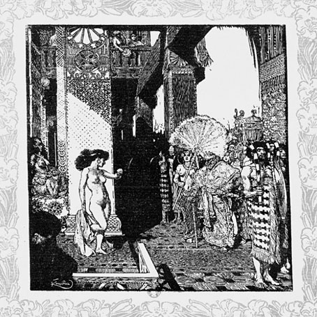
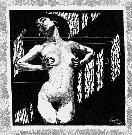
An oddity from the career of František Kupka, Le Cantique des Cantiques (1905) in this version is a stage presentation of the Song of Solomon by Jean de Bonnefon. Kupka provided a series of illustrations in a style similar to his Symbolist paintings which in the original printing are decorated with coloured borders. The copies here are from a bad scan at Gallica whose page I’ve been unable to find again. For the moment there are better copies to be seen at eBay. The drama is very much oriented towards the sexual exotica which Oscar Wilde had rendered notorious in Salomé, and which underpins so many of the obsessions of the period. A few years after this Kupka was in a different world entirely, following new directions into abstract art.

kupka6.jpg

kupka5.jpg

kupka3.jpg

Continue reading “Le Cantique des Cantiques”