The art of Takato Yamamoto

yamamoto1.jpg

Takato Yamamoto was born in Akita prefecture (Japan) in 1960. After graduating from the painting department of the Tokyo Zokei University, he experimented with the Ukiyo-e Pop style. He further refined and developed that style to create his “Heisei Esthiticism” style. His first exhibition was held in Tokyo, in 1998.

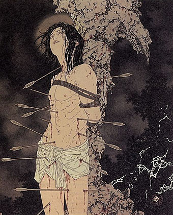
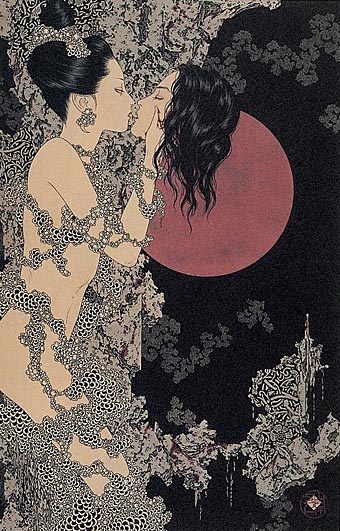
There’s much that’s superficially familiar in Takato Yamamoto’s art—“Boy’s Love” tableaux with fey young men in various states of undress mooning over each other, then the perennial Japanese obsession with naked women bound by ropes. But closer examination reveals a degree of finesse and imagination that elevates his work away from the porn ghetto into the rarified realm of Decadence (as if those favourite Symbolist themes of Saint Sebastian [above] and Salomé [below] weren’t enough of a clue). For a start the drawing style is a great amalgam of influences from Beardsley through to Harry Clarke by way of the finest Edwardian pornographer, Franz von Bayros. Then there’s the curious details of severed heads, claws, sundry bones and eyeballs which decorate the otherwise florid arrangements supporting the figures. So far there don’t appear to have been any books of Takato Yamamoto’s work produced in the west and it’s possible that the sexual content and grotesquery limits that possibility. But you can some galleries here, here and here. His official site is mostly Japanese and has to be navigated from an interior page since there seems to be a file missing from the index.
yamamoto2.jpg

Continue reading “The art of Takato Yamamoto”

Boys Own Books

boys_own1.jpg

boys_own2.jpg

boys_own3.jpg

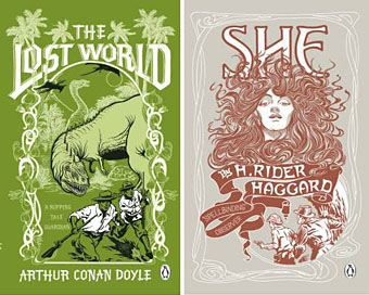
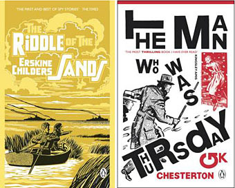
More pulp revenants come blinking back into the light. The runaway success of The Dangerous Book for Boys among fathers as well as sons has set British publishers casting about for new ways to exploit masculine nostalgia. Repackaging a few old warhorses is Penguin’s solution and a cheap one since most (all?) of these titles are out of copyright. I like these covers (and can’t find a design credit unfortunately), they’re well done, capture the right tone and look great as a set.

zenith.jpgThe Man Who Was Thursday seems to be the odd man out (as it were) story-wise. All the other books are typical adventure fare but in Chesterton’s novel what appears at first to be a pot-boiler turns out to be a metaphysical allegory closer to Charles Williams than John Buchan. One of Sax Rohmer‘s Fu Manchu volumes would have been more suited to this series but I suspect their “Yellow Peril” racism makes that less easy today. The Chesterton cover is curiously out-of-synch too, a pastiche of El Lissitzky/Bauhaus styles rather than the Edwardian designs the others are imitating. This isn’t a mistake, however, the fractured lettering suits a tale of anarchists with a plot full of twists and surprises. I tried a similar Modernist approach in 2001 with my jacket for Savoy’s edition of Zenith the Albino. In that instance the style was derived from Mondrian, with the colours coming from the initial description of the albino’s black clothes, white skin and red eyes. I’d venture to suggest that Anthony Skene’s thriller is a far better book than all of the above, Chesterton included, but then I am rather biased.

Update: Coralie from Penguin has the credits in the comments.

Elsewhere on { feuilleton }
The book covers archive

The art of NoBeast

nobeast1.jpg

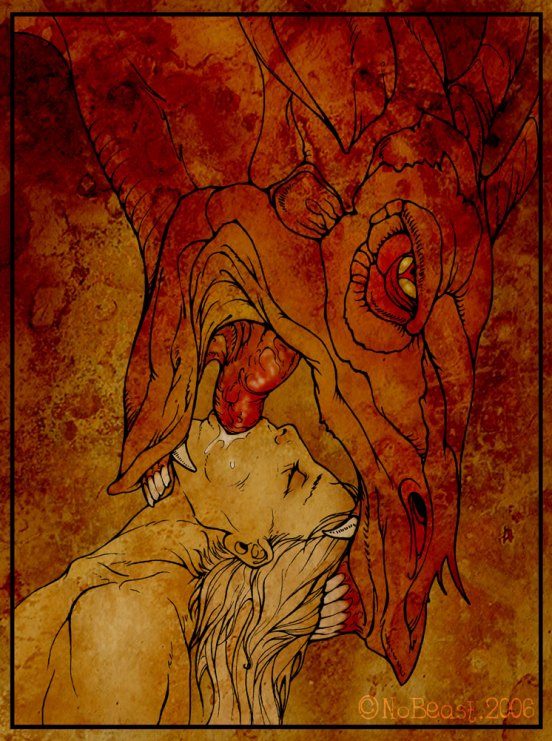
It’s not every day you get to post graphic demon porn but this is such a day so consider yourself duly warned about the content. I’ve no idea who NoBeast is since no one seems to know. Given what’s being depicted here—among other things, a rare gay take on the unique Japanese tentacle rape fetish—the anonymity might be understandable but the quality of the drawing is certainly good enough for the artist to reveal his or herself publicly. This may be the work of a moonlighting commercial artist unwilling to compromise their day job. Who knows?

Continue reading “The art of NoBeast”

The Underwater Sculpture Gallery

underwater.jpg

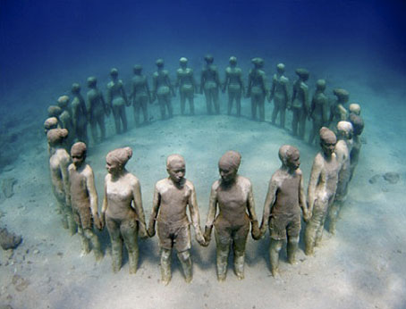
Vicissitudes, depth: 4.5 m.

The Underwater Sculpture Gallery in Grenada, West Indies is a project started in May 2006 by sculptor Jason Taylor, with the support of the Grenadian Ministry of Tourism and Culture. This is a unique artistic enterprise, celebrating Caribbean culture and highlighting environmental processes, such as coral reef re-generation.

An underwater gallery creates a whole new perspective on the world. Submerged objects are affected by different conditions both physical and emotional. Objects appear 25% larger and closer, colours are changed as light is absorbed differently by the water. The surface of the sea creates an ever-changing kaleidoscope of light, whilst its turbidity acts as a filter. The aquatic medium affords the viewer a multitude of angles and perspectives and thus transforms the traditional role of passive observer into an active process of discovery and engagement.

The ocean provides a setting imbued with mystery. Observers are invited to appreciate the works of art whilst questioning their circumstances and history. The viewer is immediately committed and involved to the environment and becomes part of the work itself. The sculptures will be an ever changing exhibition as nature colonizes the surface and the sea and tidal movement shapes the texture.

The uniqueness of the setting challenges traditional views of ourselves and our environment, transcending the boundaries separating land and water, and decompartmentalising social preconceptions. The constant flux of the marine environment on the sculptures mirrors the vicissitudes of our own lives.

Via Arthur.

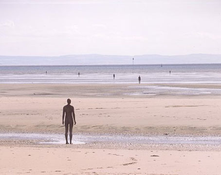
Lucky Grenadians, the closest we get is Anthony Gormley‘s Another Place, a series of his usual figure sculptures on Crosby beach, Merseyside.

gormley.jpg

Previously on { feuilleton }
Dead monuments