Weekend links 36

high_society.jpg

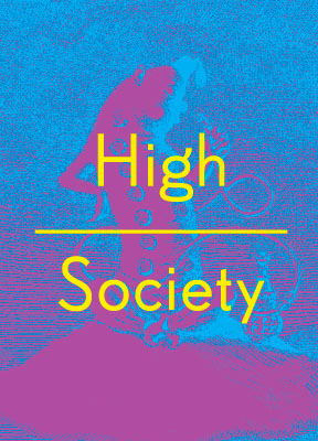
Mervyn Peake’s Caterpillar from Alice’s Adventures in Wonderland finds itself used to promote High Society, an exhibition at the Wellcome Collection devoted to the long history of human drug-taking. There’s more about the exhibition here and also an accompanying book by Mike Jay from Thames & Hudson. Related: The Most Dangerous Drug:

A group of British drug experts gathered by the Independent Scientific Committee on Drugs (ISCD) rated alcohol higher than most or all of the other drugs for health damage, mortality, impairment of mental functioning, accidental injury, economic cost, loss of relationships, and negative impact on community.

• Unless the magazine Man, Myth & Magic was advertised on TV in 1970 (and I suspect it would have been) Austin Osman Spare’s work has never been seen on British television, certainly not in any detail or with a credit to the artist. This week the BBC finally paid him some attention with a brief spot on The Culture Show as a result of the Fallen Visionary exhibition which is still running (until November 14) in London. Alan Moore, Fulgur‘s Robert Ansell and others attempt to summarise Spare’s career in seven minutes.
fujita.jpg

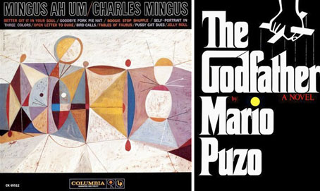
Neil Fujita designs: Mingus Ah Um (1959) and The Godfather (1969).

• RIP graphic designer Neil Fujita. Related:

“By taking the “G” and extending it to the “D,” I created a house for “God.” The way the word was designed was part of the logo and so was the type design. So when Paramount Pictures does a film version or Random House, which bought out the book from Putnam, does another Godfather book, I still get a design credit. In fact, before the first Godfather film opened in New York I saw a huge billboard going up in Times Square with my design on it. I actually got them to stop work on it until we were able to come to an agreement.” Waxing Chromatic: An Interview with S. Neil Fujita

• French SF illustration. Related: Where did science fiction come from? A primer on the pulps, a feature by Jess Nevins with some of the craziest covers you’ll see this month.

• Gay-bashers in 1970s San Francisco had to beware the wrath of the Lavender Panthers.

• More Marian Bantjes as she discusses her work in an audio interview.

• Music from Saharan cellphones.

• Origami Beauty Shots.

• Krautrock.com

• Better Git It In Your Soul (1959) by Charles Mingus.

Arik Roper relaunched

roper1.jpg

Cover art for Howlin Rain by Howlin Rain (2006).

Artist Arik Roper was in touch this week with news that his website—showcasing album cover art, book illustration and graphic designs—has been relaunched. A world of psychotropic fungi and luscious ink-stained visions awaits you here.

roper2.jpg

Cover art for Magnificent Fiend by Howlin Rain (2008).

Elsewhere on { feuilleton }
• The album covers archive

Previously on { feuilleton }
• The art of Arik Roper

Design as virus 13: Tsunehisa Kimura

kimura.jpg

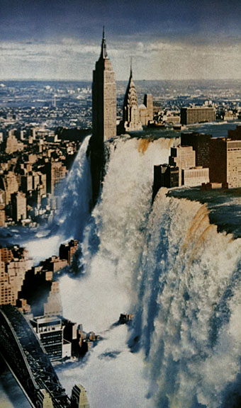
Waterfall by Tsunehisa Kimura.

Continuing an occasional series. Japanese artist Tsunehisa Kimura (1928–2008) was initially inspired by the polemical graphics of John Heartfield to create his own photomontages, a painstaking collage technique now rendered obsolete by Photoshop. Kimura’s work exchanges Heartfield’s satire for an overt and frequently apocalyptic Surrealism, as in his most visible piece, Waterfall. The copy above is one of a number of pictures reproduced by Geoff Manaugh at BLDGBLOG from a 1979 Kimura collection, Visual Scandals by Photomontage.

schutze1.jpg

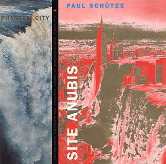
Design by Anne-Louise Falson & Paul Schütze.

I was first startled by Waterfall in 1996 when Paul Schütze released his Site Anubis album, the product of a “virtual group” comprised of musicians recording in different studios around the world:

The musicians comprising Phantom City—the name, incidentally, originating from the book title Topology of a Phantom City by French novelist Alain Robbe-Grillet—never met for the recording of Site Anubis, as each one recorded in a different studio in a different country: guitarist Raoul Björkenheim in Helsinki, bass- and contra-bass clarinetist Alex Buess in a Basel studio, soprano saxophonist Lol Coxhill in London, bassist Bill Laswell at Green Point Studio in Brooklyn, New York, trombonist Julian Priester in Seattle, drummer Dirk Wachtelaer in Brussels, and Schütze himself in London and Basel. Incredibly, Laswell had only Schütze’s electronic backing track to respond to. Wachtelaer had Laswell and Schütze to play against, Björkenheim had drums and bass,—in short, certain players had more information than others.

schutze2.jpg

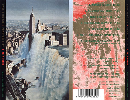
Kimura’s picture is an ideal accompaniment to this excellent album, especially when you note a Ballard reference in the titles (not the first in Schütze’s oevre), and read the scene-setting piece of fiction on the CD insert, an explanation of the album title:

That morning a report came in from an unmarked helicopter somewhere over the city. The waters were subsiding and the smoke from a thousand fires had begun to drift inland revealing an impossible new structure. Towering some eight hundred feet over the gleaming devastation of the streets, its base occupying an entire city block, was a colossal black basalt figure. The body was male and human, – the head, which stared expectantly toward the boiling western horizon, was the head of a jackal. From the air it was clear that the pattern of destruction on the ground was radial and that the massive figure was sited precisely at its centre.

Continue reading “Design as virus 13: Tsunehisa Kimura”

Steampunk Reloaded

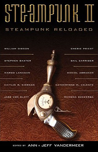
sr00.jpg

Cover design by Ann Monn. Cover image by Dan Jones / Tinkerbots.

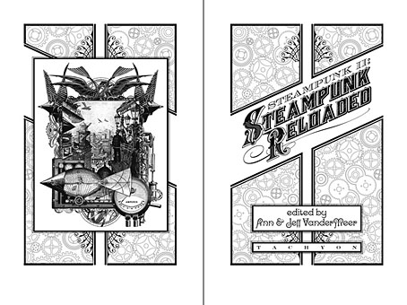
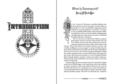
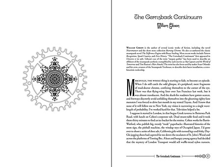
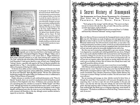
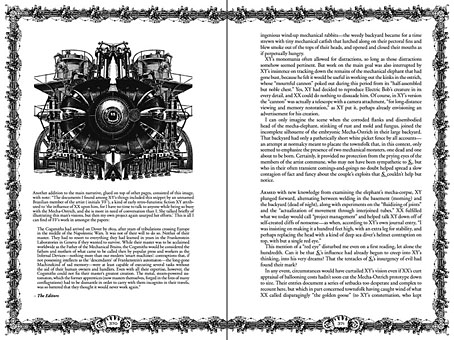
Here at last is the steampunk anthology I mentioned back in September and whose interiors I designed. This is another Tachyon publication, and also another anthology edited by Ann & Jeff VanderMeer. I went further with the design for this than I have done for other Tachyon books, partly because if there’s one thing steampunk lends itself to, it’s decoration but also because the book includes illustrations from Ramona Szczerba, Eric Orchard, and others, plus a comic strip by Sydney Padua; adding extra spot illustrations stopped the pictorial material from seeming too isolated.

sr01.jpg

Title spread. The illustration on the left is one I created last year.

This is a sequel to an earlier steampunk anthology by the same editors but the contents are just as strong as the first collection with excellent stories throughout. (For a review, see here.) By coincidence the book is published in the wake of a recent (and inevitable) backlash against steampunk as science fiction sub-genre and cultural phenomenon. This collection can serve as a repudiation to some of the lazier accusations that writers are ignoring the moral and physical squalor of the Victorian era and the legacies of imperialism; several stories in Steampunk Reloaded address those very issues. For my part I’ve read Friedrich Engels’ Condition of the Working Class in England, Henry Mayhew’s London Labour and the London Poor, and Kellow Chesney’s The Victorian Underworld so I don’t feel in urgent need of a lecture on the iniquities of the 19th century, thank you very much.

sr02.jpg

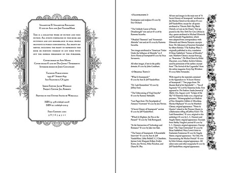
While we’re on the subject, the cover of The Steampunk Bible, edited by Jeff VanderMeer and SJ Chambers, has been revealed here. Abrams will be publishing this next year and having seen some of the interior pages it’s going to be a splendid book. More about that later. Further pages from Steampunk Reloaded follow.

Update: A couple more reviews here and here.

sr03.jpg

Contents spread.

sr04.jpg

sr05.jpg

sr09.jpg

A detail of one of the page footers.

sr06.jpg

Title page for A Secret History of Steampunk, a self-contained section within the body of the book.

sr07.jpg

sr08.jpg

Previously on { feuilleton }
• Steampunk overloaded!
• Skeleton clocks
• Vickers Airship Catalogue
• The Air Ship
• Dirigibles
• More Steampunk and the Crawling Chaos
• The art of François Schuiten
• Steampunk Redux
• Steampunk framed
• Steampunk Horror Shortcuts
• The Airship Destroyer
• Zeppelin vs. Pterodactyls

Wilfried Sätty: Artist of the occult

satty1.jpg

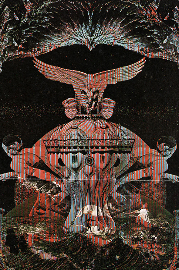
After last week’s post about Wilfried Sätty‘s illustrated Poe, I thought I’d follow it up with this 1970 interview from Man, Myth & Magic, a part-work publication which built weekly into a seven-volume “illustrated encyclopedia of the occult”. In the back of each issue there was a two-page feature, Frontiers of Belief, usually featuring more topical material, and issue 36 had Sätty as its subject. The interview captures him just after he’d been building his reputation as one of San Francisco’s psychedelic poster artists and just before the book collections of his collage work started to appear. The description of his working methods inevitably plays up the occult associations but helps to give a little insight into the artist. The first two pictures here are from the published article to which I added a couple of the album covers he produced in the 1970s. There’s also a poster for an exhibition with friend and fellow artist David Singer whose lettering adorned many of Sätty’s posters.

A note about Sätty’s name: he was known as Wilfried Podriech when he came to America but changed his name to Sätty thereafter. This surname is often reproduced without an umlaut over the “a” which I regard as an error. When Jay Babcock, Richard Pleuger and I visited David Singer to discuss Sätty’s work (and see some of Singer’s own) we were informed that Sätty’s adopted name was intended to be reminiscent of the Egyptian Pharaohonic name Seti. The umlaut over the “a” gives the pronunciation setty; without it would be satty.

*   *   *

ARTIST OF THE OCCULT by Robert W. Neubert

Alchemy can be a state of being according to Sätty, a German-born artist who now lives in San Francisco; and he believes that this concept can be extended to art. In his attempts to plumb the depths of the subconscious he makes use of his collection of occult works, including a 17th century alchemical text and a book of healing and magic published in 1648.

Blue and orange flames flicker from an ancient urn and throw dancing shadows about a dimly-lit subterranean chamber in San Francisco, California. Old, dark-hued tapestries hang from the walls and low ceiling, and occult art objects are crammed into every corner. Baroque harpsichord music filters through the incense-scented air.

Descending a wooden ladder into the nearly black chamber is a tall, lanky man with flowing brown hair, a dark blue Western-styled shirt, and grey flared slacks. He carries under his arm a mystical-looking montage he has recently created and run off on a lithograph press.

The montage is in poster form, and it is a haunting collection of Renaissance and medieval themes, incredible in its intensity, colour and creativity.

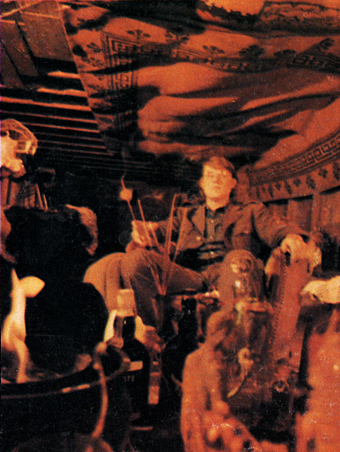
satty_photo.jpg

Sätty photographed for Man, Myth & Magic (1970).

The artist is Sätty, a German-born montage-maker with a dream—a dream of plumbing the depths of the subconscious by utilizing alchemy and mysticism in his work.

Alchemy is essential to his creativity, he says. But the 31-year-old artist’s definition of alchemy has a broader meaning than the classic textbook definition of transmuting base metals into gold. He is one of the first non-commercial poster makers, and his work far transcends the psychedelic art used to advertise San Francisco rock and roll dances.

“Alchemy can be a state of being,” he says. “There is such a thing as visual or intellectual or artistic alchemy. The undeveloped mind may be considered akin to lead, the fully-realized mind as gold. And the same is true of art. Much of contemporary art is lead.”

Continue reading “Wilfried Sätty: Artist of the occult”