Weekend links 239

crystal.jpg

The Crystal Gazer (or The Magic Crystal, 1904) by Gertrude Käsebier.

• “I had to resort to extreme violence”: how Hipgnosis revolutionised the album sleeve. Aubrey Powell, last surviving member of the design team, talks to Joe Muggs.

• Mixes of the week: Radio Belbury: Programme 14; The Conjurer’s Hexmas by SeraphicManta; Secret Mix 139 by A Closer Listen.

• Social progress, high-speed transport and electricity everywhere: Iwan Rhys Morus on how the Victorians invented the future.

• At Cinephilia & Beyond: “The most complete investigation into the origins and making of Citizen Kane.”

Poor Souls’ Light: seven curious tales for the end of the year, and a dedication to Robert Aickman.

• Music and the Occult: Stuart Maconie and Rob Young spend an hour in the magick circle.

Alejandro Jodorowsky and Iain Sinclair in conversation at the British Library, July 2014.

• From 1972: An unpublished Victor Moscoso interview by Patrick Rosenkranz.

The Spooky Story Behind Hollywood’s Favourite Mansion.

The Lost World of British Tape Recording Clubs.

• 2014 was a year of outrage.

Wyrd Daze issue 11

Inspirograph

• Pepper-Tree (1984) by Cocteau Twins | Otterley (1984) by Cocteau Twins | Aikea-Guinea (1985) by Cocteau Twins

Design as virus 13: Tsunehisa Kimura

kimura.jpg

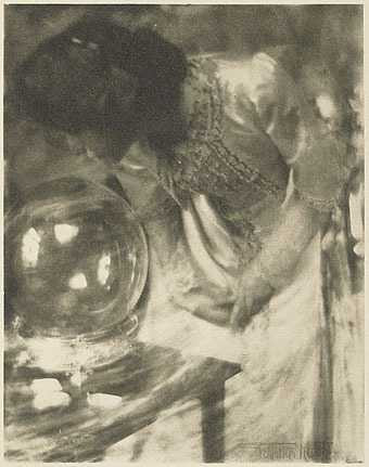
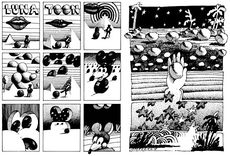
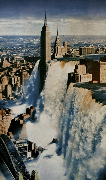
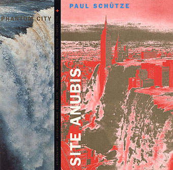
Waterfall by Tsunehisa Kimura.

Continuing an occasional series. Japanese artist Tsunehisa Kimura (1928–2008) was initially inspired by the polemical graphics of John Heartfield to create his own photomontages, a painstaking collage technique now rendered obsolete by Photoshop. Kimura’s work exchanges Heartfield’s satire for an overt and frequently apocalyptic Surrealism, as in his most visible piece, Waterfall. The copy above is one of a number of pictures reproduced by Geoff Manaugh at BLDGBLOG from a 1979 Kimura collection, Visual Scandals by Photomontage.

schutze1.jpg

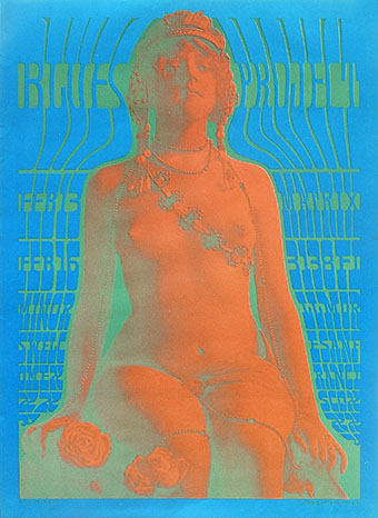
Design by Anne-Louise Falson & Paul Schütze.

I was first startled by Waterfall in 1996 when Paul Schütze released his Site Anubis album, the product of a “virtual group” comprised of musicians recording in different studios around the world:

The musicians comprising Phantom City—the name, incidentally, originating from the book title Topology of a Phantom City by French novelist Alain Robbe-Grillet—never met for the recording of Site Anubis, as each one recorded in a different studio in a different country: guitarist Raoul Björkenheim in Helsinki, bass- and contra-bass clarinetist Alex Buess in a Basel studio, soprano saxophonist Lol Coxhill in London, bassist Bill Laswell at Green Point Studio in Brooklyn, New York, trombonist Julian Priester in Seattle, drummer Dirk Wachtelaer in Brussels, and Schütze himself in London and Basel. Incredibly, Laswell had only Schütze’s electronic backing track to respond to. Wachtelaer had Laswell and Schütze to play against, Björkenheim had drums and bass,—in short, certain players had more information than others.

schutze2.jpg

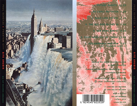
Kimura’s picture is an ideal accompaniment to this excellent album, especially when you note a Ballard reference in the titles (not the first in Schütze’s oevre), and read the scene-setting piece of fiction on the CD insert, an explanation of the album title:

That morning a report came in from an unmarked helicopter somewhere over the city. The waters were subsiding and the smoke from a thousand fires had begun to drift inland revealing an impossible new structure. Towering some eight hundred feet over the gleaming devastation of the streets, its base occupying an entire city block, was a colossal black basalt figure. The body was male and human, – the head, which stared expectantly toward the boiling western horizon, was the head of a jackal. From the air it was clear that the pattern of destruction on the ground was radial and that the massive figure was sited precisely at its centre.

Continue reading “Design as virus 13: Tsunehisa Kimura”

Design as virus 12: Barney’s faces

lowe.jpg

Sleeve for I Love The Sound Of Breaking Glass (1978), a 7″ single by Nick Lowe. Design by Barney Bubbles.

Continuing an occasional series. Designer Vic Fieger had a guest post at Reasons To Be Cheerful earlier this week examining Barney Bubbles’ use of the human face in his graphic designs. This is one side of the Bubbles work I really enjoy, he had a remarkable facility for demonstrating a versatility with abstract shapes—or found objects, as in the piece above—while playing games with our pattern recognition. A recurrent playfulness was one of the many notable things about his approach to design.

colour.jpg

Story title from The Best of Michael Moorcock (2009).

Fieger’s focussing on the faces in Barney’s work struck a chord for me since I’d deliberately tried something similar last year, taking a cue from Barney’s example. The Colour piece above is one of the story titles from The Best of Michael Moorcock published by Tachyon. For each story I designed a different title in a style which complemented the subject; Colour is a science fiction piece in which card games figure, hence the symbols. Mike Moorcock was friends with Barney during the 1970s so there was an additional reason for the reference.

booklife.jpg

I don’t know whether anyone has noticed the face on the cover of Booklife but it is there, with the two flowers at the top forming the eyes and the book’s title standing for the mouth. Once again, this wasn’t strictly necessary for the success of the design but it gave a rationale for the arrangment of the flowers. There’s also the hope when something is this subtle that the attraction of the pattern impells a browser to pick up the book in a shop without quite knowing why.

Booklife and The Best of Michael Moorcock are both available from Tachyon. Paul Gorman’s Barney Bubbles book, Reasons To Be Cheerful: The Life & Work Of Barney Bubbles, will be relaunched later this year in a new edition.

Previously on { feuilleton }
Into the Media Web by Michael Moorcock
Design as virus 11: Burne Hogarth
Design as virus 10: Victor Moscoso
Design as virus 9: Mondrian fashions
The Best of Michael Moorcock
Design as virus 8: Keep Calm and Carry On
Designing Booklife
Design as virus 7: eyes and triangles
Design as virus 6: Cassandre
Design as virus 5: Gideon Glaser
Design as virus 4: Metamorphoses
Design as virus 3: the sincerest form of flattery
Design as virus 2: album covers
Design as virus 1: Victorian borders
Barney Bubbles: artist and designer

Design as virus 11: Burne Hogarth

mighty_baby.jpg

Mighty Baby (1969). Illustration by Martin Sharp.

Yet another album cover prompts this post, part of an occasional series. Mighty Baby were a British rock band who formed out of psychedelic group The Action in the late Sixties, and their music is fairly typical of the period, being “heavy” without any of the psych trappings which—for me—often make everything from that time a lot more interesting. This was a journey undertaken by many groups at the end of that lurid decade, a junking of the playful and evocative side of what was now called rock music in favour of a denim-clad earnestness. This album isn’t one I like very much—I’d rather listen to their earlier incarnation—but the cover painting by psych artist Martin Sharp is certainly a startling piece, being a violent mutation of one of the most famous Tarzan drawings by comic artist Burne Hogarth.

hogarth.jpg

Tarzan by Burne Hogarth (194?).

Hogarth was drawing Tarzan for much of the 1940s and this particular panel showing the Ape-Man attacking Numa the lion dates from the latter part of his run on the series. I wish I could pin this to an actual year but I don’t have a complete set of the comics and that detail eluded me. If anyone knows the date, please leave a comment.

Continue reading “Design as virus 11: Burne Hogarth”

Design as virus 10: Victor Moscoso

india.jpg

Continuing an occasional series.

A recent post at A Journey Round My Skull is a stylish series of Indian book jackets from 1964 to 1984. These impress partly for the way they rework western design approaches, and they consequently look very different from the florid visuals one might (lazily) expect of Indian cover design. Western culture borrowed more than enough from India in the 1960s, from clothes to music, so it only seems right that the sub-continent should be free to take something back.

luna.jpg

Luna Toon by Victor Moscoso (1968).

Will at A Journey Round My Skull mentions the above cover design as reminding him of this Krautrock bible, The Crack in the Cosmic Egg, a book which happens to be a favourite repository of musical obsession. The cover reminded me more of the weirdly abstract comic strips created by artist and graphic designer Victor Moscoso for the early run of Zap Comix in the late Sixties. Moscoso was one of the most graphically revolutionary of the West Coast poster artists, and his approach to comics looks surprisingly fresh today next to the work of fellow artists like Robert Crumb. Those limitless vistas go back to Giorgio de Chirico but it was Salvador Dalí who made deserts raked by evening shadows reflect interior landscapes of his own, and it was Dalí’s immense popularity that in turn popularised that endless plane as a stage for surreal events. Moscoso borrows from the Surrealists and comic artists like George Herriman as much as he borrows from Disney; in his posters he was one of many artists taking motifs or whole designs from Art Nouveau. Our Indian egg may well be an original work but the first example in Will’s post is a very Saul Bass-like hand, so I’m guessing that the designers of these books were looking around for inspiration. And that eye-in-a-hand? Moscoso had done that as well.

neon.jpg

Blues Project Poster by Victor Moscoso (1967).

While we’re discussing Victor Moscoso, it’s convenient to draw attention to a slight mystery connecting his poster art and the great album cover designer, Barney Bubbles. The poster above was one of a number that Moscoso made incorporating Victorian or Edwardian photographs, and two at least of these use antique erotica as their central image.

ritual.jpg

Space Ritual interior, design by Barney Bubbles (1973).

This particular photo always stands out for me. The woman is familiar to anyone who’s seen the interior of the fold-out sleeve Barney Bubbles created for Hawkwind’s Space Ritual album in 1973. Barney spent some time in San Francisco in the late Sixties and was undoubtedly familiar with Moscoso’s work, as he was with all the great designs coming from the West Coast at that time. What surprises me is that he should have somehow found the same image to use as Moscoso did. Was there a popular book of Edwardian erotica which everyone was familiar with? Did he ask Moscoso where he’d found the photo? Did he find it by chance? Barney Bubbles experts don’t know the answer (I’ve asked) and the question is in any case a rather trivial one. But I’m still curious… As early porn photos go it’s a particularly fine one and I’d like to know whether there are more like it and where it came from. Needless to say, if anyone knows more about this, please leave a comment.

Previously on { feuilleton }
Design as virus 9: Mondrian fashions
Design as virus 8: Keep Calm and Carry On
Design as virus 7: eyes and triangles
Design as virus 6: Cassandre
Design as virus 5: Gideon Glaser
Design as virus 4: Metamorphoses
Design as virus 3: the sincerest form of flattery
Design as virus 2: album covers
Design as virus 1: Victorian borders